I’m not too sure how I stumbled into this one. But something led me to this tweet:
Has anyone done this directional lighting cursor interaction with CSS? pic.twitter.com/zLL7Sk6kW5
— Jed Bridges (@JedBridges) July 1, 2020
And, to me, that’s a challenge.
The button design is neat. But I didn’t want to do a direct copy. Instead, we decided to make a “Twitter” button. The idea is that we create an almost transparent button with a social icon on it. And then that social icon casts a shadow below. Moving our mouse across the button shines a light over it. Pressing the button pushes it onto the surface. Here’s the final result:
Directional Lighting 3D CSS Twitter Button ????
???? https://t.co/qpfzEwUMey via @CodePen pic.twitter.com/zWfwtPaixo
— Jhey ???????? (@jh3yy) January 30, 2021
In this article, we’re going to look at how you can make it too. The cool thing is, you can swap the icon out to whatever you want.
The Markup
My first-take approach for creating something like this is to scaffold the markup. Upon first inspection, we’ll need to duplicate the social icon used. And a neat way to do this is to use Pug and leverage mixins:
mixin icon() svg.button__icon(role='img' xmlns='http://www.w3.org/2000/svg' viewbox='0 0 24 24') title Twitter icon path(d='M23.953 4.57a10 10 0 01-2.825.775 4.958 4.958 0 002.163-2.723c-.951.555-2.005.959-3.127 1.184a4.92 4.92 0 00-8.384 4.482C7.69 8.095 4.067 6.13 1.64 3.162a4.822 4.822 0 00-.666 2.475c0 1.71.87 3.213 2.188 4.096a4.904 4.904 0 01-2.228-.616v.06a4.923 4.923 0 003.946 4.827 4.996 4.996 0 01-2.212.085 4.936 4.936 0 004.604 3.417 9.867 9.867 0 01-6.102 2.105c-.39 0-.779-.023-1.17-.067a13.995 13.995 0 007.557 2.209c9.053 0 13.998-7.496 13.998-13.985 0-.21 0-.42-.015-.63A9.935 9.935 0 0024 4.59z') Here, we’ve created a mixin for rendering an SVG of the Twitter icon. This would render the Twitter icon if we invoke it like so:
+icon() Doing that will give us a big Twitter icon.
See the Pen 1. Render An Icon by SitePoint (@SitePoint)
on CodePen.
Because social icon sets tend to use the same “0 0 24 24” viewBox, we could make the title and path arguments:
mixin icon(title, path) svg.button__icon(role='img' xmlns='http://www.w3.org/2000/svg' viewbox='0 0 24 24') title= title path(d=path) Then our Twitter icon becomes
+icon('Twitter Icon', 'M23.953 4.57a10 10 0 01-2.825.775 4.958 4.958 0 002.163-2.723c-.951.555-2.005.959-3.127 1.184a4.92 4.92 0 00-8.384 4.482C7.69 8.095 4.067 6.13 1.64 3.162a4.822 4.822 0 00-.666 2.475c0 1.71.87 3.213 2.188 4.096a4.904 4.904 0 01-2.228-.616v.06a4.923 4.923 0 003.946 4.827 4.996 4.996 0 01-2.212.085 4.936 4.936 0 004.604 3.417 9.867 9.867 0 01-6.102 2.105c-.39 0-.779-.023-1.17-.067a13.995 13.995 0 007.557 2.209c9.053 0 13.998-7.496 13.998-13.985 0-.21 0-.42-.015-.63A9.935 9.935 0 0024 4.59z') But, we could pass it a key — and then have the paths stored in an object if we have many icons we wanted to use or repeat:
mixin icon(key) - const PATH_MAP = { Twitter: "M23.953 4.57a10 10 0 01-2.825.775 4.958 4.958 0 002.163-2.723c-.951.555-2.005.959-3.127 1.184a4.92 4.92 0 00-8.384 4.482C7.69 8.095 4.067 6.13 1.64 3.162a4.822 4.822 0 00-.666 2.475c0 1.71.87 3.213 2.188 4.096a4.904 4.904 0 01-2.228-.616v.06a4.923 4.923 0 003.946 4.827 4.996 4.996 0 01-2.212.085 4.936 4.936 0 004.604 3.417 9.867 9.867 0 01-6.102 2.105c-.39 0-.779-.023-1.17-.067a13.995 13.995 0 007.557 2.209c9.053 0 13.998-7.496 13.998-13.985 0-.21 0-.42-.015-.63A9.935 9.935 0 0024 4.59z" } svg.button__icon(role='img' xmlns='http://www.w3.org/2000/svg' viewbox='0 0 24 24') title= `${key} Icon` path(d=PATH_MAP[key]) +icon('Twitter') This can be a neat way to create an icon mixin to reuse. It’s a little overkill for our example, but worth noting.
Now, we need some markup for our button.
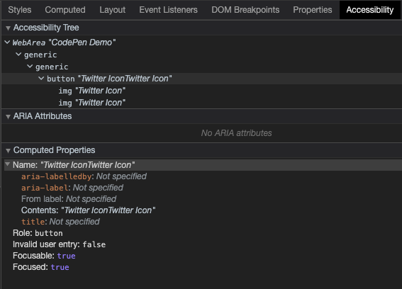
.scene button.button span.button__shadow +icon('Twitter') span.button__content +icon('Twitter') span.button__shine It’s always good to be mindful of accessibility. We can check what our button gives off by checking the Accessibility panel in your browser’s developer tools.
It might be a good idea to put a span in for our button text and hide the icons with aria-hidden. We can hide the span text too whilst making it available to screen readers:
.scene button.button span.button__shadow +icon('Twitter') span.button__content span.button__text Twitter +icon('Twitter') span.button__shine We’ve got different options for applying those aria-hidden attributes. The one we’ll use is changing the mixin code to apply aria-hidden:
mixin icon(key) - const PATH_MAP = { Twitter: "...path code" } svg.button__icon(role='img' aria-hidden="true" xmlns='http://www.w3.org/2000/svg' viewbox='0 0 24 24') title= `${key} Icon` path(d=PATH_MAP[key]) Another neat way with Pug is to pass through all attributes to a mixin. This is useful in scenarios where we only want to pass some attributes through:
mixin icon(key) - const PATH_MAP = { Twitter: "...path code" } svg.button__icon(role='img' xmlns='http://www.w3.org/2000/svg' viewbox='0 0 24 24')&attributes(attributes) title= `${key} Icon` path(d=PATH_MAP[key]) If we check the Accessibility panel again, our button only reads “Twitter”. And that’s what we want!
The Styles
Here’s the part you came for — how we style the thing. To start, we’ve dropped this in:
* { transform-style: preserve-3d; } That allows us to create the 3D transforms we need for our button. Try switching that off in the final demo and you’ll see that everything breaks.
Let’s hide the span text from our eyes. We can do this in many ways. One recommended way to hide an element from our eyes, but not those of the screenreader, is to use these styles:
.button__text { position: absolute; width: 1px; height: 1px; padding: 0; margin: -1px; overflow: hidden; clip: rect(0, 0, 0, 0); white-space: nowrap; border-width: 0; } Before we start working on our button, we’re going to tilt the scene. We can do this using a transform. Here we chain the transform to get it into the position we want. I spent a bit of time tinkering with values here on live stream to get it close to the original:
.scene { height: var(--size); position: relative; width: var(--size); transform: rotateX(-40deg) rotateY(18deg) rotateX(90deg); } You’ll notice a size variable there too. We’re going to drive certain things for our button with CSS variables. This will make it handy for tinkering with values and the effect. Usually, we’d put these under the scope they’re required in. But, for demos like this, putting them under the :root at the top of our file makes it easier for us to play with.
:root { --blur: 8px; --shine-blur: calc(var(--blur) * 4); --size: 25vmin; --transition: 0.1s; --depth: 3vmin; --icon-size: 75%; --radius: 24%; --shine: rgba(255,255,255,0.85); --button-bg: rgba(0,0,0,0.025); --shadow-bg: rgba(0,0,0,0.115); --shadow-icon: rgba(0,0,0,0.35); --bg: #e8f4fd; } These are the variables we’re working with, and they’ll make sense as we build up our button.
Continue reading Creating Directionally Lit 3D Buttons with CSS on SitePoint.