I saw in the release notes for Safari Technical Preview 122 that it has support for a color-contrast() function in CSS. Safari is first out of the gate here. As far as I know, no other browser supports this yet and I have no idea when stable Safari will ship it, or if any other browser ever will. But! It’s a very good idea! Any native tool to get us to ship more accessible interfaces (of which color contrast is a part) is cool by me. So let’s attempt to get it to work.

Anybody can download Safari Technical Preview, so I did that.
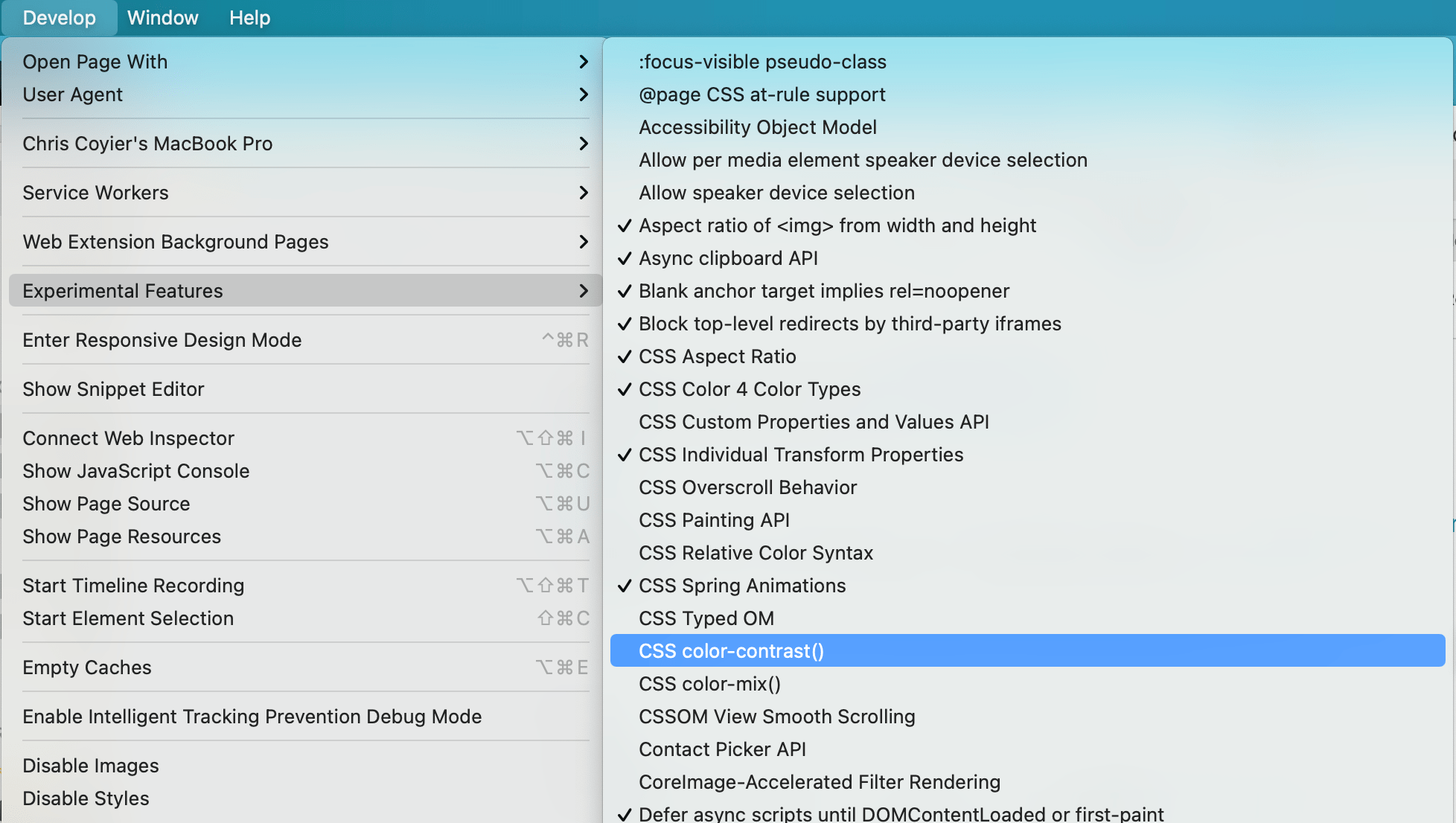
I had to ask around about this, but just because this is a pre-release browser, it doesn’t mean all these features are active by default. Just as Chrome Canary has feature flags you have to turn on, so does Safari Technical Preview. So, I had to flip it on like this:
The release notes don’t have any information about how to actually use color-contrast(), but fortunately web searching turns up a spec (it’s part of Color Module 5), and MDN has a page for it with very basic syntax information.
This is how I understand it:
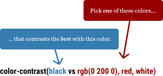
That example above is a little silly, because it will always return white — that has the most contrast with black. This function actually gets useful when one or more of those color values is dynamic, meaning very likely it is a CSS custom property.
The function returns a color, so the top use-case, I would guess, is going to be setting a color based on a dynamic background. So…
section { background: var(--bg); color: color-contrast(var(--bg), white, black);
}
Now we can toss any color at all at --bg and we’ll either get white or black text, depending on what has the most contrast:
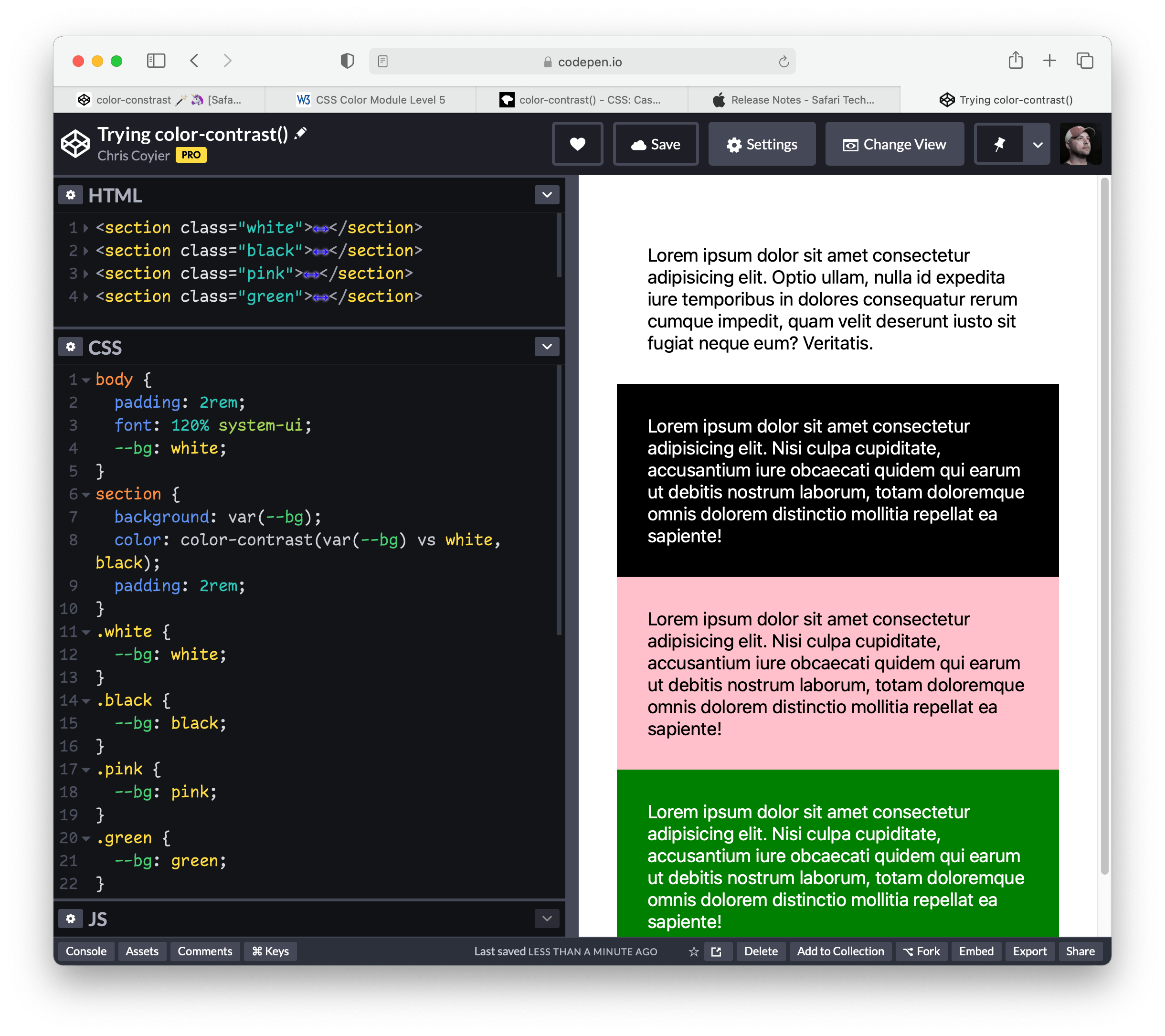
That’s extremely cool, even in the most basic use case.
Here’s a demo from Dave where he’s not just setting the text color in the parent, but the color of links as well, and the links have a different set of colors to choose from. Play with the HSL sliders (in Safari Technology Preview, of course) to see it work.
Just picking two colors that have enough contrast is easy enough (although you’d be surprised how often it’s screwed up by even those of us with good intentions). But oh wow does it get complicated quick with different situations, let alone having a bunch of color variations, or god forbid, arbitrary combinations.
Here’s a video of me playing with Dave’s tester so you can see how the colors update at different places.