For a while now, I’ve been creating these 3D scenes with CSS for fun — usually on my live stream.
3D CSS Responsive Stunt Plane! ????️
It does loops and rolls! ????
Responds to mouse movement ????
???? https://t.co/A1zNmfEzzi via @CodePen pic.twitter.com/87D7LIXLr2
— Jhey ???????? (Exploring Opportunities ✨) (@jh3yy) March 27, 2021
<!–
3D CSS Responsive Stunt Plane! 🛩️
It does loops and rolls! 😎
Responds to mouse movement 🐭
👉 https://t.co/A1zNmfEzzi via @CodePen pic.twitter.com/87D7LIXLr2
— jhey ʕ•ᴥ•ʔ (@jh3yy) March 27, 2021
–>
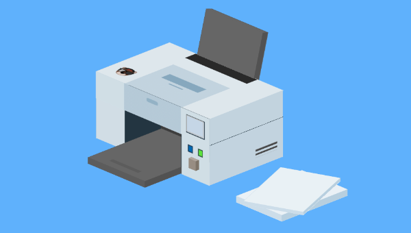
Each demo is an opportunity to try something different or work out ways to do things with CSS. One thing I often do is take suggestions for what we should try and make on the stream. A recent suggestion was a printer that prints in “3D”. And here’s what I put together!
???? CSS Print Shop is open for business! ????
Free printing! ????
Input an image URL to see it printed out by the 3D CSS Printer ????
???? https://t.co/UWTDAyUadn via @CodePen pic.twitter.com/z3q9dJavYv
— Jhey ???????? (Exploring Opportunities ✨) (@jh3yy) April 22, 2021
<!–
📢 CSS Print Shop is open for business! 😅
Free printing! 😮
Input an image URL to see it printed out by the 3D CSS Printer 😁
👉 https://t.co/UWTDAyUadn via @CodePen pic.twitter.com/z3q9dJavYv
— jhey ʕ•ᴥ•ʔ (@jh3yy) April 22, 2021
–>
Making Things 3D with CSS
I’ve written about making things 3D with CSS before. The general gist is that most scenes are a composition of cuboids.
To make a cuboid, we can use CSS transforms to position the sides of a cuboid — the magic property being transform-style. Setting this to preserve-3d allows us to transform elements on the third dimension:
* { transform-style: preserve-3d; } Once you create a few of these scenes, you start picking up ways to speed things up. I like to use Pug as a HTML preprocessor. The mixin ability gives me a way to create cuboids faster. The markup examples in this article use Pug. But for each CodePen demo you can use the “View Compiled HTML” option to see the HTML output:
mixin cuboid() .cuboid(class!=attributes.class) - let s = 0 while s < 6 .cuboid__side - s++ Using +cuboid()(class="printer__top") will produce this:
<div class="cuboid printer__top"> <div class="cuboid__side"></div> <div class="cuboid__side"></div> <div class="cuboid__side"></div> <div class="cuboid__side"></div> <div class="cuboid__side"></div> <div class="cuboid__side"></div> </div> Then I have a set block of CSS I use to lay out the cuboids. The joy here is that we can leverage CSS custom properties to define the properties of a cuboid (as shown in the video above):
.cuboid { // Defaults --width: 15; --height: 10; --depth: 4; height: calc(var(--depth) * 1vmin); width: calc(var(--width) * 1vmin); transform-style: preserve-3d; position: absolute; font-size: 1rem; transform: translate3d(0, 0, 5vmin); } .cuboid > div:nth-of-type(1) { height: calc(var(--height) * 1vmin); width: 100%; transform-origin: 50% 50%; position: absolute; top: 50%; left: 50%; transform: translate(-50%, -50%) rotateX(-90deg) translate3d(0, 0, calc((var(--depth) / 2) * 1vmin)); } .cuboid > div:nth-of-type(2) { height: calc(var(--height) * 1vmin); width: 100%; transform-origin: 50% 50%; transform: translate(-50%, -50%) rotateX(-90deg) rotateY(180deg) translate3d(0, 0, calc((var(--depth) / 2) * 1vmin)); position: absolute; top: 50%; left: 50%; } .cuboid > div:nth-of-type(3) { height: calc(var(--height) * 1vmin); width: calc(var(--depth) * 1vmin); transform: translate(-50%, -50%) rotateX(-90deg) rotateY(90deg) translate3d(0, 0, calc((var(--width) / 2) * 1vmin)); position: absolute; top: 50%; left: 50%; } .cuboid > div:nth-of-type(4) { height: calc(var(--height) * 1vmin); width: calc(var(--depth) * 1vmin); transform: translate(-50%, -50%) rotateX(-90deg) rotateY(-90deg) translate3d(0, 0, calc((var(--width) / 2) * 1vmin)); position: absolute; top: 50%; left: 50%; } .cuboid > div:nth-of-type(5) { height: calc(var(--depth) * 1vmin); width: calc(var(--width) * 1vmin); transform: translate(-50%, -50%) translate3d(0, 0, calc((var(--height) / 2) * 1vmin)); position: absolute; top: 50%; left: 50%; } .cuboid > div:nth-of-type(6) { height: calc(var(--depth) * 1vmin); width: calc(var(--width) * 1vmin); transform: translate(-50%, -50%) translate3d(0, 0, calc((var(--height) / 2) * -1vmin)) rotateX(180deg); position: absolute; top: 50%; left: 50%; } Using custom properties, we can control various characteristics of the cuboids, and so on:
--width: the width of a cuboid on the plane--height: the height of a cuboid on the plane--depth: the depth of a cuboid on the plane--x: the X position on the plane--y: the Y position on the plane
This isn’t very impressive until we put the cuboid into a scene and rotate it. Again, I use custom properties to manipulate the scene whilst I work on making something. Dat.GUI comes in super handy here.
See the Pen CSS 3D Sandbox ???? by SitePoint (@SitePoint)
on CodePen.
If you inspect the demo, using the control panel updates custom CSS properties on the scene. This scoping of CSS custom properties saves a lot of repeated code and keeps things DRY.
Continue reading Create a 3D CSS Printer that Actually Prints! on SitePoint.