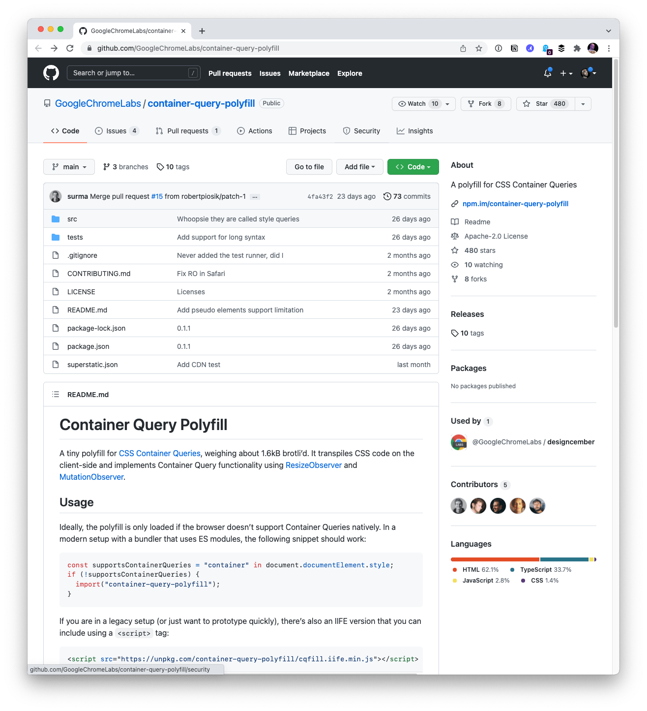
There is now a polyfill for Container Queries that behaves as perfectly as a polyfill should:
- You conditionally load it when you detect the browser doesn’t support Container Queries.
- You write CSS as you normally would, including current-spec-compliant Container Queries syntax code.
- It just works.
It’s pretty great to have a container query polyfill that is this easy to use and from Chrome itself, the first-movers as far as early test implementations. Looks like Surma put it together — thanks Surma!
There was a Container Query polyfill from Jonathan Neal called cqfill that predates this. I’m not sure if it’s officially deprecated, but it required extra non-spec CSS to work and PostCSS processing, so I’d consider it deprecated in favor of this newer polyfill.
Loading the polyfill is like this:
// Support Test
const supportsContainerQueries = "container" in document.documentElement.style; // Conditional Import
if (!supportsContainerQueries) { import("https://cdn.skypack.dev/container-query-polyfill");
}
You can pull it from npm or use as a <script>, but this way seems best to me to keep things light and easy.
Then you’re free to use the syntax for a container query in CSS. Say you have a weather widget in HTML. You’ll need an extra wrapper element for your queries. That’s just the rule: you can’t query the thing you style.
<div class="weather-wrap"> <dl class="weather"> <div> <dt>Sunday</dt> <dd> <b>26°</b> 7° </dd> </div> <div> <dt>Monday</dt> <dd> <b>34°</b> 11° </dd> </div> <!-- etc --> </dl>
</div>
The wrapper is instantiated as a container:
.weather-wrap { container: inline-size / weather-wrapper; /* Shorthand for: */ /* container-type: inline-size; */ /* container-name: weather-wrapper; */ /* For quick testing, do this to get a resize handle on desktop: */ /* resize: both; */ /* overflow: hidden; */
}
Then you write any global styling for that component, as well as container query scoped styles:
.weather { display: flex;
}
@container weather-wrapper size(max-width: 700px) { .weather { flex-direction: column; }
}
Container Queries polyfill example
Here’s that slightly more fleshed-out demo of the Container Query polyfill using an actual weather widget:
I first saw this over on Bramus’ blog, and he’s got a classic card demo going with this Container Query polyfill. Scroll up and down. You’ll see a row of bear cards at the top (if your browser window is wide enough), and then similar bear cards in different layout positions below that change into nicer formats when they can, based on the container query.
Container Query polyfill browser support
The polyfill docs say:
The polyfill relies on ResizeObserver, MutationObserver and :is(). Therefore, it should work in all modern browsers, specifically Chrome/Edge 88+, Firefox 78+ and Safari 14+.
There are all sorts of other minor little caveats covered in those docs, including what it does and doesn’t support. Seems like mostly niche stuff to me — the main/typical use cases are covered.
A game changer?
As I write, we’ve seen behind-flag support for Container Queries in Chrome, and it is an official spec draft now:
That’s extremely exciting and points heavily toward browsers actually shipping with Container Queries, even if the syntax changes a bit on the way (it already has a number of times). But, of course, we have no idea if/when Container Queries do ship — and when that magical threshold is crossed, we also don’t know where we can use them without much worry, like we can with flexbox and grid now.
That “just use it” date is probably a decent ways off, but if you’re into the idea of polyfilling and being careful with progressive enhancement, I’d say the date for using Container Queries could be right now-ish. Looks to me like the polyfill script comes across the wire at 2.8kb, so it’s fairly trivial in size for something so important.
I suspect this polyfill will skyrocket usage of Container Queries in this coming year.
FOUC?
The fact that your styles only correctly apply after a JavaScript file is downloaded and executed puts sites into Flash of Unstyled Content (FOUC) territory. Here’s a video recording where I can see it on my own demo. I’m not sure there is a way around this other than intentionally delaying rendering, which is generally considered a no-no. Similar to loading web fonts, FOUC is probably a good thing as it means your content is never hidden or delayed, even if the shifts aren’t ideal. The FOUC should go away once browser support lands and the polyfill stops loading at all.
Have fun polyfilling container queries! I’d love to see more demos of it.