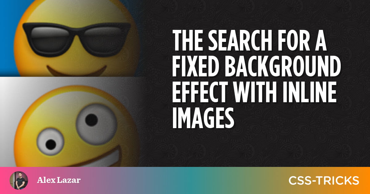
I was working on a client project a few days ago and wanted to create a certain effect on an <img>. See, background images can do the effect I was looking for somewhat easily with background-attachment: fixed;. With that in place, a background image stays in place—even when the page scrolls. It isn’t used all that often, so the effect can look unusual and striking, especially when used sparingly.
Table of Contents
Table of Contents
It took me some time to figure out how to achieve the same effect only with an inline image, rather than a CSS background image. This is a video of the effect in action:
The exact code for the above demo is available in this Git repo. Just note that it’s a Next.js project. We’ll get to a CodePen example with raw HTML in a bit.
Why use <img> instead of background-image?
The are a number of reasons I wanted this for my project:
- It’s easier to lazy load (e.g.
<img loading="lazy"… >. - It provides better SEO (not to mention accessibility), thanks to
alttext. - It’s possible to use srcset/sizes to improve the loading performance.
- It’s possible to use the <picture> tag to pick the best image size and format for the user’s browser.
- It allows users to download save the image (without resorting to DevTools).
Overall, it’s better to use the image tag where you can, particularly if the image could be considered content and not decoration. So, I wound up landing on a technique that uses CSS clip-path. We’ll get to that in a moment, right after we first look at the background-image method for a nice side-by-side comparison of both approaches.
1. Using CSS background-image
This is the “original” way to pull off a fixed scrolling effect. Here’s the CSS:
.hero-section { background-image: url("nice_bg_image.jpg"); background-repeat: no-repeat; background-size: cover; background-position: center; background-attachment: fixed;
}
But as we just saw, this approach isn’t ideal for some situations because it relies on the CSS background-image property to call and load the image. That means the image is technically not considered content—and thus unrecognized by screen readers. If we’re working with an image that is part of the content, then we really ought to make it accessible so it is consumed like content rather than decoration.
Otherwise, this technique works well, but only if the image spans the whole width of the viewport and/or is centered. If you have an image on the right or left side of the page like the example, you’ll run into a whole number of positioning issues because background-position is relative to the center of the viewport.
Fixing it requires a few media queries to make sure it is positioned properly on all devices.
2. Using the clip-path trick on an inline image
Someone on StackOverflow shared this clip-path trick and it gets the job done well. You also get to keep using the<img> tag, which, as we covered above, might be advantageous in some circumstances, especially where an image is part of the content rather than pure decoration.
Here’s the trick:
.image-container { position: relative; height: 200px; clip-path: inset(0);
} .image { object-fit: cover; position: fixed; left: 0; top: 0; width: 100%; height: 100%;
}
Check it out in action:
Now, before we rush out and plaster this snippet everywhere, it has its own set of downsides. For example, the code feels a bit lengthy to me for such a simple effect. But, even more important is the fact that working with clip-path comes with some implications as well. For one, I can’t just slap a border-radius: 10px; in there like I did in the earlier example to round the image’s corners. That won’t work—it requires making rounded corners from the clipping path itself.
Another example: I don’t know how to position the image within the clip-path. Again, this might be a matter of knowing clip-path really well and drawing it where you need to, or cropping the image itself ahead of time as needed.
Is there something better?
Personally, I gave up on using the fixed scrolling effect on inline images and am back to using a CSS background image—which I know is kind of limiting.
Have you ever tried pulling this off, particularly with an inline image, and managed it well? I’d love to hear!

