Illustrations can beautifully and uniquely capture reality. If your website has a nature/outdoors theme, photography might not quite cut it for really nailing that stylized, personal touch. Need some ideas? These awesome examples will give you all the inspiration you need!
Your Web Designer Toolbox
Unlimited Downloads: 500,000+ Web Templates, Icon Sets, Themes & Design Assets
Starting at only $16.50/month!

DOWNLOAD NOW![]()
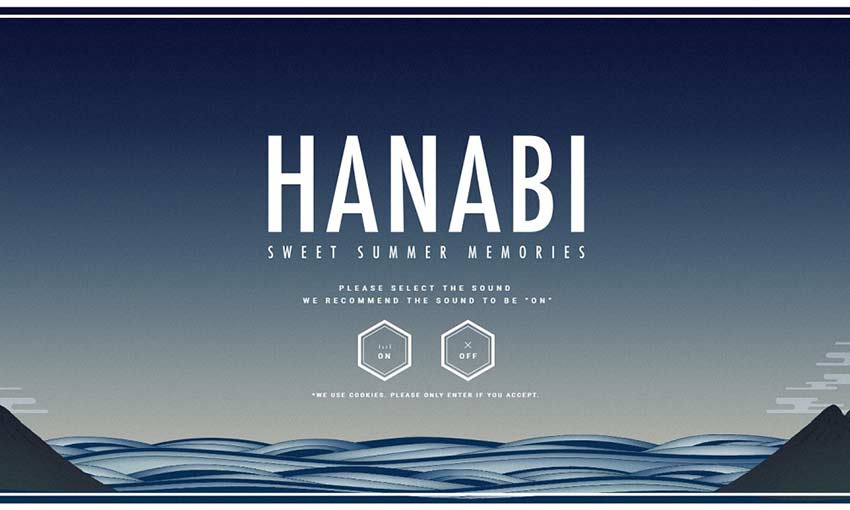
The simplistic style of this background is reminiscent of a watercolor painting. Upload a photo, and see it turn into a colorful spray of fireworks! It’s a unique idea with beautiful execution.
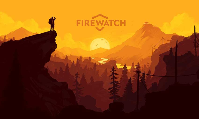
Firewatch instantly hits you with gorgeous art of a mountain landscape at sunset. Scroll down and you’ll get even more of a treat as the parallax reveals a new depth to the background. If you want to design your front page around illustration, take note!
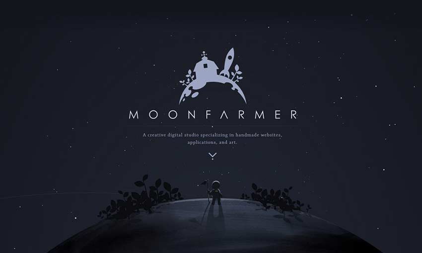
A parallax planet set against stunning animated starscapes. This one-page website obviously had a lot of work and inspiration poured into it. Even with some simple panning and rotating, you can create something really beautiful.
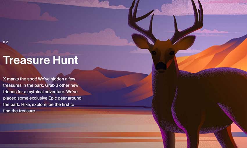
This whole page is packed with stunning illustrations of camping and natural scenery. The parallax at the top of the page is used to good effect, and as you scroll down, you’ll see even more pretty images. Take note of how the site’s color theme meshes well with the large illustrations.
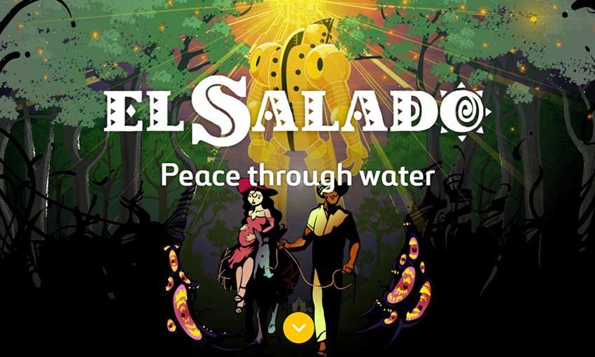
This website uses both photography and art to tell you about the story of a village in conflict. The graphic novel, though illustrated, speaks about a very real event in history. You’ll find both a cartoonish depiction of conflict as a monster and photos of the actual village that inspired the story here.
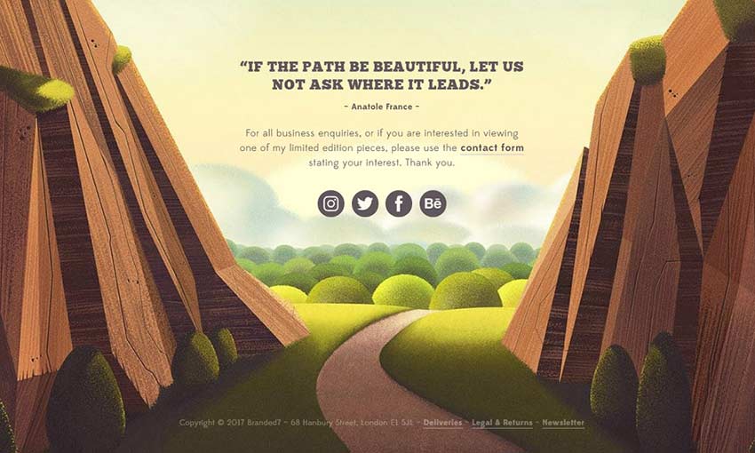
This site is filled with all kinds of art, but natural pieces appear to be a specialty. Scroll down to encounter a beautiful parallax piece of a mountain trail that serves as your send-off with social media links. Explore to find even more awesome nature illustrations!
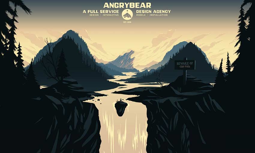
This website is a real experience, top to bottom. As you scroll down, you’ll descend the falls, seeing the illustration continue between information about the company until you reach the bottom of the image. A very unique and clever one-page design.
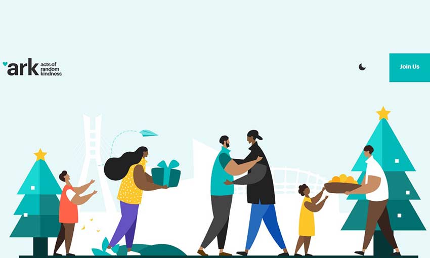
You don’t need to create the next “Starry Night” on your website. A simple, minimalistic header more than gets the point across. The bright colors and stylized designs look great, and all the fun little animations are a joy to look at.
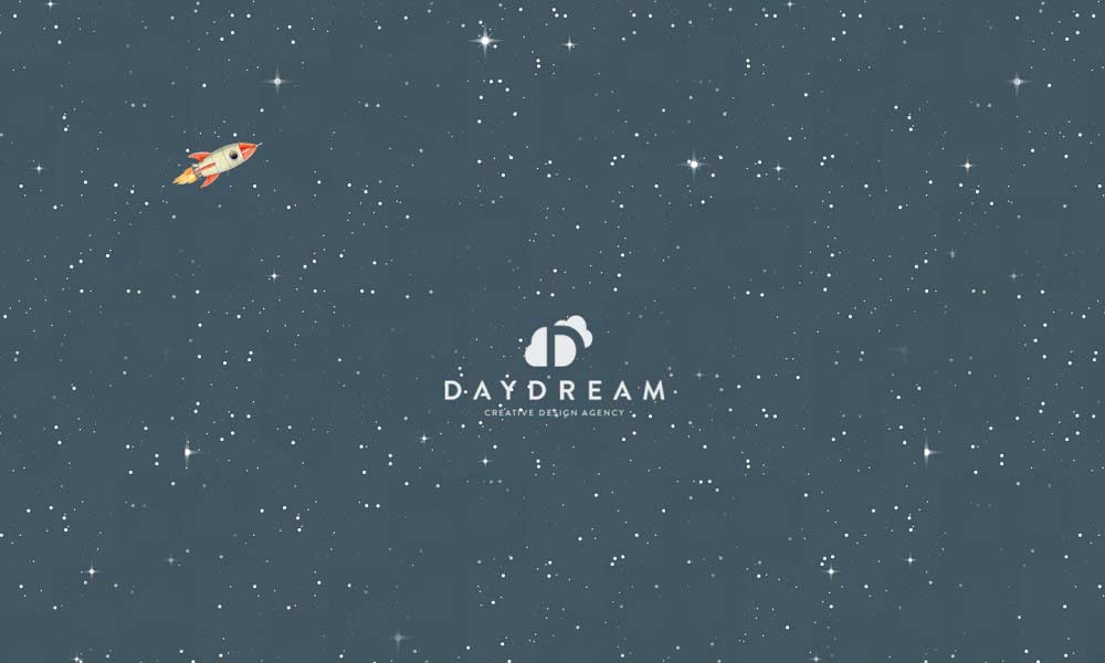
This site is just really well put together. With a starry opening, a sky full of clouds that follows you as you navigate the site, and some great art, you won’t find a page more well-crafted. There are so many subtle animations, like the transition from night to day and the mouse animations in the background. You can even step inside the building!
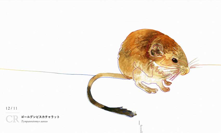
The premise is simple: An endangered species for every day, presented in a beautiful illustration. Scroll down and you can see the animals from the last few days. Plants, animals, and insects are all featured, along with a little blurb about the species.
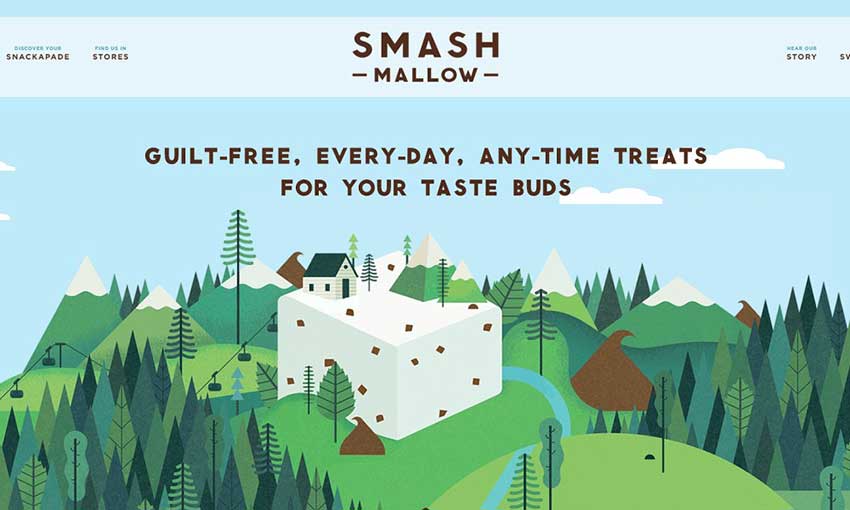
This colorful site is super fun to navigate. The homepage is filled with delightful background images, but no matter where you go, the illustrated header and footer banners follow you.
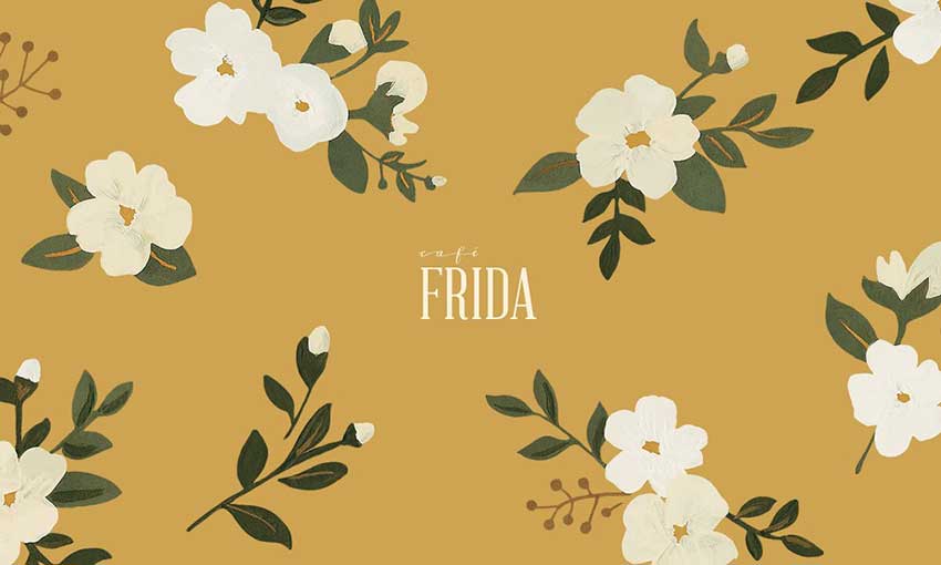
Here’s a cool effect! When you open the site, you’ll see an elegant header filled with flowers and leaves. Scroll down and they’ll move out of your way, but remain as an overlay as you read on.
Capturing Nature Through Illustration
Drawings of the natural world can look especially beautiful, as you’ve seen in these gorgeous examples. Illustrated headers, icons, and logos with a nature theme can completely transform your website and overhaul your branding.
If you loved these examples, definitely consider giving illustrations a try in your next project!
This post may contain affiliate links. See our disclosure about affiliate links here.