The portfolio design of a web designer is an ever-evolving process of redesign after redesign. It is their portal to prospective clients and employers and thus has to, in itself, show off the web designer’s wide-range of skills while pushing the boundaries of the latest design trends.
This area of web design is of particular importance to the overall aesthetic of the web and can give great insight into the direction that the current web design trends are taking.
Today, we’re going to take a look at some of the most recent web designer portfolio trends and showcase examples which implement these trends highly effectively.
Your Web Designer Toolbox
Unlimited Downloads: 500,000+ Web Templates, Icon Sets, Themes & Design Assets
Table of Contents

DOWNLOAD NOW![]()
Resume-Style Portfolios
Until recently, there was considerable focus on imagery on web designer portfolio sites. Now we see a shift towards more resume-style portfolios where the portfolio is a set of links to live products, projects, or previous companies.
This is likely, in part, a response to many companies looking for live portfolio work and projects, as opposed to pure visuals.
Floating Elements
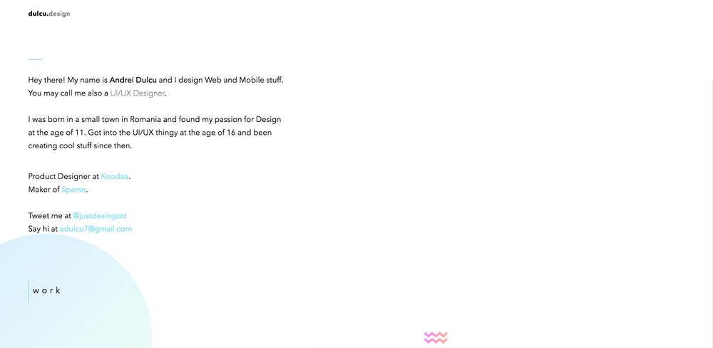
Floating and randomly placed elements can introduce personality to a portfolio design. It signals a shift away from the very structured, template-like layouts that we have become so accustomed to (and quite truthfully now struggle to make a portfolio stand out).
It is particularly effective in combination with visuals such as past work or imagery.
Experimental color schemes
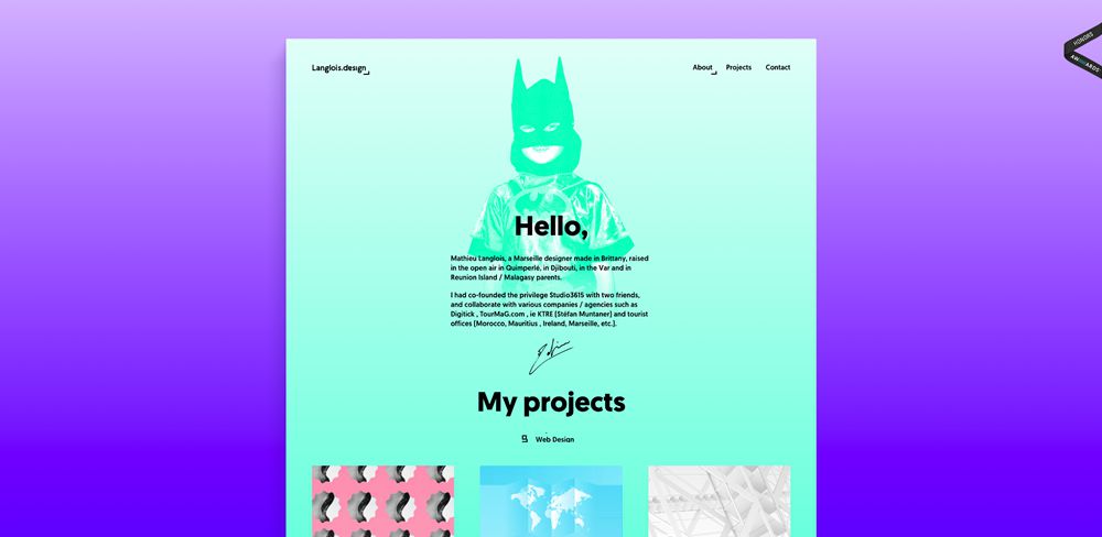
Likely a product of the brutalist web design trend, experimental color schemes are popping up more and more in web designer portfolio websites and producing some highly visual results. The schemes often involve gradient background colors, high contrast, and bright primary colors.
Unique spacing and layout
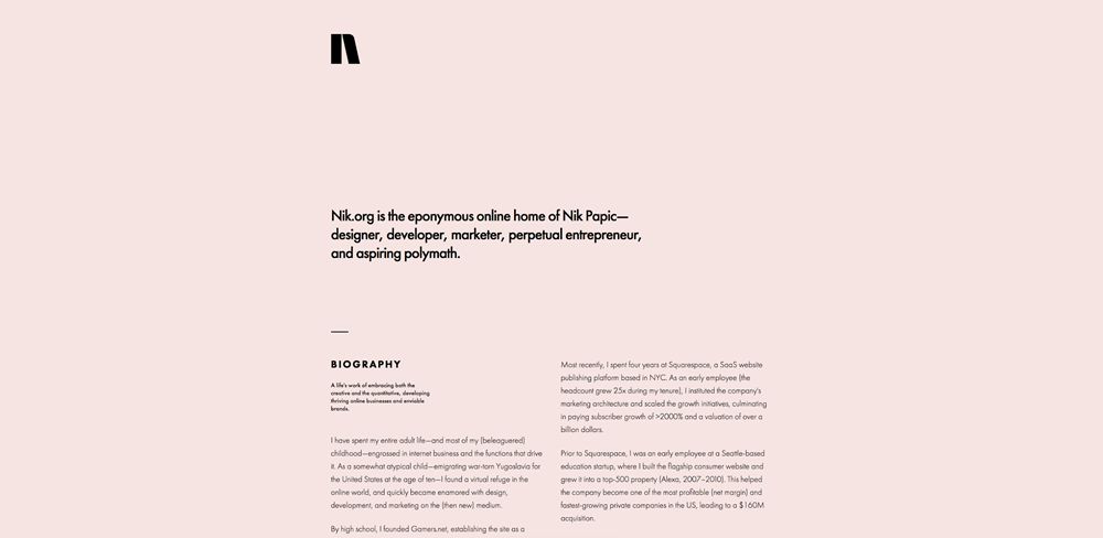
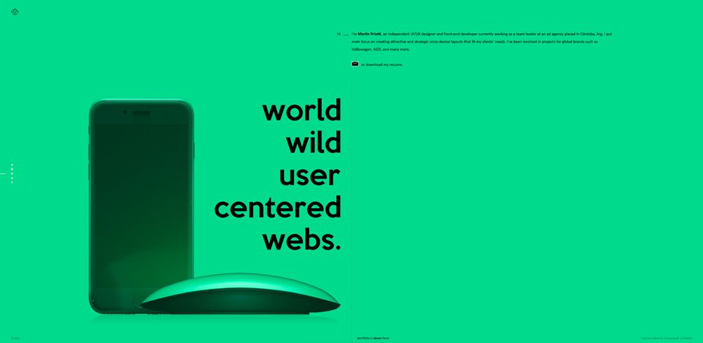
Many web designers are shifting away from the more generic grid-type layouts and defining their own unique layouts and spacing.
This has resulted in some truly unique results and make for some exceptional visuals such as in the example below. It uses a split layout while incorporating multiple text alignments, monochrome imagery, and vast areas of whitespace.
Diagonal scroll
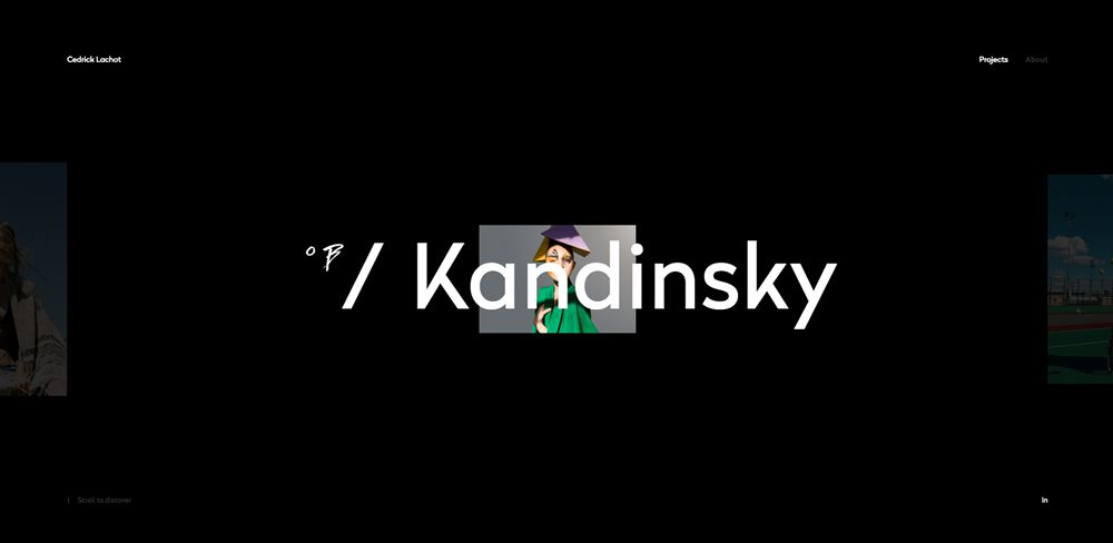
Gone are the days of horizontal scrolling, and in its place is a far more usable alternative: diagonal scrolling. You can test it out here. A simple vertical scroll results in images that move diagonally across and up the screen, resulting in some lovely visual effects. It feels natural, sophisticated, and will no doubt catch on as the second half of 2017 nears ever closer.
Have you stumbled across any stunning web designer portfolios recently? Share them with us below!
This post may contain affiliate links. See our disclosure about affiliate links here.


