Graphical backgrounds have been an emerging trend in mobile design over the last year. It entails incorporating some form of visuals behind the primary content. Typically this area tended to be left untouched, aside from color variations.
Going back further, we used to see the use of subtle background patterns such as linen which was popular in earlier iOS releases. Now we see some more refined examples of what can be achieved with graphical backgrounds.
In this article we are going to look at a selection of the most elegant and most beautiful examples of graphical backgrounds across both iOS and Android app design.
Your Web Designer Toolbox
Unlimited Downloads: 500,000+ Web Templates, Icon Sets, Themes & Design Assets

DOWNLOAD NOW![]()
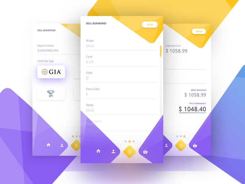
This app combines purple and gold diamond shapes to provide visual impact as well as contrast behind buttons and active tab elements.
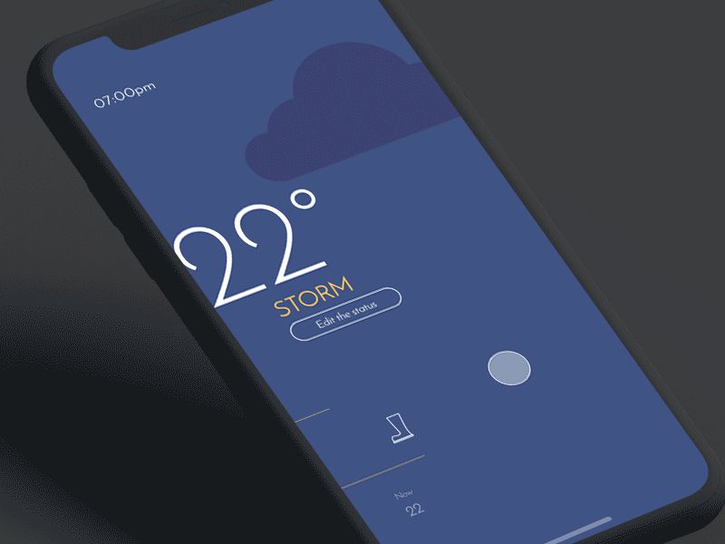
This custom weather app utilizes refined background graphics to emphasize the current forecast. The graphics are minimal but offer a balance without being too overwhelming.
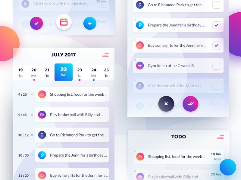
This todo app uses overlapping gradient shapes behind the app content. They are subtle enough not to draw too much attention away from the content while offering some impressive visuals.
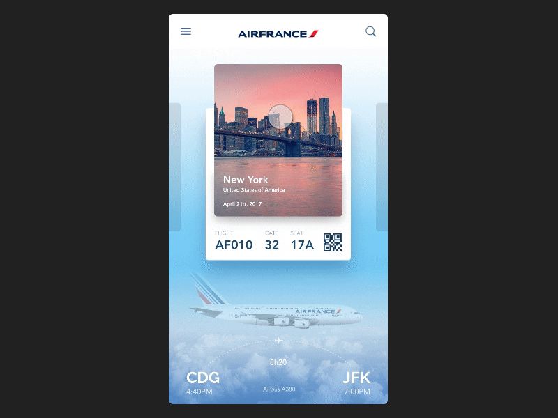
This boarding pass app goes all-out with their graphical background designs. They include carefully-placed imagery to offer some visual cues while keeping the main content areas clean of any conflicting graphics.
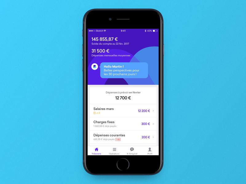
This subtle implementation is one of the finest examples. While it doesn’t span the entire screen, it serves as a background to the primary content. The colors are vibrant and perfectly in keeping with the brand and remainder of the user interface design.
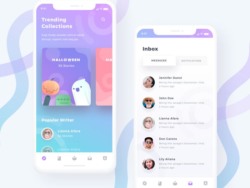
This design implements a combination of gradients and subtle brand graphics for the backgrounds. They are impressive against the cards and typography.

Qonto’s background graphics are one of the more minimal examples. However, the wave-like bottom section of the background offers great visual interest and blends seamlessly with the navigation and device color.
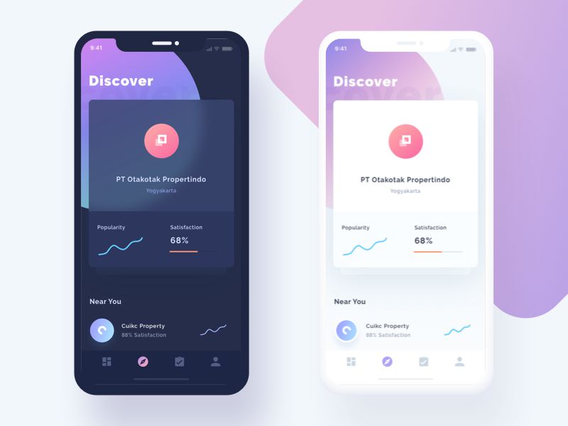
Another more subtle implementation is this background from Property Developer Finder. It uses a giant circular gradient object encompassing large cropped typography.
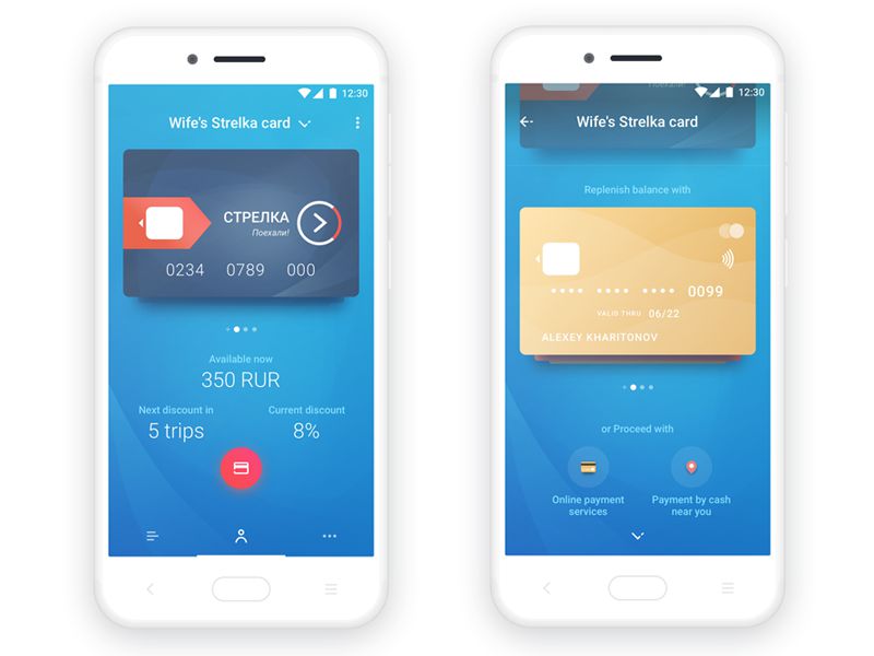
Strelka’s banking app contains one of the most vibrant background visuals. It has been able to experiment this way due to the small quantity of overlaying content. The high-contrast credit card designs work beautifully against this background.
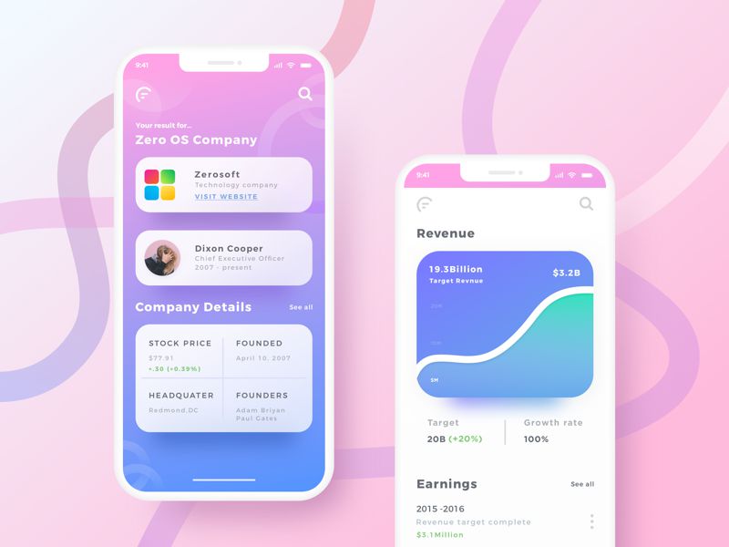
Another app to use a full-width, full-height gradient background is this by Xplr. The pink-to-blue gradient is beautiful and uses a range of circular stroke objects throughout for added effect.
This post may contain affiliate links. See our disclosure about affiliate links here.

