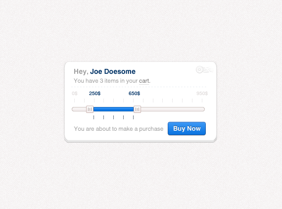
We will focus on the creation of a “filter” slider and a call to action button. We will try to achieve a nice color contrast by using a few tones of blue with a few gray tones.
By adding small details, we will improve the overall quality and look of our user interface piece. This tutorial is meant for designer of all levels, especially for beginners and intermediate level users with an approximate completion time of 20 to 40 minutes.
Your Designer Toolbox
Unlimited Downloads: 500,000+ Web Templates, Icon Sets, Themes & Design Assets
Table of Contents
- 1 Your Designer ToolboxUnlimited Downloads: 500,000+ Web Templates, Icon Sets, Themes & Design Assets
- 2 The Final Result
- 3 Unlimited Downloads: 500,000+ Fonts, Web Templates, Themes & Design Assets
- 4 Step 1
- 5 Step 2
- 6 Step 3
- 7 Step 4
- 8 Step 5
- 9 Step 6
- 10 Step 7
- 11 Step 8
- 12 Step 9
- 13 Step 10
- 14 Step 11
- 15 Step 12
- 16 Step 13
- 17 Step 14
- 18 Step 15
- 19 Step 16
- 20 Step 17
- 21 Result So Far
- 22 Step 18
- 23 Step 19
- 24 Step 20
- 25 Step 21
- 26 Step 22
- 27 Success so Far:
- 28 Final Result

DOWNLOAD NOW![]()
The Final Result
Unlimited Downloads: 500,000+ Fonts, Web Templates, Themes & Design Assets
DOWNLOAD NOW![]()
Step 1
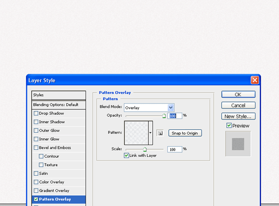
We will be starting this user interface element by creating a new document of the following size: 900px width; 500px height. It doesn’t matter what size you create your document, but it must be wide enough for us to have some “breathing space”.
On the background, apply a pattern overlay style with a nice, subtle pattern. There are hundreds of awesome subtle patterns on SubtlePatterns.
Step 2
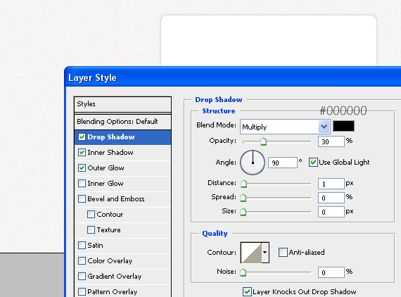
Create a white, rounded rectangle by using the Rounded Rectangle Tool (U). Mine is 310 pixels wide and 160 pixels high. Apply some drop-shadow to it, as shown in the screenshot.
Step 3
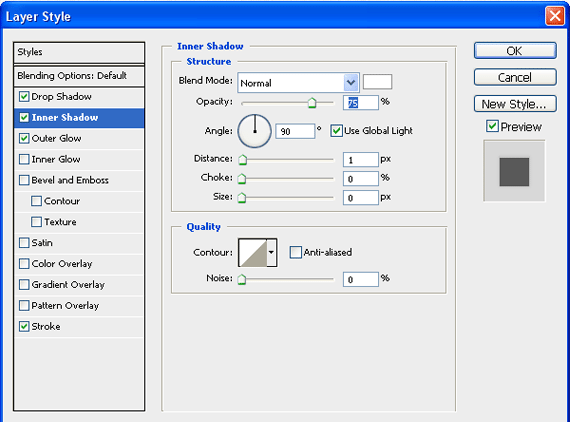
Add some white inner shadow.
Step 4
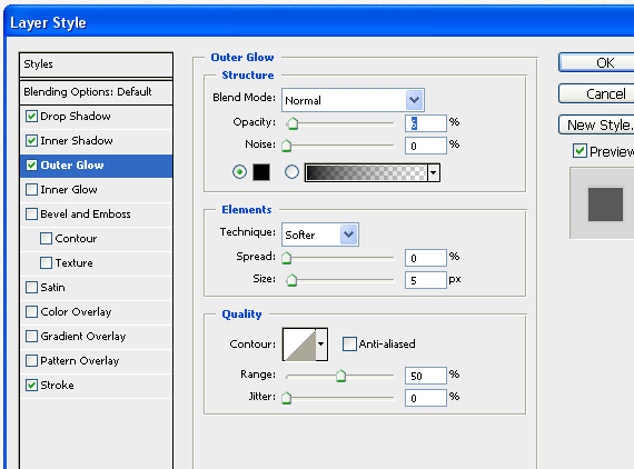
We will add some Outer Glow, which will be black. The outer glow with the stroke and drop shadow applied will give us a nice shadow all around the shape.
Step 5
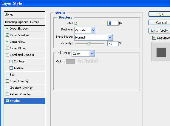
Add the stroke to the shape. It must be a light-grey color (#b2b0b0). This will be the “base” rectangle which will be a shadow for the upcoming layers which will be placed over it.
Step 6
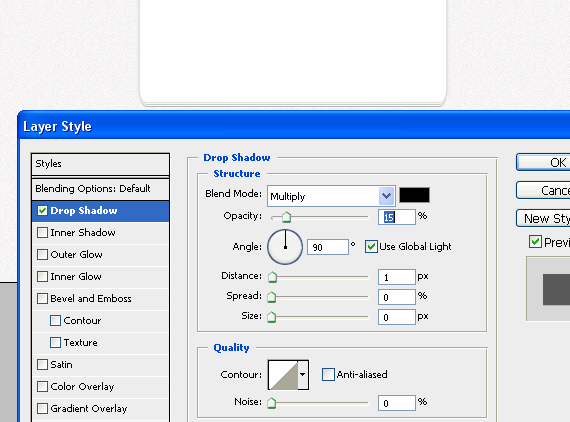
Create a new rectangle shape, it must be of the same width but the height must be 10 pixels more. Be sure that the new rectangle fits the upper part exactly, then apply some black drop shadow to it.
Set the Blend Mode to: Multiply, Opacity to 25%, Distance to 1, Spread and Size to 0. Duplicate this layer then move it up by 2 pixels. Duplicate the last layer one more time and move it by 2 pixels up as well. Now you have a nice “stack” of well-styled rectangles placed one over the other.
And, as you can see, the shape we’ve created in the first step now works as a shadow for all sides, except the bottom part (the effect we wanted to achieve).
Step 7
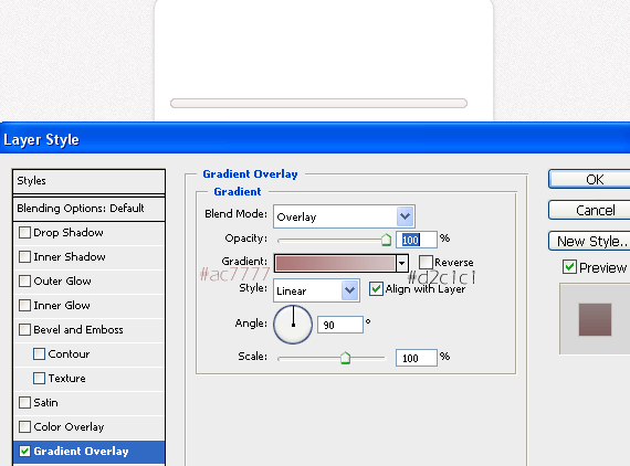
It’s time to create a new shape that we’ll color grey, again, use the Rounded Rectangle Tool (U). Be sure to set the Radius to 10px as we want to have our corners fairly round.
This shape will be the base of our slider. Apply some gradient overlay styling as shown in the figure. I’ve chosen this light-maroon color because it will perfectly contrast with blue and grey colors, the ones we are going to use a bit later.
Step 8
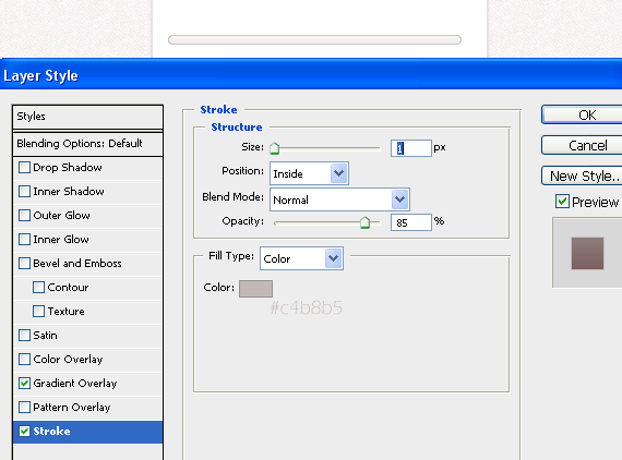
Apply some stroke to the shape with a little bit darker color, which is: #c4b8b5
Step 9

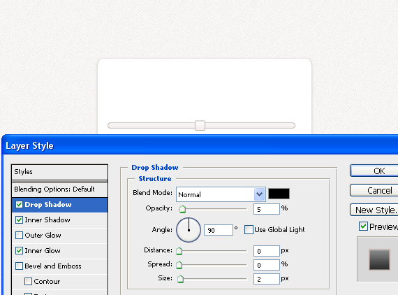
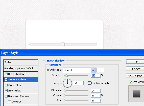
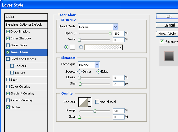
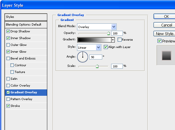
Create a simple square of about 12 x 12px and align it on the slider bar. Apply all the styling shown on the screenshots below for a nice final result.
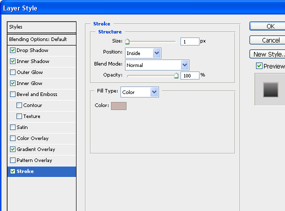
Step 10
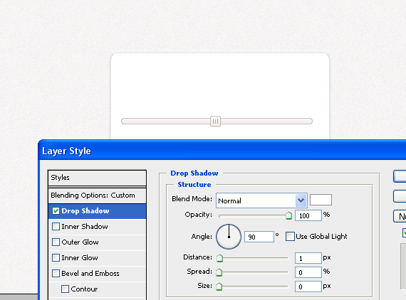
Create 3 lines using the Line Tool (U). Two of them must be the same size while one should be 2 pixels smaller in height. This will make our buttons look better and they won’t have the “blank” look. Apply some white drop shadow to make the lines even more noticeable.
Step 11
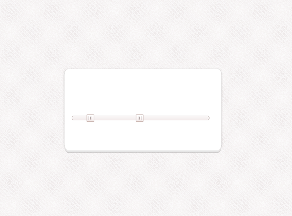
Duplicate this pin and leave some space between them. You can leave as much space you’d like, because this will be our “marked/checked” area which is going to be highlighted.
Step 12
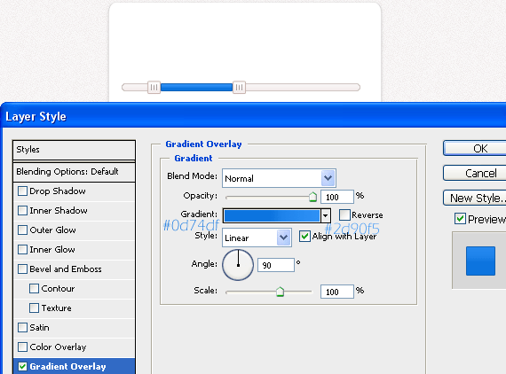
Use the Rectangle Tool (U) or Rectangular Marquee Tool (M), followed by the Bucket Tool (G), fill the space between the pins with any color.
Apply some Gradient Overlay style of a nice light and dark blue, which looks awesome in combination.
Step 13
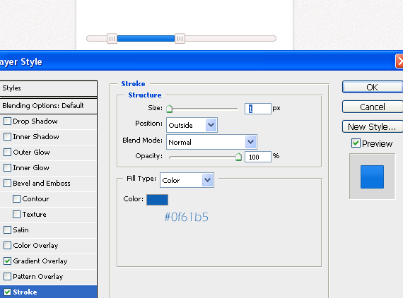
Add some dark blue stroke to the highlighted area to make it stand out and grab attention.
Step 14
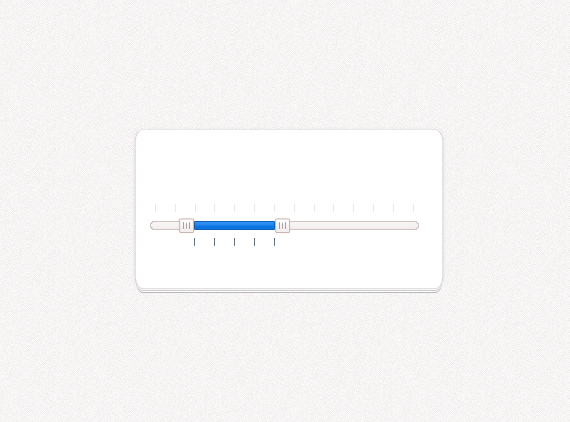
By Using the Line Tool (U) and holding the SHIFT button you can create straight lines.
Create some 5-7px sized lines and be sure to have an equal spacing between each. I have a spacing of 19 pixels between each line. Create enough lines to fill the upper part of the slider.
All of them must be light grey colored (#ebeaea). If you’d like to make the “checked” part of the slider stand out more, you can create those blue colored lines under the slider.
They will only cover the blue part of the slider (from the ending of the first pin till the beginning of the second one).
Step 15
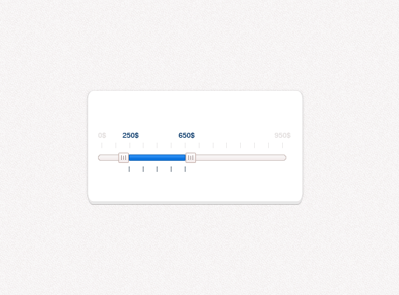
Add some price tags over the lines. If you want to add the price over each line, you can, but you should keep in mind that this will mess up the layout a lot and will distract the user, that is why I decided to add the price tags only over the first and the last grey lines (the beginning and the end of the slider) and to the first and last lines which belong to the highlighted area.
Step 16
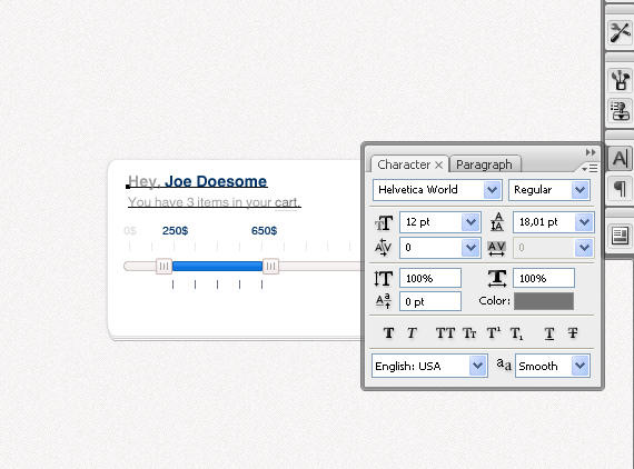
While the slider looks pretty nice, it doesn’t look very attractive by itself, that is why we will add some extra elements to make the interface stand out. By using a Sans-Serif font (I am using Helvetica, but Arial may work just great for you), add some text above the slider.
Let’s assume this interface is for an e-commerce website; therefore we will add the name of the buyer and how many items are in his cart. As you can see there are 2 different rows of text, with different styling.
The font size used for the name is 14px while the size for the cart statement is 12px. This will add more importance to the name, rather than the cart, that’s why it won’t bug the user about seeing a huge-sized text about how many items he has in the cart.
The “cart” text itself is going to be highlighted by a applying a darker-grey color to it and adding some “underline” paragraph styling. Take a look at the screenshot for exact details.
Step 17
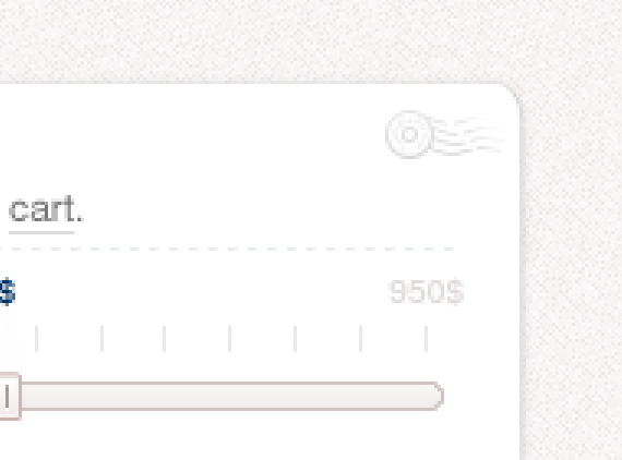
I have added a nice grey icon at the top right corner to show some extra info. My icon says that the website is using some kind of “Super-fast-shipping method”.
Result So Far
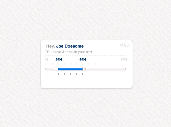
As you can see, we have done a pretty nice job tweaking the slider interface, but as you can notice, there is too much space under the slider and the bottom of the rectangle.
We can either make the rectangles fit the current space used, or we can improve this piece of user-interface elements by adding a few more things which will make it definitely stand out!
Step 18
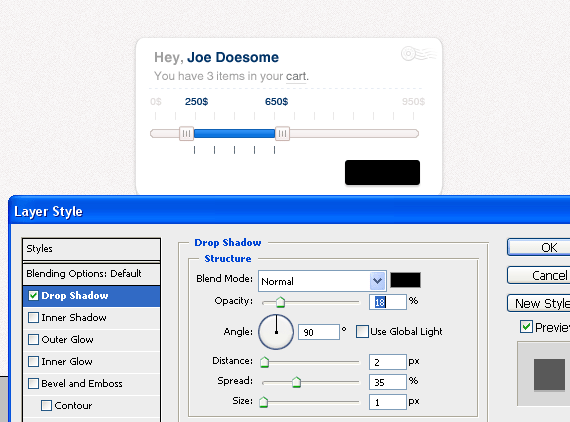
Create a black rectangle by using the Rounded Rectangle Tool (U) with a radius of 3 pixels. This will be the base of a “Call to Action” button. Apply some black shadow with an opacity of just 18% to give it a light-grey drop shadow look.
Step 19
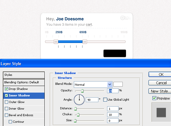
Add some Inner Shadow to the button base. It won’t be so clearly seen right now, but when we change the base color to blue, the shadow will be clearly seen.
Step 20
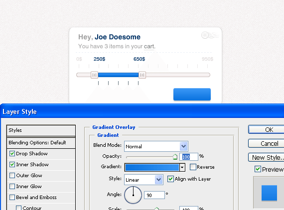
Add some gradient overlay to the button as we obviously need to get rid of the black color. For this gradient overlay styling we are going to use exactly the same colors we have used to apply the Gradient effect to the highlighted area of the slider.
Step 21
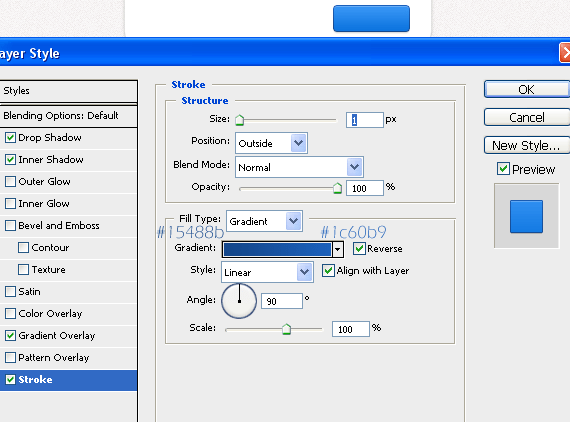
We could add a simple stroke but because of the gradient effect applied on button, it won’t look all that good. For the stroke, we are again using the gradient effect, with a bit darker blue colors: #15488b and #1c60b9.
Step 22
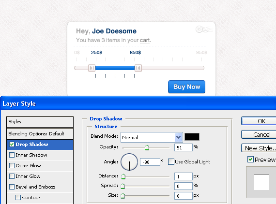
Finish up this button by adding some “Buy Now” text with black drop shadow effect applied.
Success so Far:
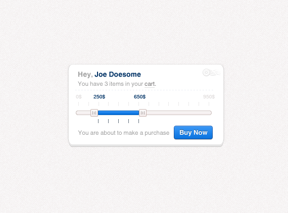
As you can see, we have almost finished our slider. It isn’t a final result yet because there are some pixel-imperfections. While the pixelation isn’t a big deal for some, it should not be ignored.
If you have a really quick look at the interface, you won’t see any imperfections, however, if you look at it for 10 seconds you can spot some really unattractive spots like the ends of the slider bar and the bottom corners of the base rectangle shapes.
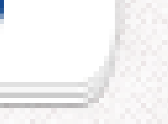
By zooming in you can clearly see the pixelation that we talked about. This can be solved in a few ways, but we will go through a simple one.
This isn’t the best solution because we are going to change the shapes a little bit, but we’ll easily get rid of these pixel imperfections. Grab the Rectangular Marquee Tool (M) and Bucket Tool (G) and start fixing pixel by pixel.

It works for us in this case because it’s a pretty small area to fix and won’t require a lot of effort. After you are done with one side, you can move to the other side and repeat the exact steps in order to get an acceptable result.
Final Result

Hope you’ve enjoyed this tutorial. Do share your thoughts with us in the comments!
This post may contain affiliate links. See our disclosure about affiliate links here.


