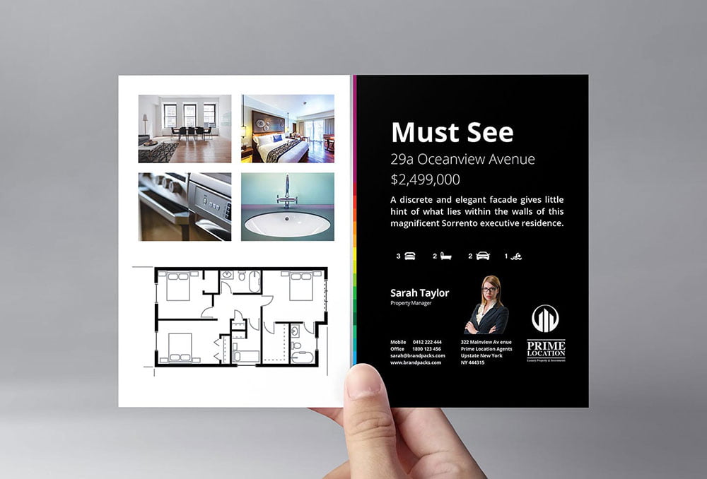
In a digital world, many of us forget that marketing doesn’t have to be exclusively online and through facebook channels. In the real estate industry, print marketing has long been a tried and true method for attracting home buyers and making sales. However, it’s not a matter of just putting together a quick listing of available properties and getting it placed in with weekly flyers. Print marketing has to be more attractive than ever, and designed to draw people in before they have a chance to throw it in the recycling bin. Here are some real estate flyer ideas and tips that can help your materials stand out.
Create a Standard Layout
Table of Contents
You don’t need to reinvent the wheel. In fact, if you are an expert on real estate, then there’s a good chance that graphic design is not your thing. However, you can use a service like My Creative Shop to use a template for your flyer. There are several benefits to this. For one, online templates are tested and designed to be effective layouts for marketing. You can trust the experts who designed them. Then, all you need to do is plug in your content. This not only saves you time when you first create a flyer, but it also saves you time every subsequent week. You will have a standard layout into which you can just plug your content every time you need to put out a flyer.
Create a Focus
In the car commercial business, they say to “show more steel.” This means showing off the vehicle as much as possible. The same goes for real estate. Your flyer needs to have a focus, so your current most attractive property should be front and center. Someone quickly leafing through their pile of newsprint should be urged to stop and take a look at the wonderful house on your flyer. It might turn out that the property is out of their price range, or in a location that doesn’t suit them. However, once they are hooked, they are more likely to take a look at what else you have to offer, where there may be something more suitable to them. Make sure as well that your main photo is in colour. Even make it brighter if possible. Bold and bright colors will be more attractive to the eye.
Be Professional
Almost everyone has a phone that can take high-quality pictures. However, not everyone can take a good picture, no matter how good their phone camera is. It’s a good idea to invest in a professional photographer to take the photos you will place on your flyers. They have the talent and expertise to make sure to get the best angles and lighting to make your properties look their best. If you are looking to save some money, then at least use a professional for the main photo, and then you can take the photos for the other properties. The more professional your business looks, including in marketing materials, the more home buyers will take you seriously.
Proofread and Double Check
Make sure that every detail on your flyer is correct. Every word must be spelled correctly, and your grammar must be perfect. Proofread everything yourself, and then pass it along to someone else to double check. Make sure that your photos are lined up properly, and that your fonts are consistent throughout. Every single tiny detail must be right, otherwise it can ruin the entire flyer. A spelling mistake or a misplaced apostrophe will make you look unprofessional and untrustworthy. If you are not able to take the time to spell things properly, why should home buyers trust you to find them a good home and sell their current one?
Contrast
Rember, the point of a flyer is to grab attention so that a consumer will take action. That action could be calling your number or visiting your website, for instance. You need to highlight certain points or details so that the viewer can easily see what you want them to see. Contrasting colors can help provide an eye-catching way for your audience to discover the actions you want them to take or the most important information. The contrast can be between certain colors, but it can also be between black and white, or bolded letters and non-bolded. Having a static font throughout without any contrast can seem boring and stale, and is a good way to have your audience toss your flyer in the trash.
Keep Your Branding Consistent
Even though it’s a different medium, make sure to keep your branding consistent between all of your marketing materials, no matter whether it’s online or offline. Your colors, logo, and everything else need to keep the experience for your audience the same when they transition between the flyer and your website. That way there’s no confusion. They should also be able to easily find the information from your flyer on your website so that they can take the action that you want them to.
Even though so many people are searching for properties online, do not forget about offline marketing such as flyers. With these tips, you can create the best real estate marketing flyers possible and get the business you need to be successful.


