Many business websites need a multilingual setup. As with anything development-related, implementing one in an easy, efficient, and maintainable way is desirable. Designing and developing to be ready for multiple languages, whether it happens right at launch or is expected to happen at any point in the future, is smart.
Changing the language and content is the easy part. But when you do that, sometimes the language you are changing to has a different direction. For example, text (and thus layout) in English flows left-to-right while text (and thus layout) in Arabic goes right-to-left.
In this article, I want to build a multilingual landing page and share some CSS techniques that make this process easier. Hopefully the next time you’ll need to do the same thing, you’ll have some implementation techniques to draw from.
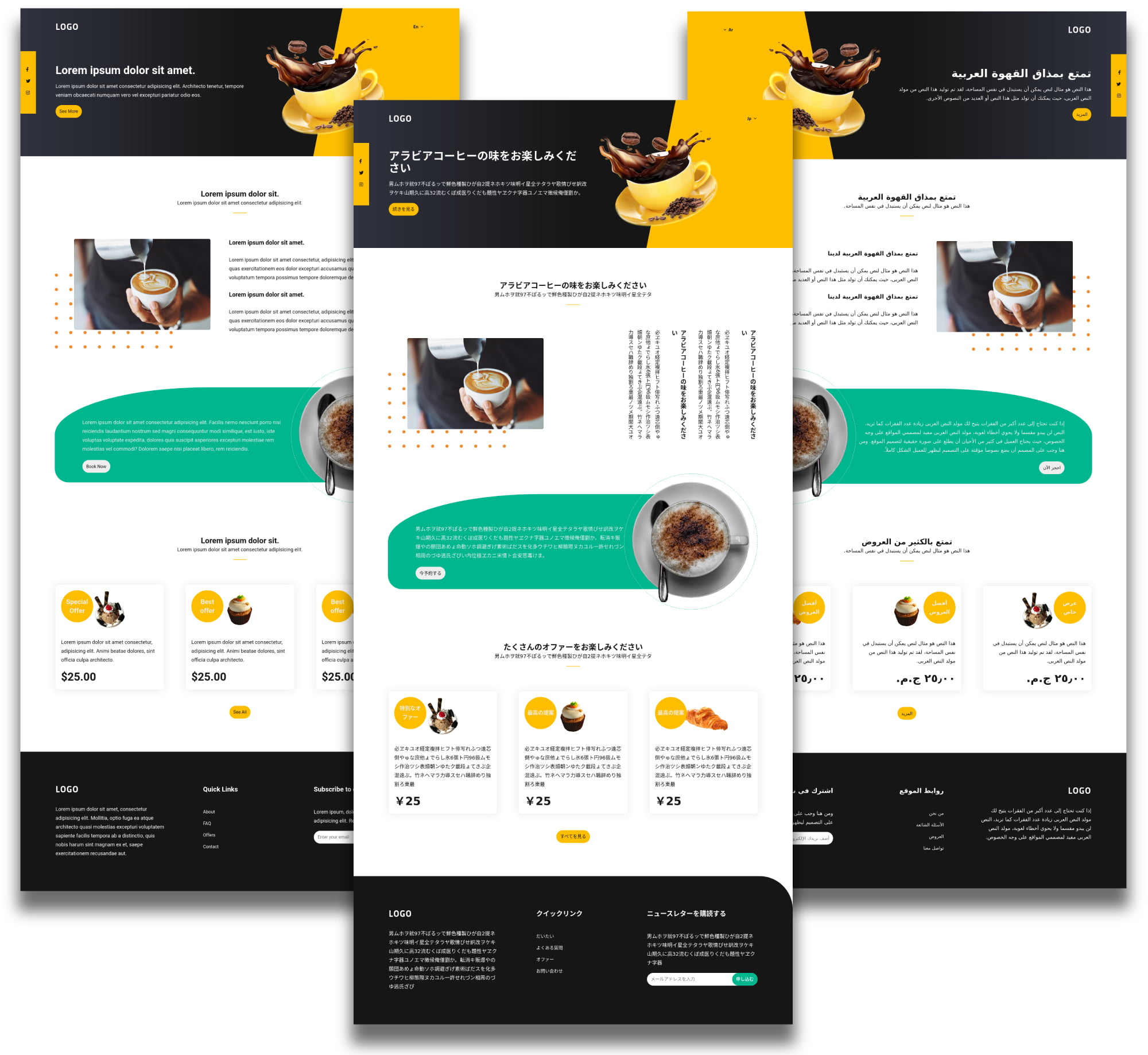
We’ll cover six major points. I believe that the first five are straightforward. The sixth includes multiple options that you need to think about first.
1. Start with the HTML markup
Table of Contents
The lang and dir attributes will define the page’s language and direction.
<!-- English, left-to-right -->
<html lang="en" dir="ltr"> <!-- Arabic, right-to-left -->
<html lang="ar" dir="rtl">
Then we can use these attributes in selectors to do the the styling. lang and dir attributes are on the HTML tag or a specific element in which the language varies from the rest of the page. Those attributes help improve the website’s SEO by showing the website in the right language for users who search for it in case that each language has a separate HTML document.
Also, we need to ensure that the charset meta tag is included and its value is UTF-8 since it’s the only valid encoding for HTML documents which also supports all languages.
<meta charset="utf-8">I’ve prepared a landing page in three different languages for demonstration purposes. It includes the HTML, CSS, and JavaScript we need.
2. CSS Custom Properties are your friend
Changing the direction may lead to inverting some properties. So, if you used the CSS property left in a left-to-right layout, you probably need right in the right-to-left layout, and so on. And changing the language may lead to changing font families, font sizes, etc.
These multiple changes may cause unclean and difficult to maintain code. Instead, we can assign the value to a custom property, then change the value when needed. This is also great for responsiveness and other things that might need a toggle, like dark mode. We can change the font-size, margin, padding, colors, etc., in the blink of an eye, where the values then cascade to wherever needed.
Here are some of the CSS custom properties that we are using in this example:
html { /* colors */ --dark-color: #161616; --light-color: #eee; --primary-text-color: var(--dark-color); --primary-bg-color: #fff; --shadow-color: var(--light-color); --hero-bg-gradient: linear-gradient(90deg, #30333f, #161616, #161616); /* font sizes */ --logo-font-size: 2rem; --lang-switcher-font-size: 1.02em; --offers-item-after-font-size: 1.5rem; /* margin and padding */ --btn-padding: 7px; --sec-padding-block: 120px; /* height and width */ --hero-height: 500px; --cta-img-width: 45.75%;
}
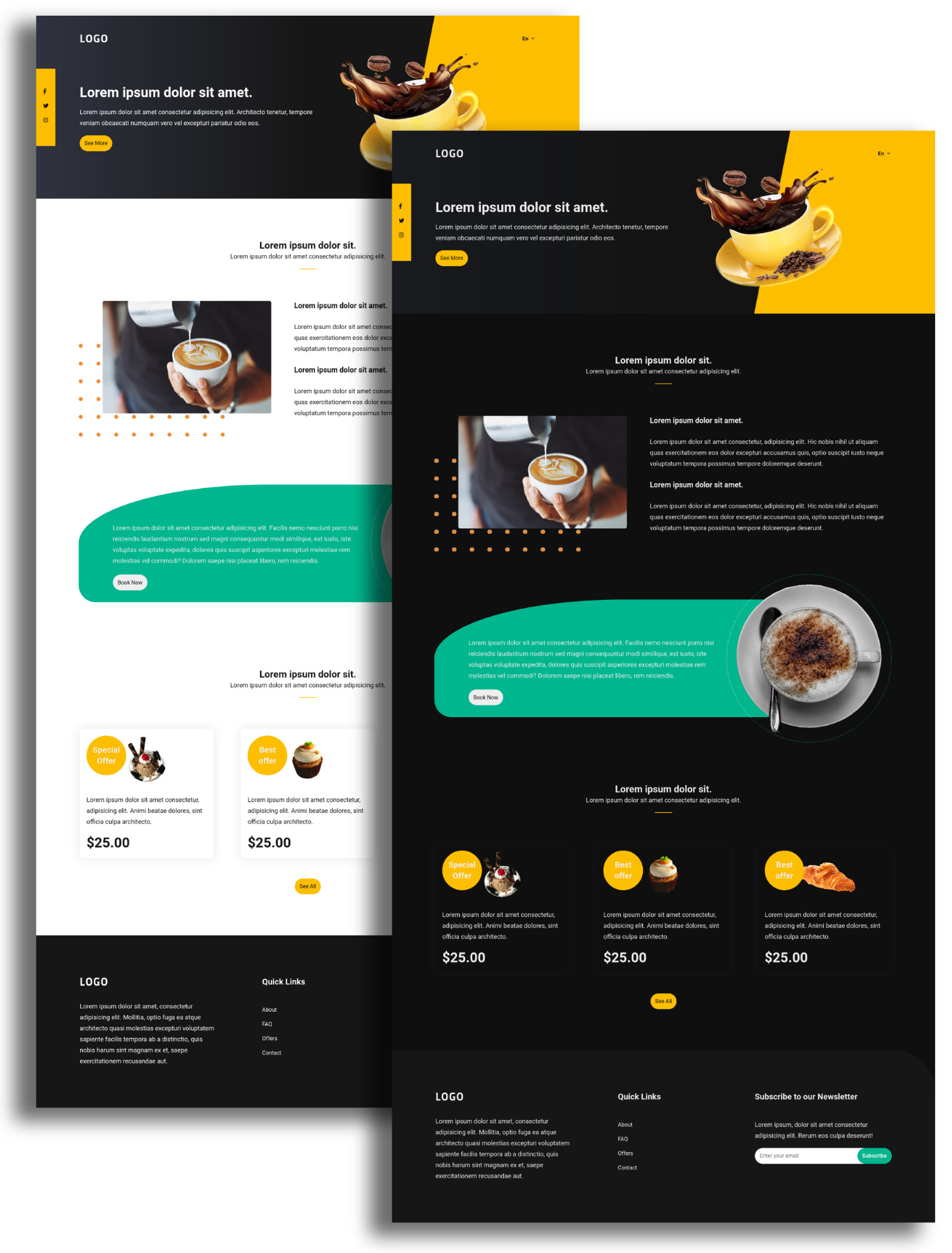
While styling our page, we may add/change some of these custom properties, and that is entirely natural. Although this article is about multi-directional websites, here’s a quick example that shows how we can re-assign custom property values by having one set of values on the <body>, then another set when the <body> contains a .dark class:
body { background-color: var(--primary-bg-color); color: var(--primary-text-color);
}
body.dark { --primary-bg-color: #0f0f0f; --primary-text-color: var(--light-color); /* other changes */ --shadow-color: #13151a; --hero-bg-gradient: linear-gradient(90deg, #191b20, #131313, #131313);
}
That’s the general idea. We’re going to use custom properties in the same sort of way, though for changing language directions.
3) CSS pseudo-classes and selectors
CSS has a few features that help with writing directions. The following two pseudo-classes and attribute are good examples that we can put to use in this example.
The :lang() pseudo-class
We can use :lang() pseudo-class to target specific languages and apply CSS property values to them individually, or together. For example, in this example, we can change the font size when the :lang pseudo-class switches to either Arabic or Japanese:
html:lang(ar),
html:lang(jp){ --offers-item-after-font-size: 1.2rem; }
Once we do that, we also need to change the writing-mode property from its horizontal left-to-right default direction to vertical right-to-left direction account:
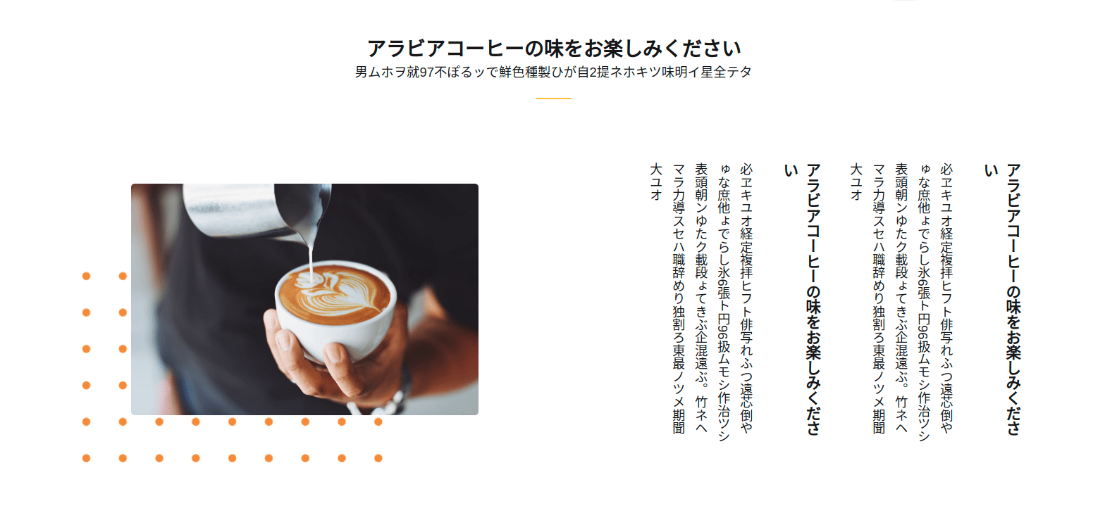
html:lang(jp) .about__text { writing-mode: vertical-rl;
}
The :attr() pseudo-class
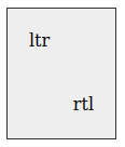
The :attr() pseudo-class helps makes the “content” of the pseudo-elements like ::before or ::after “dynamic” in a sense, where we can drop the dir HTML attribute into the CSS content property using the attr() function. That way, the value of dir determines what we’re selecting and styling.
<div dir="ltr"></div>
<div dir="rtl"></div>
div::after { content: attr(dir);
}
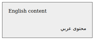
The power is the ability to use any custom data attribute. Here, we’re using a custom data-name attribute whose value is used in the CSS:
<div data-name="English content" dir="ltr"></div>
<div data-name="محتوى عربي" dir="rtl"></div>
div::after { content: attr(data-name);
}
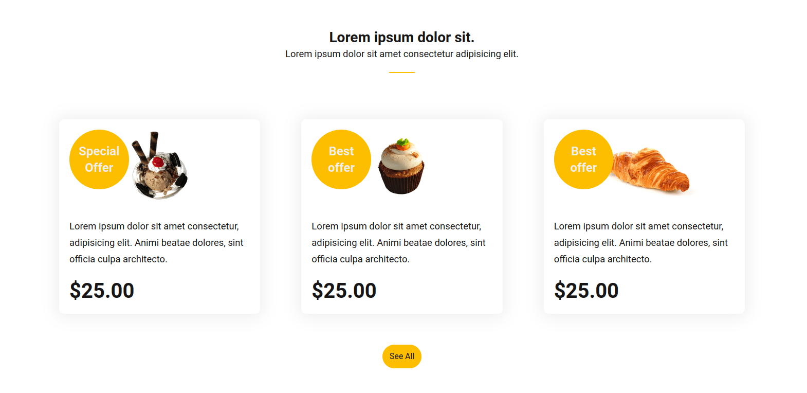
This makes it relatively easy to change the content after switching that language without changing the style. But, back to our design. The three-up grid of cards has a yellow “special” or “best” off mark beside an image.

This is the HTML for each card:
<div class="offers__item relative" data-attr="data-offer" data-i18n_attr="special_offer"> <figure class="offers__item_img"> <img src="./assets/images/offer1.png" data-attr="alt" data-i18n_attr="image_alt" alt="" class="w-100"> </figure> <div class="offer-content_item-text"> <p class="para" data-i18n="offer_item_text"></p> <span class="price bolder" data-i18n="offer_item_price"></span> </div>
</div>
JavaScript’s role is to:
- Set an attribute called
data-offeron each card. - Assign a “special offer” or “best offer” value to it.
Finally, we can use the data-offer attribute in our style:
.offers__item::after { content: attr(data-offer); /* etc. */
}
Select by the dir attribute
Many languages are left-to-right, but some are not. We can specify what should be different in the [dir='rtl']. This attribute must be on the element itself or we can use nesting to reach the wanted element. Since we’ve already added the dir attribute to our HTML tag, then we can use it in nesting. We will use it later on our sample page.
4. Prepare the web fonts
In a multilingual website, we may also want to change the font family between languages because perhaps a particular font is more legible for a particular language.
Fallback fonts
We can benefit from the fallback by writing the right-to-left font after the default one.
font-family: 'Roboto', 'Tajawal', sans-serif;This helps in cases where the default font doesn’t support right-to-left. That snippet above is using the Roboto font, which doesn’t support Arabic letters. If the default font supports right-to-left (like the Cairo font), and the design needs it to be changed, then this is not a perfect solution.
font-family: 'Cairo', 'Tajawal', sans-serif; /* won't work as expected */Let’s look at another way.
Using CSS variables and the :lang() pseudo-class
We can mix the previous two technique where we change the font-family property value using custom properties that are re-assigned by the :lang pseudo class.
html { --font-family: 'Roboto', sans-serif;
} html:lang(ar){ --font-family: 'Tajawal', sans-serif;
} html:lang(jp){ --font-family: 'Noto Sans JP', sans-serif;
}
5. CSS Logical Properties
In CSS days past, we used to use left and right to define offsets along the x-axis, and the top and bottom properties to to define offsets along the y-axis. That makes direction switching a headache. Fortunately, CSS supports logical properties that define direction‐relative equivalents of the older physical properties. They support things like positioning, alignment, margin, padding, border, etc.
If the writing mode is horizontal (like English), then the logical inline direction is along the x-axis and the block direction refers to the y-axis. Those directions are flipped in a vertical writing mode, where inline travels the y-axis and and block flows along the x-axis.
| Writing Mode | x-axis | y-axis |
|---|---|---|
| horizontal | inline |
block |
| vertical | block |
inline |
In other words, the block dimension is the direction perpendicular to the writing mode and the inline dimension is the direction parallel to the writing mode. Both inline and block levels have start and end values to define a specific direction. For example, we can use margin-inline-start instead of margin-left. This mean the margin direction automatically inverts when the page direction is rtl. It’s like our CSS is direction-aware and adapts when changing contexts.
There is another article on CSS-Tricks, Building Multi-Directional Layouts from Ahmad El-Alfy, that goes into the usefulness of building websites in multiple languages using logical properties.
This is exactly how we can handle margins, padding and borders. We’ll use them in the footer section to change which border gets the rounded edge.
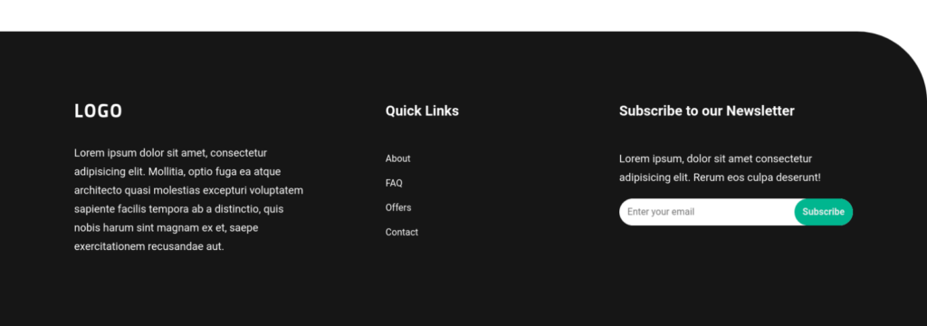
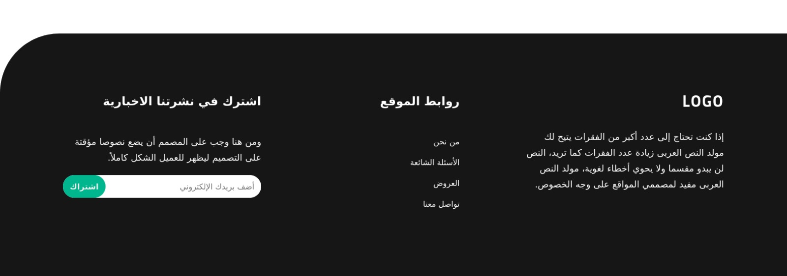
ltr writing mode.As long as we’re using the logical equivalent of border-top-right-radius, CSS will handle that change for us.
.footer { border-start-end-radius: 120px;
}
Now, after switching to the rtl direction, it’ll work fine.
The “call to action” section is another great place to apply this:
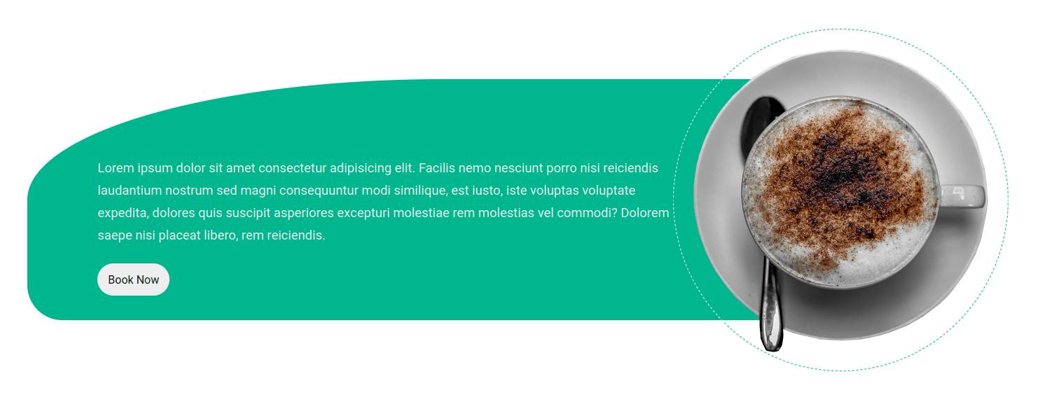
.cta__text { border-start-start-radius: 50%; border-end-start-radius: 50px;
}
.cta__img { border: 1px dashed var(--secondary-color); border-inline-start-color: var(--light-color);
}
Now, in Arabic, we get the correct layout:
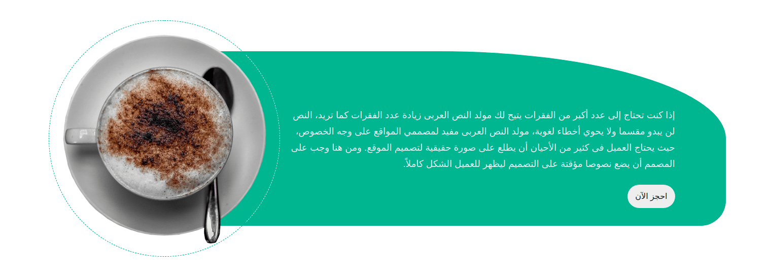
You might be wondering exactly how the block and inline dimensions reverse when the writing mode changes. Back to the Japanese version, the text is from vertical, going from top-to-bottom. I added this line to the code:
/* The "About" section when langauge is Japanese */
html:lang(jp) .about__text { margin-block-end: auto; width: max-content;
}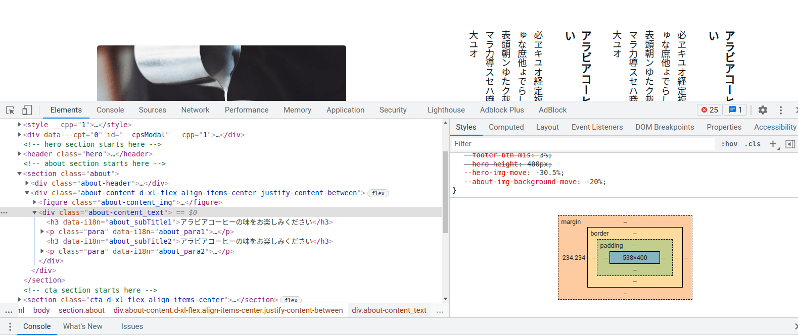
Although I added margin to the “block” level, it is applied it to the left margin. That’s because the text rotated 90 degrees when the language switched and flows in a vertical direction.
6. Other layout considerations
Even after all this prep, sometimes where elements move to when the direction and language change is way off. There are multiple factors at play, so let’s take a look.
Position
Using an absolute or fixed position to move elements may affect how elements shift when changing directions. Some designs need it. But I’d still recommend asking yourself: do I really need this?
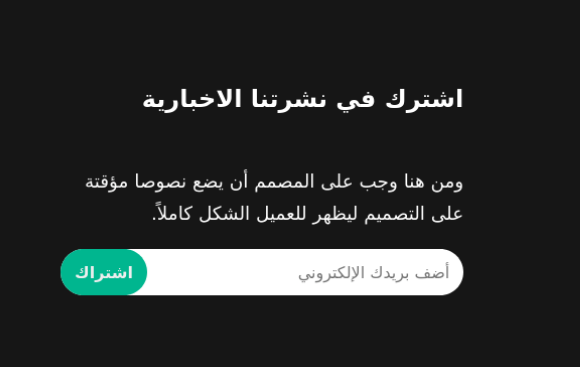
Fro example, the newsletter subscription form in the footer section of our example can be implemented using position. The form itself takes the relative position, while the button takes the absolute position.
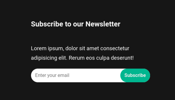
<form id="newsletter-form" class="relative"> <input type="email" data-attr="placeholder" data-i18n_attr="footer_input_placeholder" class="w-100"> <button class="btn btn--tertiary footer__newsletter_btn bolder absolute" data-i18n="footer_newsLetter_btn"></button>
</form>
html[dir="ltr"] .footer__newsletter_btn { right: 0;
}
html[dir="rtl"] .footer__newsletter_btn { left: 0;
}
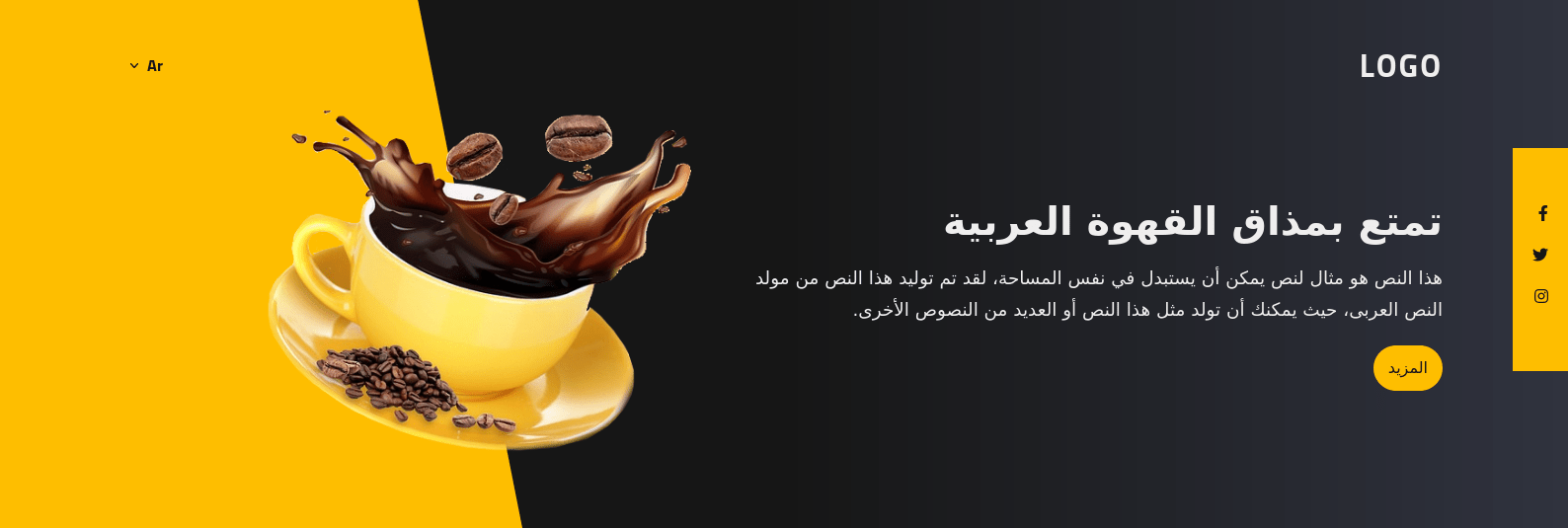
rtl writing mode.In the “hero” section, I made the background using a ::before pseudo-class with an absolute position:
<header class="hero relative"> <!-- etc. -->
</header>
.hero { background-image: linear-gradient(90deg, #30333f, #161616, #161616);
}
.hero::before { content: ''; display: block; height: 100%; width: 33.33%; background-color: var(--primary-color); clip-path: polygon(20% 0%, 100% 0, 100% 100%, 0% 100%); position: absolute; top: 0; right: 0;
}
Here’s the HTML for our hero element:
<header class="hero relative"> <!-- etc. --> <div class="hero__social absolute"> <div class="d-flex flex-col"> <!-- etc. --> </div> </div>
</header>
Note that an .absolute class is in there that applies position: absolute to the hero section’s social widget. Meanwhile, the hero itself is relatively positioned.
How we move the social widget halfway down the y-axis:
.hero__social { left: 0; top: 50%; transform: translateY(-50%);
}
In the Arabic, we can fix the ::before pseudo-class position that is used in the background using the same technique we use in the footer form. That said, there are multiple issues we need to fix here:
- The
clip-pathdirection - The background
linear-gradient - The coffee-cup image direction
- The social media box’s position
Let’s use a simple flip trick instead. First, we wrap the hero content, and social content in two distinct wrapper elements instead of one:
<header class="hero relative"> <div class="hero__content"> <!-- etc. --> </div> <div class="hero__social absolute"> <div class="d-flex flex-col"> <!-- etc. --> </div> </div>
</header>
Then we rotate both of the hero wrappers—the social box inner wrapper and the image—180 degrees:
html[dir="rtl"] .hero,
html[dir="rtl"] .hero__content,
html[dir="rtl"] .hero__img img,
html[dir="rtl"] .hero__social > div { transform: rotateY(180deg);
}
Yeah, that’s all. This simple trick is also helpful if the hero’s background is an image.
transform: translate()
This CSS property and value function helps move the element on one or more axes. The difference between ltr and rtl is that the x-axis is the inverse/negative value of the current value. So, we can store the value in a variable and change it according to the language.
html { --about-img-background-move: -20%;
} html[dir='rtl']{ --about-img-background-move: 20%;
}
We can do the same thing for the background image in the another section:
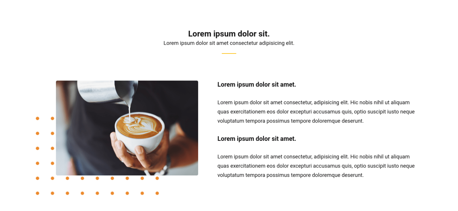
<figure class="about__img relative"> <img src="image.jpg" data-attr="alt" data-i18n_attr="image_alt" class="w-100">
</figure>
.about__img::after { content: ''; position: absolute; z-index: -1; transform: translateY(-75%) translateX(var(--about-img-background-move)); /* etc. */
}Margins
Margins are used to extend or reduce spaces between elements. It accepts negative values, too. For example, a positive margin-top value (20%) pushes the content down, while a negative value (e.g. -20%) pulls the content up.
If margins values are negative, then the top and left margins move the item up or to the left. However, the right and bottom margins do not. Instead, they pull content that is located in the right of the item towards the left, and the content underneath the item up. For example, if we apply a negative top margin and negative bottom margin together on the same item, the item is moved up and pull the content below it up into the item.
Here’s an example:
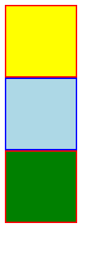
<section> <div id="d1"></div> <div id="d2"></div> <div id="d3"></div>
</section>
div { width: 100px; height: 100px; border: 2px solid;
}
#d1 { background-color: yellow; border-color: red;
}
#d2 { background-color: lightblue; border-color: blue;
}
#d3 { background-color: green; border-color: red;
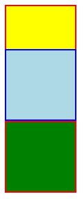
}The result of the above code should be something like this:
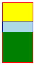
Let’s add these negative margins to the #d2 element:
#d2 { margin-top: -40px; margin-bottom: -70px;
}
Notice how the second box in the diagram moves up, thanks to a negative margin-top value, and the green box also moves up an overlaps the second box, thanks to a negative margin-bottom value.
The next thing you might be asking: But what is the difference between transform: translate and the margins?
When moving an element with a negative margin, the initial space that is taken by the element is no longer there. But in the case of translating the element using a transform, the opposite is true. In other words, a negative margin leads pulls the element up, but the transform merely changes its position, without losing the space reserved for it.
Let’s stick to using margin in one direction:
#d2 { margin-top: -40px; /* margin-bottom: -70px; */
}
Now let’s replace the margin with the transform:
#d2 { /* margin-top: -40px;*/ transform: translateY(-40px);
}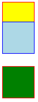
You can see that, although the element is pulled up, its initial space is still there according to the natural document flow.
Flexbox
The display: flex provides a quick way to control the how the elements are aligned in their container. We can use align-items and justify-content to align child elements at the parent level.
In our example, we can use flexbox in almost every section to make the column layout. Plus, we can use it in the “offers” section to center the set of those yellow “special” and “best” marks:
.offers__item::after { content: attr(data-offer); display: flex; align-items: center; justify-content: center; text-align: center;
}
The same can be applied to the hero section to center text vertically.
<div class="d-lg-flex align-items-center"> <div class="hero__text d-xl-flex align-items-center"> <div> <!-- text --> </div> </div> <figure class="hero__img relative"> <img src="/image.jpg" data-attr="alt" data-i18n_attr="image_alt" class="w-100"> </figure>
</div>
If the flex-direction value is row, then we can benefit from controlling the width for each element. In the “hero” section, we need to set the image on the angled slope of the background where the color transitions from dark gray to yellow.
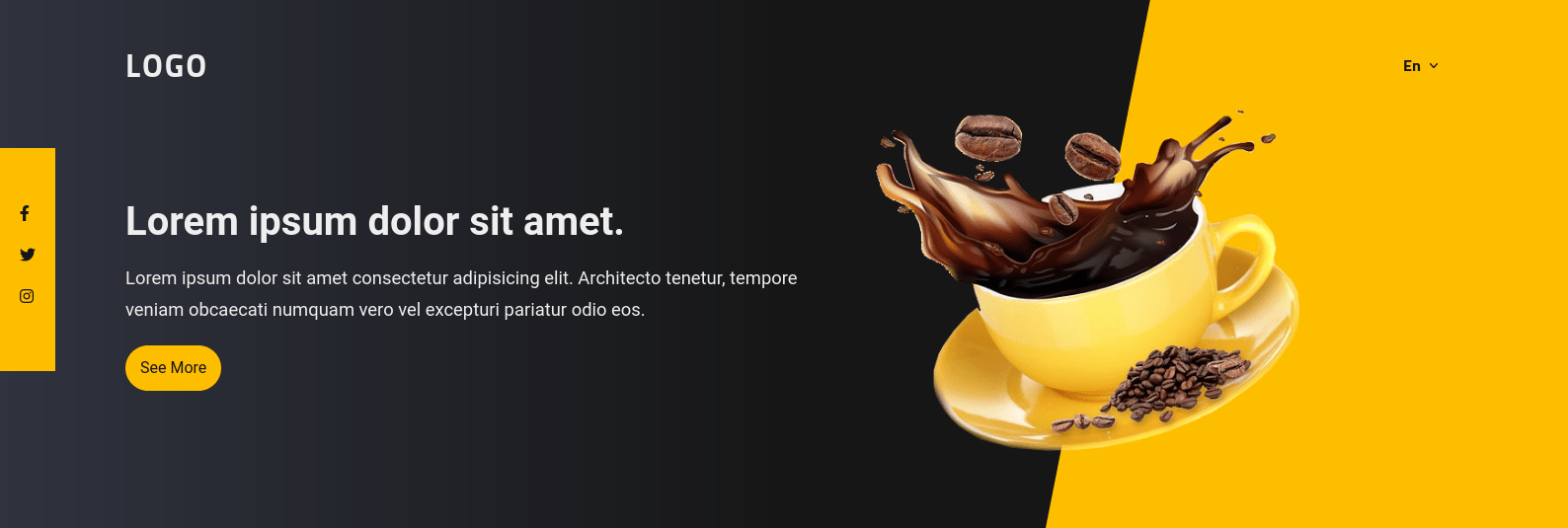
.hero__text { width: 56.5%;
}
.hero__img { width: 33.33%;
}
Both elements take up a a total of 89.83% of the parent container’s width. Since we didn’t specify justify-content on the parent, it defaults to start, leaving the remaining width at the end.
We can combine the flexbox with any of the previous techniques we’ve seen, like transforms and margins. This can help us to reduce how many position instances are in our code. Let’s use it with a negative margin in the “call to action” section to locate the image.
<section class="cta d-xl-flex align-items-center"> <div class="cta__text w-100"> <!-- etc. --> </div> <figure class="cta__img"> <img src="image.jpg" data-attr="alt" data-i18n_attr="image_alt" class="w-100"> </figure>
</section>
Because we didn’t specify the flex-wrap and flex-basis properties, the image and the text both fit in the parent. However, since we used a negative margin, the image is pulled to the left, along with its width. This saves extra space for the text. We also want to use a logical property, inline-start, instead of left to handle switching to the rtl direction.

Grid
Finally, we can use a grid container to positing the elements. CSS Grid is powerful (and different than flexbox) in that it lays things along both the x-axis and the y-axis as opposed to only one of them.
Suppose that in the “offers” section, the role of the “see all” button is to get extra data that to display on the page. Here’s JavaScript code to repeat the current content:
// offers section ==> "see all" btn functionality
(function(){ document.querySelector('.offers .btn').addEventListener('click', function(){ const offersContent = document.querySelector('.offers__content'); offersContent.innerHTML += offersContent.innerHTML; offersContent.classList.remove('offers__content--has-margin'); this.remove(); })
})();
Then, let’s use display: grid in the CSS for this section. First, here’s our HTML, with our grid container highlighted.
<div class="offers__content offers__content--has-margin d-grid"> <div class="offers__item relative" data-attr="data-offer" data-i18n_attr="special_offer"> <!-- etc. --> </div> <div class="offers__item relative" data-attr="data-offer" data-i18n_attr="best_offer"> <!-- etc. --> </div> <div class="offers__item relative" data-attr="data-offer" data-i18n_attr="best_offer"> <!-- etc. --> </div>
</div>
We implement CSS Grid on the .offers__content element:
html { /* custom properties */ --offers-content-column: repeat(3, 1fr); --offers-content-gap: 5vw;
} .offers__content { display: grid; grid-template-columns: var(--offers-content-column); gap: var(--offers-content-gap);
}
.offers__content--has-margin { margin-block-end: 60px;
}
This is the result after clicking the button:
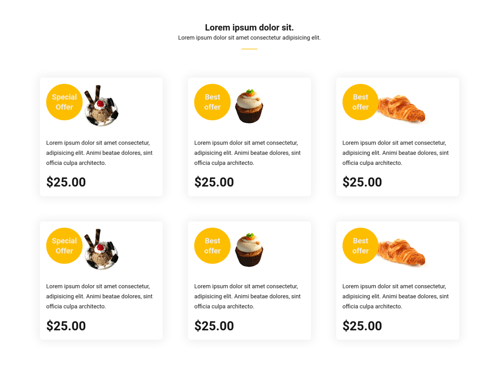
Our page is far from being the best example of how CSS Grid works. While I was browsing the designs online, I found a design that uses the following structure:
Notice how CSS Grid makes the responsive layout without media queries. And as you might expect, it works well for changing writing modes where we adjust where elements go on the grid based on the current writing mode.
Wrapping up
Here is the final version of the page. I ensured to implement the responsiveness with a mobile-first approach to show you the power of the CSS variables. Be sure to open the demo in full page mode as well.
I hope these techniques help make creating multilingual designs easier for you. We looked at a bunch of CSS properties we can use to apply styles to specific languages. And we looked at different approaches to do that, like selecting the :lang pseudo-class and data attributes using the attr() function. As part of this, we covered what logical properties are in CSS and how they adapt to a document’s writing mode—which is so much nicer than having to write additional CSS rulesets to swap out physical property units that otherwise are unaffected by the writing mode.
We also checked out a number of different positioning and layout techniques, looking specifically at how different techniques are more responsive and maintainable than others. For example, CSS Grid and Flexbox are equipped with features that can re-align elements inside of a container based on changing conditions.
Clearly, there are lots of moving pieces when working with a multilingual site. There are probably other requirements you need to consider when optimizing a site for specific languages, but the stuff we covered here together should give you all of the layout-bending superpowers you need to create robust layouts that accommodate any number of languages and writing modes.

