If you’re taking on the huge task of designing a studio or agency’s website, it’s important that you get everything just right. Professionalism and ease of navigation needs to balanced perfectly against beautiful design and modern trends.
If you need a little inspiration for this undertaking, we’ve got a few amazing websites to show you. These agency sites are exceedingly well made, so see what you can learn from these impeccable designs.
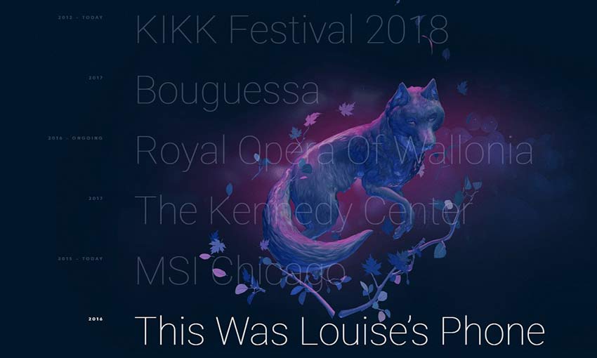
Dogstudio nails its branding by designing a website around its wolf-like character. Everywhere you explore, the beautifully animated dog follows you, changing color, rotating, and moving around the screen. It’s an amazing display of interactivity and 3D web animation.
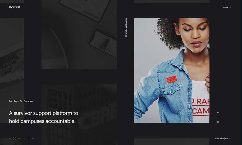
Design studios have lots of content to show off, so it’s important to have good navigation. Everest does it right with a beautiful and functional homepage that takes you through the company’s work. Click something you’re interested in and it smoothly transitions to a whole new area to explore.
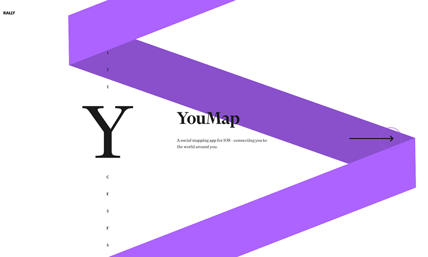
If you’re not sure where to start with a design, try using consistency. This studio’s homepage is made up of a spiral that changes color as you scroll through each project. The colorful ribbon remains on other pages and stretches as you navigate between them.
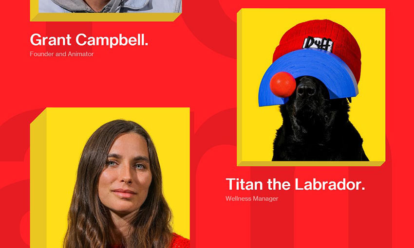
Websites for agencies are often dark and serious. But that doesn’t mean you can’t have fun with your design! Okalpha’s site is bright and colorful, with a flat look and cartoonish hues. It’s the perfect fit for an upbeat animation studio.
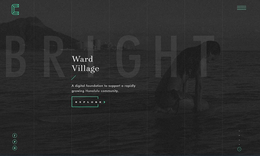
This site is all about clean and interesting UI. There’s plenty of elegant hover and transition animations – even the loading screen includes a beautiful animated logo! The flawless UI design leaves a lasting impression of quality and grace.
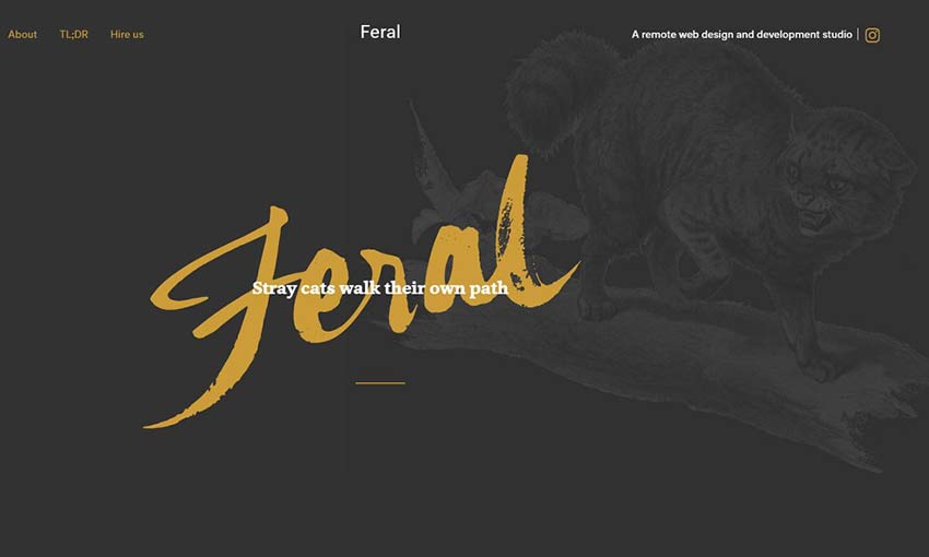
Many websites opt for digital icons or photography rather than illustrations, but Feral’s website proves that they have a place in web design. Lively sketches are scattered absolutely everywhere, and it makes the site seem unique and personalized.
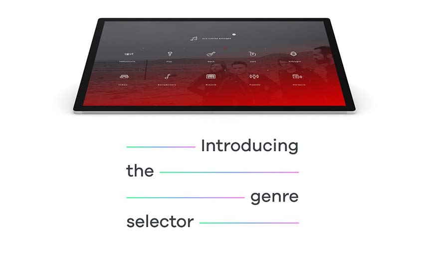
Studios need a good portfolio, and UIX does it perfectly. Widescreen images allow you to get a good look at their work, with quick animations keeping you interested in the content. Short paragraphs and impactful blurbs are broken up with more visual examples. It allows you to get an in-depth look at their design choices and see if the company is the right fit for you.
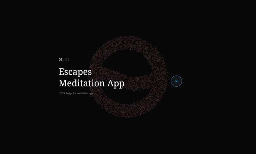
For portfolio sites, a simple but strong design often works best. This site uses a background of particles that shift into different shapes, while also leaving a comfortable amount of space. Click on a project and the site becomes much more compact as it takes you through the creative process of designing an app.
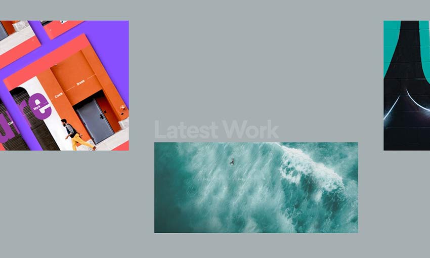
Content-packed boxes make up this website’s design with links and articles appearing inside them. Click one to explore this colorful site as you navigate through portfolio pieces, articles, and videos.
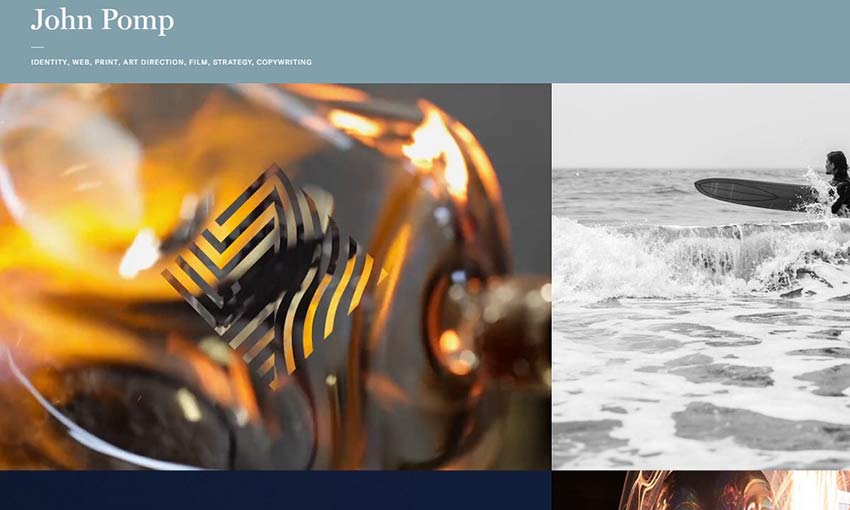
Nothing hooks people more than a charming intro video, and there’s plenty of interesting photos and videos to be found on this website. Explore to learn more about a company’s branding campaign, and be stunned at the perfectly synergistic design.
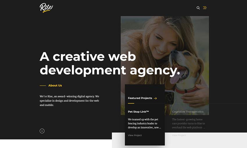
Though many brands’ websites go over the top with flashy elements and animations, clean and simple design shouldn’t be forgotten! Rise uses space and simplicity to create a breathable website that uses contrast to call attention to important areas. It’s a solid look that gives a sense of reliability.
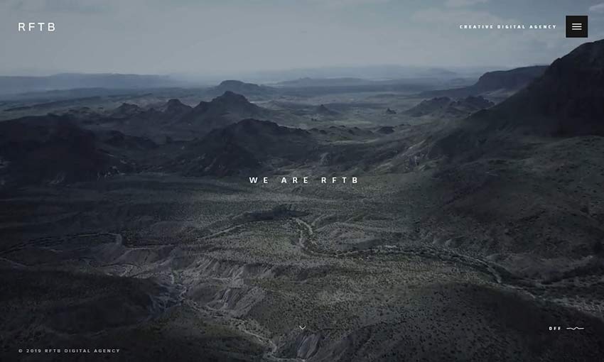
If one site inspires you, it should definitely be this one. The building music and slowly scrolling video background create a sense of wonder and curiosity. Follow that up with other great background videos, leading you to plenty of interesting excerpts and you’re already hooked.
Creating Gorgeous and Professional Websites
When you’re creating a site for a professional studio, your main goal is to hook potential customers – and a website that’s beautiful and inspiring is more likely to charm visitors and get them interested in the company.
These twelve great website examples gracefully capture their agency’s vision, all while creating a site that’s easy to navigate and fun to explore. There’s a lot to learn from these designers.
This post may contain affiliate links. See our disclosure about affiliate links here.


