When Chris first sent me this prompt, I was thinking about writing about progressive enhancement, but that subject is so wide-reaching to be one thing and all too predictable, especially for those already familiar with my writing. Saying that, what I’m going to outline in this article also isn’t just one thing either, but the day I meet a writing prompt exactly will be the day pigs start flying. This one group of things, though, will change how you write CSS.
I personally think this group of things lets a lot of sites down—especially in a responsive design sense. The things in this group are typography and spacing. So often, I see inconsistent spacing—especially vertically—that makes content hard to scan and creates this subtle, disjointed feeling. The same goes for type: huge headings on small viewports, or heading hierarchies that visually have no contrast in size, rendering them useless in a visual sense.
There is a pretty easy fix for all of this using a sizing scale and fluid type, and I promise it’ll make your websites look and feel heaps better. Let’s get into it.
What the heck is a sizing scale?
Table of Contents
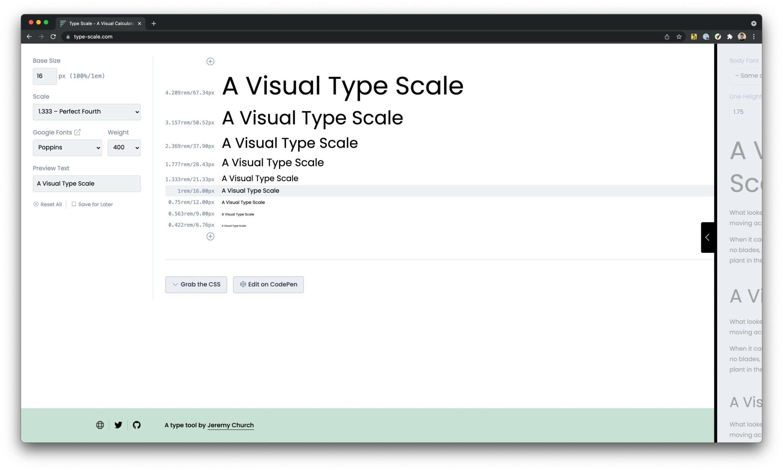
A sizing scale is a uniform progression of sizes based on a scale—or, more accurately, a ratio.

In that screenshot of type-scale.com, I’ve selected a “Perfect Fourth” scale which uses a ratio of 1.333. This means each time you go up a size, you multiply the current size by 1.333, and each time you go down a size, you subtract 1.333.
If you have a base font size of 16px, using this scale, the next size up is 16 * 1.333, which is 21.33px. The next size up is 21.33 * 1.333, which is 28.43px. This provides a lovely curve as you move up and down the scale.
CSS clamp() and type fluidity
For years, if you were to say, “Hey Andy, what’s your favorite CSS feature?” I would immediately say flexbox, but nah, not these days. I am a clamp() super fan. I wrote about it in more detail here, but the summary of clamp() is that it does clever stuff based on three parameters you give it:
- a minimum value
- an ideal value
- a maximum value
This makes for a very useful tool in the context of fluid typography and spacing, because you write CSS like this:
.my-element { font-size: clamp(1rem, calc(1rem * 3vw), 2rem);
}
This tiny bit of CSS gives us full responsive text sizes based on the viewport width with handy locks to make sure sizes don’t get too big or too small.
It’s really important to test that your text is legible when you zoom in and zoom out when using clamp. It should be very obviously larger or smaller. Because we’re using a rem units as part of our fluid calculation, we’re helping that considerably.
Putting it all together
Right, so we’ve got a size scale and CSS clamp() all set up—how does it all come together? The smart people behind Utopia came up with the simplest, but handiest of approaches. I use their type tool and their spacing tool to create size scales for small and large viewports. Then, using clamp(), I generate a master size scale that’s completely fluid, as well as a Sass map that informs Gorko’s configuration.
$gorko-size-scale: ( '300': clamp(0.7rem, 0.66rem + 0.2vw, 0.8rem), '400': clamp(0.88rem, 0.83rem + 0.24vw, 1rem), '500': clamp(1.09rem, 1rem + 0.47vw, 1.33rem), '600': clamp(1.37rem, 1.21rem + 0.8vw, 1.78rem), '700': clamp(1.71rem, 1.45rem + 1.29vw, 2.37rem), '800': clamp(2.14rem, 1.74rem + 1.99vw, 3.16rem), '900': clamp(2.67rem, 2.07rem + 3vw, 4.21rem), '1000': clamp(3.34rem, 2.45rem + 4.43vw, 5.61rem)
);
This snippet is from my site, piccalil.li, and the typography is super simple to work with because of it.
You could also translate that into good ol’ CSS Custom Properties:
:root { --size-300: clamp(0.7rem, 0.66rem + 0.2vw, 0.8rem); --size-400: clamp(0.88rem, 0.83rem + 0.24vw, 1rem); --size-500: clamp(1.09rem, 1rem + 0.47vw, 1.33rem); --size-600: clamp(1.37rem, 1.21rem + 0.8vw, 1.78rem); --size-700: clamp(1.71rem, 1.45rem + 1.29vw, 2.37rem); --size-800: clamp(2.14rem, 1.74rem + 1.99vw, 3.16rem); --size-900: clamp(2.67rem, 2.07rem + 3vw, 4.21rem); --size-1000: clamp(3.34rem, 2.45rem + 4.43vw, 5.61rem);
};
This approach also works for much larger sites, too. Take the new web.dev design or this fancy software agency’s site. The latter has a huge size scale for large viewports and a much smaller, more sensible, scale for smaller viewports, all perfectly applied and without media queries.
I’m all about keeping things simple. This approach combines a classic design practice—a sizing scale—and a modern CSS feature—clamp()—to make for much simpler CSS that achieves a lot.


