Animation on the web is often a contentious topic. I think, in part, it’s because bad animation is blindingly obvious, whereas well-executed animation fades seamlessly into the background. When handled well, animation can really elevate a website, whether it’s just adding a bit of personality or providing visual hints and lessening cognitive load. Unfortunately, it often feels like there are two camps, accessibility vs. animation. This is such a shame because we can have it all! All it requires is a little consideration.
Here’s a couple of important questions to ask when you’re creating animations.
Does this animation serve a purpose?
Table of Contents
This sounds serious, but don’t worry — the site’s purpose is key. If you’re building a personal portfolio, go wild! However, if someone’s trying to file a tax return, whimsical loading animations aren’t likely to be well-received. On the other hand, an animated progress bar could be a nice touch while providing visual feedback on the user’s action.
Is it diverting focus from important information?
It’s all too easy to get caught up in the excitement of whizzing things around, but remember that the web is primarily an information system. When people are trying to read, animating text or looping animations that play nearby can be hugely distracting, especially for people with ADD or ADHD. Great animation aids focus; it doesn’t disrupt it.
So! Your animation’s passed the test, what next? Here are a few thoughts…
Did we allow users to opt-out?
It’s important that our animations are safe for people with motion sensitivities. Those with vestibular (inner ear) disorders can experience dizziness, headaches, or even nausea from animated content.
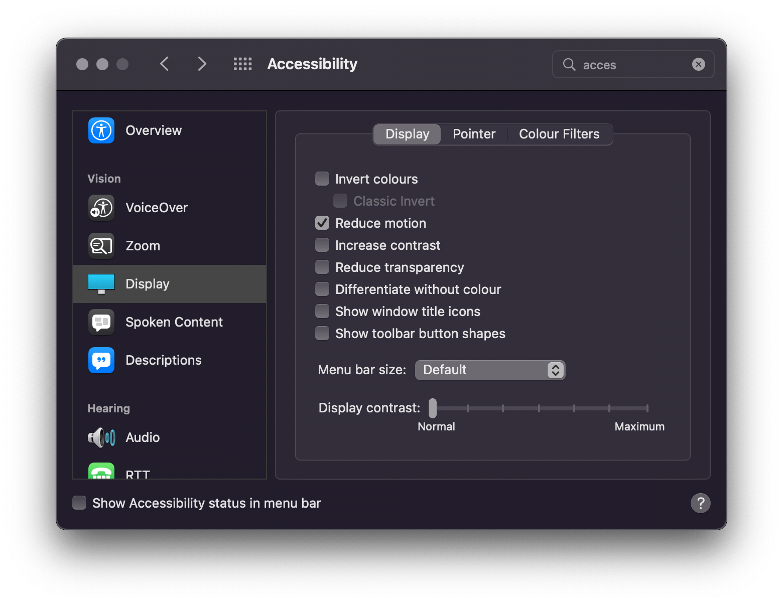
Luckily, we can tap into operating system settings with the prefers-reduced-motion media query. This media query detects whether the user has requested the operating system to minimize the amount of animation or motion it uses.

Here’s an example:
@media (prefers-reduced-motion: reduce) { *, *::before, *::after { animation-duration: 0.01ms !important; animation-iteration-count: 1 !important; transition-duration: 0.01ms !important; scroll-behavior: auto !important; }
}
This snippet taps into that user setting and, if enabled, it gets rid of all your CSS animations and transitions. It’s a bit of a sledgehammer approach though — remember, the key word in this media query is reduced. Make sure functionality isn’t breaking and that users aren’t losing important context by opting out of the animation. I prefer tailoring reduced motion options for those users. Think simple opacity fades instead of zooming or panning effects.
What about JavaScript, though?
Glad you asked! We can make use of the reduced motion media query in JavaScript land, too!
let motionQuery = matchMedia('(prefers-reduced-motion)'); const handleReduceMotion = () => { if (motionQuery.matches) { // reduced motion options }
} motionQuery.addListener(handleReduceMotion);
handleReduceMotion()
Tapping into system preferences isn’t bulletproof. After all, it’s there’s no guarantee that everyone affected by motion knows how to change their settings. To be extra safe, it’s possible to add a reduced motion toggle in the UI and put the power back in the user’s hands to decide. We {the collective} has a really nice implementation on their site
Here’s a straightforward example:
Scroll animations
One of my favorite things about animating on the web is hooking into user interactions. It opens up a world of creative possibilities and really allows you to engage with visitors. But it’s important to remember that not all interactions are opt-in — some (like scrolling) are inherently tied to how someone navigates around your site.
The Nielson Norman Group has done some great research on scroll interactions. One particular part really stuck out for me. They found that a lot of task-focused users couldn’t tell the difference between slow load times and scroll-triggered entrance animations. All they noticed was a frustrating delay in the interface’s response time. I can relate to this; it’s annoying when you’re trying to scan a website for some information and you have to wait for the page to slowly ease and fade into view.
If you’re using GreenSock’s ScrollTrigger plugin for your animations, you’re in luck. We’ve added a cool little property to help avoid this frustration: fastScrollEnd.
fastScrollEnd detects the users’ scroll velocity. ScrollTrigger skips the entrance animations to their end state when the user scrolls super fast, like they’re in a hurry. Check it out!
There’s also a super easy way to make your scroll animations reduced-motion-friendly with ScrollTrigger.matchMedia():
I hope these snippets and insights help. Remember, consider the purpose, lead with empathy, and use your animation powers responsibly!


