Advertisement
Cars are a fundamental means of transport for society. At first, their production was extremely expensive, which limited their acquisition to few users. However, with the start of mass production, new companies could be incorporated into the market. Perhaps you recognize the Honda logo, and this is one of the most popular manufacturers in the world. Let’s know a little about its history and how they came to adopt this emblem.
The Japanese Soichiro Honda founded Honda in 1946. Its beginnings were humble, being a fan of mechanics from a young age. Moved by curiosity, young Soichiro was a self-taught student who wanted to make his cars. At 21, Honda opened a piston factory that was not very successful, so it would resume university studies. However, later he would return to the factory.
In a series of subsequent events between World War II and an earthquake, Honda would culminate by selling the remains of the devastated piston factories to Toyota.
Thanks to that money, and in association with Takeo Fujisawa, they would find Honda Motor Company with the intention of manufacturing motorcycles. The brand, of course, is now recognized for many more things, including its logo.
Side note: Do you want to increase your chances of getting a better design job? Get a Graphic Design Specialization from CalArts (California Institute of the Arts).
Behind the Honda Emblem
Table of Contents


Honda has one of the longest-lived logos on the market, remaining virtually intact since its conception. It could easily enter the Guinness record book as the most stable logo of the 20th century.
/*div{padding-right:0!important;padding-bottom:10px}.ml-form-formContent.horozintalForm .ml-button-horizontal{width:100%!important}.ml-form-formContent.horozintalForm .ml-button-horizontal.labelsOn{padding-top:0!important}}
/*]]>*/
/**/
![]()
![]()
Honda logo is a capital H that refers to the name of the company and its founder. This logo is found on each of the manufacturer’s products, although each department has its version.
The base symbol


There are many Honda logos, but they all start from the idea of the letter H. The hood of each manufactured vehicle has the emblem, and it is difficult not to recognize its shape in the distance.
We have the original design, which is an H bordered in a square of rounded corners with a wider upper part. In this sense, the centerline of the H is located a little lower to maintain the direction of the logo.
Acura logo is used for cars of the same name, and they retain the essence of Honda by inverting the H and reducing its top side, making it look like a letter A.
Finally, there is the Honda Wings logo, which is used for the company’s motorcycles. Although it has the written name, the symbology is different since it adopts a wing.
A unique emblem design
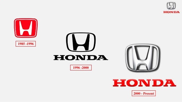

In the beginning, Honda did not have a logo. They simply used a blurry image on the hood, and covered its surface, is almost unrecognizable. It was not until the 60s that they adopted its design.
Soichiro Honda was personally responsible for making it happen. The letter used is not a conventional font, but one that reflects the thought and work of a lifetime of the founder. He thinks he was born to be constantly inventing things, and that is why he thought the logo could not be an exception.
The red, black, and silver colors in the Honda symbols are classics of the automotive industry and represent elegance, passion, and power. These are used between different versions to maintain consistency.
Typography prepared for everything


The font used in the Honda logos is not completely random. This was specially designed to be easily reproducible. That is why it has almost no details and opts for a stylized design. The thickness of the line was also evaluated so that it could easily stand out regardless of the background.
When installed as an emblem in a vehicle, it is made with a chrome-colored coating, which makes it look clean and elegant. Finally, as a general rule, the word HONDA is written at the bottom of all logos.
Advertisement
Meaning of the logo in the industry
Although in the early years there was no defined logo for Honda, the truth is that it was never left without a brand. The H has always represented the company, even when it was virtually unrecognizable.
The H is not only a tribute to the founder Soichiro Honda but also resembles an armchair, implying that the products they manufacture are comfortable.
Although it is not known with certainty what was the founding date of Honda Motor Company, the truth is that they managed to make a name in the motorcycle market, becoming in 1963 the most important exporter and manufacturer in the world.
The expansionist plans because of the success they had were the perfect time to develop a logo that could represent them as a brand throughout the world. And well that it fulfilled the objective since the automotive market would not be the same without Honda.
Honda motorcycles have changed
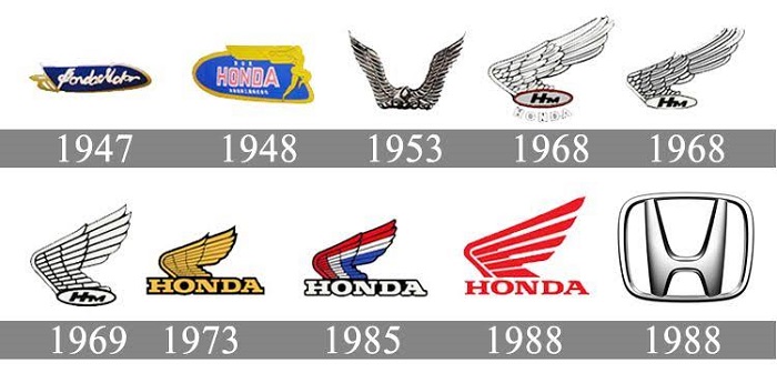

Since its founding in 1948, Honda has been known for its motorcycles, cars, and more recently robots. The motorcycle department, being the most popular, has had different face washes in the logo.
While cars use a letter H as a logo, motorcycles have wings. The first version included two wings of the goddess Nike, in what Soichiro defined as a metaphor that the company could always achieve its objectives. The color red was not always the selected one, but it never disappeared completely.
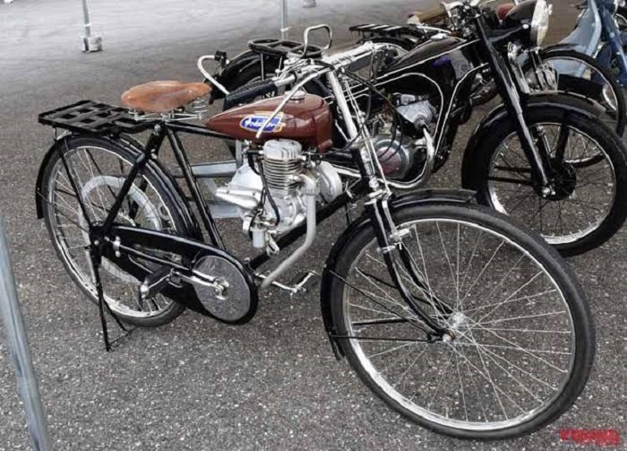

In 1947, this logo received an aggregate of the prototype engine called “Fireplace”. Later in 1948, the wings would be changed to those of the goddess Victoria.
In 1988, the emblem returned to adopt a red color as a reason for its 40th anniversary, and since then it has not undergone any change.


In spite of the slight changes that they underwent, the concept between marks always stayed, conserving the characteristic H for the automobiles and the wings for the motorcycles.
Honda’s achievements
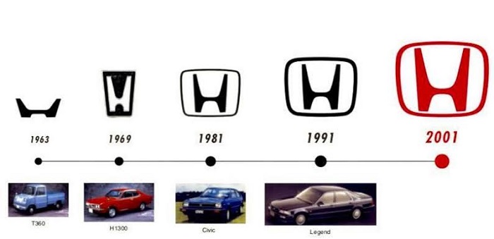

Seeing the Honda logo is going through the long history that the company has had since its inception. The high quality of the products they offered, many at an affordable price, has made them the largest manufacturer of internal combustion vehicles in the world.
However, their success lies not only in the quality they offer but also in the wide variety of products. In addition to vehicles, they also manufacture parts, engines, power generators, garden equipment, water vehicles, and even robots (we all remember ASIMO, the robot that could walk and that laid the foundation for the future of robotics).
That is why the company has so many varieties of logos. It is not easy to differentiate each of the departments you own while retaining the original essence. But Honda has achieved it with the simple use of a letter.
A sample of how something so simple that was designed more than 50 years ago can be maintained over time and adapted to the modern era without having to abandon the original idea.
If you enjoyed reading this article on the Honda logo, you should read these as well:
