We recently covered creating fancy borders with CSS mask properties, and now we are going to cut the corners with CSS mask and clip-path! A lot of techniques exist to cut different shapes from the corners of any element. In this article, we will consider modern techniques to create unique corner shapes while trying to work from reusable code that allows us to produce different results by adjusting variables.
Check this online tool to get an idea of what we are building. It’s a CSS generator where you select the shape, the corners, and the size then you get the code in no time!
We mainly have two types of cuts: a circular one and an angled one. For each, we can get the full shape or the border-only shape, not to mention that we can select the corners we want to cut. A lot of combinations!
Like in the previous article, we will make lots of use of the CSS mask property. So, if you are not familiar with it, I recommend reading the quick primer I wrote before continuing.
Circular cut-out
Table of Contents
For a circular or rounded cut, we will use radial-gradient(). To cut four corners, the logical solution is to create four gradients, one for each corner:
Each gradient is taking a quarter of the element’s dimensions. The syntax of the gradient is self-explanatory:
radial-gradient(circle 30px at top left, #0000 98%, red) top left;Translated, this renders a circle at the top-left corner with a 30px radius. The main color is transparent (#0000) and the remaining is red. The whole gradient is also placed so that it starts at the element’s top-left corner. Same logic for the three other gradients. The keyword circle can be omitted since we explicitly specified one value for the radius.
Like I did in the previous article, I will be using slightly bigger or smaller values this time around in order to avoid bad visual result. Here, I am using 98% instead of 100% to avoid jagged edges and 51% instead of 50% to create an overlap between gradients and avoid white spaces. This logic will follow throughout this article. In fact, you will find that adding or removing 1% or 1deg typically results in a nice visual.
We apply this to the CSS mask property and we are done!
We can actually optimize that code a little:
--g: #0000 98%,#000;
--r: 30px;
mask: radial-gradient(var(--r) at 0 0 ,var(--g)) 0 0, radial-gradient(var(--r) at 100% 0 ,var(--g)) 100% 0, radial-gradient(var(--r) at 0 100%,var(--g)) 0 100%, radial-gradient(var(--r) at 100% 100%,var(--g)) 100% 100%;
mask-size: 51% 51%;
mask-repeat: no-repeat;
This way, we use custom properties for the redundant values and, as a personal preference, I am using numeric values for the positions instead of keywords.
In the generator, I will use the following syntax:
--g: #0000 98%,#000;
--r: 30px;
mask: radial-gradient(var(--r) at 0 0 ,var(--g)) 0 0 /51% 51% no-repeat, radial-gradient(var(--r) at 100% 0 ,var(--g)) 100% 0 /51% 51% no-repeat, radial-gradient(var(--r) at 0 100%,var(--g)) 0 100%/51% 51% no-repeat, radial-gradient(var(--r) at 100% 100%,var(--g)) 100% 100%/51% 51% no-repeat;
The shorthand syntax is easier to generate plus the whole value can be used as one custom property.
Can we use fewer gradients if we want?
Sure! One gradient can do the job. Hover the below to see the trick:
Here, we define one radial-gradient() with no size (by default it is 100% height and 100% width). This gives us a hole in the center. We translate/move the gradient by half the width and height of the image to move the hole to one corner. Since, by default, the CSS mask repeats, we get the same on each corner. We have four cut corners with only one gradient!
The only drawback of this method is that we need to know the width and height of the element in advance.
Can’t we use -50% instead of half the width and height?
Unfortunately, we’re unable to do that here because percentages doesn’t behave the same as pixel values when used with the CSS mask-position property. They’re tricky.
I have a detailed Stack Overflow answer that explains the difference. It deals with background-position but the same logic applies to the CSS mask-position property.
However, we can use some tricks to make it work with percentage values and without the need to know the width or the height. When a gradient (or a background layer) has a width and height equal to the element, we cannot move it using percentage values. So we need to change its size!
I will define a size equal to 99.5% 99.5%. I am reducing 0.5% from the width and the height to have a value different from 100% and at the same time keep the same visual result since we won’t notice a big difference between 100% and 99.5%. Now that our gradient has a size different from 100% we can move it using percentage values.
I will not detail all the math, but to move it by half the width and the height we need to use this equation:
100% * (50/(100 - 99.5)) = 100% * 100 = 10000%It’s a strange value but it does the job:
As you can see, the trick works just fine. Whatever the size of the element is, we can cut four corners using only one gradient. However, this method has a small drawback when the width or the height of the element is a decimal value. Here is an example with an image having a width equal to 150.5px:
The use of 99.5% combined with 150.5px will create rounding issues that will break the calculation, resulting in the mask being misaligned. So, use this method with caution.
To overcome the rounding issue, we can combine the last trick with a pseudo-element. Here is a step-by-step illustration to understand the idea:
Here’s what going on in there:
- We define a pseudo-element that behaves as our background layer. Logically, we should use
inset:0to make it cover the entire area, but we will create a small overflow by usinginset: -10%meaning that the pseudo element will overflow each side by 10%. - We set our CSS mask to the pseudo-element. The mask size needs to match the size of the main element, not the pseudo-element. In other words, it will be smaller than the size of the pseudo-element and this is what we want to be able to move using percentage values. After we do the math, the size needs to be
100%/1.2. Notice in the demo above that the CSS mask is within the green border so that it matches the size of the container. - Now, we need to move it in a way that simulates cutting the corner of the main element. The center of the hole needs to be in the corner of the main element, as illustrated in the demo. To do this, we use
mask-position: 300% 300%(300% = 50%/(1 - 1/1.2)). - We remove
no-repeatto activate the repetition and get the same effect for every corner. - We clip the overflow and we get our final result!
I know it’s a bit overkill, but it does work and it requires only one gradient instead of four.
Let’s quickly recap the three methods we just covered:
- The first method uses four gradients and has no drawbacks as far as usage. Sure, it’s verbose but it works with any kind of element and size. I recommend using this one.
- The second method uses one gradient and works with any element, but it can break in some particular cases. It’s suitable with fixed-size elements. It’s ok to use, but maybe less frequently.
- The third method uses one gradient and requires a pseudo-element. It won’t work with
<img>and other elements that unable to support a pseudo-element.
The generator only supports the first and third methods.
Now that we saw the case with all the corners, let’s disable some of them. Using the first method, any corner we want to keep uncut we simply remove its gradient and adjust the size of what remains.
To disable the top-right corner:
- We remove the top-right gradient (the blue one).
- We have an empty corner, so we increase the size of the red gradient (or the purple one) to cover that leftover space.
Done!
You probably see just how many possibilities and combinations we can do here. If we want to cut N corners (where N ranges from 1 to 4), we use N gradients. All we need is to correctly set the size of each one to leave no space.
What about the other methods where there’s only one gradient? We will need another gradient! Those two methods use only one radial-gradient() to cut the corners, so we will rely on another gradient to “hide” the cut. We can use a conic-gradient() with four sections for this task:
conic-gradient(red 25%, blue 0 50%, green 0 75%, purple 0)We add it on the top of the radial gradient to get the following:
The conic-gradient() covers the radial-gradient() and no corner is cut. Let’s change one color in the conic-gradient() to transparent. The one at the top-right, for example:
Did you see that? We revealed one corner of the radial-gradient() and we end with one cut corner!
Now let’s do the same thing, but for the bottom-left corner.
I think you probably get the trick by now. By changing the colors of the conic-gradient() from opaque to transparent, we reveal the corners we want to cut and gain all kinds of possible combinations. The same can be done with the third method.
Circular border-only cut-out
Let’s make the border-only version of the previous shape. In other words, we achieve the same shape but knock out the fill so all we’re left with is a border of the shape.
This is a bit tricky because we have different cases with different code. Fair warning, I will be using a lot of gradients here while finding opportunities to trim the number of them.
It should be noted that we will consider a pseudo-element in this case. Showing only the border means we need to hide the inner “fill” of the shape. Applying this to the main element will also hide the content — that’s why this is a nice use case for a pseudo-element.
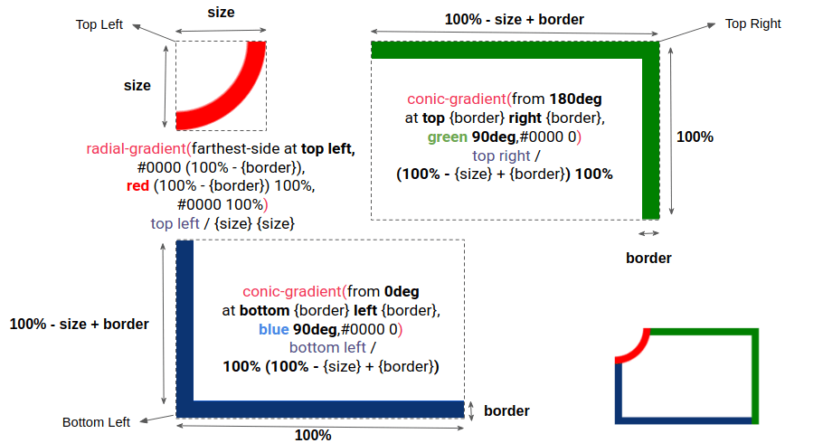
One cut corner
This one needs one radial gradient and two conic gradients:
The first example illustrates the radial gradient (in red) and both conic gradients (in blue and green). In the second example, we apply all of them inside the CSS mask property to create the border-only shape with one cut corner.

As the diagram shows, the radial-gradient() creates the quarter of a circle and each conic-gradient() creates two perpendicular segments to cover two sides. It should be noted that overlapping gradients is not an issue since we are not going to change the CSS mask-composite property value.
Using the same code an adjusting a few variables, we can get the shape for the other corners.
Two cut corners
For the two-corner configuration we have two situations taking place.
In the first situation, there are two opposite corners where we need two radial gradients and two conic gradients.
The configuration is almost the same as cutting only one corner: we add an extra gradient and update a few variables.
In the second situation, there are two adjacent corners and, in this case, we need two radial gradients, one conic gradient, and one linear gradient.
“Wait!” you might exclaim. “How come the conic gradient covers three sides?” If you check the code, notice the repeat-y. In all of the examples, we always used no-repeat for the gradients, but for this we can repeat one of them to cover more sides and reduce the number of gradients we use.
Here is an example with only the conic-gradient() to understand the repetition. The trick is to have a height equal to 100% minus the border size so that the gradient fills that space when repeating, which covers the third side in the process.
Three cut corners
For this configuration, we need three radial gradients, one conic gradient, and two linear gradients.
Four corners cut
It takes four radial gradients and two linear gradients to cut all four corners.
I can hear you screaming, “How the heck am I supposed to memorize all these cases?!” You don’t need to memorize anything since you can easily generate the code for each case using the online generator. All you need is to understand the overall trick rather than each individual case. That’s why I’ve only gone into fine detail on the first configurations — the rest are merely iterations that tweak the initial foundation of the trick.
Notice there’s a general pattern we’ve been following throughout the examples:
- We add a
radial-gradient()on the corners we want to cut. - We fill the sides using either a
conic-gradient()or alinear-gradient()to create the final shape.
It should be noted that we can find different ways to create the same shape. What I am showing in this post are the methods I found to be best after trying lots of other ideas. You may have a different approach you consider to be better! If so, definitely share it in the comments!
Angled cut-out
Let’s tackle another type of cut shape: the angled cut.
We have two parameters: the size and angle of the cut. To get the shape, we need a conic-gradient() for each corner. This configuration is very similar to the example that kicked off this article.
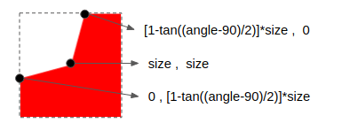
Here is an illustration of one corner to understand the trick:

The difference between each corner is an extra offset of 90deg in from and the at position. The full code is like below:
--size: 30px;
--angle: 130deg; --g: #0000 var(--angle), #000 0;
mask: conic-gradient(from calc(var(--angle)/-2 - 45deg) at top var(--size) left var(--size),var(--g)) top left, conic-gradient(from calc(var(--angle)/-2 + 45deg) at top var(--size) right var(--size),var(--g)) top right, conic-gradient(from calc(var(--angle)/-2 - 135deg) at bottom var(--size) left var(--size),var(--g)) bottom left, conic-gradient(from calc(var(--angle)/-2 + 135deg) at bottom var(--size) right var(--size),var(--g)) bottom right;
mask-size: 51% 51%;
mask-repeat: no-repeat;
If we want to disable one corner, we remove the conic-gradient() for that corner and update the size of another one to fill the remaining space exactly like we did with the circular cut. Here’s how that looks for one corner:
We can do the exact same thing for all the other corners to get the same effect.
In addition to CSS mask, we can also use the CSS clip-path property to cut the corners. Each corner can be defined with three points.

The other corners will have the same value with an offset of 100%. This gives us the final code with a total of 12 points — three per corner.
/* I will define T = [1-tan((angle-90)/2)]*size */
clip-path: polygon( /* Top-left corner */ 0 T, size size,0 T, /* OR 0 0 */ /* Top-right corner */ calc(100% - T) 0,calc(100% - size) size,100% T, /* OR 100% 0 */ /* Bottom-right corner*/ 100% calc(100% - T),calc(100% - size) calc(100% - size), calc(100% - T) 100%, /* OR 100% 100% */ /* Bottom-left corner */ T 100%, size calc(100% - size),0 calc(100% - T) /* OR 0 100% */
)
Notice the OR comments in that code. It defines the code we have to consider if we want to disable a particular corner. To cut a corner, we use three points. To uncut a corner, we use one point — which is nothing but the coordinate of that corner.
Border-only angled cut
Oof, we have reached the last and trickiest shape at last! This one can be achieved with either gradients or clip-path, but let’s go with the clip-path approach.
Things would get complex and verbose if we go with the gradient approach. Here’s a demo that illustrates that point:
There are nine gradients total, and I am still not done with the calculation. As you can tell, the thickness of the border is incorrect, plus the final result is unsatisfying due to the nature of gradients and their anti-aliasing issues. This approach might be a good exercise to push the limit of gradients, but I don’t recommend it in a production environment.
So, back to the clip-path method. We will still wind up with verbose code, but less of a big deal since the generator can do the job for us with a cleaner end result.
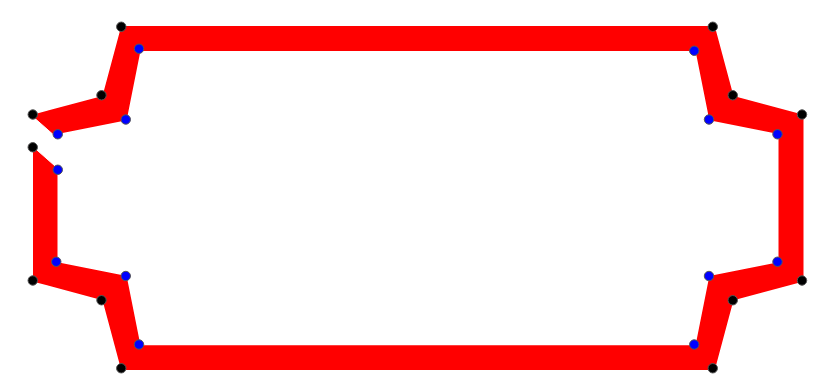
Here is an overview of the path. I am adding a small gap to better see the different points but we should have an overlap of points instead.

The way we calculate the outer points is the same as how we did it for the regular angled cut. For the inner points, however, we need more math. Don’t worry, I’ll spare you some “boring” geometry explanation for this one. I know most of you don’t want it, but in case you need to dig into this, you can check the JavaScript file of the generator to find the code and the math I am using to generate the shape.
The 180deg special case
Before we end, there’s a special case for the angle cut I want to call out. It’s where we use an angle equal to 180deg. Here’s what that produces:

We have a straight line on the corner so we can optimize the clip-path code. For the full shape, we can use eight points (two points per corner) instead of 12. And for the border-only version, we can use 18 points (nine inner points and outer points) instead of 26. In other words, we can remove the middle point.
The border-only shape can also be made using gradients. But rather than using nine gradients like we did before, we can get away with only four linear gradients and a clean result.
Conclusion
We just combined CSS masks with gradients to create some fancy shapes without resorting to hacks and a lot of code! We also experienced just how much it takes to strike the right balance of code to get the right results. We even learned a few tricks along the way, like changing values by one or even half a unit. CSS is super powerful!
But, as we discussed, the online generator I made is a great place to get the code you need rather than writing it out by hand. I mean, I went through all the work of figuring out how all of this works and I would likely still need to reference this very article to remember how it’s all put together. If you can memorize all of this, kudos! But it’s nice to have a generator to fall back on.


