In my last article we saw how CSS background properties allow us to create cool hover effects. This time, we will focus on the CSS text-shadow property to explore even more interesting hovers. You are probably wondering how adding shadow to text can possibly give us a cool effect, but here’s the catch: we’re not actually going to make any shadows for these text hover effects.
text-shadow but no text shadows?
Table of Contents
Let me clear the confusion by showing the hover effects we are going to build in the following demo:
Without looking at the code many of you will, intuitively, think that for each hover effect we are duplicating the text and then independently animating them. Now, if you check the code you will see that none of the text is actually duplicated in the HTML. And did you notice that there is no use of content: "text" in the CSS?
The text layers are completely made with text-shadow!
Hover effect #1
Let’s pick apart the CSS:
.hover-1 { line-height: 1.2em; color: #0000; text-shadow: 0 0 #000, 0 1.2em #1095c1; overflow: hidden; transition: .3s;
}
.hover-1:hover { text-shadow: 0 -1.2em #000, 0 0 #1095c1;
}
The first thing to notice is that I am making the color of the actual text transparent (using #0000) in order to hide it. After that, I am using text-shadow to create two shadows where I am defining only two length values for each one. That means there’s no blur radius, making for a sharp, crisp shadow that effectively produces a copy of the text with the specified color.
That’s why I was able to claim in the introduction that there are no shadows in here. What we’re doing is less of a “classic” shadow than it is a simple way to duplicate the text.
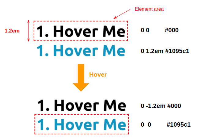
We have two text layers that we move on hover. If we hide the overflow, then the duplicated text is out of view and the movement makes it appear as though the actual text is being replaced by other text. This is the main trick that that makes all of the examples in this article work.
Let’s optimize our code. I am using the value 1.2em a lot to define the height and the offset of the shadows, making it an ideal candidate for a CSS custom property (which we’re calling --h):
.hover-1 { --h: 1.2em; line-height: var(--h); color: #0000; text-shadow: 0 0 #000, 0 var(--h) #1095c1; overflow: hidden; transition: .3s;
}
.hover-1:hover { text-shadow: 0 calc(-1 * var(--h)) #000, 0 0 #1095c1;
}
We can still go further and apply more calc()-ulations to streamline things to where we only use the text-shadow once. (We did the same in the previous article.)
.hover-1 { --h: 1.2em; line-height: var(--h); color: #0000; text-shadow: 0 calc(-1*var(--_t, 0em)) #000, 0 calc(var(--h) - var(--_t, 0em)) #1095c1; overflow: hidden; transition: .3s;
}
.hover-1:hover { --_t: var(--h);
}
In case you are wondering why I am adding an underscore to the --_t variable, it’s just a naming convention I am using to distinguish between the variables we use to control the effect that the user can update (like --h) and the internal variables that are only used for optimization purposes that we don’t need to change (like --_t ). In other words, the underscore is part of the variable name and has no special meaning.
We can also update the code to get the opposite effect where the duplicated text slides in from the top instead:
All we did is a small update to the text-shadow property — we didn’t touch anything else!
Hover effect #2
For this one, we will animate two properties: text-shadow and background. Concerning the text-shadow, we still have two layers like the previous example, but this time we will move only one of them while making the color of the other one transparent during the swap.
.hover-2 { /* the height */ --h: 1.2em; line-height: var(--h); color: #0000; text-shadow: 0 var(--_t, var(--h)) #fff, 0 0 var(--_c, #000); transition: 0.3s;
}
.hover-2:hover { --_t: 0; --_c: #0000;
}
On hover, we move the white text layer to the top while changing the color of the other one to transparent. To this, we add a background-size animation applied to a gradient:
And finally, we add overflow: hidden to keep the animation only visible inside the element’s boundaries:
.hover-2 { /* the height */ --h: 1.2em; line-height: var(--h); color: #0000; text-shadow: 0 var(--_t,var(--h)) #fff, 0 0 var(--_c, #000); background: linear-gradient(#1095c1 0 0) bottom/100% var(--_d, 0) no-repeat; overflow: hidden; transition: 0.3s;
}
.hover-2:hover { --_d: 100%; --_t: 0; --_c: #0000;
}
What we’ve done here is combine the CSS text-shadow and background properties to create a cool hover effect. Plus, we were able to use CSS variables to optimize the code.
If the background syntax looks strange to you, I highly recommend reading my previous article. The next hover effect also relies on an animation I detailed in that article. Unless you are comfortable with CSS background trickery, I’d suggest reading that article before continuing this one for more context.
In the previous article, you show us how to use only one variable to create the hover effect — is it possible to do that here?
Yes, absolutely! We can indeed use that same DRY switching technique so that we’re only working with a single CSS custom property that merely switches values on hover:
.hover-2 { /* the height */ --h: 1.2em; line-height: var(--h); color: #0000; text-shadow: 0 var(--_i, var(--h)) #fff, 0 0 rgb(0 0 0 / calc(var(--_i, 1) * 100%) ); background: linear-gradient(#1095c1 0 0) bottom/100% calc(100% - var(--_i, 1) * 100%) no-repeat; overflow: hidden; transition: 0.3s;
}
.hover-2:hover { --_i: 0;
}
Hover effect #3
This hover effect is nothing but a combination of two effects we’ve already made: the second hover effect of the previous article and the first hover effect in this article.
.hover-3 { /* the color */ --c: #1095c1; /* the height */ --h: 1.2em; /* The first hover effect in this article */ line-height: var(--h); color: #0000; overflow: hidden; text-shadow: 0 calc(-1 * var(--_t, 0em)) var(--c), 0 calc(var(--h) - var(--_t, 0em)) #fff; /* The second hover effect from the previous article */ background: linear-gradient(var(--c) 0 0) no-repeat calc(200% - var(--_p, 0%)) 100% / 200% var(--_p, .08em); transition: .3s var(--_s, 0s), background-position .3s calc(.3s - var(--_s, 0s));
}
.hover-3:hover { --_t: var(--h); --_p: 100%; --_s: .3s
}
All I did was copy and paste the effects from those other examples and make minor adjustments to the variable names. They make for a neat hover effect when they’re combined! At first glance, such an effect may look complex and difficult but, in the end, it’s merely two relatively easy effects made into one.
Optimizing the code with the DRY switching variable technique should also be an easy task if we consider the previous optimizations we’ve already done:
.hover-3 { /* the color */ --c: #1095c1; /* the height */ --h: 1.2em; line-height: var(--h); color: #0000; overflow: hidden; text-shadow: 0 calc(-1 * var(--h) * var(--_i, 0)) var(--c), 0 calc(var(--h) * (1 - var(--_i, 0))) #fff; background: linear-gradient(var(--c) 0 0) no-repeat calc(200% - var(--_i, 0) * 100%) 100% / 200% calc(100% * var(--_i, 0) + .08em); transition: .3s calc(var(--_i, 0) * .3s), background-position .3s calc(.3s - calc(var(--_i, 0) * .3s));
}
.hover-3:hover { --_i: 1;
}
Hover effect #4
This hover effect is an improvement of the second one. First, let’s introduce a clip-path animation to reveal one of the text layers before it moves:
Here’s another illustration to better understand what is happening:
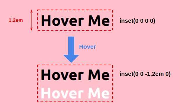
Initially, we use inset(0 0 0 0) which is similar to overflow: hidden in that all we see is the actual text. On hover, we update the the third value (which represent the bottom offset) using a negative value equal to the height to reveal the text layer placed at the bottom.
From there, we can add this to the second hover effect we made in this article, and this is what we get:
We are getting closer! Note that we need to first run the clip-path animation and then everything else. For this reason, we can add a delay to all of the properties on hover, except clip-path:
transition: 0.4s 0.4s, clip-path 0.4s;And on mouse out, we do the opposite:
transition: 0.4s, clip-path 0.4s 0.4s;The final touch is to add a box-shadow to create the sliding effect of the blue rectangle. Unfortunately, background is unable to produce the effect since backgrounds are clipped to the content area by default. Meanwhile, box-shadow can go outside the content area.
.hover-4 { /* the color */ --c: #1095c1; /* the height */ --h: 1.2em; line-height: var(--h); color: #0000; text-shadow: 0 var(--_t, var(--h)) #fff, 0 0 var(--_c, #000); box-shadow: 0 var(--_t, var(--h)) var(--c); clip-path: inset(0 0 0 0); background: linear-gradient(var(--c) 0 0) 0 var(--_t, var(--h)) no-repeat; transition: 0.4s, clip-path 0.4s 0.4s;
}
.hover-4:hover { --_t: 0; --_c: #0000; clip-path: inset(0 0 calc(-1 * var(--h)) 0); transition: 0.4s 0.4s, clip-path 0.4s;
}
If you look closely at the box-shadow, you will see it has the same values as the white text layer inside text-shadow. This is logical since both need to move the same way. Both will slide to the top. Then the box-shadow goes behind the element while text-shadow winds up on the top.
Here is a demo with some modified values to visualize how the layers move:
Wait, The background syntax is a bit different from the one used in the second hover effect!
Good catch! Yes, we are using a different technique with background that produces the same effect. Instead of animating the size from 0% to 100%, we are animating the position.
If we don’t specify a size on our gradient, then it take up the full width and height by default. Since we know the height of our element (--h) we can create a sliding effect by updating the position from 0 var(--h) to 0 0.
.hover-4 { /* ... */ background: linear-gradient(var(--c) 0 0) 0 var(--_t, var(--h)) no-repeat;
}
.hover-4:hover { --_t: 0;
}
We could have used the background-size animation to get the same effect, but we just added another trick to our list!
In the demos, you also used
inset(0 0 1px 0)… why?
I sometimes add or remove a few pixels or percentages here and there to refine anything that looks off. In this case, a bad line was appearing at the bottom and adding 1px removed it.
What about the DRY switch variable optimization?
I am leaving this task for you! After those four hover effects and the previous article, you should be able to update the code so it only uses one variable. I’d love to see you attempt it in the comments!
Your turn!
Let me share one last hover effect which is another version of the previous one. Can you find out how it’s done without looking at the code? It’s a good exercise, so don’t cheat!
Wrapping up
We looked at a bunch of examples that show how one element and few lines of CSS are enough to create some pretty complex-looking hover effects on text elements — no pseudo elements needed! We were even able to combine techniques to achieve even more complex animations with a small amount of effort.
If you’re interested in going deeper than the four text-shadow hover effects in this article, check my collection of 500 hover effects where I am exploring all kinds of different techniques.

