Website testing has become increasingly complex. The days of checking functionality in a couple of browsers are long gone. Your latest masterpiece must be rigorously evaluated on a range of mobile, tablet and desktop devices with differing OSs, screen resolutions, and capabilities. In extreme cases, it could take as long as the original development.
The process is complicated further by touch-screens, hybrid devices, and high-density displays. If you’re coding on a regular PC with a mouse and keyboard, it’s difficult to appreciate how your masterpiece will operate. Features such as mouse hover won’t necessarily work and your application could be inoperable. But how can you test your system during development and avoid the pain of managing and switching between multiple devices?
Fortunately, all modern browsers offer mobile emulation tools, and one of the best can be found in Chrome. It can help identify early problems without leaving the comfort of your PC and development environment.
Developer Tools
Start Chrome, navigate to the web page you want to test and open the Developer Tools (Menu > Tools > Developer Tools, Cmd + Opt + I on macOS or F12 / Ctrl + Shift + I on Windows and Linux).
You can now enable the browser emulator by clicking the Toggle device toolbar icon in the top left:

A device simulation will now appear:
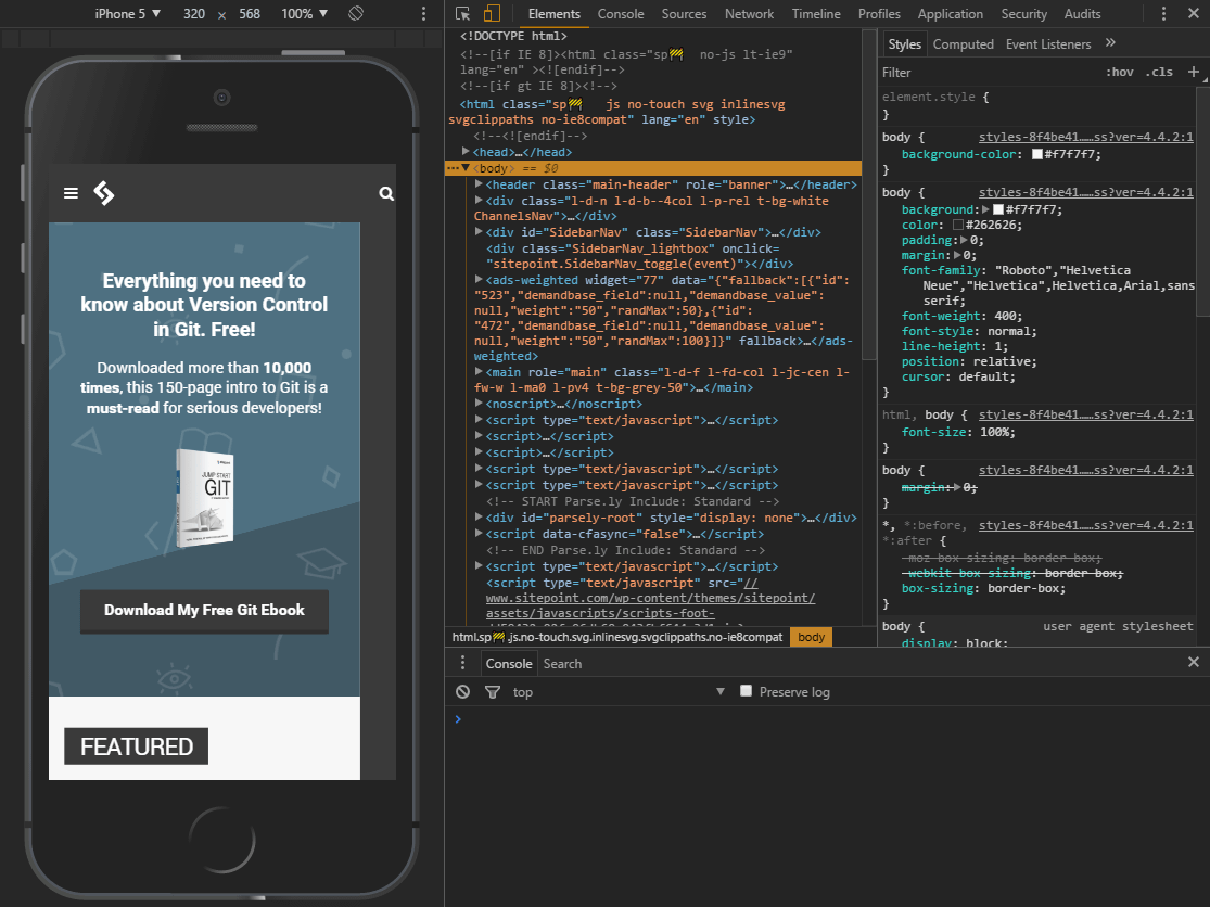
The dimensions of the emulated screen can be changed when Responsive is selected as the device type.
Touch Enabled Emulation
Move your mouse over the device to see a circular “touch” cursor. This will react to touch-based JavaScript events such as touchstart, touchmove and touchend. Mouse-specific events and CSS effects should not occur.
Hold down Shift then click and move your mouse to emulate pinch zooming.
The Mobile Emulator Device Toolbar
It’s worth spending a little time familiarizing yourself with the toolbar and menu above the mobile emulator:
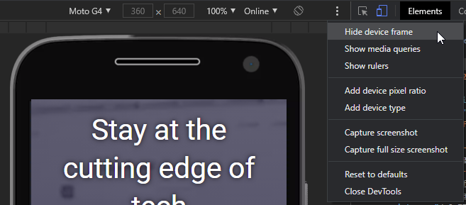
The default controls are:
- the device type (or Responsive)
- the current resolution
- the scale (the screen can be zoomed in or out to fit better in the emulator pane)
- the network speed
- a portrait/landscape toggle button
The three-dot menu allows you to show or hide additional controls:
- the device frame (if available, a graphic of the phone or tablet)
- CSS media query bars (see below)
- a pixel ruler
- add device pixel ratios
- add device types
- capture a screenshot (including the device frame if shown)
- capture a full-page screen shot
CSS Media Query Bars
Select Show media queries from the three-dot menu to view a graphical color-coded representation of all media queries set in the CSS.

- BLUE: queries which target a maximum width
- GREEN: queries which target widths within a range
- ORANGE: queries which target a minimum width
Any bar can be clicked to set the emulator screen to that width.
Continue reading How to Simulate Mobile Devices with Device Mode in Chrome on SitePoint.