We’ve spent the last two articles in this three-part series playing with gradients to make really neat image decorations using nothing but the <img> element. In this third and final piece, we are going to explore more techniques using the CSS outline property. That might sound odd because we generally use outline to draw a simple line around an element — sorta like border but it can only draw all four sides at once and is not part of the Box Model.
We can do more with it, though, and that’s what I want to experiment with in this article.
Fancy Image Decorations series
Let’s start with our first example — an overlay that disappears on hover with a cool animation:
We could accomplish this by adding an extra element over the image, but that’s what we’re challenging ourselves not to do in this series. Instead, we can reach for the CSS outline property and leverage that it can have a negative offset and is able to overlap its element.
img { --s: 250px; /* the size of the image */ --b: 8px; /* the border thickness*/ --g: 14px; /* the gap */ --c: #4ECDC4; width: var(--s); aspect-ratio: 1; outline: calc(var(--s) / 2) solid #0009; outline-offset: calc(var(--s) / -2); cursor: pointer; transition: 0.3s;
}
img:hover { outline: var(--b) solid var(--c); outline-offset: var(--g);
}
The trick is to create an outline that’s as thick as half the image size, then offset it by half the image size with a negative value. Add in some semi-transparency with the color and we have our overlay!
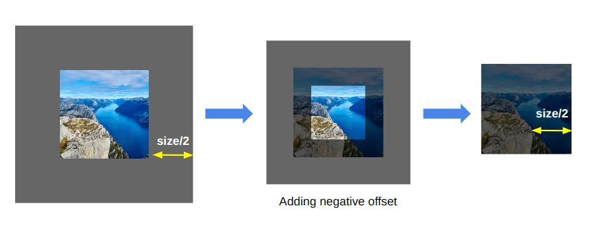
The rest is what happens on :hover. We update the outline and the transition between both outlines creates the cool hover effect. The same technique can also be used to create a fading effect where we don’t move the outline but make it transparent.
Instead of using half the image size in this one, I am using a very big outline thickness value (100vmax) while applying a CSS mask. With this, there’s no longer a need to know the image size — it trick works at all sizes!
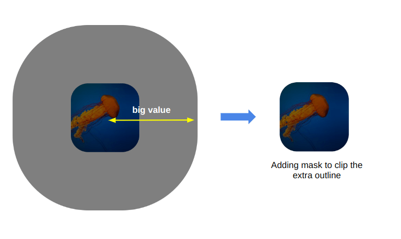
You may face issues using 100vmax as a big value in Safari. If it’s the case, consider the previous trick where you replace the 100vmax with half the image size.
We can take things even further! For example, instead of simply clipping the extra outline, we can create shapes and apply a fancy reveal animation.
Cool right? The outline is what creates the yellow overlay. The clip-path clips the extra outline to get the star shape. Then, on hover, we make the color transparent.
Oh, you want hearts instead? We can certainly do that!
Imagine all the possible combinations we can create. All we have to do is to draw a shape with a CSS mask and/or clip-path and combine it with the outline trick. One solution, infinite possibilities!
And, yes, we can definitely animate this as well. Let’s not forget that clip-path is animatable and mask relies on gradients — something we covered in super great detail in the first two articles of this series.
I know, the animation is a bit glitchy. This is more of a demo to illustrate the idea rather than the “final product” to be used in a production site. We’d wanna optimize things for a more natural transition.
Here is a demo that uses mask instead. It’s the one I teased you with at the end of the last article:
Did you know that the outline property was capable of so much awesomeness? Add it to your toolbox for fancy image decorations!
Combine all the things!
Now that we have learned many tricks using gradients, masks, clipping, and outline, it’s time for the grand finale. Let’s cap off this series by combine all that we have learned the past few weeks to showcase not only the techniques, but demonstrate just how flexible and modular these approaches are.
If you were seeing these demos for the first time, you might assume that there’s a bunch of extra divs wrappers and pseudo-elements being used to pull them off. But everything is happening directly on the <img> element. It’s the only selector we need to get these advanced shapes and effects!
Wrapping up
Well, geez, thanks for hanging out with me in this three-part series the past few weeks. We explored a slew of different techniques that turn simple images into something eye-catching and interactive. Will you use everything we covered? Certainly not! But my hope is that this has been a good exercise for you to dig into advanced uses of CSS features, like gradients, mask, clip-path, and outline.
And we did everything with just one <img> element! No extra div wrappers and pseudo-elements. Sure, it’s a constraint we put on ourselves, but it also pushed us to explore CSS and try to find innovative solutions to common use cases. So, before pumping extra markup into your HTML, think about whether CSS is already capable of handling the task.
