We rely on CSS Media Queries for selecting and styling elements based on a targeted condition. That condition can be all kinds of things but typically fall into two camps: (1) the type of media that’s being used, and (2) a specific feature of the browser, device, or even the user’s environment.
So, say we want to apply certain CSS styling to a printed document:
@media print { .element { /* Style away! */ }
}
The fact that we can apply styles at a certain viewport width has made CSS Media Queries a core ingredient of responsive web design since Ethan Marcotte coined the term. If the browser’s viewport width is a certain size, then apply a set of style rules, which allows us to design elements that respond to the size of the browser.
/* When the viewport width is at least 30em... */
@media screen and (min-width: 30em) { .element { /* Style away! */ }
}
Notice the and in there? That’s an operator that allows us to combine statements. In that example, we combined a condition that the media type is a screen and that it’s min-width feature is set to 30em (or above). We can do the same thing to target a range of viewport sizes:
/* When the viewport width is between 30em - 80em */
@media screen and (min-width: 30em) and (max-width: 80em) { .element { /* Style away! */ }
}
Now those styles apply to an explicit range of viewport widths rather than a single width!
But the Media Queries Level 4 specification has introduced a new syntax for targeting a range of viewport widths using common mathematical comparison operators — things like <, >, and = — that make more sense syntactically while writing less code.
Let’s dig into how that works.
New comparison operators
Table of Contents
That last example is a good illustration of how we’ve sort of “faked” ranges by combining conditions using the and operator. The big change in the Media Queries Level 4 specification is that we have new operators that compare values rather than combining them:
<evaluates if a value is less than another value>evaluates if a value is greater than another value=evaluates if a value is equal to another value<=evaluates if a value is less than or equal to another value>=evaluates if a value is greater than or equal to another value
Here’s how we might’ve written a media query that applies styles if the browser is 600px wide or greater:
@media (min-width: 600px) { .element { /* Style away! */ }
}
Here’s how it looks to write the same thing using a comparison operator:
@media (width >= 600px) { .element { /* Style away! */ }
}
Targeting a range of viewport widths
Often when we write CSS Media Queries, we’re creating what’s called a breakpoint — a condition where the design “breaks” and a set of styles are applied to fix it. A design can have a bunch of breakpoints! And they’re usually based on the viewport being between two widths: where the breakpoint starts and where the breakpoint ends.
Here’s how we’ve done that using the and operator to combine the two breakpoint values:
/* When the browser is between 400px - 1000px */
@media (min-width: 400px) and (max-width: 1000px) { /* etc. */
}
You start to get a good sense of how much shorter and easier it is to write a media query when we ditch the Boolean and operator in favor of the new range comparison syntax:
@media (400px <= width <= 1000px) { /* etc. */
}
Much easier, right? And it’s clear exactly what this media query is doing.
Browser support
This improved media query syntax is still in its early days at the time of this writing and not as widely supported at the moment as the approach that combines min-width and max-width. We’re getting close, though! Safari is the only major holdout at this point, but there is an open ticket for it that you can follow.
Desktop
| Chrome | Firefox | IE | Edge | Safari |
|---|---|---|---|---|
| 104 | 63 | No | 104 | No |
Mobile / Tablet
| Android Chrome | Android Firefox | Android | iOS Safari |
|---|---|---|---|
| 107 | 106 | 107 | No |
Let’s look at an example
Here’s a layout for that’s nicely suited for larger screens, like a desktop:

This layout has base styles that are common to all breakpoints. But as the screen gets narrower, we start to apply styles that are conditionally applied at different smaller breakpoints that are ideally suited for tablets all the way down to mobile phones:

To see what’s happening, here’s a how the layout responds between the two smaller breakpoints. The hidden nav list getting displayed as well as title in the main gets increased in font-size.
That change is triggered when the viewport’s changes go from matching one media’s conditions to another:
/* Base styles (any screen size) */
header { display: flex; justify-content: center;
} header ul { display: none;
} .title p { font-size: 3.75rem;
} /* When the media type is a screen with a width greater or equal to 768px */
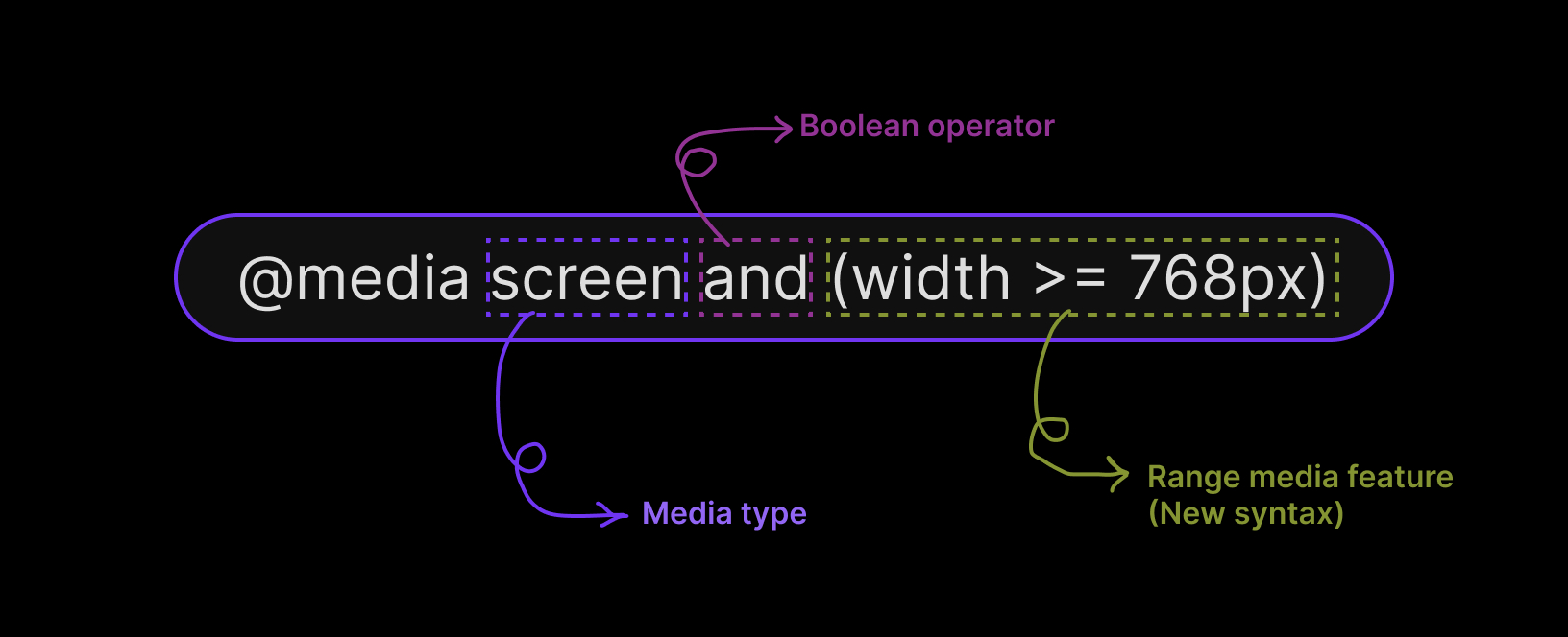
@media screen and (width >= 768px) { header { justify-content: space-between; } header ul { display: flex; justify-content: space-between; gap: 3rem; } .title p { font-size: 5.75rem; }
}
We’ve combined a few of the concepts we’ve covered! We’re targeting devices with a screen media type, evaluating whether the viewport width is greater than or equal to a specific value using the new media feature range syntax, and combining the two conditions with the and operator.
OK, so that’s great for mobile devices below 768px and for other devices equal to or greater than 768px. But what about that desktop layout… how do we get there?
As far as the layout goes:
- The
mainelement becomes a 12-column grid. - A button is displayed on the image.
- The size of the
.titleelement’s font increases and overlaps the image.
Assuming we’ve done our homework and determined exactly where those changes should take place, we can apply those styles when the viewport matches the width condition for that breakpoint. We’re going to say that breakpoint is at 1000px:
/* When the media type is a screen with a width greater or equal to 1000px */
@media screen and (width >= 1000px) { /* Becomes a 12-column grid */ main { display: grid; grid-template-columns: repeat(12, 1fr); grid-template-rows: auto 250px; } /* Places the .title on the grid */ .title { grid-row: 1; } /* Bumps up the font-size */ .title p { font-size: 7.75rem; } /* Places .images on the grid */ .images { grid-row: 1 / span 2; align-self: end; position: relative; } /* Displays the button */ .images .button { display: block; position: absolute; inset-block-end: 5rem; inset-inline-end: -1rem; }
}
Have a play with it:
Why the new syntax is easier to understand
The bottom line: it’s easier to distinguish a comparison operator (e.g. width >= 320px) than it is to tell the difference between min-width and max-width using the and operator. By removing the nuance between min- and max-, we have one single width parameter to work with and the operators tell us the rest.
Beyond the visual differences of those syntaxes, they are also doing slightly different things. Using min- and max- is equivalent to using mathematical comparison operators:
max-widthis equivalent to the<=operator (e.g.(max-width: 320px)is the same as(width <= 320px)).min-widthis equivalent to the>=operator (e.g.(min-width: 320px)is the same as(width >= 320px)).
Notice that neither is the equivalent of the > or < operators.
Let’s pull an example straight from the Media Queries Level 4 specification where we define different styles based on a breakpoint at 320px in the viewport width using min-width and max-width:
@media (max-width: 320px) { /* styles for viewports <= 320px */ }
@media (min-width: 320px) { /* styles for viewports >= 320px */ }
Both media queries match a condition when the viewport width is equal to 320px. That’s not exactly what we want. We want either one of those conditions rather than both at the same time. To avoid that implicit changes, we might add a pixel to the query based on min-width:
@media (max-width: 320px){ /* styles for viewports <= 320px */ }
@media (min-width: 321px){ /* styles for viewports >= 321px */ }
While this ensures that the two sets of styles don’t apply simultaneously when the viewport width is 320px, any viewport width that fall between 320px and 321px will result in a super small zone where none of the styles in either query are applied — a weird “flash of unstyled content” situation.
One solution is to increase the second comparison scale value (numbers after the decimal point) to 320.01px:
@media (max-width: 320px) { /* styles for viewports <= 320px */ }
@media (min-width: 320.01px) { /* styles for viewports >= 320.01px */ }
But that’s getting silly and overly complicated. That’s why the new media feature range syntax is a more appropriate approach:
@media (width <= 320px) { /* styles for viewports <= 320px */ }
@media (width > 320px) { /* styles for viewports > 320px */ }
Wrapping up
Phew, we covered a lot of ground on the new syntax for targeting viewport width ranges in CSS Media Queries. Now that the Media Queries Level 4 specification has introduced the syntax and it’s been adopted in Firefox and Chromium browsers, we’re getting close to being able to use the new comparison operators and combining them with other range media features besides width, like height and aspect-ratio
And that’s just one of the newer features that the Level 4 specification introduced, alongside a bunch of queries we can make based on user preferences. It doesn’t end there! Check out the Complete Guide to CSS Media Queries for a sneak peek of what might be included in Media Queries Level 5.


