Today, we’re going to introduce to you different transitions and effects that can be achieved using CSS alone. Let’s get going!
Resources You Will Need to Complete This Tutorial:
Table of Contents
- Images (You can download free images here or you can use your own).
- Viga Font (Google Font).

Your Designer Toolbox
Unlimited Downloads: 500,000+ Web Templates, Icon Sets, Themes & Design Assets

DOWNLOAD NOW![]()
Shape
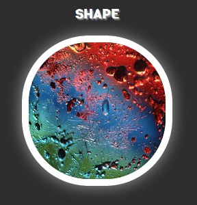
For the shape, I’m going to show you how to morph an image shape from a square (with radius) to a circle. We added the transition value of all 1s ease to animate this.
This means that while hovering over the image, it will transform the shape to circle smoothly within a 1-second duration. We will, then, give it a radius of 50% to create a perfect circle when transformed.
The Markup
All of the HTML markup will have an image wrap with a class of the effect along with the class img. On this part, we’re going to add the class morph (for the morphing effect) along with a class of img for the styling of our images.
</pre>
<div class="morph img"><img alt="" src="img/image1.jpg" /></div>
<pre>
The CSS
For this part of our CSS, we will give our images a dimension of 200px x 200px and a white border with a 10px thickness. Let’s also put a radius of 15px to have smooth edges.
We’ll hide the overflow for our effects. For the mouse-over state, we’ll set the cursor to pointer to emphasize that we’re hovering on the element.
.img { width: 200px; height: 200px; border: 10px solid #fff; -webkit-border-radius: 15px; border-radius: 15px; overflow: hidden;
} .img:hover { cursor: pointer;
}
Now, for the morphing effect, we’ll use the CSS3 transitions for the animation. For this class, we will specify first the browser specific properties (-webkit, -moz, -ms, -o) and set the value to all 1s ease. This value will do the process of changing the style of the image from the normal state to the mouse-over state at a 1-second duration.
To give you a clear idea how the CSS transition properties work, check out the syntax below.
transition: [transition-property] [transition-duration] [transition-timing-function];
- [transition-property] is used to specify the specific styles or properties you want to select or use, such as background, width etc. In our CSS, we use all to refer to all properties. Both background and padding will transition.
- [transition-duration] refers to the speed of the animation or transition. In our example, we use 1s. This means that the animation will happen within 1 second. Please take note that if the duration is not set, the transition will have no effect.
- [transition-timing-function] will determine how the speed during a transition will be calculated. The default transition [transition-timing-function] is ease, which means the transition effect will start slowly, then fast, then end slowly. You can check here to learn more about the [transition-timing-function].
Next we added the styles of the mouse-over state. We added the white border with 10px size and a border radius of 50%, giving us a perfect circle shape when the hover state occurs. We also added box shadows to add a glow effect.
.morph { -webkit-transition: all 1s ease; -moz-transition: all 1s ease; -ms-transition: all 1s ease; -o-transition: all 1s ease; transition: all 1s ease;
} .morph:hover { border: 10px solid #fff; border-radius: 50%; -webkit-box-shadow: 0 0 40px rgba(255,255,255,.6), inset 0 0 40px rgba(255,255,255,1); -moz-box-shadow: 0 0 40px rgba(255,255,255,.6), inset 0 0 40px rgba(255,255,255,1); box-shadow: 0 0 40px rgba(255,255,255,.6), inset 0 0 40px rgba(255,255,255,1); }
Displacement
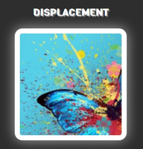
For the displacement, we are going to do a zoom effect. We will pull the image close to the borders when hovered and hide the overflows of the box content.
The Markup
Our HTML markup is the same as the morphing effect but this time we’re going to add the class zoom (for the zooming effect) along with a class of img for the styling of our images.
</pre>
<div class="zoom img"><img alt="" src="img/image2.jpg" /></div>
<pre>
The CSS
In our zooming effect, we will specify a base width and height of 200px x 200px. We will again implement the transition effects but for this, we’ll give it a 2-second generation to put a little drama on its mouse-over state. For its mouse-over state, we will just add 100px on the regular width and height, creating a zooming illusion.
If you go back to our image CSS, we hide the overflow. This will retain the image inside our border. Also, we will add the box shadows style for our glow effect.
.zoom img { width: 200px; height: 200px; -webkit-transition: all 2s ease; -moz-transition: all 2s ease; -ms-transition: all 2s ease; -o-transition: all 2s ease; transition: all 2s ease;
} .zoom img:hover { width: 300px; height: 300px; -webkit-box-shadow: 0 0 40px rgba(255,255,255,.6), inset 0 0 40px rgba(255,255,255,1); -moz-box-shadow: 0 0 40px rgba(255,255,255,.6), inset 0 0 40px rgba(255,255,255,1); box-shadow: 0 0 40px rgba(255,255,255,.6), inset 0 0 40px rgba(255,255,255,1);
}
Position
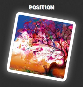
For the position, we are going to tilt the image. This will vary on the degrees and duration based on your preference. Take note that you change the duration by changing the value of 0.3s (which means 0.3 seconds).
Meanwhile, you can also declare how many degrees you would like the image to tilt under the transform element. Transform is an effect that lets an element change shape, size and position. You can manipulate the element by changing the value of rotate(10deg) (which means 10 degrees).
The Markup
We still have the same HTML markup for the tilt effect but this time, we just put the tilt class instead along with our img class.
</pre>
<div class="tilt img"><img alt="" src="img/image3.jpg" /></div>
<pre>
The CSS
Now, for our CSS, we will again add our transition effects, starting with browser specific properties. But this time, we don’t want this to move so slow so we will give it a duration of 0.3 milliseconds.
Next for the mouse-over state, we will use the transform property. This property allows you to rotate, scale, move, skew the elements.
Afterwards, we will add a value of rotate to 10 degrees. So upon the hover state, it will rotate or change its position 10 degrees from the normal state. And finally, we will add the box shadow styles to obtain the glow effect.
.tilt { -webkit-transition: all 0.3s ease; -moz-transition: all 0.3s ease; -o-transition: all 0.3s ease; -ms-transition: all 0.3s ease; transition: all 0.3s ease;
} .tilt:hover { -webkit-transform: rotate(10deg); -moz-transform: rotate(10deg); -ms-transform: rotate(10deg); -o-transform: rotate(10deg); transform: rotate(10deg); -webkit-box-shadow: 0 0 40px rgba(255,255,255,.6), inset 0 0 40px rgba(255,255,255,1); -moz-box-shadow: 0 0 40px rgba(255,255,255,.6), inset 0 0 40px rgba(255,255,255,1); box-shadow: 0 0 40px rgba(255,255,255,.6), inset 0 0 40px rgba(255,255,255,1);
}
Color
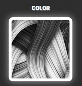
For the color, we’re going to drop all the saturation by creating a grayscale effect using webkit filter when hovered.
The web filter effect is a graphical operation that is applied to an element as it is drawn into the document. It’s just like having Photoshop-like effects where you can change the color or drop its color.
Then, we set the value of the transition to all 1s ease to have a smooth effect and when hovered, we can see a grayscale image or element.
The Markup
Again, we will repeat our HTML markup but this time we’ll put color class instead, along with our img class.
</pre>
<div class="color img"><img alt="" src="img/image4.jpg" /></div>
<pre>
The CSS
We’ll again repeat the process for our transition effect. We’ll set it to 1 second and timing function of ease.
For our mouse-over state, we’ll use the webkit-filter property and then drop the color by using the grayscale property. And lastly, we’ll add the box shadows to gain the glowing effect.
.color { -webkit-transition: all 1s ease; -moz-transition: all 1s ease; -o-transition: all 1s ease; -ms-transition: all 1s ease; transition: all 1s ease;
} .color:hover { -webkit-filter: grayscale(100%); -webkit-box-shadow: 0 0 40px rgba(255,255,255,.6), inset 0 0 40px rgba(255,255,255,1); -moz-box-shadow: 0 0 40px rgba(255,255,255,.6), inset 0 0 40px rgba(255,255,255,1); box-shadow: 0 0 40px rgba(255,255,255,.6), inset 0 0 40px rgba(255,255,255,1); }
Tip: You can also blur, apply sepia, invert, saturate color or manipulate the brightness of the image or element when hovered using the blur or brightness suffix. Just add the value inside the parenthesis.
Blur
-webkit-filter: blur(3px);
Sepia
-webkit-filter: sepia(100%);
Sepia
-webkit-filter: sepia(5%);
Invert
-webkit-filter: invert(0.2);
Saturate
-webkit-filter: saturate(50%);
Final Words
CSS3 transitions are effects that let an element gradually change from one style to another. These are very helpful if you’re not that good at programming and want to create a simple smooth effect. I suggest you explore all of the other transition styles and effects that you can use to do more advanced effects.
On this tutorial, you learned the basics on how to apply these effects (transitions, web filter, web transform) on a real world example. Hope you enjoy the tutorial and I’ll see you next time! Cheers!
This post may contain affiliate links. See our disclosure about affiliate links here.


