When you put something — say a regular sheet of paper — in a manilla folder, a part of that thing might peek out of the folder a little bit. The same sort of thing with a wallet and credit cards. The cards poke out just a smidge so you can get a quick glance of which cards you’re carrying.
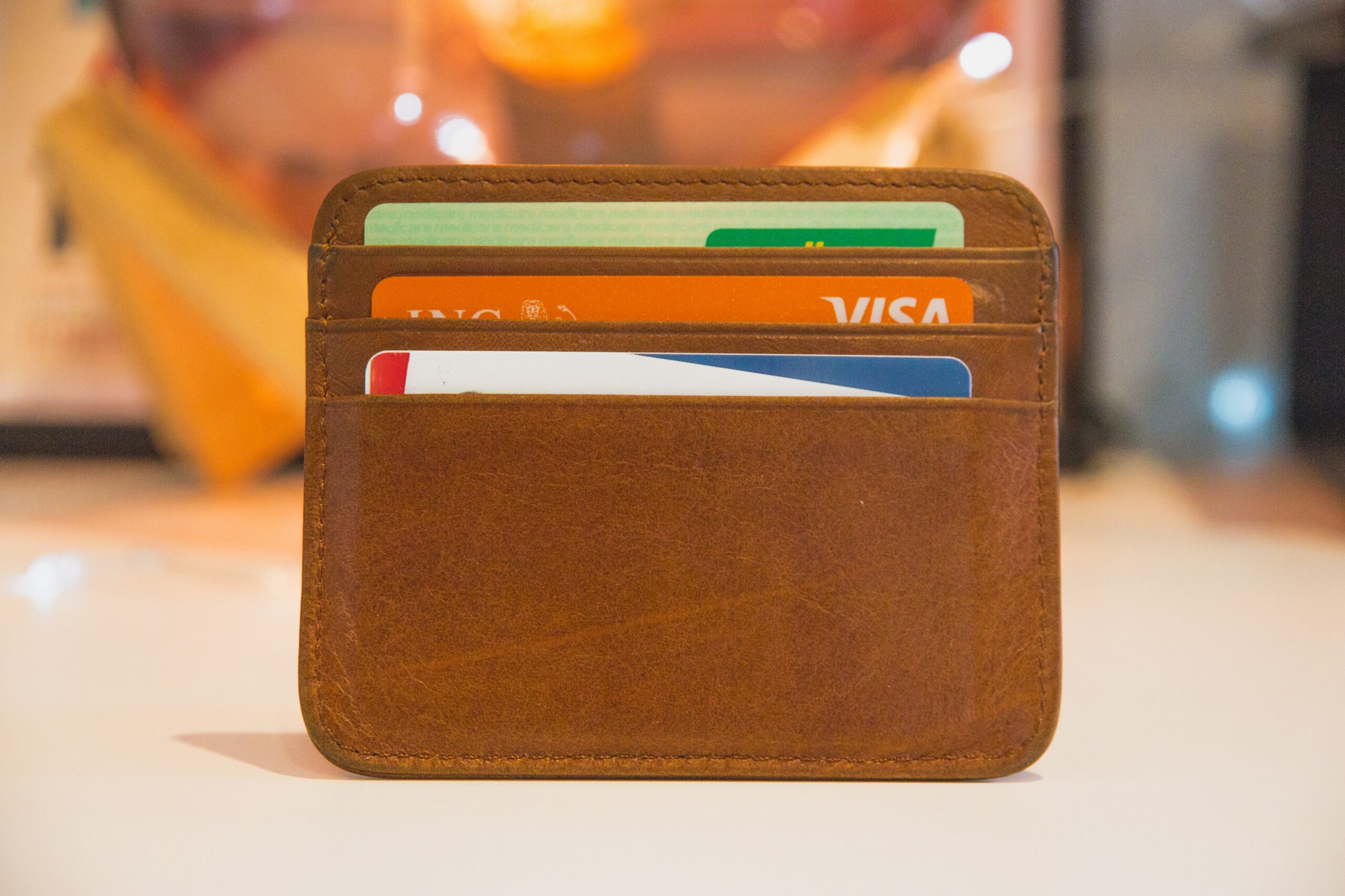
I call this sort of thing a “slit”. A slit is where we create the illusion of an opening through which we can tease a visual element peeking out of it. And we can do that in CSS!
The crucial part of the design is the shadow, which is what gives the visual cue of there being a slit. Then there’s the cover for the slit which provides the space for the exhibited element to peek through from under.
Here’s what we’re going to make together:
Let’s begin with creating the shadow
You might be surprised that the shadow in the example is not created with an actual CSS shadow, like box-shadow or a drop-shadow() filter. Instead, the shadow is a separate element in itself, dark and blurred out. This is important in order to make the design more adaptable, both in its default and animated states.
The cover is the other element in the design. The cover is what I call the element that overlaps the shadow. Here’s a figure depicting how the shadow and cover come together.
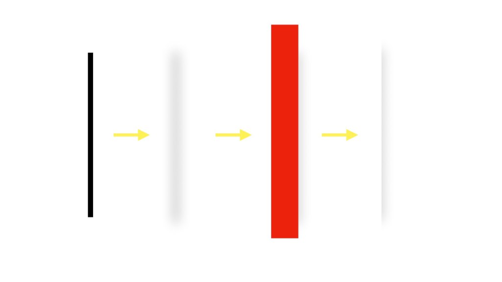
The shadow is made from a small upright rectangle that has a gradient background. The gradient is darker in the middle. So when the element is blurred, it creates a shadow that’s darker in the middle; hence more dimensional.
Now, the left half of the recreated shadow is covered with a rectangle on top, colored exactly the same as the background of its container.
Both the cover and the shadow are then moved to the left ever so slightly so it appears to be layered
Working on the cover
For the cover to blend with the design’s background, its background color is inherited from its containing element. Alternatively, you can also try to blend the cover to its background using standards like CSS masks and blend modes, depending on your design choices and requirements.
To learn some basics on how these standards might be applied, you can refer to these articles: Sarah Drasner’s “Masking vs. Clipping: When to Use Each” provides an excellent primer on masks. I’ve also written about CSS blend modes in this article where you can brush up on the topic.
In the source code of my example, you’ll notice that I aligned and stacked the elements inside the <main> element using CSS Grid, which is a layout standard I often use in my demos. If you’re recreating a similar design, use a layout method that fits the best for your application to align the different parts of the design. In this case, I’ve set up a single-column grid on the <main> element which allows me to center align the cover, shadow, and image.
What CSS Grid also allows me to do is set all three of those divs so they are all full-width in the <main> container:
main > div { grid-area: 1 / 1;
}
This gets everything to stack on top of one another. Normally, we work hard to avoid covering elements with other elements in a grid. But this example relies on it. I’ve given the .slit-cover at width of 50% which naturally reveals the image underneath it. From there, I set a transform on it that moves it 50% in the negative direction, plus the small amount I shifted the shadow earlier (25px) to make sure that is revealed as well.
.slit-cover { width: 50%; transform: translatex(calc(-50% - 25px)); /* etc. */
}
And there we have it! A pretty natural-looking slit that mimics something peeking out of a folder, wallet, or whatever.
There are more ways to do this! For one, Flexbox can get elements to line up in a row and align in the center like this. There are lots of ways to get things side-by-side. And maybe you have a way to use the box-shadow property, drop-shadow() filter, or even SVG filters to get the same sort of shadow effect that really sells the illusion.
And you can totally riff on this to get your own look and feel. For example, try swapping the position of the shadow and image. Or play with the color combinations and change the blur() filter value. The shape of the cover and the shadow can also be tweaked — I bet you can create a curved shadow instead of a straight one and share it with us in the comments!