In this excerpt from Unleashing the Power of CSS, we we explore the exciting new possibilities offered by container queries.
Container queries enable the styling of elements based on available space. They allow us to build resilient components that are adaptable across infinite, unknown layout arrangements. This is in contrast to viewport media queries, which require style changes to be orchestrated at the page level.
We’re most likely familiar with responsive design and layouts that respond to the viewport, like the one pictured below.
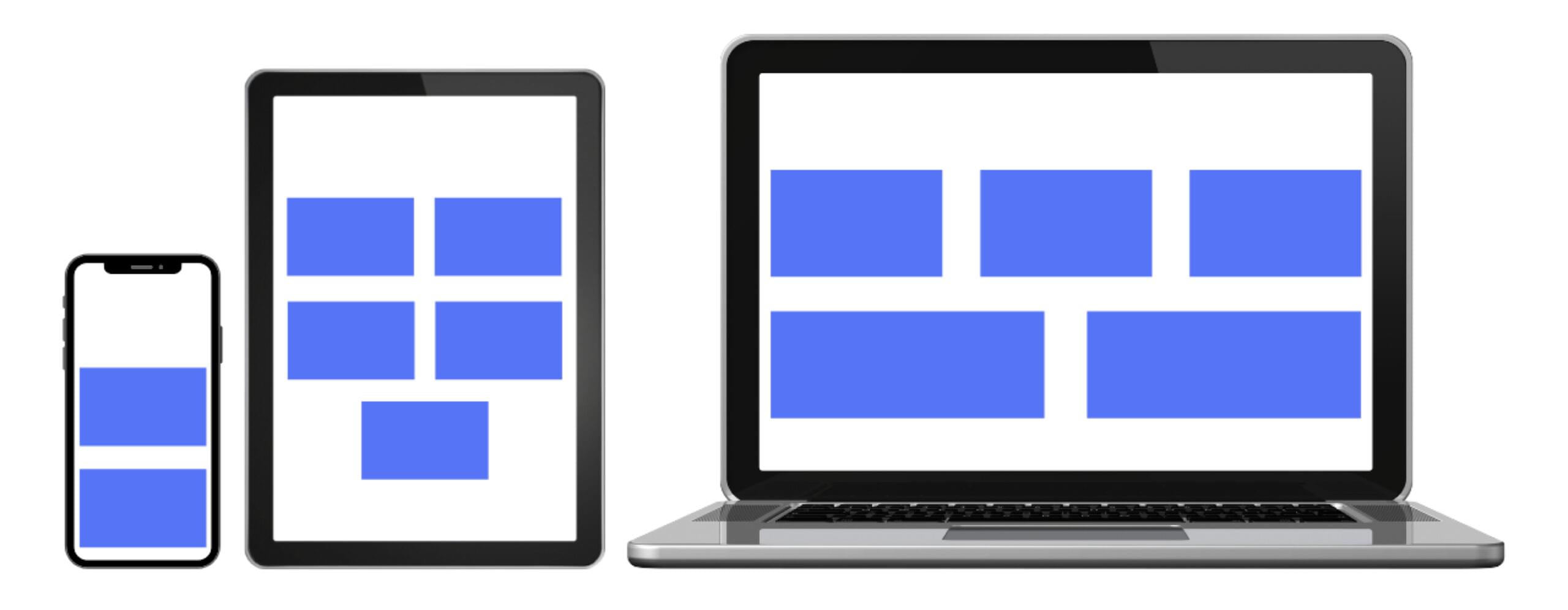
In viewport responsive design, it’s popular to couple a layout grid to breakpoints. Those breakpoints usually relate to simplified device sizes, as pictured above, such as mobile, tablet and desktop.
Importantly, these breakpoints don’t necessarily consider individual elements and components on the screen, focusing more on how components flow into the predefined grid. Sometimes larger components like navigation will morph separately from the grid, but typically they’ll use the global breakpoints.
Let’s contrast viewport responsive design with container responsive design.
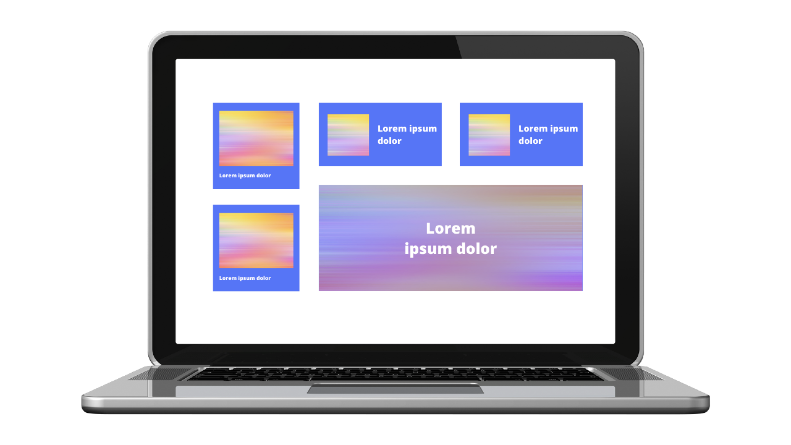
Pictured below are variations of a card component. These three variations are rendered using container queries, which are completely independent of the viewport. The card styles are adjusted based on available space.
Note: container queries are supported in all evergreen browsers as of the release of Firefox 110. To extend support for older browsers, a polyfill is available.
First, let’s learn the syntax for creating container queries.
Defining Container Queries
The first step is to designate that an element is a container by using the container-type property. The most fundamental and currently best-supported value is inline-size, which in a horizontal writing mode equates to the element’s width. So this definition means that we intend to support a query based on the .container element’s inline size:
.container { container-type: inline-size;
}
Adding a container-type to an element officially designates it as a container.
Next, we’ll create the actual container query using the container at-rule, which accepts a parameter that will look familiar if we’ve ever assigned media queries.
The following @container rule says that, when an <h2> is within a container that’s 40ch wide or greater, its color should be blue:
@container (min-width: 40ch) { h2 { color: blue; }
}
Note: the rules we place within a container query won’t affect the styling of the container itself, but only its children. This means we can’t style a container from within its own query. But we can style a container with a container query if that container has an ancestor that’s also defined as a container.
To accommodate more than horizontal writing modes, we can update our query to use the logical syntax of inline-size, rather than base the query strictly on the “width” of a container:
@container (inline-size > 40ch) { h2 { color: blue; }
}
There are more options that just inline-size, including block-size and aspect-ratio. To learn more about the available size container queries and how to use them, check out the official spec.
Upgrading a Card Component
If we wanted to build a card component without container queries, we could create variations by way of modifier classes. And for variations of the card size, those modifiers could be tied to breakpoints. That means that, if the card had the modifier, it would be allowed to change when the viewport width fell within that breakpoint.
The following image shows three card size variations and their respective modifier classes, where the top .card would be considered the “default”.
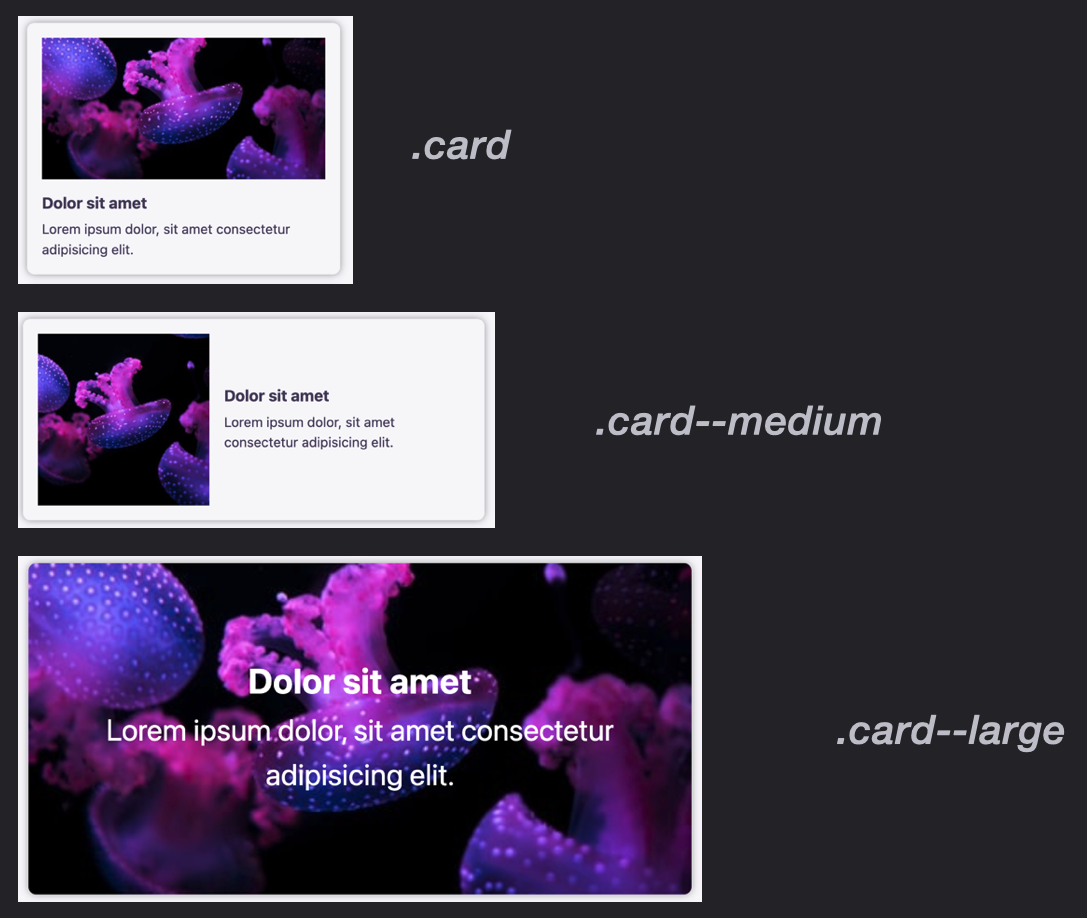
Here’s a live CodePen demo of the viewport-responsive cards pictured above. (Resize the viewport to see the various styles kick in.)
See the Pen Viewport Media Query Cards by SitePoint (@SitePoint)
on CodePen.
Let’s now switch our perspective and think how we would handle these card variations using container queries.
We’ll still make the top card the default, which really means it will apply at the narrowest widths. This will also be the fallback version where container queries aren’t supported — an important scenario to consider until container queries have reached support maturity.
We’ll set layout for the middle-sized card (with the horizontal orientation) to activate when the container has a width of 350px or greater.
Finally, we’ll set the card layout to use its image as the background when the container has a width of 600px or greater.
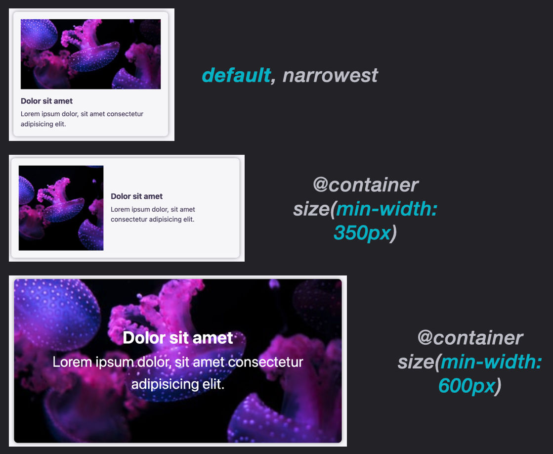
This creates a card element that’s adaptable based on the size of the card containers. Play around with the following CodePen demo to see this in action. (Note the “Resize me!” handle in the bottom right corner.)
See the Pen Container Queries for Cards by SitePoint (@SitePoint)
on CodePen.
This article is excerpted from Unleashing the Power of CSS: Advanced Techniques for Responsive User Interfaces, available on SitePoint Premium.


