Learn how to make a website responsive in this quick CSS and HTML5 tutorial. Both video and text versions are available.
- Tutorial Level: Beginner
- Skills Required: Basic knowledge in HTML5 and CSS
- Completion Time: Approximately 15 minutes
- Warning: This responsive HTML and CSS tutorial is targeted towards beginners, but it can also be for designers and developers who want to have fun!
Your Designer Toolbox
Unlimited Downloads: 500,000+ Web Templates, Icon Sets, Themes & Design Assets
Table of Contents
- 1 Your Designer ToolboxUnlimited Downloads: 500,000+ Web Templates, Icon Sets, Themes & Design Assets
- 2 How To Make A Website Responsive (Text Version) – Preparation
- 3 What is Responsive Web Design?
- 4 Our Goal
- 5 Step 1: Understanding the Foundation
- 6 Step 2: Laying Out the Foundation
- 7 Step 3: Adding Content To Web Design
- 8 Step 4: There is no Step 4
- 9 How To Make a Website Responsive Video Tutorial

DOWNLOAD NOW![]()
How To Make A Website Responsive (Text Version) – Preparation
We promised that it will only take about 15 minutes to build a responsive website, and we will hold true to our word. We’ll start by creating a simple single-page website.
What is Responsive Web Design?
If you are fairly new to the term, then we have the perfect reading materials for you!
Our Goal

This is our goal.
By the end of this responsive CSS tutorial you will end up with something similar to the page above. It is a very plain design, but it will do the trick for now. It is fairly easy to clone the image as seen above, but the main goal here is to make it responsive. To make the website respond based on the size of your device’s screen size.
Try opening the demo on your smartphone and you will see this:

This is what Foundation can do along with several other frameworks that focus on making websites responsive for mobile devices.
Before moving on, download the Foundation Web Framework and unzip it to a folder where all of your files for this tutorial will be located. It should look like this:

Open index.html and see several elements blasted in one page as a demo. We won’t use everything you will see in it, but you can learn a lot from it. Now, delete it or move it somewhere else so that we can start from scratch.
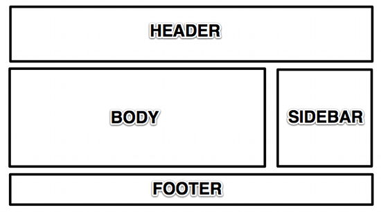
Our goal is to create a website which has the basic areas of a website: header, body, sidebar, and footer. Of course, everything will be responsive, from images down to text and elements placement.

Step 1: Understanding the Foundation
Okay, it is already given that we will use the structure above, but how will we translate that to HTML? Easy!
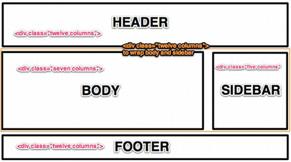
First, you need to understand a few things about Foundation and how creating layouts works. It uses 12 columns to define the width of each “section”, which is derived from foundation.css‘ width of 1000px. So, if we write:
<div class="row">
<div class="twelve columns"></div>
</div>
The above code would mean that in this certain row, you will occupy twelve columns with the width of 1000px. While on the code below:
<div class="row">
<div class="twelve columns">
<div class="six columns"></div>
<div class="six columns"></div>
</div>
</div>
We placed two “six columns” inside of “twelve columns”, this would mean that “six columns” will occupy 50% of the width of “twelve columns”. The same is true for other number of columns:
<div class="row">
<div class="twelve columns">
<div class="row">
<div class="seven columns">
<div class="row">
<div class="twelve columns"></div>
</div>
</div>
<div class="five columns"></div>
</div>
</div>
For “seven columns” we placed another row inside which occupies “twelve columns”. This means that the “twelve columns” will take the maximum width of “seven columns” and divide it into “twelve columns”. It’s a nest of rows and columns, which is important for our goal layout. Now that rows and columns, and nested columns, have been explained, let’s move on to the main show.
Step 2: Laying Out the Foundation

Using your favorite text editor, create a file named index.html then add the following at the very beginning of the file:
<!-- paulirish.com/2008/conditional-stylesheets-vs-css-hacks-answer-neither/ -->
<!--[if lt IE 7]> <html class="no-js lt-ie9 lt-ie8 lt-ie7" lang="en"> <![endif]-->
<!--[if IE 7]> <html class="no-js lt-ie9 lt-ie8" lang="en"> <![endif]-->
<!--[if IE 8]> <html class="no-js lt-ie9" lang="en"> <![endif]-->
<!--[if gt IE 8]><!--> <!--<![endif]-->
<!-- Set the viewport width to device width for mobile -->
Welcome to Foundation
<!-- Included CSS Files -->
<!--[if lt IE 9]>
<link rel="stylesheet" href="stylesheets/ie.css">
<![endif]--><script type="text/javascript" src="javascripts/modernizr.foundation.js"></script>
<!-- IE Fix for HTML5 Tags -->
<!--[if lt IE 9]>
<script src="http://html5shiv.googlecode.com/svn/trunk/html5.js"></script>
<![endif]-->
The above code is where we deal with the evil of Internet Explorer. It is also where we call on to different stylesheets which are necessary to make the whole thing responsive and run on mobile devices. It comes with Foundation. Then type the following code:
<div class="row">
<div class="twelve columns">
<h2>Header Twelve Columns</h2>
</div>
</div>
<div class="row">
<div class="twelve columns">
<div class="row">
<div class="seven columns">
<h2>Body Seven Columns</h2>
</div>
<div class="five columns">
<h2>Sidebar Five Columns</h2>
</div>
</div>
</div>
</div>
<div class="row">
<div class="twelve columns">
<h2>Footer Twelve Columns</h2>
</div>
</div>
We have already explained what these “rows” and “twelve columns” are above.
Tip: if it’s not clear to you why we should wrap the sidebar and body with “twelve columns” you can try removing it and see what happens!

By now it should look like this.
We haven’t added stylings yet, but you can already see how it jives with our goal. I’m not much of a designer but we will do our best to make this look amazing.
Wait, wait, wait! What’s that navigation bar, you ask? As we have mentioned earlier, this is one of the beauties of Foundation. It has extensive documentation that will teach you how to properly use forms, navigation, buttons, grids, CSS, and other elements covered by Foundation.
Everything is basically done now, all we need to do is add some images and paragraphs and design the whole thing. If you followed this tutorial, then by now you have already created your first responsive web page!
Step 3: Adding Content To Web Design
This step is needed to actually see how the webpage will look in its full glory. Copy some Lorem Ipsum and paste it on your “body” div, then insert images using tag, then you’re on your way to becoming a superstar with this!
If you’ll go back and check the demo, you might notice that the background isn’t exactly white, but with a subtle pattern. Choose one on SubtlePatterns and see for yourself which works best.
Step 4: There is no Step 4
Well, actually there is a step 4. The next thing you need to do is study the files you downloaded and start creating your own responsive web page from scratch.
There are a lot of other tools you can use aside from Foundation, but the idea is basically the same. Don’t forget to check the documentation!
How To Make a Website Responsive Video Tutorial
Now if you were looking for a video and you’re ready to build a responsive web design with HTML5 and CSS3 – you are in the right place. Just download the source files, view the demo, and click play on the video – let’s make a responsive website!
[embedded content]
This post may contain affiliate links. See our disclosure about affiliate links here.


