Once we enter the professional field, we have to think twice before finalizing a decision. Same goes with fonts. The design of a font matters a lot in every format of text. It takes years of experience and plenty of intuition to develop that gut feeling required to analyze a font for a respective situation. We are here to help you learn it faster.
Note: My examples and my text in this discussion might look overly simple, but it has been done with a purpose. The whole idea is to provide you with an explanation using the simplest possible style. (Was this a disclaimer?).
UNLIMITED DOWNLOADS: 400,000+ Fonts & Design Assets
Table of Contents
- 1 UNLIMITED DOWNLOADS: 400,000+ Fonts & Design Assets
- 2 Unlimited Downloads: 500,000+ Fonts, Web Templates, Themes & Design Assets
- 3 Analyze Your End Result
- 4 The White Space
- 5 Don’t Over Experiment
- 6 Headline Fonts Aren’t Meant to be Paragraph Fonts
- 7 The Classic Choices
- 8 Avoid High Contrast
- 9 But, Do get a Little Cheeky
- 10 The Magic Formula to Wrap This Up
- 11 Conclusion
Starting at only $16.50 per month!
DOWNLOAD NOW![]()
Unlimited Downloads: 500,000+ Fonts, Web Templates, Themes & Design Assets
DOWNLOAD NOW![]()
Analyze Your End Result
Isn’t that obvious? You can’t start searching for the best font unless you are sure of the end market for that font. Jot down the kind of viewers that you are expecting. Will the readers of your website be night life lovers or white collar employees? All this depends on the type of content and your niche.

See, it is very easy just to decide on a font and go with it when your readership isn’t huge and you’re just starting out. It is later on that you will understand how much the wrong font selection can effect your site (after you’ve finished this article, there will be no reason for you to make bad font decisions). Once you understand your goals these tips will be more meaningful.
The White Space
Those who smiled after reading “The White Space” know exactly what I mean. A font that does not care about the spacing between two letters can mess it up big time for you. Tightly placed letters can confuse an eye and result in visuals that aren’t actually there. Properly calculated white space helps the eye to run as fast as the mental skills of the reader permits.
Don’t Over Experiment
It will be weird if you opt for a font with uneven shapes and sizes just because they provide the artsy look you want for your text. If you end up with fonts that have artistic deformations, then the reader’s brain will take more time to process the information. Like, the below image I tried to over experiment with fonts and you can see the result. Total confusion!
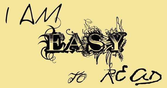
The delay in time might just be enough for the reader to move on to another site. Something that you don’t want, right?
Headline Fonts Aren’t Meant to be Paragraph Fonts
Get it? C’mon! Wasn’t that simple to understand? There are fonts that are designed for a specific purpose. Fonts that are specifically designed for headings. You use them for headings, and the reader will be in awe of your choice of font. But, just because a font looks good as a header or paragraph font, that doesn’t mean the opposite is true.
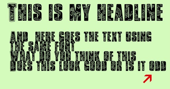
A font designed for headings will never fulfill the purpose when used in paragraphs.
The Classic Choices
Times New Roman might not provide your design with an over-the-top edge, but it also won’t look terrible. These good old fonts have been around for ages, and they have been used over and over whenever designers were confused about the right font.
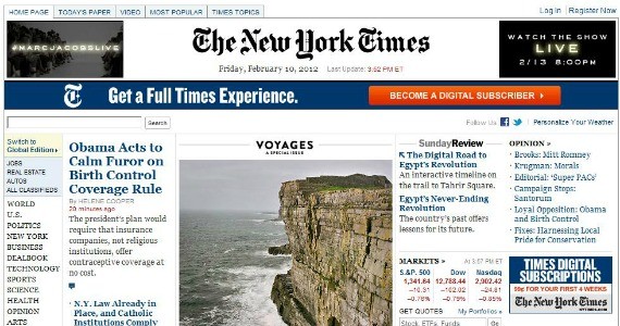
It might not give you the high that you are looking for but sometimes these fonts are just enough (like the font selection in New York Times). Perhaps, they are the high-quality font that will complete your design. You just don’t know yet!
Avoid High Contrast
So, how does contrast apply into the world of fonts? Wasn’t this supposed to be inclined towards the world of photography?
Enough kidding! By contrast, I mean the difference in design of two fonts. It is suggested that you don’t use two completely different fonts on the same page and, moreover, next to each other. Please understand that it is the gradual change which is soothing for the reader’s eye. If you end up confusing the reader’s mind by drastically changing fonts at short intervals, then it might just kill the purpose.
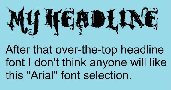
Designers have to choose fonts that merge with their design and not fonts that pop out and kill the design. Make sure you help the reader save time instead of wasting their time while they try to understand what is happening.
But, Do get a Little Cheeky
Some of my above tips might prevent you from getting cheeky, but that does not mean that you are not permitted to experiment. Though you’ve got to stick with the standard decision throughout the design, there can still be those occasional text sections that will stand out and leave your readers wanting more. Experiment!
The Magic Formula to Wrap This Up
I guess we have already done plenty of reading over here so I thought why not merge my traditional conclusion with the last (and the most obvious) tip. See, at the end of the day it will be your choice that will prevail so instead of thinking too much just follow the basic steps that you would follow in any situation (which is nowhere related to fonts):
- Look for familiar fonts and create a list.
- Look out for fonts that you haven’t seen before. You will have to dive into forums, and various typography websites but the research will be worth the time spent.
- Start playing with each font in your result and see which suits your design the most.
- Increase/Decrease the size of font and make them uppercase occasionally. See how they look.
- Choose with your gut feeling.
Remember, if you like it then you will be able to represent it too. But, if you aren’t confident with your choice then you will find 10 critics killing your hard work. Be confident (and vigilant)!
Conclusion
I really hope you have enjoyed this font article as much as we enjoyed creating it! Hopefully the tips on how to choose the perfect font for your next project will help you with the decision.
Some of these modern fonts are certainly free for personal use. For commercial use please check the license that comes with each item. I hope you enjoyed this article and if you want to show appreciation for us making this resource for you – please share it with your friends! If you got any super fonts that you own and would like to share with us, please let us know in comment section.
And to avoid getting caught by the Font Police you should from time to time update your font library!
This post may contain affiliate links. See our disclosure about affiliate links here.

