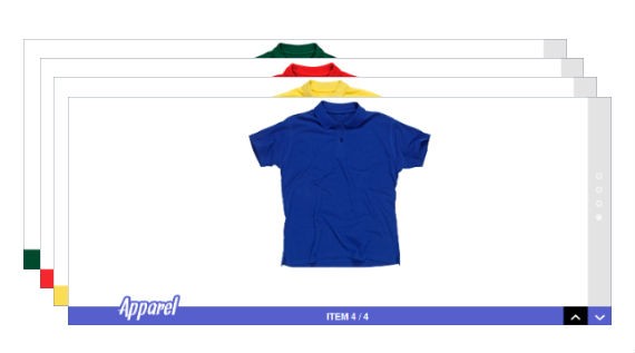
The first method is creating the before and after effect of an image. I am going to create the second method which will change the product’ as we scroll down. Take a quick look at our demo product page to get an idea about the effect we are implementing in this tutorial.
Your Designer Toolbox
Unlimited Downloads: 500,000+ Web Templates, Icon Sets, Themes & Design Assets
Table of Contents

DOWNLOAD NOW![]()
Introduction to CSS Background Attachments
First you need to add a background image to a HTML container. Then background-attachment property defines whether to scroll the image with the content or keep it fixed. You can use either fixed or scroll as the value of the background-attachment property.
Lets say you have 4 containers with fixed background attachments at the same position. In such cases images will stack on top of the next one and the content will aligned vertically like they normally do. Let’s try to understand this concept using graphical view.
.imghide{ background-attachment: fixed; background-color: white; background-position: center 10px; background-repeat: no-repeat; color: #5C5C5C; display: block; font-family: helvetica; font-size: 35px; font-weight: bold; }
In the code above there are 4 elements with fixed background attachments. So the 4 images will stack on top of other like in the screen shown below. I have kept some margins to show you how images are stacked. Actually you will be able to see the top image only.

Now lets take a look at how containers in above example are placed.

As you can see images are fixed in the same position and their containers are stacked up vertically. Since the containers are empty you will see the top image only. This is how we generate the cool effect in the demo.
If you fill the containers with some text you will see how it is placed and value of this effect will go off. We have learned the theory behind this effect. Next section will show you how to design the products page.
Design Product Page
The product page will contain the products in the center of the screen as images. Then we are going to develop two navigation sections for footer and sidebar. Products section contains the main effect of this tutorial. So let’s start designing the product images.
<!DOCTYPE html>
<html> <head> <meta charset="utf-8"> <title>Product Page with jQuery and CSS Background Attachments</title> <link type="text/css" rel="stylesheet" href="css/rhinoslider-1.05.css" /> <script src="jquery-latest.js" ></script> <script src="jquery.scrollTo-1.4.3-min.js" ></script> <style type="text/css"> body { background-color:#fff; margin:0;} *{margin:0; } #slider { /*IE bugfix*/ padding:0; margin:0; } #slider li { list-style:none; } #page { margin:0 auto; } .imghide{ background-attachment: fixed; background-color: white; background-position: center 10px; background-repeat: no-repeat; background-size:460px 400px; color: #5C5C5C; display: block; font-family: helvetica; font-size: 35px; font-weight: bold; height:700px; } .imghide span{ display:none; } p{ margin:1px; } </style> </head> <body> <div id="page"> <ul id="slider"> <li> </li> </ul> </div> </body>
</html>
We have 4 images we used in the previous section. Here I have hard coded the height of the containers as 700px. In the demo this height will be calculated using the height of the browser window since its needed for navigation controls and show the effect properly.
Now you can scroll down the page and you will be able to see the scrolling effect as shown below.

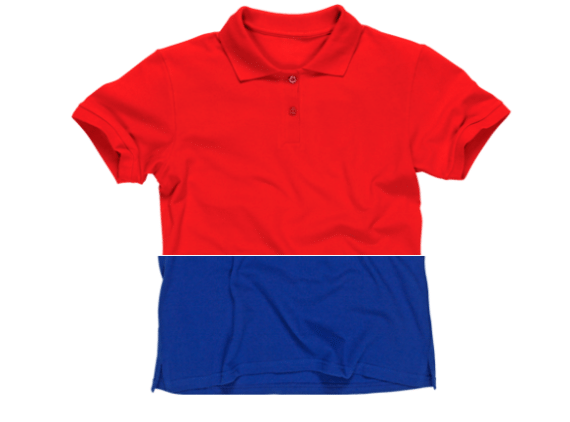
Once you scroll down, the HTML containers goes up. Since the background image of each container is fixed, when the next container reaches the visible area the relative image starts to display. In the above screenshot, the second container has been scrolled up 50% of the window.
So the background image for first image cuts by 50%, and the second image is displayed in next 50%. I think now you should have an idea of how it works. We are going to create navigations in next section.
In the footer navigation area we have a section to display the number (Item 1/4) and section for Next and Previous buttons. Lets take a look at the HTML code before we start implementing navigation functionality.
<div id="floating-footer"> <div id="brand_icon"></div> <span id="item_num">ITEM <span id="active_num" data-active="1">1</span> / <span id="slide_count">4</span></span> <div id="down-arrow"><img src="images/down-arrow.png" /></div> <div id="up-arrow"><img src="images/up-arrow.png" /></div> </div>
Footer is separated into sections according to our functionality. Now let’s move onto the initial part of the functional implementation.
<script type="text/javascript"> var windowHeight; var positions = [0]; var slideCount; var colors = ["#fbdd56","#01492c","#f5272d","#565fcc"]; </script>
- We have to define variables needed for this demo in the top part of the code.
- windowHeight will hold the height of browser window , positions array will hold the scrolling distance before next slide appears , slideCount defines the total slides in the demo and colors will hold the background colors for footer bar in each slide.
Take a look at the initialization code in the following section.
$(document).ready(function() { $("#brand_icon").html("<img src='images/logo-1.png' />"); slideCount = $(".imghide").length; windowHeight = $(window).height(); var bottomMargin = windowHeight-420; positions.push(bottomMargin); for(i=1;i<(slideCount-1);i++){ positions.push(parseInt(bottomMargin)+(parseInt(windowHeight)*parseInt(i))); } $(".imghide").css("height",windowHeight+"px"); $("#floating-footer").css("top",(windowHeight-50)+"px"); $("#floating-sidebar").css("height",(windowHeight-50)+"px"); $("#slide_count").html(slideCount); });
- First line assigns the initial brand logo to the footer bar.
- Then we calculate window height and slide count using jQuery.
- Images used in this demo will be 420px height. So we reduce it from window height to get the margin between image and bottom of window.
- We have to keep an array of positions for slide transition. Initial position will be 0. Then once you start scrolling HTML container has to slide from bottom of the screen until it reaches bottom of the previous image to start displaying next image.
- So the second position will be the value of bottomMargin.
- From second image onwards, images will appear after windowHeight length from the previous image. So we add the images after 2nd one using push function inside the loop.
- Then we have to calculate the height of image containers using window height. We hard coded it in earlier section as 700px.
- Then we set the positions of footer starting 50px from the bottom of the screen and sidebar from 50px from right of the screen.
- Finally we assign the slide count to the footer section.
Develop Previous Next Navigation
In this section I’ll explain how to create previous and next buttons. Clicking the previous button from first slide will navigate you to the last slide and clicking next from last slide will navigate you to first slide. Let’s take a look at the jQuery code.
$("#down-arrow").click(function(){ var activeNumber = $("#active_num").attr("data-active"); if(activeNumber == slideCount){ $("html, body").animate({ scrollTop: "0px" }, { duration: 2000 }); return; } var scrollPosition = 0; if(parseInt(activeNumber)+1 == slideCount){ scrollPosition = (positions[parseInt(activeNumber)]+windowHeight) + "px"; }else{ scrollPosition = (positions[parseInt(activeNumber)+1]) + "px"; } $("html, body").animate({ scrollTop: scrollPosition }, { duration: 2000 });
});
- Once you click on #down arrow activeNumber will be retrieved. Active slide number is stored in the footer area. It changes on slide transition.
- Then we check whether we are on the last slide. If so next button will scroll you to the first slide using scrollTop: “0px”. I have used jQuery animation to provide smooth scrolling effect.
- Positions array hold the starting points of each slide. Once you click next button we want the slide to be displayed completely. So we have to get the starting position of next slide. Example: Get the starting position of slide 3 to display slide 2 completely.
- When the slide before the final one comes up, we don’t have an element in the position array. So we get the scroll position using last element of positions + windowHeight
- Then we animate the window to calculated scroll position using scrollTop attribute
Previous functionality can be implemented similarly. Difference in the code will be using scrollTop: positions[parseInt(slideCount-1)]+parseInt(windowHeight) + “px” instead of “0px”. Also we have to use minus instead of plus in calculating scrollPosition. You can find the code under $(“#up-arrow”).click(function() in the source codes.
Footer navigation allows you to go to the next and previous slides. Now we are going to implement sidebar navigation using circles which will allow you to traverse directly to any slide by clicking the relative circle. Lets consider the code below.
var htmlRings = ''; for(y=0;y<slideCount;y++){ if(y==0){ htmlRings += " <div id='pag-"+(y+1)+"' class='pagination-common pagination-active' data-active='"+(y)+"'></div> "; }else{ htmlRings += " <div id='pag-"+(y+1)+"' class='pagination-common pagination' data-active='"+(y)+"'></div> "; } } $("#pagination-bar").html(htmlRings);
Circles for sidebar will be generated on page load. So I have assigned circles to #pagination-bar in the above section. Important thing to notice is I have used pagination-active class for the first slide. It will display the highlighted circle. Once you navigate pagination-active class will be assigned to the current active slide.
$(".pagination-common").on("click",function(){ var activeNumber = $(this).attr("data-active"); if(activeNumber == slideCount){ $("html, body").animate({ scrollTop: "0px" }, { duration: 2000 }); return; } var scrollPosition = 0; if(parseInt(activeNumber)+1 == slideCount){ scrollPosition = (positions[parseInt(activeNumber)]+windowHeight) + "px"; }else{ scrollPosition = (positions[parseInt(activeNumber)+1]) + "px"; } $("html, body").animate({ scrollTop: scrollPosition }, { duration: 2000 });
});
The above code is executed whenever you click on a circle to navigate. The same code we used for next button is used here.
Now we have implemented both footer and sidebar navigation. We need to implement navigation on scroll as well. So let’s gets started.
$(window).scroll(function () { var scrolltop = $(window).scrollTop(); for(x=(slideCount-1);x>=0;x--){ if(scrolltop > positions[x]){ $("#active_num").html(x+1); $("#active_num").attr("data-active",x+1); $(".pagination-common").removeClass("pagination-active"); $("#pag-"+(x+1)).addClass("pagination-active"); $("#floating-footer").css("background",colors[x]); if(x==0){ $("#brand_icon").html("<img src='images/logo-1.png' />"); } if(x==1){ $("#brand_icon").html("<img src='images/logo-2.png' />"); } if(x==2){ $("#brand_icon").html("<img src='images/logo-3.png' />"); } if(x==3){ $("#brand_icon").html("<img src='images/logo-4.png' />"); } return; } } });
- $(window).scroll function will be executed when ever you scroll the browser window. First we calculate the position of top of the scrolllbar using scrollTop function.
- Then we loop through each slide and check which slide is relative to the current scrolltop position using positions array.
- Once match is found we increase the active number in the footer and remove the active class from the circles navigation.
- Then we add the active class to circle related to new slide and assigns the relative color for the footer.
- Finally we assign the brand logo depending on the active slide.
We have completed implementing the product page with awesome scrolling effect. You can use this for promoting your producs. This is ideal for displaying different features of similar type of products. Hope you enjoyed the tutorial and feel free to try out different ways of implementing product page using this technique.
Well we are done with this article, now it’s your turn, to tell us what you think of these awesome resources and tutorials? Hope you have liked it.
This post may contain affiliate links. See our disclosure about affiliate links here.


