Typography is one of the most difficult things to sort out when designing, especially because with the amount of typefaces a designer can use. It’s almost impossible to choose the best one without spending hours on it.
A simple search on Google will show you that there are hundreds of thousands of fonts, most of them even free of charge; and the number increases weekly. This means the decision is even harder to make today than it was last year.
Your Designer Toolbox
Unlimited Downloads: 500,000+ Web Templates, Icon Sets, Themes & Design Assets

DOWNLOAD NOW![]()
And it is not only about the typefaces available, but mostly about the skills a designer has. There are Universities that teach typography throughout years, because it is a deep field. Knowing alignment rules, kerning, hierarchy and other terms like these is crucial in making your text say something specific.
The good part is that good typography alone is enough to create a powerful visual identity or design. Being able to hit the right mark with the typography is critical and therefore I will share with you several tips on how to improve your typography skills.
It is important to design with the idea that the result has to mean something. It is even more important to think of the information you want to give to the visitors and how you want to do this. Every typeface says something about itself, so think also about the way you want to transmit the message. Looking at the picture below should make you understand what I mean, even if you don’t have that much knowledge of typography.
The same word has been written with four different typefaces and they each have a totally different impact. While the one written with Impact creates the most powerful visual attraction of all (the name is not a coincidence at all), the one with Helvetica Neue looks more modern, fine, polished and sleek.
The one written with Ethnocentric seems the most modern of them all, but might be difficult to use for something other than titles or headings. The reason why this is will be discussed right away.
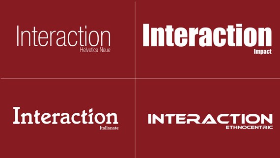
“Interaction” written with Helvetica Neue, Impact, Italianate and Ethnocentric.
There are more font classes in the world, but only two of them are of such importance that everybody should know about them: serif and sans-serif. The difference between them is the “serif”, which are small additional endings at the end of the strokes – specific of the serif fonts. “Sans” comes from French and means “without”, so it is quite obvious which is which.
The serif fonts are usually used in printed material such as newspapers or books. However, magazines employ sans-serif fonts because they are “cleaner” and are easier to read when the font size is small. But according to studies, the serif typefaces may be easier to read in print, while sans-serifs are better on-screen, especially in low font size and low resolution.
The good part about the new technologies on the web are that even if your computer does not have a font you might like to have, downloading it is only few steps away. Moreover, embedding the font into your site, so that everybody who visits it sees the text with the typeface you want, is possible as well now, so why not use this if you can? I would like to show you two examples of websites with integration of custom typefaces, and then we’ll come back and discuss why are they successful.
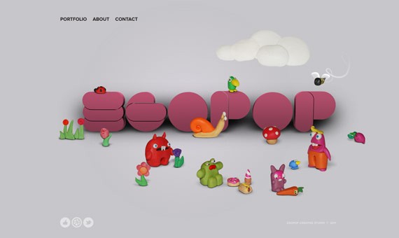
Egopop Design Studio uses a custom-made font.

Chirp has a funny custom-made font as well.
The success of these two webpages, and many others for that matter, is also given by the way they made use of typefaces. Maybe tomorrow you will not remember what the website was about, but it is very likely you will remember the website itself, because it creates a powerful visual impact – and this is the first step into having a web identity worthy of remembering. This is what a good, well used typeface can turn your website into.
Another good tip is not to overdo it. It is not a good idea to use many fonts, so try to keep the number of typefaces as low as possible. I usually go with two, maximum three. I think two is perfect because you have a typeface (serif maybe) which can be used for titles and headlines, in huge sizes, while the other one is for paragraphs and small text, and often it is a sans-serif. In the image below you can see a good example of two well-combined typefaces.
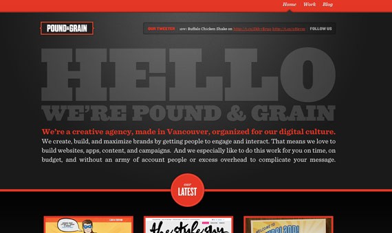
Pound & Grain uses a sans-serif for the headlines and serif font for text.
If you combine too many fonts in the same design, this can cause your text readability to suffer and will not create the same experience as the example above. Fonts have to be used wisely, and quality is more important than quantity. Although it doesn’t have that much to do with typography, embedding too many fonts will make your site load slower.
Experimenting is the way to find a great combination. Try as many fonts as possible, play with them, combine them, increase or decrease the number of typefaces and so on, until you reach the desired effect. Managing to find the perfect combination rarely happens the first time when you try it, so get ready to spend some hours on this.
The line spacing is critically important as well, because it has a lot to do with readability and impact. Moving the lines apart from each other will make the human eye read them easier, while bringing them closer will obviously have the opposite effect. The average of the line spacing should be about 0.3em to 0.5em larger than the font size, but this is only a guideline and you shouldn’t follow it all the time.
Actually, I never even think about this one; I always increase or decrease the line spacing by looking at the text and comparing the options. To realize why big line spacing is important, look at the image below and try to think of which is the easiest to read. Note that the typeface is the same in both paragraphs.
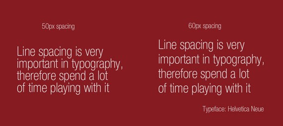
A difference of only 10px spacing (Photoshop size, not HTML/CSS) makes a huge difference.
Another important concept is the hierarchy, which can not only be made by increasing the font size, but also by using different typefaces, as I usually like to do. Headlines and titles are either bigger or have a more powerful, thick font, because they need to stand out. “If it makes a difference, better make it big”. If talking about rules, then this is one you should keep in mind – make the differences obvious.
The hierarchy can be emphasized through color, contrast, dimension or placement, but the most visual is the one emphasized through typography.
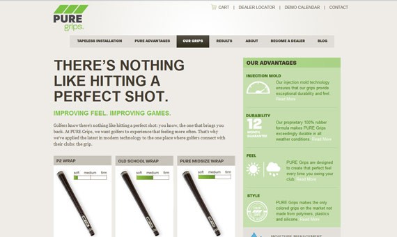
The headline is a sans-serif in bigger size, while the rest of the text is written with a serif font.
Measuring the width of the text is important too, but it is more crucial for paragraphs than for headlines. The ideal line length seems to be between 10 and 15 words per line, but this is another rule that doesn’t apply all the time. It is so important which typeface you use, because some are wider than others. The line spacing between rows has an influence over this as well, so don’t think of rules.
Ask anybody around you to read your text and then ask if it was difficult, easy or normal. Don’t read it yourself, because you’re the one that designed the layout and after spending hours looking at it, small details become unnoticeable. It doesn’t only depend on the font you use or line spacing, but also about the general width of your design.
Alignment is important too, but the sad truth is that it is impossible to make it work for everybody in the world with only one design. This is because in Western culture we read from left to right, top to bottom, while some countries in the Eastern part of the World read right to left, bottom to top. Therefore you should think of your audience and design for it.
If we take the Western culture as an example, then try to have starting points on the left side. This is because the eye is used to start from the same point as before when reading a new line, and having a different starting point for each line will make it difficult to read. Maybe we don’t think of this too much, but the brain probably does. It is far more easy to read a text aligned to the left, than a text aligned to the right, and the example below should express this.
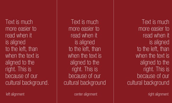
The text on the left side is the easiest to read.
Although I am a big fan of the center alignment, I only use it in headlines with few lines. The version on the left side is definitely the best and I think everybody would consider a website aligned to the right a bit weird, especially people in Europe and America.
Justifying the text is not a very good option either, because it will create a lot of empty space between the words and this will become confusing. Justifying is usually popular in print, in narrow columns, but not in web design where the containers are usually wider.
The weight of the font is important as well. The weight is actually how thick the font is. Highlighting words or links is usually done by using a thicker font or another color. Having several font weight types means that you can reduce the number of other embedded fonts, because having the same font in different weights gives a feeling of hierarchy and importance.
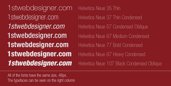
Helvetica Neue is a font with more than 40 different font styles and weight.
As you can see, typography is built on several important concepts and it is important to keep an eye on all of them. Typography is an important part of any design and if you manage to hit the mark with it, a basic, simple and clean layout will be enough to create a powerful identity.
You will have to spend a lot of time on improving your typography skills, therefore I will share with you a list of useful links where you can find out more about the art of typography:
I hope you find these tutorials and tips helpful. Please feel free to comment below if you have any other idea to do the same effect like the demo.
This post may contain affiliate links. See our disclosure about affiliate links here.


