Before that time, the architects used superfluous and intricate ornamentation associated with the beaux arts, art deco styles, and nouveau arts which were popular for quite some time.
The architects during the early 20th century believed that such ornamentation were no longer relevant and appropriate to the modern times so they embraced new building techniques of concrete, steel, glass, and mass production.
Your Web Designer Toolbox
Unlimited Downloads: 500,000+ Web Templates, Icon Sets, Themes & Design Assets
Table of Contents
- 1 Your Web Designer ToolboxUnlimited Downloads: 500,000+ Web Templates, Icon Sets, Themes & Design Assets
- 2 White Space and Minimalism
- 3 1. Improves Comprehension
- 4 2. Helps in Creating Mental Maps
- 5 3. Attracts Attention
- 6 Four Major Elements of White Space
- 7 White Space and Human Attention and Memory
- 8 Taking Advantage of Minimalism in Web Design
- 9 Valuable Guidelines for Minimalism
- 10 Integrating Minimalism in Other Styles
- 11 What a Minimalist Design Can Do to Your Business
- 12 Conclusion

DOWNLOAD NOW
The same thing can be said about web design. Prior to the emergence of flat design, most web designers often incorporated skeuomorphic design with ornamental and overrated features that added aesthetic values to the product they were designing.
While it is true that such ornamental additions made their works more visually appealing, many failed in delivering what web users really want: usability of a product.

Is it really the end for the skeuomorphic design as more and more brands go for the flat and minimalist web design?
When you think of it, flat or minimalist design is not really new. It is more of a resurrection or re-emergence of modernism utilized in different mediums. In terms of the popularity of minimalist design in UI, it can be said that the shift stemmed from the public expectations years ago.
While it is true that it is important to capture users’ attention with an awesome and detailed design, that shouldn’t be the focus. For many users, the detail should not just be admired, but they also need to be functional.
As expected, not all web designers are ecstatic about the flat and minimalist design. Many are unhappy that the highly detailed and skeuomorphic trend of the past has fallen from its glory. There are even those who looked down on the flat design, stating they cannot fathom how it has gained popularity.
However, skeuomorphic design is not totally out of the picture. In fact, it still has its share of popularity alongside the flat and minimalist flat design. Perhaps, the most notable change is that skeuomorphic design is used more appropriately these days.
If you look at the skeuomorphic and flat design, it is unfair to put more value on one over the other. To a certain extent, it wouldn’t be fair to compare the two in terms of which style shows more character, skill, and meaning. While it’s true that coming up with an app icon these days, for instance, would only use a fraction of the time used to make one in the past, the arduous mental process of creating it remains the same.
Surely, there are some non-formally trained designers who take shortcut these days, thanks to the various free UI kits, self-building websites, and flat design color palettes. However, if you compare their works to the ones done by professionally trained designers, they will surely pale in comparison.
It is true, however, that the emergence of flat design has taken a toll on the perception of craftsmanship significance by some designers. On the other hand, it has also led to the explosion of other aspects of the design process like UX and animation.
So, is this a bad thing? Well, not totally. Nonetheless, it’s a bad thing for designers who lost their jobs because the arrival of flat design has, indeed, simplified the processes involved in web design.
White Space and Minimalism
With more and more companies and web designers embracing the minimal or flat design, it can be said that it is here to stay. Therefore, it is not really surprising why the number of designers also using white for their negative space is on the constant rise.
If you compare the white space to a movie, it can be likened to the supporting actors. It may not be the focus, but it certainly helps in bringing out the best in the main character, making him shine further.
If you are the kind of designer who doesn’t think that there is no need for you to have any blank space in your design, then, you should think again. It’s high time you embraced the mindset that using too many objects in your design can leave it a disaster as each competes for attention with one another.
While it is true that white space influences the aesthetics of a design, it is more than that. In fact, it serves 3 other functions that can surely make your design more effective:
1. Improves Comprehension
It has been proven that white space improves comprehension by as much as 20 %. If your interface is loaded with too much information, how can you expect your user to comprehend everything in it? Therefore, you need to reduce the clutter so that it be easier for your website visitors to comprehend the information that you have placed.
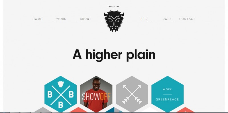
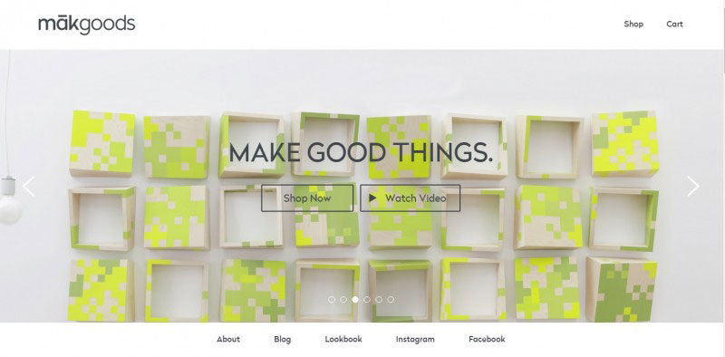
Built by Buffalo’s white space emphasizes its logo and other elements.
It has been proven that, if you use white space between paragraphs and in the left and right margin, the ability of the user is increased by 20%. This enables you to provide a comprehensible amount of content as the extraneous details are stripped away.
2. Helps in Creating Mental Maps
Apart from improving comprehension, white space also aids your users’ creation of mental maps. Minimal white space is employed between the top navigation and content stream, since both of them have similar functions in leading the user deeper into content.
The right-side navigation is more focused on creating and saving content, so more white space borders it from the content stream. In this case, white space helps users assign various functionalities to different parts of the interface. If users click through to an article, white space helps them focus the content.
3. Attracts Attention
As mentioned above, the absence of other elements will only make existing elements more noticeable. If you add lots of white space to separate the categories from the search function, for instance, the category icons become much more pronounced.
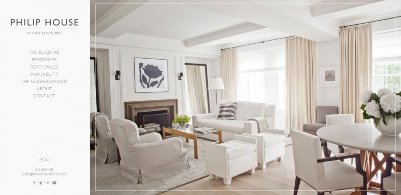
The use of lots of white space in the case of Philip House highlights its image and attracts attention.
If you combine it with an animation-like color fill that’s triggered upon hovering, the category section becomes further noticeable and can successfully call users to action. Nonetheless, you should know when to reduce or alter the spacing between content because users have selective attention.
Four Major Elements of White Space
White space has four elements, namely:
- Visual white space – the space surrounding the graphics, icons, and images
- Layout white space – this includes the margins, paddings, and gutters.
- Text white space – the spacing between lines and letters
- Content white space – the space that separates columns of text.
Medium is one example of an impressively nice balance of all four elements of white space. Users want to access the content that interests them as quickly as possible. Medium’s homepage makes this possible by placing the content in the center and the front, emphasized by lots of white space on both sides.
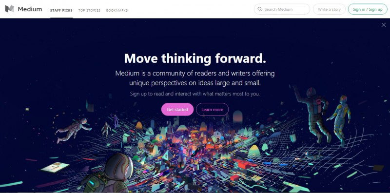
Medium has impressively used and balanced all four elements of white space
The visuals and the between lines of copy also abound with white space. The minor issue here is that the padding around the images is not uniform as the space found at the left of each image is not consistent with their space below.
White Space and Human Attention and Memory
The power of white space, to a certain extent, is influenced by human attention and memory. If you compare the interfaces of Yahoo and Google, you will notice that Yahoo offers its users many possible actions all at once.
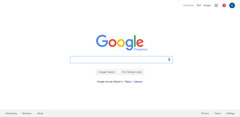
Google does not need a lot of aesthetics to make a point
On the other hand, Google just knows that the main reason why people use search engines is because they just want to find things that they need or want. It goes without saying that Google’s design is more realistic as it encourages a more interactive interaction.
Taking Advantage of Minimalism in Web Design
The lightweight layouts and low maintenance of minimalism make it flexible for a responsive design that it is naturally elegant. Hence, it is not surprising why many brands have embraced it.
A minimalist design does not mean it is easy to make
However, appreciating minimalism and recreating it are not synonymous with each other. Some people think that copying a minimalist style because of its sparse elements is easy. The truth is designing a minimalist site requires a lot of thinking and effort because designers only have a few elements to work with.
So, how do you use minimalism and take full advantage of it?
You need to understand that, popular as it may be these days, minimalist design is not for everybody. You first need to honestly assess if this style is the right thing for your website. While the technique works great for straightforward businesses, like agency sites and creative portfolios, it becomes trickier for more complex sites.
Here are some of the common concerns about the minimalist design:
Too Much Content
This problem is best exemplified by Amazon and eBay. A minimalist interface is not suited for these sites as they need a more detailed one that can support each of their categories.
Nonetheless, both Amazon and eBay have adapted some of the principles of minimalism, like hiding the content if a user does not need it. Hence, if your site offers a lot of content, going for a minimalist design may not just be the right thing to do.

Minimalism may not just be right for Ebay and Amazon because of their numerous elements
Ads Overload
On the whole, paid ads and minimalism don’t go hand in hand. Since minimalism is precise and finicky, the entire design of your website may be ruined by petty things, such as the ads color, especially if you have no control of the things that come from the ads server.
How about if the ad is pre-set? There is that danger of the ad not being compatible with your design.
Boring
If your website caters to children or young adults, never ever make a mistake of going for a minimalist design. Bear in mind that children and young adults have a short attention span and a minimalist design will easily bore them.
Remember, those who belong to this bracket prefer something more visual to stimulate their senses,
Before going for minimalism design, you need to understand that it works by applying a particular set of criteria that sets it apart from other styles. Hence, you need to contemplate carefully before deciding to go for it.
Valuable Guidelines for Minimalism
Minimalism will greatly benefit a landing page
- Landing Page Only. Since minimalism restricts the use of many elements, content-rich websites are at risk if they adapt this design. The best thing that these sites can do, if they really want to use the minimalist approach, is to apply the minimalist landing page that will eventually lead customers to more detailed pages of the site.
- Crisp Copy. Few words, few mistakes. Remember what your writing teacher constantly reminds you about omitting those superfluous words in your elementary writing class? Well, you should apply that reminder even more if you decide to go for a minimalist design.
- Heavy at the Top. To sync with the users’ browsing habit, you need to place your high-level content at the top section of the screen. Make sure to provide lots of white space. As the scroll deepens, gradually increase the density of the content.
- Keep It Interesting. Holding the interest of your visitors or users is the biggest challenge of going for minimalism. While it is true that simplicity is beauty, not everybody subscribes to this belief. At times, the simplicity of your site because of its minimalist design can bore your visitors or users. One way to address this concern is to change your layout. You can go for alternating layouts that run along the Z-shaped reading pattern.
- One Concept Per Page. In order to adhere to the concept of simplicity, make sure that each page of your site should only have one concept, zeroing in on a single visual.
- Don’t Go Beyond Five. The content section for a minimalist concept should not go beyond 5. If you have more than 5 sections, make sure to remove the less important ones.
- Start simple. This is a very good way for you to identify what’s important and what’s not. Start with a black and white wireframe, then inject other things like color at the latter part
Knowing what to keep and what to throw can be quite a challenge if you are new to applying minimalism. To make things easier for you, here’s the list of the things that you should consider as essentials and throwaways:
Essentials:
- Logo
- Navigation options
- Body content
- Contact information.
Throwaways:
- Social media links/icons
- Footers
- Widgets
If you can’t let go of those listed on the throwaways, then, maybe you should not go for the minimalist design. On the other hand, if you have no issues with letting go of any of the mentioned, you can expect yourself to get better at knowing what really matters and what doesn’t as you continue to embrace minimalism. That will not only benefit you as a minimalist designer but your life, in general, too.
Integrating Minimalism in Other Styles
One of the many good things about minimalism is that it can look good when combined with other styles that result in a stronger and better style or technique. This is especially true these days, when mobile devices, such as smartphones and tablets, are prevalent.
If a minimalist style is used in conjunction with other styles, it can help a design become more fully-responsive, reducing a site’s maintenance without sacrificing its quality.
Here are some of the other styles that are commonly paired with minimalism:
- Flat Design.Since both flat design and minimalism have a shared emphasis on simplicity, there is no denying that they are a perfect combination. Both minimalism and flat design have let go of intrinsic designs in order to focus more on the content.Furthermore, the basic style of flat design is already minimalistic, hence, it is often equated to a minimalistic design, just like what is mentioned in the earlier part of this article.
Flat design and minimalism simply go hand in hand.
- Hero Headers and Images. Despite the popularity of flat design, there are some sites that have shifted away from the trend and embraced another, which zeroes in on an image-focused style.Since these large photos and images are already enough to gather attention to them, a page or the site itself no longer needs to be further intricate. Hence, pairing it with a minimalist style is the most sensible thing to do so that competition for the users’ attention can be avoided.
Minimalism and image-focused design are just a perfect combination
- Simple Navigation. This simply means that you can simplify the navigation by using a single button, such as the hamburger icon, which, in turn, only reveals the complete navigation menu if it is hovered over or clicked by a user.Nonetheless, bear in mind that this strategy is not for everybody. If things are oversimplified, they might defeat the purpose of navigation, especially if users fail to recognize the buttons.
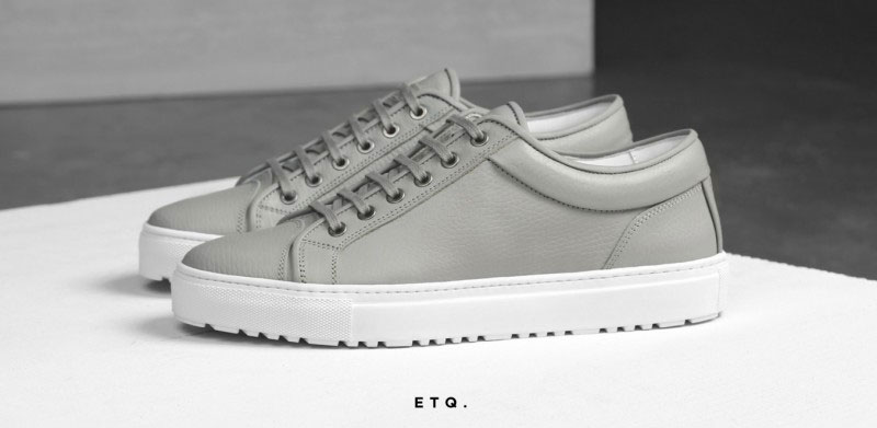
Minimalism has, indeed, made navigation way simple in the case of ETQ
Minimalism can make your typography even more
What a Minimalist Design Can Do to Your Business
If you have a business-related website, should you totally go for a minimalist design or combine it with other styles? There is no reason for you not to do so. In fact, more and more business-related websites have benefitted from a minimalist design because of the following reasons:
1. No room to play loose. With a minimalist design, you don’t have room to play loose. Every element on the page is considered and is there for a good purpose. You can’t afford to be undecided on what to include on it. You have to be short and concise in order to deliver your message well.
With a minimalist design, you can’t afford to play loose as every element matters
2. Faster page loading. One thing about a minimalist website is that you have lesser resources. This means that you don’t really need a big storage space for your server. This averts the overloading of your server with big file videos, flash, or other less relevant content.
It also means that your business website will not be slowed down with hundreds of plugins, resulting in you’re the faster loading of your page. The faster your page loads, the faster your users get what they want and be called to action.
3. Less clutter equals better conversion. Since your page has less clutter, it is a lot easier for your page’s USP (Unique Sales Proposition) to be noticed. The more noticeable it becomes, the higher your conversion rate you have.
Conclusion
While it is true that minimalism has cost some designers their job, it does not really signal the fall of designers. Instead, designers should look at it as their new way, possibility, or technology in this new era of design.
Reduced loading time. Easier responsive design.
These are just some of the advantages of a minimalist design. If your site is qualified to all of the things discussed above, don’t you think it’s high time that you reimagined it? You will find out that letting go of the things that have little importance to your website is actually not that difficult to do.
This post may contain affiliate links. See our disclosure about affiliate links here.