How do you feel when you see a long Sign Up form for a website or service? Generally, people get bored when the Sign Up form is too long. Ideally, you should keep the form as simple as possible with minimum fields, and if that is not possible, try using a multi-step form.
The reason why Facebook Connect and Sign In with Twitter has become so popular these days is because of their simplicity, since users can sign up just by logging into their Facebook or Twitter account.
Your Designer Toolbox
Unlimited Downloads: 500,000+ Web Templates, Icon Sets, Themes & Design Assets
Table of Contents
- 1 Your Designer ToolboxUnlimited Downloads: 500,000+ Web Templates, Icon Sets, Themes & Design Assets
- 2 Why Use RhinoSlider For Contact Forms?
- 3 Introduction to Rhinoslider
- 4 Creating the Multi-Step Contact Form
- 5 Creating Form Elements for Steps
- 6 Converting Rhinoslider Icons to Buttons
- 7 Converting Numbered Menu Into Step Menu In Our Contact Form
- 8 Adding Step Descriptions
- 9 Adjusting Control Buttons In The Contact Form
- 10 Validating Contact Form Steps
- 11 Customizing the Rhinoslider Plugin
- 12 Disable Click Event for Steps
- 13 Customizing the Previous Button Functionality
- 14 Customizing Next Button Functionality
- 15 Customizing Multi-Step Contact Form
- 16 Contact Form Tutorial Conclusion

DOWNLOAD NOW![]()
If you are using normal Sign Up forms and still require a lot of data from your users, a multi-step form is the best solution. So the form is broken into small sections and the user only sees one section at a time. Also, multi-step forms reduces the space you need on the page.
View the Demo and Download the Source Files
Why Use RhinoSlider For Contact Forms?
In a multi-step form, once you complete the first step, the second step will be displayed and Step 1 will be hidden. Normally we use sliding effects in step transitions. So this a scenario where we can use a Slider differently from its default behavior of creating image slideshows.
There are plenty of great sliders available and no point of reinventing the wheel by creating a slider from scratch. So I chose Rhinoslider for this tutorial as it provides great effects and is very easy to customize. So let’s get started on making a multi-step form.
Introduction to Rhinoslider
Before we create the multi-step form, you should have a basic idea of how RhinoSlider works. They recommend that you generate a custom version instead of a full version with all the effects. So I have downloaded the default version for our tutorial.
You can open the demo file in the browser and it will look something like the following screen.
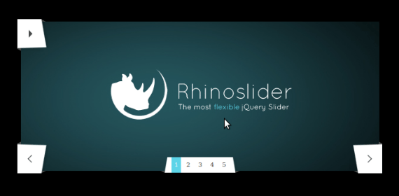
So let’s look at the demo file code first.
<!DOCTYPE html>
<html> <head> <meta charset="utf-8"> <title>Multi Step Form with Rhinoslider 1.05</title> <link type="text/css" rel="stylesheet" href="css/rhinoslider-1.05.css" /> <script type="text/javascript" src="js/jquery.min.js"></script> <script type="text/javascript" src="js/rhinoslider-1.05.min.js"></script> <script type="text/javascript" src="js/mousewheel.js"></script> <script type="text/javascript" src="js/easing.js"></script> <script type="text/javascript"> $(document).ready(function(){ $('#slider').rhinoslider(); }); </script> <style type="text/css"> body { background-color:#fff; } #slider { width:600px; height:250px; /*IE bugfix*/ padding:0; margin:0; } #slider li { list-style:none; } #page { width:600px; margin:50px auto; } </style> </head> <body> <div id="page"> <div id="page"> <ul id="slider"> <img src="img/slider/01.jpg" alt="" />; <img src="img/slider/02.jpg" alt="" />; <img src="img/slider/03.jpg" alt="" />; <img src="img/slider/04.jpg" alt="" />; >img src="img/slider/05.jpg" alt="" />; </ul> </div>
</body>
</html>
- You can see that 5 images are placed in the unordered list called #slider.
- Once you initialize Rhinoslider with $(‘#slider’).rhinoslider(), all the images will be assigned to slider and will slide automatically.
Now we have a basic idea of how to use Rhinoslider. So Lets get started on creating multi-step form.
Creating the Multi-Step Contact Form
We need to do some modifications in initializing the code to suit our multi-step form creation process. Consider the modified initialization code below.
$('#slider').rhinoslider({
controlsPlayPause: false,
showControls: 'always',
showBullets: 'always',
controlsMousewheel: false,
prevText: 'Back',
slidePrevDirection: 'toRight',
slideNextDirection: 'toLeft'
});
- In the image slider top button is used to control automatic play and pause. We don’t need it in a multi step form. So we remove it by setting controlsPlayPause: false.
- The controls and numbering on the slider are shown on hover by default. We make it permanent by setting showControls: ‘always’ and showBullets: ‘always’.
- Slider moves on mousewheel by default. So we disable it by setting controlsMousewheel: false
- Finally we change the previous button text to Back.
Creating Form Elements for Steps
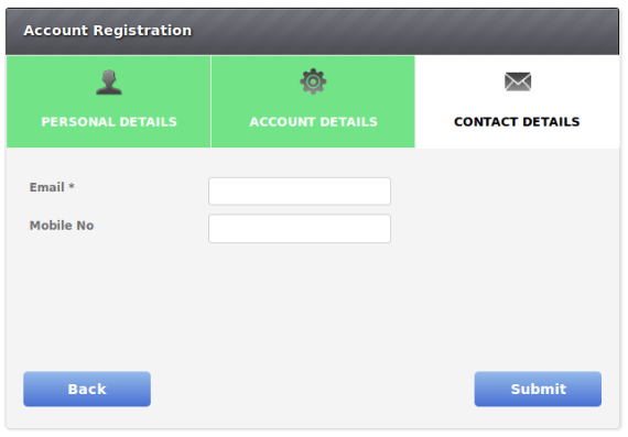
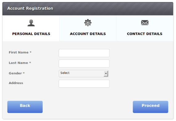
Instead of images we want sections of form elements. So in this demo I created a simple registration form with 3 steps called PERSONAL DETAILS, ACCOUNT DETAILS and CONTACT DETAILS. Each section will have some form elements. I am going to replace the unordered list of images with my form elements as shown below.
<div id="wrapper"> <h3>Account Registration</h3> <form action="" > <div id="slider"> <div class="form-step" > <div class="row"> <div class="form-left">First Name *</div> <div class="form-right"><input type="text" id="fname" name="fname" class="form-input" /></div> <div class="form-error"></div> </div> <div class="row"> <div class="form-left">Last Name *</div> <div class="form-right"><input type="text" id="lname" name="lname" class="form-input" /></div> <div class="form-error"></div> </div> <div class="row"> <div class="form-left">Gender *</div> <div class="form-right"> <select id="gender" name="gender"> <option value="0">Select</option> <option value="M">Male</option> <option value="F">Female</option> </select> </div> <div class="form-error"></div> </div> <div class="row"> <div class="form-left">Address</div> <div class="form-right"><input type="text" id="address" name="address" class="form-input" /></div> <div class="form-error"></div> </div> </div> <div class="form-step" > <div class="row"> <div class="form-left">Username *</div> <div class="form-right"><input type="text" id="username" name="username" class="form-input" /></div> <div class="form-error"></div> </div> <div class="row"> <div class="form-left">Password *</div> <div class="form-right"><input type="text" id="pass" name="pass" class="form-input" /></div> <div class="form-error"></div> </div> <div class="row"> <div class="form-left">Confirm Password *</div> <div class="form-right"><input type="text" id="cpass" name="cpass" class="form-input" /></div> <div class="form-error"></div> </div> </div> <div class="form-step"> <div class="row"> <div class="form-left">Email *</div> <div class="form-right"><input type="text" id="email" name="email" class="form-input" /></div> <div class="form-error"></div> </div> <div class="row"> <div class="form-left">Mobile No</div> <div class="form-right"><input type="text" id="mobile" name="mobile" class="form-input" /></div> <div class="form-error"></div> </div> </div> </div> </form> </div>
- First I have added a div called wrapper and a heading called Account Registration.
- Then I have replaced the ul with a div called #slider.
- Next I have replaced the list items of images with divs with the class “form-step”.
- Then necessary input fields for each section are added accordingly.
- Once the slider is initialized divs with the class containing form-step will turn into a slide.
Now copy the images in the project folder to your demo folder and include the following CSS styles in the demo file.
<style type='text/css'> body { background-color:#fff; } #wrapper{ border: 1px solid #DCDADA; border-radius: 5px 5px 5px 5px; box-shadow: 2px 2px 2px #E1E1E1; background: #fff; width:700px; height:480px; background:#f4f4f4; } #wrapper h3{ font-family:"Lucida Sans Unicode", "Lucida Grande", sans-serif; font-size:16px; height:60px; background:url(img/title.png) no-repeat left top; margin:0; padding:16px 0 0 20px; text-shadow: 1px 1px 2px #000; filter: dropshadow(color=#000, offx=1, offy=1); color:#fff; } #slider { background: #fff; /*IE bugfix*/ padding:0; margin:0; width:700px; height:400px; } #slider li { list-style:none; } #page { width:600px; margin:50px auto; } #slider{ color: #000; background:#f4f4f4; font-family:"Lucida Sans Unicode", "Lucida Grande", sans-serif; font-size:12px; } .form-step{ padding:16% 3% !important; } .form-submit{ cursor: pointer; display: block; position: absolute; right: 0; bottom: 0; -moz-user-select: none; background: none repeat scroll 0 0 #6F95DC; border-radius: 5px 5px 5px 5px; color: #FFFFFF; display: block; margin: 0 20px 20px; padding: 10px; text-align: center; width: 125px; z-index: 10; font-weight: bold; text-decoration: none; background-image: -webkit-gradient(linear, 0% 0%, 0% 100%, from(#94b9e9), to(#4870d2)); background-image: -moz-linear-gradient(#94b9e9, #4870d2); background-image: -webkit-linear-gradient(#94b9e9, #4870d2); background-image: -o-linear-gradient(#94b9e9, #4870d2); filter: "progid:DXImageTransform.Microsoft.gradient(startColorstr=#94b9e9, endColorstr=#4870d2)"; -ms-filter: "progid:DXImageTransform.Microsoft.gradient(startColorstr=#94b9e9, endColorstr=#4870d2)"; font-family:"Lucida Sans Unicode", "Lucida Grande", sans-serif; } .errorDisplay{ border:2px solid red; } .form-left{ color: #717171; float: left; font-size: 13px; font-weight: bold; padding: 5px; width: 200px; } .form-right{ float: left; width: 214px; } .row{ float: left; margin: 5px 0; width: 100%; } .form-step input[type='text']{ border: 1px solid #CFCFCF; border-radius: 4px 4px 4px 4px; height: 25px; padding: 3px; width: 200px; } select{ border-radius: 4px; border: 1px solid #CFCFCF; -webkit-border-radius: 4px; -moz-border-radius: 4px; background: #FFF; padding: 2px; height: 30px; width:205px; font-family:"Lucida Sans Unicode", "Lucida Grande", sans-serif; font-size:12px; background:#f4f4f4; } select option{ font-family:"Lucida Sans Unicode", "Lucida Grande", sans-serif; font-size:12px; background:#f4f4f4; color:#717171; } .form-error{ color: red; font-size: 12px; padding: 8px; } .step-error{ background:#f5715f !important; color:#FFF !important; -moz-box-shadow:1px 1px 4px #C6C4C4 -webkit-box-shadow:1px 1px 4px #C6C4C4 box-shadow:1px 1px 4px #C6C4C4 } .step-success{ background:#72e487 !important; color:#FFF !important; -moz-box-shadow:1px 1px 1px 4px #C6C4C4 -webkit-box-shadow:1px 1px 1px 4px #C6C4C4 box-shadow:1px 1px 1px 4px #C6C4C4 } .bullet-desc{ font-size: 14px; font-weight: bold; } </style>
Now the slider will look something like the image below:
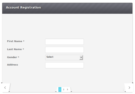
So let’s compare it with our final output screen.
- Left button should be changed to Back
- Right button should be changed to Proceed
- Numbering menu should change to steps on the top bar
Converting Rhinoslider Icons to Buttons
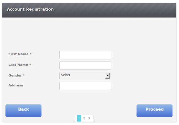
First we have to make sure that we remove the default icons displayed for previous and next buttons and insert buttons for back and proceed. Open the CSS file in the Rhinoslider CSS folder and change the styles for rhino-btn as follows.
.rhino-btn { cursor: pointer; display: block; position: absolute; right: 0; bottom: 0; -moz-user-select: none; background: none repeat scroll 0 0 #6F95DC; border-radius: 5px 5px 5px 5px; color: #FFFFFF; display: block; margin: 0 20px 20px; padding: 10px; text-align: center; width: 125px; z-index: 10; font-weight: bold; text-decoration: none; background-image: -webkit-gradient(linear, 0% 0%, 0% 100%, from(#94b9e9), to(#4870d2)); background-image: -moz-linear-gradient(#94b9e9, #4870d2); background-image: -webkit-linear-gradient(#94b9e9, #4870d2); background-image: -o-linear-gradient(#94b9e9, #4870d2); filter: "progid:DXImageTransform.Microsoft.gradient(startColorstr=#94b9e9, endColorstr=#4870d2)"; -ms-filter: "progid:DXImageTransform.Microsoft.gradient(startColorstr=#94b9e9, endColorstr=#4870d2)"; font-family:"Lucida Sans Unicode", "Lucida Grande", sans-serif;
}
Take a look at the updated form below.
Converting Numbered Menu Into Step Menu In Our Contact Form
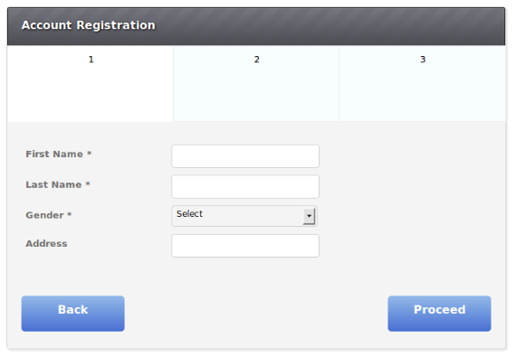
We need to change the CSS styles related to the numbering menu in order to get it to the top part and make custom steps instead of just numbers. So update the styles of Rhinoslider CSS file with the following code:
.rhino-bullets li a.rhino-bullet { display: block; width: 100%; height: 90px; cursor: pointer; background: none repeat scroll 0 0 #F8FDFF; border: 1px solid #EEEEEE; font-size: 10px; text-align: center; padding: 10px 0 5px 0; color: #000; text-decoration:none; -webkit-user-select:none; -moz-user-select:none; user-select:none; font-family:"Lucida Sans Unicode", "Lucida Grande", sans-serif; font-size:13px;
}
.rhino-bullets { position: relative; top: -438px; z-index: 10; background: #fff; padding:0; float:left;
}
.rhino-bullets:before, .rhino-bullets:after { position:absolute; display:block; left:-16px; content:' '; width:16px; height:26px;
}
.rhino-bullets li { float:left; display:inline; margin:0; width: 233px;
}
.rhino-bullets li a.rhino-bullet.rhino-active-bullet { color:#000; background:#fff; border-bottom: none;
}
Now the CSS changes are completed and our screen will look like this:
Adding Step Descriptions
Instead of using numbers for steps we planned to use descriptive text about the step with an image. So add the following code right after the initialization part of slider.
var info = ["PERSONAL DETAILS","ACCOUNT DETAILS","CONTACT DETAILS"]; var images = ["personal-details-icon.png","account-details.png","contact-details.png"]; $('.rhino-bullet').each(function(index){ $(this).html('<p style="margin: 0pt; font-size: 13px; font-weight: bold;"><img src="./img/'+ images[index]+'"></p><p class="bullet-desc">'+info[index]+'</p></a>'); });
- We got 2 arrays for images and descriptions. Insert the text and images in the order of your steps.
- Each step has a class called rhino-bullet. So while looping through each step we replace the number with the image and text from the array.
Here is our form after the text and image integration.
Adjusting Control Buttons In The Contact Form
In the slider we saw the previous and next buttons for each slide. But for multi-step form we don’t need a previous button in first step. So let’s see how we can remove that.
$(".rhino-prev").hide(); $('.rhino-next').after('<a class="form-submit" href="javascript:void(0);" >Proceed</a>'); $(".rhino-next").hide();
- When the page is loaded, active slide will always be the first section. So we hide the Back button by using $(“.rhino-prev”).hide().
- Then before we go into the next step we need to validate the form. So we hide the default next button of Rhinoslider and insert the Proceed button as shown above.
Validating Contact Form Steps
Generally we have to complete a step before we go to the next step in a multi-step form. In this section I’ll explain how to add validation to each step.
$('.form-submit').live("click",function(){
$('.form-error').html("");
var current_tab = $('#slider').find('.rhino-active').attr("id");
switch(current_tab){
case 'rhino-item0':
step1_validation();
break;
case 'rhino-item1':
step2_validation();
break;
case 'rhino-item2':
step3_validation();
break;
}
});
var step1_validation = function(){
var err = 0;
if($('#fname').val() == ''){
$('#fname').parent().parent().find('.form-error').html("First Name is Required");
err++;
}
if($('#lname').val() == ''){
$('#lname').parent().parent().find('.form-error').html("Last Name is Required");
err++;
}
if($('#gender').val() == '0'){
$('#gender').parent().parent().find('.form-error').html("Please Select Gender");
err++;
}
if(err == 0){
$(".rhino-active-bullet").removeClass("step-error").addClass("step-success");
$(".rhino-next").show();
$('.form-submit').hide();
$('.rhino-next').trigger('click');
}else{
$(".rhino-active-bullet").removeClass("step-success").addClass("step-error");
}
};
- Our Proceed button has a class called form-submit. So every time we click on the proceed button the above validation function is called.
- You can find the current tab using rhino-active class. Then based on the step you call a custom validation function.
- I have shown the necessary validations for step 1 in the above code. Validations for the other two steps can be found in the project files.
- If validation error is found, we display the errors in front of the field and make the highlight the step in red color by adding step-error class to active step.
- If there are no errors, we make the step green by adding class step-success.
- Then we hide our custom proceed button and display the default next button of Rhinoslider.
- Then we make the next button click automatically by using $(‘.rhino-next’).trigger(‘click’) function which will move the form to the next step.
Following screens shows the contact form on validation errors and validation success.

Customizing the Rhinoslider Plugin
Now we are coming to the final part of the tutorial. We need to make some changes to the default Rhinoslider functionality to get things done as we need. You can click on the steps and move to the other steps in the demo we have now. So let’s see how we can disable it.
Disable Click Event for Steps
Open the rhinoslider-1.05.min.js file in the js folder and comment the following code section which provides the clickable functionality.
vars.buttons.bullets.click(function(){
var itemID=$(this).attr('id').replace('-bullet','');
var $next=vars.container.find('#'+itemID);
var curID=parseInt(vars.navigation.find('.'+vars.prefix+'active-bullet').attr('id').replace('-bullet','').replace(vars.prefix+'item',''),10);
var nextID=parseInt(itemID.replace(vars.prefix+'item',''),10);
if(curID&amp;amp;amp;amp;amp;lt;nextID){
next($slider,settings,$next);
}else if(curID&amp;amp;amp;amp;amp;gt;nextID){
prev($slider,settings,$next);
}else{
return false;
}
if(settings.autoPlay){
pause();
}
});
Customizing the Previous Button Functionality
I have made the previous button hidden in the initial step. Now we need to show it in other steps. So let’s customize the Rhinoslider previous button functionality to meet our requirements.
vars.buttons.prev.click(function(){
prev($slider,settings);
if(settings.autoPlay){
pause();
}
});
The code above shows the default functionality of previous function. So let’s change it to the following.
vars.buttons.prev.click(function(){
$(".rhino-next").hide();
$('.form-submit').show();
$('.form-submit').html("Proceed");
if(($slider.find('.rhino-active').index()) != 0){
prev($slider,settings);
}
if($slider.find('.rhino-active').index() == 1){
$(".rhino-prev").hide();
}
if(settings.autoPlay){
pause();
}
});
- Each time you click the previous button, by default the next button will be loaded. So we have to manually hide it and show our custom form submit button first.
- Line $slider.find(‘.rhino-active’).index() will give you the index of the active step.
- If step 1 becomes active, we hide the previous button. Otherwise we call the default previous button functionality by calling prev($slider,settings) .
Customizing Next Button Functionality
Also we need to customize the Rhinoslider next button functionality to meet our requirements. Let’s see how it works.
vars.buttons.next.click(function(){
next($slider,settings);
if(settings.autoPlay){
pause();
}
});
Above code shows the default functionality of previous function. So let’s change it to the following.
vars.buttons.next.click(function(){
$(".rhino-next").hide();
$('.form-submit').show();
$(".rhino-prev").show();
if($slider.find('.rhino-active').index() != ($slider.find('.rhino-item').length -1)){
next($slider,settings);
}
if($slider.find('.rhino-active').index() == ($slider.find('.rhino-item').length -2)){
$('.form-submit').html("Submit");
}
if(settings.autoPlay){
pause();
}
});
- We need to hide the next button and display our custom form submit button on each next button click as we did earlier with previous button.
- Also we need to show the previous button(Back button).
- Then we display Submit as the button text if the form is on the final step.
- If the active step is not the final one, we need to call next($slider,settings) to slide to next step.
We have completed the multi-step form creation process using Rhinoslider. Now you should have something similar to the provided demo. I suggest you download Rhinoslider and follow the tutorial steps to create the form instead of just looking at the project files.
Finally compare your version with the demo version and make the necessary changes.
Customizing Multi-Step Contact Form
Now we have a 3 step form. Its easy to add or remove steps according to your needs. Use the following guidelines for customizations.
- Add or remove step descriptions from info array.
- Add or remove step images from images array.
- Add or remove validation functions for steps.
- Adjust the width of rhino-bullets li class to match your needs.
Contact Form Tutorial Conclusion
It will take you around 2 hours to get used to Rhinoslider and create this Multi-Step contact form. But I think it’s worth doing it since you will have a form which can be used any time you require a multi-step form. You can add or remove steps as you wish.
In real-life projects you will not have the time to do everything from scratch. So tools such as this are useful to learn as you might need to customize existing plugins.
This post may contain affiliate links. See our disclosure about affiliate links here.


