Even in a deep and text-based world like literature, you still have to think about creative book covers.
Cover designs are probably the hardest thing for designers to design because it should show the heart and the soul of the book in one single image. At the same time, it should be visually striking and appealing. Readers are still visual people after all.
And a creative book cover design needs to be acknowledged and celebrated. And this article is made to give them the justice. Enjoy the showcase of what we consider some creative book cover designs. These are just some of the amazing book cover designs that made us think, laugh, cry, smile, or contemplate about life.
Your Web Designer Toolbox
Unlimited Downloads: 500,000+ Web Templates, Icon Sets, Themes & Design Assets
Table of Contents
- 1 Your Web Designer ToolboxUnlimited Downloads: 500,000+ Web Templates, Icon Sets, Themes & Design Assets
- 2 Last Last Chance by Fiona Maazel
- 3 The Paradox of Choice by Barry Schwartz
- 4 Impossible Motherhood by Irene Vilar
- 5 Valkyrie by Philipp von Boeselager
- 6 Book Covers that will make you smile
- 7 How to Speak at Public Events
- 8 South of the Border, West of the Sun by Haruki Murakami
- 9 Stargirl by Jerry Spinelli
- 10 American Nerd by Benjamin Nugent
- 11 Eat, Pray, Love by Elizabeth Gilbert
- 12 Spring, Heat, Rains by David Shulman
- 13 Book Covers that are just plain witty
- 14 The Horizontal World by Debra Marquart
- 15 Pisa, Paris and London Books by Penguin Books
- 16 The Great Gatsby by F. Scott Fitzgerald
- 17 The Psychopath Test by Jon Ronson
- 18 Things I Learned from the Women who Dumped Me by Ben Karlin
- 19 Book Covers that are creative and just–one of a kind!
- 20 Experimental Geography by Nato Thampson
- 21 Killing the Buddha by Peter Manseau
- 22 Sheriff of Yrnameer by Michael Rubens
- 23 Book Covers that are dramatic and sad
- 24 The Thing about Life is that One Day You’ll be Dead by David Shields
- 25 How the Other Half Lives by Jacob Riis
- 26 The Snowman by Jo Nesbo
- 27 John Dies at the End by David Wong
- 28 The Last Skin by Barbara Ras

DOWNLOAD NOW![]()
Last Last Chance by Fiona Maazel

Last Last Chance by Fiona Maazel
Fiona Mazeel’s cover was designed by Henry Yee, using the Baskerville typeface. The cover seems to be split into two, cut across 45 degrees. It looks like the whole book was split in two, a prism of some sort, with a ‘broken’ rainbow. Looking at the cover, one cannot help admire the pretty picture but feel a bit depressed; rainbows, after all, are a symbol of hope. By the cover alone, you can tell that Fiona Mazeel’s novel would be a heartbreaking piece.
The Paradox of Choice by Barry Schwartz

Paradox of Choice by Barry Schwartz
The cover is designed by High Design NYC, featuring countless displays in a supermarket with a nutritional panel in the center, but instead of bearing nutritional information, it displays the book’s title, subtitle, author and review in Helvetica typeface.
I like this book cover because it’s colorful and witty. The title itself is a great one, ‘Paradox of Choice’, and then the artist juxtaposed it with a photo of a supermarket display. It is true that nowadays, we are given the freedom of choice brought by democracy and consumerism, but with the influx of brands and products promoted to us, it can get confusing and almost suffocating. Choice is a paradox, indeed.
Impossible Motherhood by Irene Vilar

Impossible Motherhood by Irene Vilar
Irene tackles a very touchy subject, abortion. Although her book is a very frank and honest testimony on abortion addiction, it’s good that Carin Goldberg toned things down with the book cover design. The cover is very clean and minimalist, with thin curvy lines and sticks representing ’15’, the number of abortions she’s had. Goldberg didn’t overdo it, as it would have been easy to do. Instead he kept it basic but still kept things interesting and memorable.
Valkyrie by Philipp von Boeselager

The book cover designed by Jason Booher is, like a sniper shot, ‘straight to the point’. It shows a single laser dot right on Hitler’s temple. This represents the idea of assassinating the Fuhrer. Over the course of WWII Adolf Hitler survived 42 failed assassination attempts. The most famous attempt of course was ‘Operation Valkyrie’. The book is about Philip Boeselager and his brother, along with another conspirator spent months planning and preparing for contingencies, and left nothing to chance. It was a failed attempt, of course, but it will be interesting to read about it.
Book Covers that will make you smile
How to Speak at Public Events

How to Speak at Public Events
This is one of my favorite cover designs of the series. It is a mock-up of the common (and ineffective) advice to conquering public speaking: ‘just pretend the audience is in their underwear’. Ironically, the opposite happens–you feel like you are in your underwear in front of the audience.
The cover design was designed by the talented Alister MacInnes, using pixel-based characters and bright colors. There is no title in the front, but I think the picture is self-explanatory. The audience consists of members that may be in any audience where you would speak publicly such as weddings, funerals, PTA meetings, etc.
South of the Border, West of the Sun by Haruki Murakami

South of the Border, West of the Sun by Haruki Murakami
John Gall designed the cover design, and he designs most of Haruki Murakami’s works. He makes use of the thin Futura font and warm, natural hues. I admire how Gall plays with symmetry and beauty of the face.
Stargirl by Jerry Spinelli

Stargirl by Jerry Spinelli
I am a gregarious reader myself, even in my teens, and I remember buying this book for the cover design alone. The colors are lovely, and the star and girl is drawn in stick figures, like it was drawn by a pre-schooler. The title of the book is not shown on the cover. Since the book is about non-conformity, the book cover design also followed suit by being different on its own.
American Nerd by Benjamin Nugent

American Nerd by Benjamin Nujent
Jason J Heuer designed Benjamin Nujent’s book, “American Nerd”. It shows several items that are associated with nerds: an inhaler, thick glasses, retainers and a pocket protector. Even how the items are framed in an obsessive-compulsive manner reflect ‘American nerd-ness’.
Eat, Pray, Love by Elizabeth Gilbert

Eat, Pray, Love by Elizabeth Gilbert
Helen Yentus came up with a delightful cover design for Gilbert’s bestseller, ‘Eat, Pray, Love’. The book is about a recently divorced woman who traveled to three different destinations throughout the year. The first word ‘Eat’ represents her months in Italy, wherein she recovered from her depression through food and pasta. The second word ‘Pray’ is spelled out in prayer beads, representing her months in India meditating; and finding spirituality in her life. The third word ‘Love’ is spelled out in (what I think) is flowers, representing the tropical east Indonesia where our heroine found love.
Spring, Heat, Rains by David Shulman
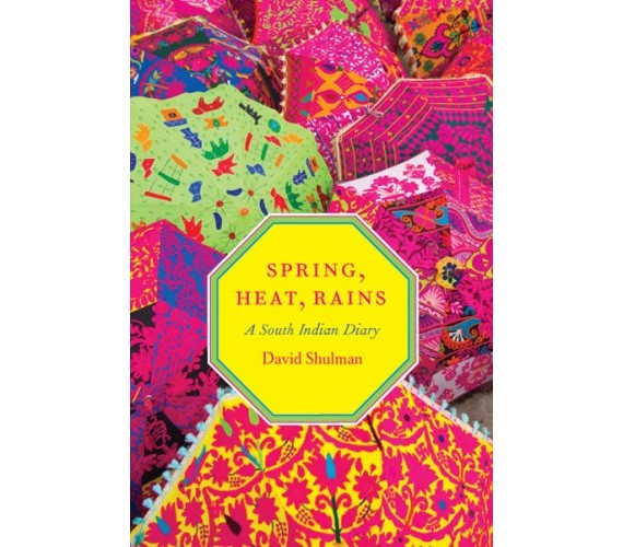
Spring, Heat, Rains by David Shulman
This book cover design is by Isaac Tobin. The cover design features different umbrellas of different patterns, and in the center a yellow octagon (shape of the umbrellas), bearing the title and author. I love the use of patterns and bright colors associated with India–it’s a cheerful design that will make you smile without even trying.
Book Covers that are just plain witty
The Horizontal World by Debra Marquart

The Horizontal World
Kathleen DiGrado took on the cover design literally, be creating a horizontal cover design instead of the usual vertical book cover design. It’s smart. It’s witty. Plus it’s funny how people tilt their heads to see the cover.
Pisa, Paris and London Books by Penguin Books
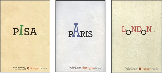
Penguin books have several unique book cover designs, but these series are among my favorite. The cover only bears the place, and then plays with the letters to indicate more about the place: Pisa had a leaning ‘I’, Paris has the ‘A’ Eiffel tower, while London has the ‘o’ on the bottom parts to signify the London buses. It makes you wonder how the designer Elias Figueiroa came up with that!
The Great Gatsby by F. Scott Fitzgerald
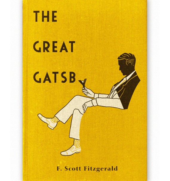
The Great Gatsby by F. Scott Fitzgerald
Although this is an old cover design, I can’t help but smirk at the witty use of typography. The last letter Y is used as the gentleman’s champagne glass. To those who have read the book, it is simply a nod to the lifestyle during the ‘Roaring Twenties’–wealth, fame, parties, materialism and champagne.
The Psychopath Test by Jon Ronson

The Psychopath Test by Jon Ronson
The cover is like a personification of Dr. Jeckyll and Mr. Hyde. The book is split into two: first is the sane and calm scheme, black and white with a border, using standard serif font and a cute bunny illustration in the middle. The right side features the disillusioned side, with neon colors, shredded fonts, and a wild leopard with his mouth open and ready for the kill. It seems like the left side is about to be eaten up by the crazy, right side of the book. An unusual cover design, but done very well.
Things I Learned from the Women who Dumped Me by Ben Karlin

Things I Learned from the Women who Dumped Me
The book cover is about ‘dissecting feelings’ by taking out the heart piece by piece. Every heartbreak is a lesson, and apparently by the cover design it is likened to a science lesson. Even the typography and the length of the title reinforced the whole scientific image. It is just as fitting because the book is a collection of funny essays from various men who have been dumped by women.
Book Covers that are creative and just–one of a kind!
Experimental Geography by Nato Thampson

The cover design is futuristic but lively. I like how it plays with lines, colors and shapes to come up with a coherent design. The design is by Kelly Blair.
Killing the Buddha by Peter Manseau

Killing the Buddha by Peter Manseau
The cover design is kind of depressing, like it’s ‘shunning’ the world. As you can see it isn’t your typical book cover: no title, no author, no subheadings or quotes. It’s just a picture of clouds with a big, red X in the middle. The red X, most especially, looks so meaningless. It doesn’t tell you what the book is about, in fact it makes you even more confused. The design won runner-up for top book cover design in 2004. It is designed by Paul Sahre.
Sheriff of Yrnameer by Michael Rubens
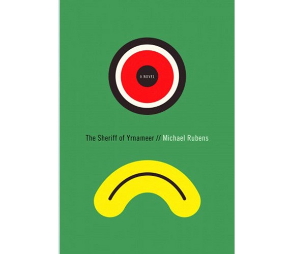
Sheriff of Yrnameer by Michael Rubens
The cover design by Peter Mendelsund reminds me of vintage pop art posters. The colors are funky and fresh, and there’s something so abstract about it. It looks like a sad face belonging to Cyclops.
Book Covers that are dramatic and sad
The Thing about Life is that One Day You’ll be Dead by David Shields
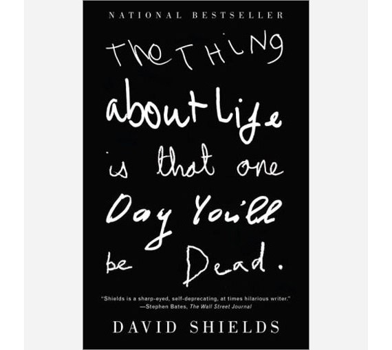
The Thing about Life is that One Day You’ll be Dead by David Shields
Nothing is more depressing than the title. The title is written all over the book cover, with different variations of crude handwriting. The cover design is just as frank as the book’s title. The cover design is by Jamie Keenan.
How the Other Half Lives by Jacob Riis
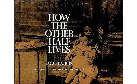
How the Other Half Lives by Jacob Riis
Another one of my favorite books in the photojournalism department. It was a sensational piece during that time in the 1890s, for it is the first chronicle that exposed New York’s upper and middle classes and the squalid living conditions in the slums. The cover design is the perfect preview of the contents of the book.
The Snowman by Jo Nesbo
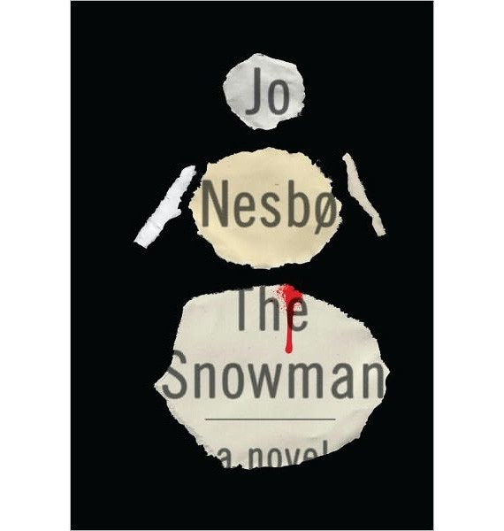
‘
Most of the books in the section feature a black background and a single picture or phrase in the center. It just gives that necessary effect of depression and mystery. Without the eerily crude cover design with a blood spatter, Jo Nesbo’s book may look like a Christmas tale or something. But it’s actually a crime novel involving gruesome murders.
John Dies at the End by David Wong

John Dies at the End by David Wong
The cover design is hilarious and gruesome at the same time–which is just like the contents of the book. David Wong’s first novel, ‘John Dies at the End’ is actually a comedy/horror novel that was first available online. The novel proved to be very popular, and had a following of 70,000 people before it was removed. The design is a bit crude, just like a B-rated horror movie, but there’s something so different and interesting about it.
The Last Skin by Barbara Ras
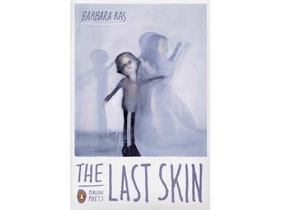
The Last Skin by Barbara Ras
This book, which is about poetry, is eerily beautiful but sad. The cover seems like a watercolor painting that looks somewhat unfinished. The book cover design is by Oliver Munday.

This post may contain affiliate links. See our disclosure about affiliate links here.


