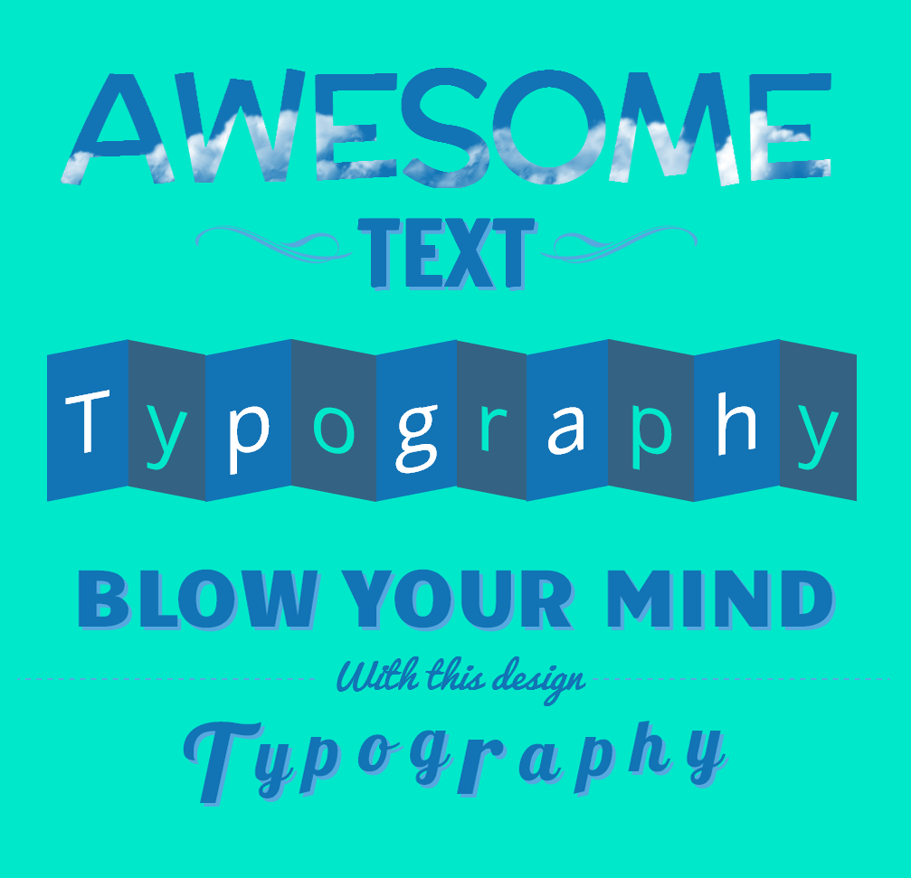
Typography on websites has become even more popular on the Internet in recent years. In the past, this was ignored, but with the different screens nowadays, this is an essential topic that should be dealt with.
These days, with the options to use Web fonts like Google Fonts and Typekit, you can achieve cross-browser, stunning and high-resolution web texts without worrying the screen sizes.
Your Designer Toolbox
Unlimited Downloads: 500,000+ Web Templates, Icon Sets, Themes & Design Assets
Table of Contents

DOWNLOAD NOW![]()
However, with all these available technologies, there’s a key ingredient missing to typographers: Kerning.
Kerning is the process of adjusting the spacing between characters in a proportional font. Thanks to the power of CSS3 and jQuery, it’s now possible to structure a well-designed typography with complete control of the text and animation quickly and easily.
Resources You Will Need to Complete This Tutorial:
What We Will Be Creating

Animated Mask Typography
The Markup
Before we begin, on our HTML file, we will add first the HTML5 doctype and series of links on our head section. This will include our link to the CSS file and Google fonts links followed by our jQuery library file and the Lettering.js plugin.
<!DOCTYPE html>
<html lang="en">
<head>
<meta charset="utf-8"> <title>Typography</title>
<link href="css/style.css" media="screen" rel="stylesheet">
<link href='http://fonts.googleapis.com/css?family=Open+Sans:300italic,400italic,600italic,700italic,800italic,400,300,600,700,800' rel='stylesheet' type='text/css'>
<link href='http://fonts.googleapis.com/css?family=Francois+One' rel='stylesheet' type='text/css'>
<link href='http://fonts.googleapis.com/css?family=Candal' rel='stylesheet' type='text/css'>
<link href='http://fonts.googleapis.com/css?family=McLaren' rel='stylesheet' type='text/css'>
<script type="text/javascript" src="js/jquery-1.11.0.min.js"></script>
<script type="text/javascript" src="js/jquery.lettering.js"></script>
</head>
Next, we will add our code to our body section. This will include a container class that has H1 and H2 tags on it. I’ll also add a vintage-line class for our vintage lines on each side of the H2 class.
<body>
<div class="container">
<h1 class="demo">Awaesome</h1>
<div class="vintage-line1"></div>
<h2 class="demo1"> Text</h2>
<div class="vintage-line2"></div>
</div> </body>
The CSS
.container {width: 960px; margin: 0 auto;} .demo{
color: transparent;
-webkit-font-smoothing: antialiased;
background: url(img/cloudy.png);
background-position: 0px 0px;
background-repeat: repeat-x; text-transform: uppercase;
font-size: 167px;
text-align: center;
font-family: 'McLaren';
-webkit-background-clip: text;
-webkit-text-fill-color: transparent;
letter-spacing: -8px;
padding-bottom: 40px;
margin-top: 30px;
animation: animatedBackground 20s linear infinite;
-ms-animation: animatedBackground 20s linear infinite;
-moz-animation: animatedBackground 20s linear infinite;
-webkit-animation: animatedBackground 20s linear infinite; } @keyframes animatedBackground {
from { background-position: 0 0; }
to { background-position: 100% 0; }
}
@-webkit-keyframes animatedBackground {
from { background-position: 0 0; }
to { background-position: 100% 0; }
}
@-ms-keyframes animatedBackground {
from { background-position: 0 0; }
to { background-position: 100% 0; }
}
@-moz-keyframes animatedBackground {
from { background-position: 0 0; }
to { background-position: 100% 0; }
} h2.demo1 span {
position: relative;
-webkit-transition: all 0.3s ease-out;
font-size: 100px;
font-family: 'Francois One';
text-transform: uppercase;
top: -200px;
color: #1273B5;
text-shadow: 4px 4px 0px #56a8de;
} h2.demo1 span:hover { top: -216px; }
h2.demo1 .char1 {
display: inline-blocks;
position: relative;
-webkit-transition: all 0.2s ease-out;
-moz-transition: all 0.2s ease-out;
-o-transition:all 0.2s ease-out;
-ms-transition: all 0.2s ease-out;
transition: all 0.2s ease-out;} .vintage-line1{
width: 215px; height:79px;
background: url('img/vintage-line.png')no-repeat;
display: block; position: absolute;
right: 760px;
top: 410px;
} .vintage-line2{
width: 215px;
height:79px;
background: url('img/vintage-line2.png')no-repeat;
display: block;
position: absolute;
right: 379px;
top: 410px; }
The jQuery
For our jQuery code, we’ll add the following script block with the magical.lettering() method:
$(document).ready(function() {
$(".demo1").lettering();
});
Now, the text is easy to manipulate in your CSS using an ordinal .char# pattern. This plugin assumes the basic counting skills, but it’s a pretty fast and easy way to get control over each letter.
Folded Text Typography
The Markup
We will again add the HTML5 doctype and series of links on our head section. This will include our link to the CSS file and Google fonts links followed by our jQuery library file and the Lettering.js plugin.
<!DOCTYPE html>
<html lang="en">
<head>
<meta charset="utf-8"> <title>Typography</title>
<link href="css/normalize.css" rel="stylesheet">
<link href="css/style.css" media="screen" rel="stylesheet">
<link href='http://fonts.googleapis.com/css?family=Open+Sans:300italic,400italic,600italic,700italic,800italic,400,300,600,700,800' rel='stylesheet' type='text/css'>
<script type="text/javascript" src="js/jquery-1.11.0.min.js"></script>
<script type="text/javascript" src="js/jquery.lettering.js"></script> </head>
Next let’s add our HTML markup, which is a H1 tag wrap in a class container.
<div class="container">
<h1 class="demo2">Typography</h1>
</div>
The CSS
Our CSS will contain all of our elements inside a 960px width container. Notice that I use the nth-child CSS selector. The :nth-child(n) selector matches every element that is the nth child, regardless of type, or its parent.
For this tutorial, we use it to select child elements whose index is odd or even (the index the first child is 1).
To learn more about nth-child selector click here. This will help easily help us to define styles from left and right side of the folded background to create an illusion of a shadow effect.
h1.demo2[class*="word"]{
margin: 0px 10px 0 0 ;
} .demo2 [class*="char"]{
font-family: 'Open Sans';
color: #fff;
font-weight: normal;
margin-top: 60px;
font-size: 90px;
padding: 20px;
background: #1273B5;
display: inline-block;
} .demo2 [class*="char"]:nth-child(odd){
-webkit-transform: skewY(-11deg);
moz-transform: skewY(-11deg);
-o-transform: skewY(-11deg);
-ms-transform: skewY(-11deg);
transform: skewY(-11deg);
} .demo2 [class*="char"]:nth-child(even){
color: #00e8ca;
background: #346282;
-webkit-transform: skewY(11deg);
moz-transform: skewY(11deg);
-o-transform: skewY(11deg);
-ms-transform: skewY(11deg);
transform: skewY(11deg);
}
The jQuery
For our jQuery code, we’ll add the following script block with the magical .lettering() method but this time, we will select its child element using .children() method.
$(document).ready(function() { $(".demo2").lettering("words").children('span').lettering();
});
Simple Header Text Typography
The Markup
<html lang="en">
<head>
<meta charset="utf-8"> <title>Typography</title> <link href="css/style.css" media="screen" rel="stylesheet">
<link href='http://fonts.googleapis.com/css?family=Open+Sans:300italic,400italic,600italic,700italic,800italic,400,300,600,700,800' rel='stylesheet' type='text/css'>
<link href='http://fonts.googleapis.com/css?family=Candal' rel='stylesheet' type='text/css'>
<link href='http://fonts.googleapis.com/css?family=Pacifico' rel='stylesheet' type='text/css'>
<link href="http://fonts.googleapis.com/css?family=Lobster" rel="stylesheet" type="text/css"> <script type="text/javascript" src="js/jquery-1.11.0.min.js"></script>
<script type="text/javascript" src="js/jquery.lettering.js"></script>
</head>
Next, we will add our code to our body section. All of our elements will be wrapped with a container class. We’ll add a header tag to organize our H1 and H2 tags. Then, on the bottom, we will add our Typography text with an on-hover animation.
div class="container">
<header>
<h1 id="title">Blow your mind</h1>
<p id="tagline">With this design</p>
</header> <div id="content">
<h1 class="typo">Typography</h1>
</div> </div>
The CSS
For the CSS, we will wrap all elements in a 960px width container. We will also play around with the positions of each character span and give it a nice smooth animation on the mouse-over.
.container{width:960px;margin:0 auto; height:900px;} h1#title{
font-size: 90px;
text-transform: uppercase;
border-bottom: 2px dashed #56a8de;
padding-bottom: 38px;
font-weight: normal;
font-family:'Candal';
text-shadow: 4px 4px 0px #56a8de;
color: #1273B5;
} h1 .char2{margin-right: -6px;} h1 .char5{margin-right: -8px;}
h1 .char8{margin-right: -3px;} #tagline{
font-size: 40px;
background:#00e8ca;
font-style: italic;
display: inline-block;
padding-right: 10px;
padding-left: 10px;
top: -142px;
position: relative;
color: #1273b5;
font-family: 'Pacifico';
} h1.typo {
font:80px "Lobster";
text-shadow:#56a8de 4px 4px 0;
position: relative;
margin-top: -215px;
color: #1273b5;
} h1.typo span {
display:inline-block;
position:relative;
padding:10px;
-webkit-transition:all 0.2s ease-out;
} h1.typo span:hover {
-moz-transform:scale(1.1);
-webkit-transform:scale(1.1);
} h1.typo .char1 { font-size:120px; position:relative; top:10px; left:-10px; }
h1.typo .char2 { position:relative; top:-15px; left:-8px; }
h1.typo .char3 { position:relative; top:-20px; left:-6px; }
h1.typo .char4 { position:relative; top:-25px; left:-4px; }
h1.typo .char5 { position:relative; top:-30px; left:-2px; }
h1.typo .char6 { font-size:120px; }
h1.typo .char7 { position:relative; top:-15px; left:0px; }
h1.typo .char8 { position:relative; top:-20px; left:4px; }
h1.typo .char9 { position:relative; top:-25px; left:6px; }
h1.typo .char10 { position:relative; top:-30px; left:8px; }
The jQuery
We’ll add the following script block with our magical.lettering() method and select both the class typo and the ID title.
$(document).ready(function(){
$("#title").lettering();
$(".typo").lettering(); });
You can now easily manipulate your CSS using an ordinal .char# pattern.
Final Words
Congratulations! You’ve made it! You can imagine what a pain in the ass it is to have all those spans littering your markup and a nightmare to maintain. Good thing we have this great plugin – Lettering.js and, of course, with the power of CSS3 animation, our typography designs will never be boring again.
This post may contain affiliate links. See our disclosure about affiliate links here.


