Redesigning a popular interface is a great way to improve your skills.
Whether you want to hone your mockup design skills or craft your frontend prowess, a fancy redesign is a solid practice project.
It’s easy to search Dribbble and find tons of website redesigns as static images. But it’s not so easy to find similar redesigns in code.
That’s why I took a dive into CodePen’s archives to find these 11 custom interfaces that reimagine popular sites. You’ll find designs for Twitter, IMDb and even a few other notable websites you might recognize.
Google Search Redesign
Table of Contents
The infamous Google search page gets billions of impressions per day. Actually 3.5b per day, to be exact.
So that page needs a design that’s on-point. If you’re redesigning something, there is a bit of room to have fun with it and that’s the idea behind this pen.
It’s a simple Google page redesign focusing just on the search input field. It features a bright, colorful button with drop shadow effects that you’d never see from Google’s design team.
The result is a fun way to reimagine search.
Gmail Application
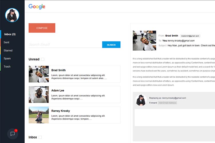
Google fans will probably enjoy this reimangined Gmail in a similar vein as the last pen.
But this one features a full Gmail interface – so it’s a little more detailed.
Clicking through the sidebar animations, you’ll notice that they really do animate smoothly. Not to mention the sleek material design color scheme.
If you’re a frequent Gmail user, you may even prefer this redesign over the current style.
Google Branded Redesign
Here’s another Google redesign I wanted to throw in. This one’s a little more detailed with links for Google’s entire set of tools.
This pen by Mohamad Reza Deylami features a redesigned Google logo, altered color scheme and links to all of their different search features.
I think it’s a bit more complex than the current page – so I wouldn’t take it over Google’s design.
What I do like about this redesign is that it’s unique and it stays true to the Google style. Oh and all the code is open source, too.
Twitter UX
Twitter has a bunch of UX features spanning their desktop and mobile interfaces. One popular design style is the card interface, which you can see in this pen.
It’s a reimagining of Twitter’s UX with a smaller card design.
This includes a scroll bar along with buttons for editing your profile. And when you scroll down, there are even placeholders for the tweets. How cool!
Modern Twitter Redesign
Now for something a little more technical, have a peek at this Twitter redesign.
This thing is monstrous and it really does flip the Twitter interface on its head. I actually recommend studying the design in full view to see how it looks in your browser.
I love the menu, love the timeline and really love the simple hover/focus effects. The only thing missing? This isn’t a responsive page.
But in all fairness, Twitter does have a mobile-specific layout aside from the main desktop design. So they handle mobile users differently, too.
FreeCodeCamp Homepage
Developers love FreeCodeCamp for its endless support of new developers and for its friendly approach to charity.
CodePen user Giana must really love the site since they created a full redesign of the FreeCodeCamp homepage.
I can’t really say if it’s a better or worse design. It’s awesome in many ways and also very different. It’s worth a glance if you’re familiar with the original layout.
Spotify Artist Page UI
The Spotify web layout is another widely-known interface and Adam Lowenthal took it upon himself to recreate the Spotify artist page.
Most of the features don’t fully work – so you can’t stream music. But the actual page elements are real, so you could copy/paste this code to mix up your own HTML audio player.
Plus, the whole thing is mobile responsive. So that’s nice.
Unsplash Redesign Stuff
I can’t say that this redesign of Unsplash is better than the current homepage. But I do think it’s a creative reimagining of how the layout could look focusing on a different structure.
This pen still has the same grid system but developer Kyle Shanks also places a focus on the email capture box and the dropdown navigation menu.
It’s super clean and super easy to rework if you’d like to edit this for your own site.
IMDb Concept
Not everything in this IMDb redesign is functional. That’s the downside here.
But the upside is this design really looks spectacular. It’s absolutely phenomenal and would probably work well as a web-app for touchscreens.
Take a peek at the full view to really see how it all comes together on the page.
LinkedIn Redesign
Over the years, LinkedIn has cluttered their layout with so many extra features. I’m really a fan of minimalism and that’s what I see in this redesign by Nahom Ebssa.
Simple colors with an easy-to-use interface. Many elements even borrow ideas from the material design language.
Granted, the layout doesn’t seem 100% finished – but I think it’s a really nice template.
If you want some HTML/CSS/JS practice, maybe fork this one and try adding your own features.
YouTube Redesign
For another design that’s not totally done (but still looks amazing), I have to recommend this YouTube redesign.
It really does look a lot cleaner than the modern YouTube homepage. Granted, some of the images won’t load but you still get the gist of the layout. It’s also 100% free of JavaScript, which is pretty awesome.
None of the links or buttons work – so it’s not usable. Still, this is a brilliant attempt to bring YouTube’s design forward with a much more focused UI.
This post may contain affiliate links. See our disclosure about affiliate links here.


