Design portfolios are fairly easy to set up. You can build project grids or add visual case studies to showcase your work, and the quality is immediately visible.
With UX design, it’s a little tougher because it’s often about the process and the results on each project. To craft a great UX portfolio I recommend studying others to get ideas.
This collection is by no means a complete collection of UX designer portfolio sites. But it’s an excellent place to start looking for ideas and studying how other UX designers present their work.
The UX Designer Toolbox
Table of Contents
Unlimited Downloads: 500,000+ Wireframe & UX Templates, UI Kits & Design Assets
Starting at only $16.50 per month!

DOWNLOAD NOW![]()
1. Hanna Jung
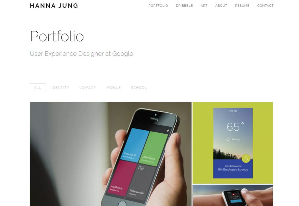
Hanna’s portfolio site offers a minimalist style with a primary focus on the work. It uses plenty of visuals to sell projects but it doesn’t feel like “just” a UX portfolio.
The header and tagline clarify exactly what Hanna does, and this is probably the best way to grab attention. If you’re designing a portfolio site for yourself always try to share what you do early, so visitors know what they’re looking at.
Each project photo inside the grid links to an internal page with more info. You can turn this into a detailed photo gallery, a quick synopsis, or even a detailed case study. But offering more info about each project on a separate page is never a bad idea.
2. Adham Dannaway
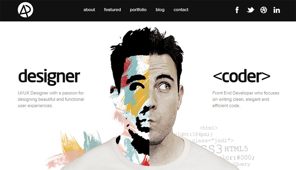
Many people know Adham Dannaway’s site because it’s been featured in galleries across the web. And for good reason!
His homepage uses a brilliant graphic illustrating the type of work he does: both design and code.
There’s a significant overlap between UI designers and UX designers, so a lot of freelancers position themselves in this overlap. It makes you more valuable to a client who may want to hire for both skills, or just one knowing both skills worth off each other.
But the real reason Adham’s portfolio works so well is the internal structure of his portfolio project pages. Check out this one as an example. Notice how it reads in a linear fashion and helps sell the work done on that project.
Definitely the best choice for anyone launching a UX portfolio site from scratch.
3. Val Head
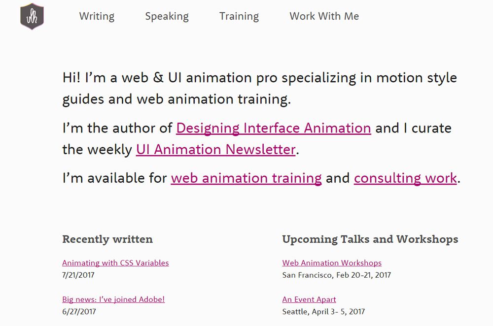
Val Head is a well-known designer with a specialty in UI/UX animations along with interaction design. Her portfolio site is a testament to all the work she does.
And you’ll notice the homepage doesn’t use a single image beyond her logo.
The structure immediately grabs your attention whether it’s focused on Val’s newsletter, her speaking engagements, or her recent blog articles. A fantastic design showing how you can sell your UX work without many visuals at all.
4. Paul Lapkin
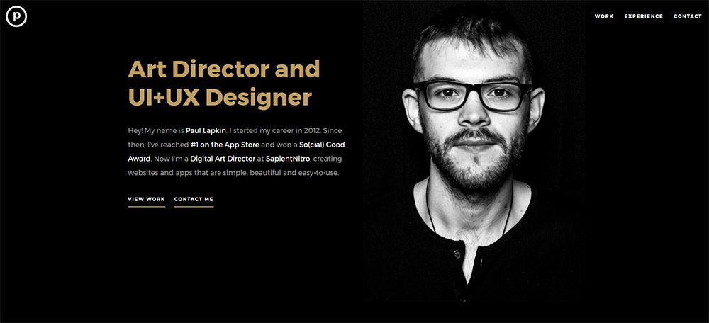
Some designers don’t feel comfortable adding their personal photos onto their portfolio. Others like it because it adds personality and gives visitors a chance to see who they are.
Paul Lapkin uses a fullscreen header background portrait that immediately grabs attention. The heading text describes his work as a UI+UX designer along with further details underneath.
This intro text is meant to grab your attention and leave you wanting more. The “view work” link is pretty clear, and if you can write copy that also grabs attention this style might work for you too.
5. Nick Finck
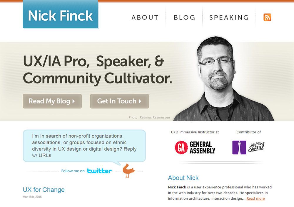
Nick Finck has a much more traditional website with a clear header, navigation, and footer area. Not all modern portfolios look like this but this layout works well and has for years.
One thing I really like on the homepage is the header section with Nick’s photo. This includes two CTAs that encourage you to dig deeper into Nick’s work.
A lot of his portfolio’s essence is in the writing and in his past project work for companies like Adobe and Google. This means it’s less about selling and more about building connections with potential clients.
6. Christina Richardson
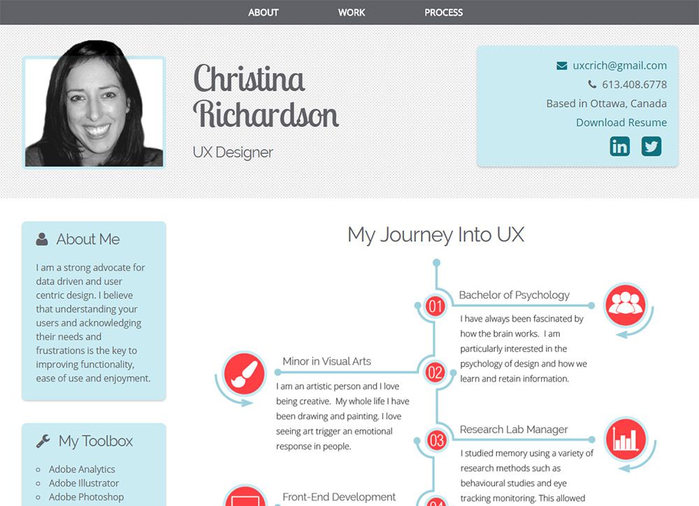
A while back I was browsing through portfolios and found Christina Richardson’s site.
This has always been a favorite of mine for a few reasons. It naturally has a sense of personality, but it doesn’t feel too cluttered or heavily customized. The whole site runs as a single-page design so it’s super easy to navigate too.
But I also really like the UX timeline feature since it’s a visual representation of work experience.
This feels a lot more user-friendly than a boring resume, but it gets the same message across. Very UX-y if I do say so myself.
7. Ionut Zamfir

Split-page designs work well if you have the right photos. Ionut Zamfir follows this trend brilliantly in his UX design portfolio.
Background images litter each section of the page and you’ll even find a slideshow featuring pics of his work.
It’s definitely a simple website, but sometimes that’s all you need. Some visuals to help sell, information about the designer and a contact form.
8. Kevin M. Hoffman
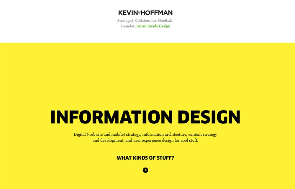
Other than photos you can also use contrast and colors to grab attention. That’s what you’ll find on Kevin Hoffman’s site which also breaks the page up with horizontal block sections.
Text is pretty easy to read and it doesn’t follow any particular formula. Not to mention the colors don’t exactly match, but they also don’t clash either.
I’d call this an experimental portfolio layout, but it does serve its purpose.
9. Simon Pan
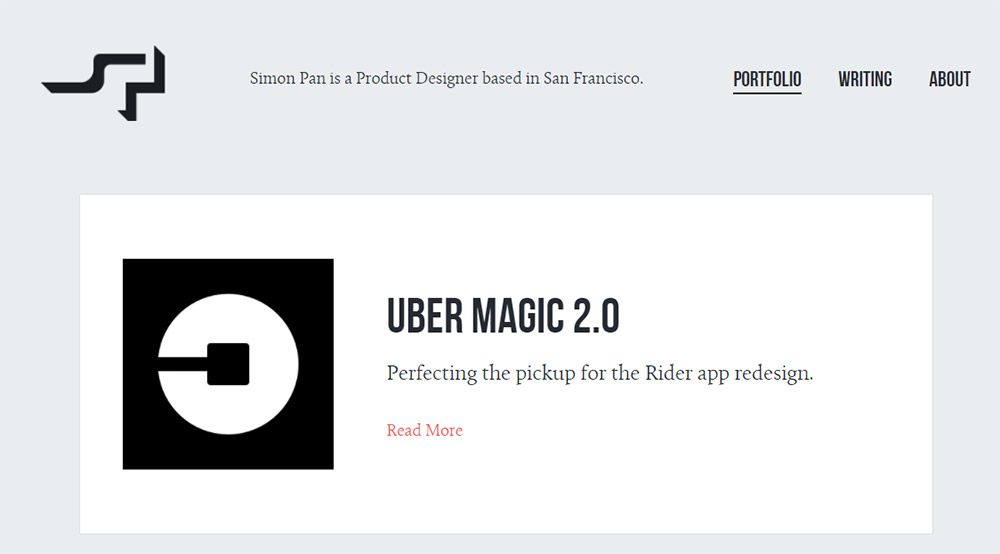
The portfolio site of Simon Pan is one of the best places for case study layouts. You can learn so much just going through his portfolio and reading through his case studies.
With UX design it’s more about selling your knowledge through the process. Clients want to know what you did on a project and how you solved problems for past clients.
Simon’s copywriting is exquisite, and it helps sell his work well. This is one of the best skills you can pick up if you’re pushing towards a case study mentality.
10. Adrian Zumbrunnen
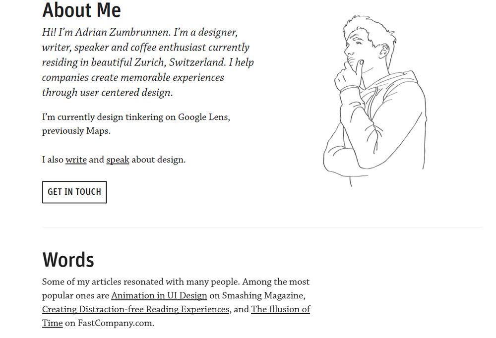
With a unique combination of minimalism and dynamic effects, this portfolio is certainly eye-catching.
Adrian Zumbrunnen uses a dark + light color scheme that feels typical of many design portfolios.
But he includes other elements like bold CTA buttons, links to video recordings of his talks, and even an illustration of himself. Pretty unique!
11. Ramin Nasibov
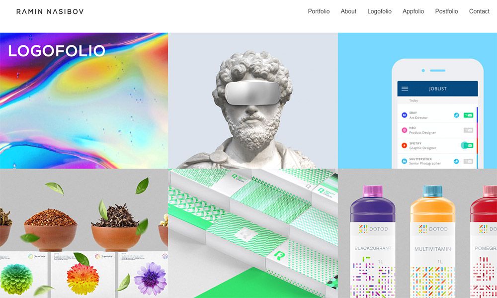
Ramin Nasibov follows a typical grid layout that works well on visual designer’s portfolios. This site is real easy to browse and it works nicely on mobile too(along with other grid-style layouts!)
One thing I would like to see on Ramin’s homepage is more info about himself. But he does so much work in the design space that it makes sense to focus solely on the work.
If you’re trying to draw more attention to your work instead of yourself I recommend a grid-style layout just like this.
12. Nishtha Mehrotra
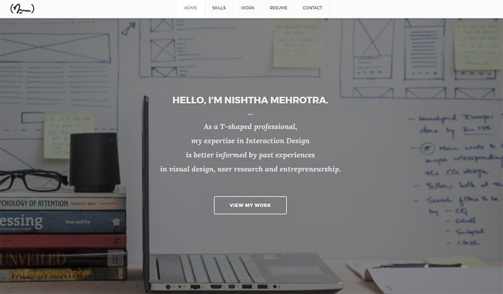
On Nishtha Mehrotra’s site you’ll find a nice mix of everything. It uses a custom hero header with animations, a visual portfolio grid, and a clean contact section with an email and a phone number.
The site feels incredibly professional, and it has been designed with the user in mind. Single page portfolios are often better if you can fit everything you want to say onto one page.
I also like the resume section which feels a lot easier to browse than a PDF doc. Overall a really clean site, and well worth studying if you’re going for the single-page portfolio look.
This post may contain affiliate links. See our disclosure about affiliate links here.

