After the shift away from skeuomorphism to flat design a few years ago, elements such as drop shadows were all-of-a-sudden deemed obsolete.
As flat design slowly evolved back into something less severe, it has begun to implement aspects from formerly popular design trends. Shadows have been the obvious development here as they contrast beautifully with minimal design styles and flat design elements.
In this article, we are going to review a selection of the very finest current implementations of shadows in web designs.
Your Web Designer Toolbox
Unlimited Downloads: 500,000+ Web Templates, Icon Sets, Themes & Design Assets
Table of Contents

DOWNLOAD NOW![]()
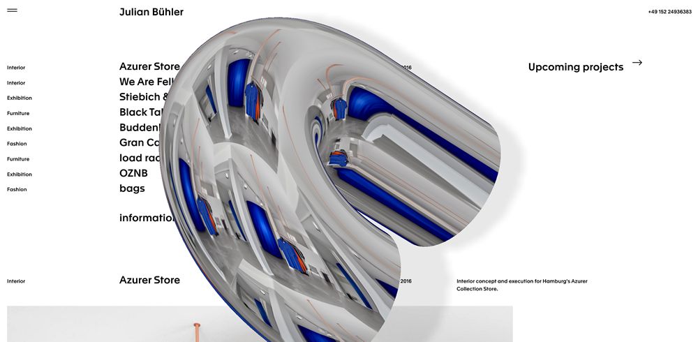
Julian Buehler
Bordering on brutalism, Julian Buehler’s website uses clever 3D shapes with shadows, providing a unique depth effect.
Combined with old school reflections, the shadows give the object a realistic feel and certainly succeed in creating something unique and out of the ordinary.
Ustwo
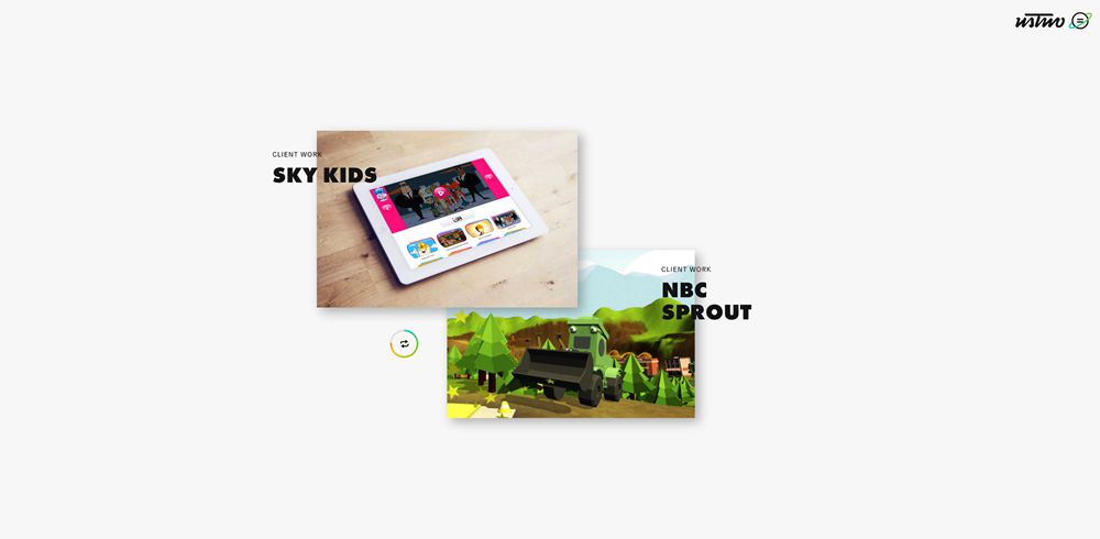
A more subtle implementation, Ustwo uses overlapping text in tandem with shadows to create a layered effect. This results in adding some separation as well as perspective and visual interest.
ATOLYE15
ATOLYE15 cleverly uses shadows against a white backdrop to create the illusion of transparency in the hero section. This minimal implementation is subtle yet effective, and a great example of how shadows can enhance a website’s design.

Better
Better is unique in its design as the shadows are connected to the objects, creating the illusion of there being a table on which the items are being placed.
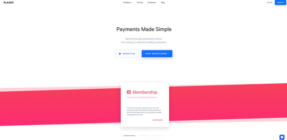
Plasso
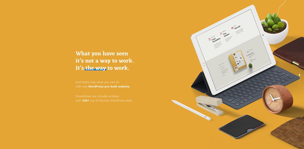
Plasso is an all around excellent website design. The shadows are implemented sparingly but in perfect fashion. They grace only the primary CTA buttons and content cards, creating a very minimal but stand-out design which highlights and brings attention to all the essential areas.
Stripe Sigma
Stripe is renowned for its excellent design direction. As it continues to roll out more products and features, the continuation of this direction includes an abundance of impressive shadows.

Smallchat
Smallchat includes shadows in their very minimal yet colorful design. They add to the contrast behind product imagery and help differentiate it from the written content. All-the-while, it adds an attractive layer to the design and rounds off an excellent landing page.

Scaphold
Scaphold, like Better above, uses shadows to produce a table-like effect underneath the product illustrations. In this example, it uses a variety of shadow styles including very harsh edges as well as softer, heightened shadows which produce the illusion of elements floating in mid-air.

Have you noticed any examples of shadows in web design recently? Share them with us below!
This post may contain affiliate links. See our disclosure about affiliate links here.


