Split screen layouts break the oldest and most critical UI design rule of all by giving equal importance to two primary areas of a site. It’s common practice to give each element of a site a priority level in relation to the structure of the design, yet split screen layouts completely ignore those rules.
And strangely, it works.
With a split-screen, you can give prominence to both elements and enable the user to choose between them. You can quickly convey dual importance. For example, if you want to communicate to your visitors that your core strengths are both your digital products as well as your talented staff, you can place one on the left side, and the other on the right side.
Your Web Designer Toolbox
Unlimited Downloads: 500,000+ Web Templates, Icon Sets, Themes & Design Assets
Table of Contents

DOWNLOAD NOW![]()
On your portfolio website you can position the identity of your brand on the left, and a list of the sites you have built on the right. If you are designing a restaurant or coffee shop website, you can use one side to feature some company or contact information while showcasing photos of customers enjoying the locales on the other side.
Split screens provide lots of ease to users, especially if they are potential customers. Thanks to the reduced clutter and the more streamlined appearance of split screen layouts, users will spend less time trying to find the information they are looking for.
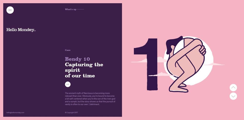
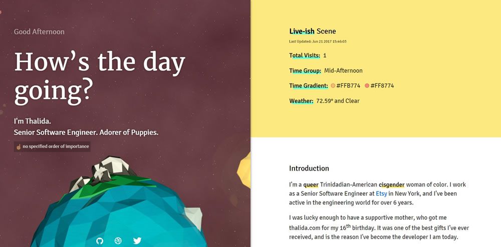
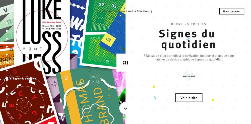
Below you will find a selection of beautifully designed websites that have successfully implemented split screen layouts.
Hello Monday
Thalida
Studio Meta
F L P L N Y

Primal

Matthew Hall

Studio Meta
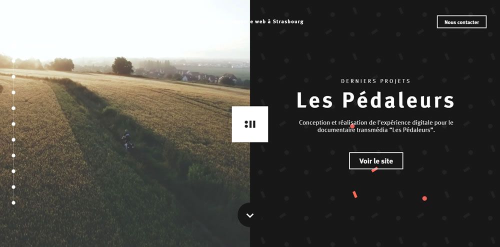
Ocean Resort Residences
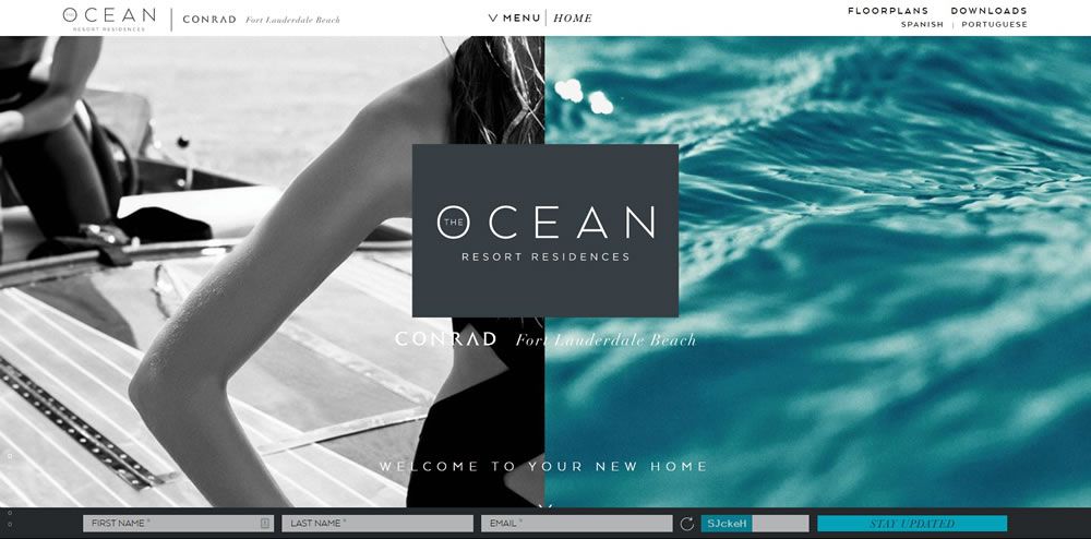
EngineThemes
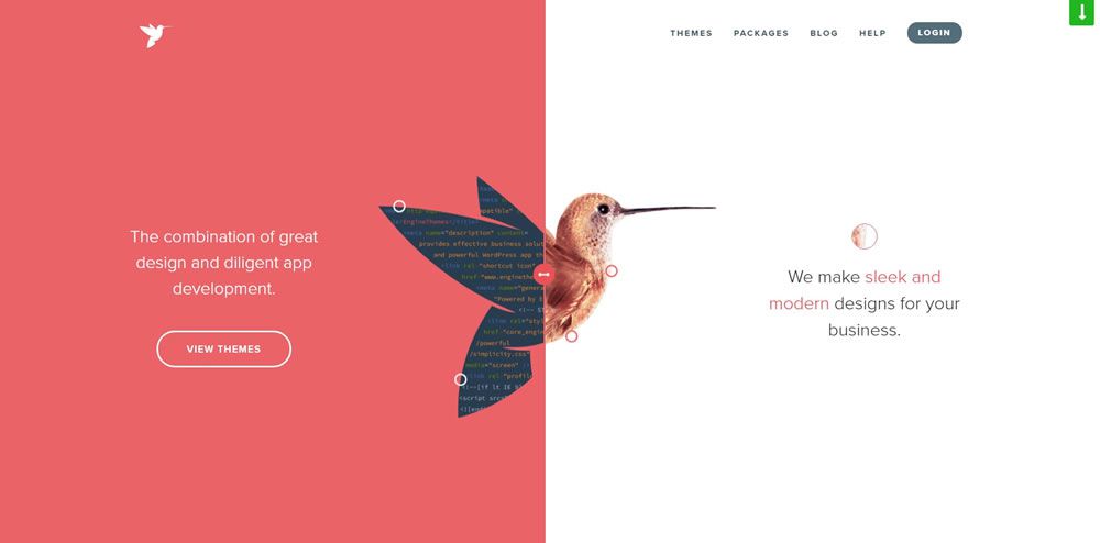
Roman Kirichik
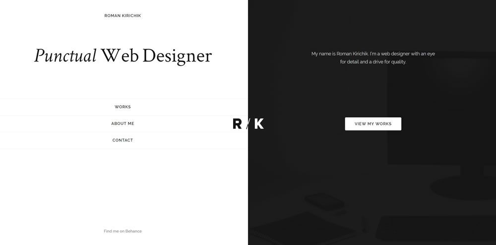
Huncwot
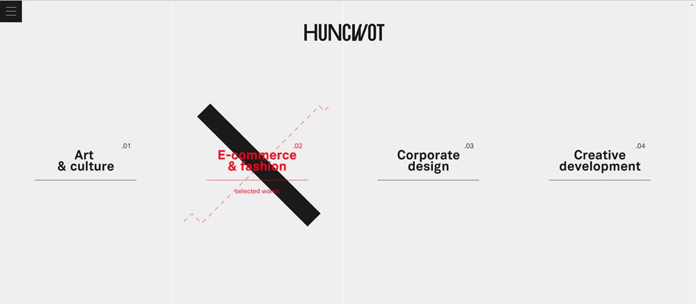
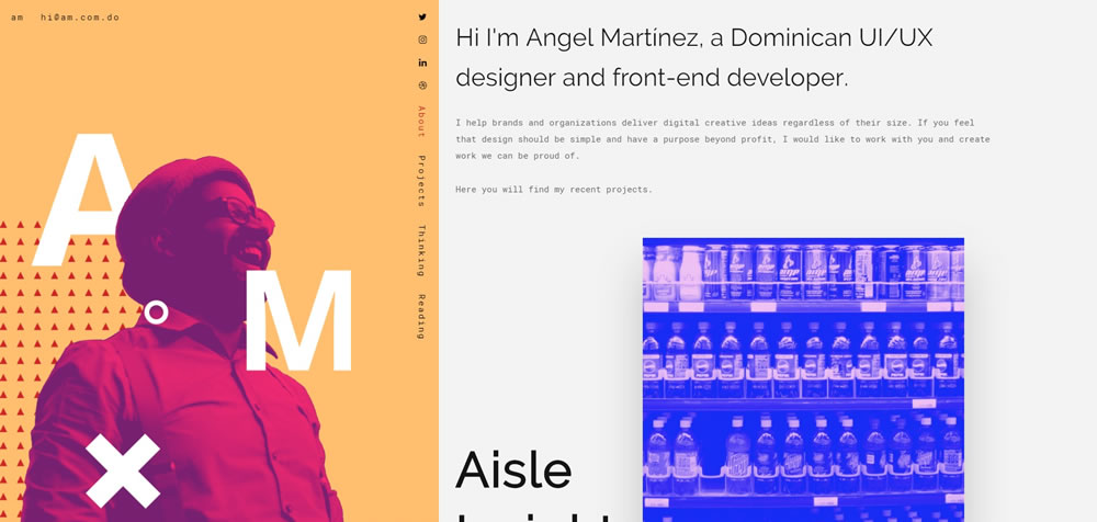
Angel Martínez
Finished!
In contrast to many other layout types, a split-screen layout design gives a website an edgy look – big and bold, yet oozing with simplicity and power.
However, you have to exercise lots of caution when working on a split screen website. If you are not careful, your overall design may look like a cheesy before and after photo, and nobody wants that.
This post may contain affiliate links. See our disclosure about affiliate links here.

