Nothing looks nicer than a good gradient in a design. Gradients can completely transform a website color scheme from mundane to gorgeous, and you’ll often find them in the centerpiece of a site’s design. Looking for some inspiration for your own backgrounds and banners? Take a look at these beautiful blends.
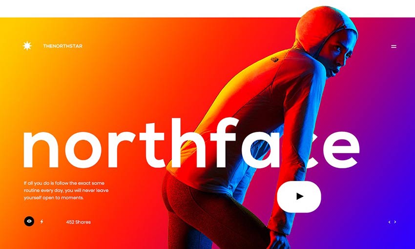
Dazzling is barely enough to describe this stunning banner. A gradient made of opposite colors is bound to be striking, and the way the strong lighting in the background reflects off the model just makes this a fantastic example of great gradients in design.
This page makes abundant use of gradients, from the animations and the background as you scroll down, to the various banners and illustrations peppered throughout. The cool purples, blues and pinks blend together perfectly thanks to the colorful style.
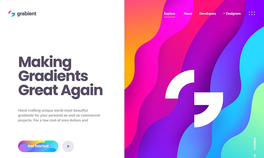
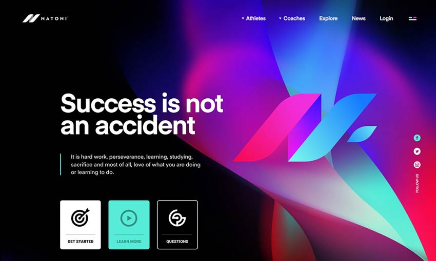
Obviously, a site designed to generate gradients would know how to utilize them effectively. The banner on the right is an instant eye-catcher, and the same color scheme is used to draw attention to the logo/homepage link as well as the call to action button.
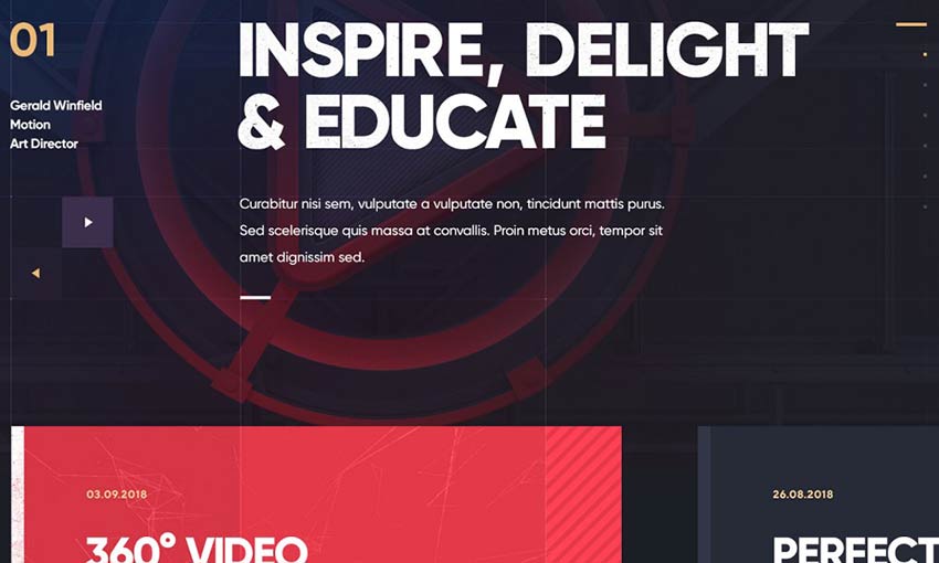
The effect here is super subtle, especially at the beginning of the page. But as you scroll, you’ll stumble upon a huge background image overlain with a pretty blue to red color palette. It then naturally flows into a big red text box, which is sure to grab attention.
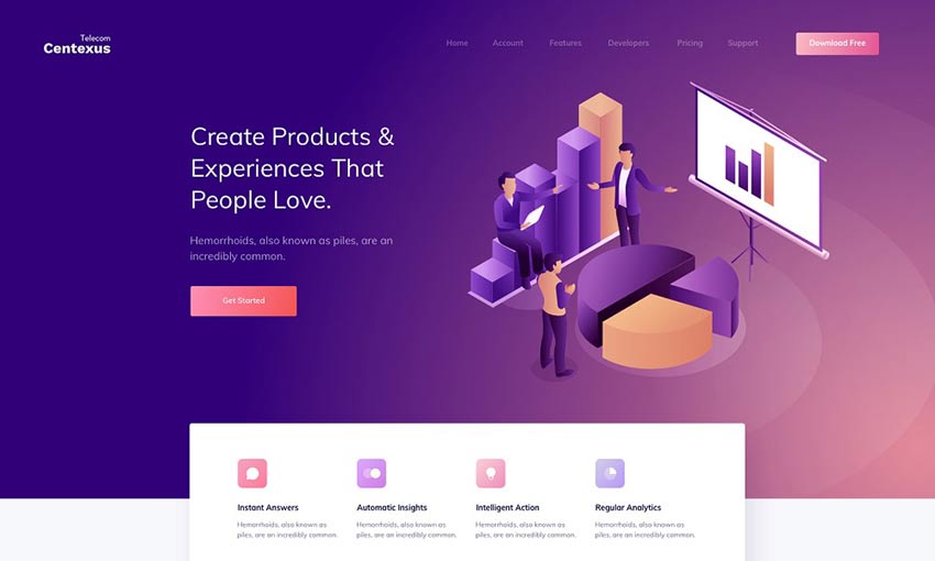
Smooth gradients can give a page a clean and elegant look. Professional doesn’t have to mean blacks and whites – add a splash of color and see what happens! This is a landing page that would definitely make conversions.
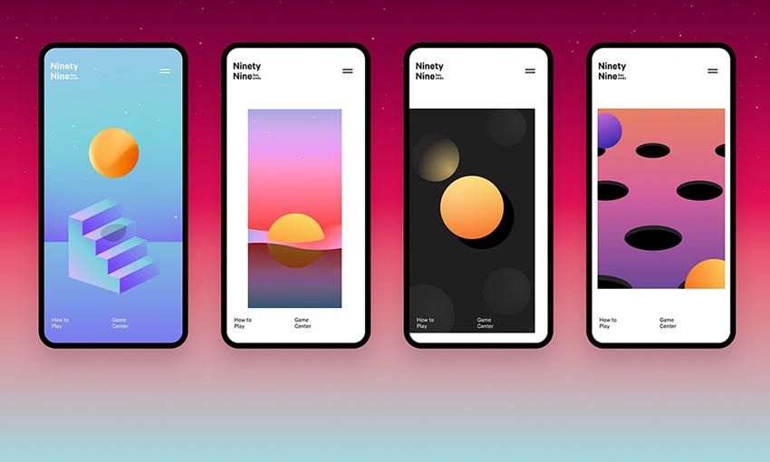
This game has a strong concept, its artistic style just as much so. Various abstract levels can be explored and discovered, each sporting a beautiful blended background. There’s even a gradient generator for this purpose. It all comes together to make an app you won’t easily forget.

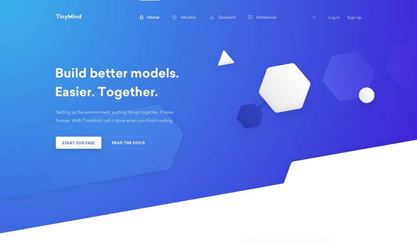
The beautifully designed landing page opens with vibrant blues and purples that cleanly fade to white as you scroll. Who needs a hero image when you can create a “hero gradient” that naturally transitions into your feature list?
Effective gradients can be simple and subtle, or flashy and gorgeous – all that matters is that it’s done well. This landing page sports the latter, with an image that serves both as a good background and yet is also the centerpiece of the design. It doesn’t distract from the text, but you can’t help but stare at the amazingly blended colors with the logo right in the middle.
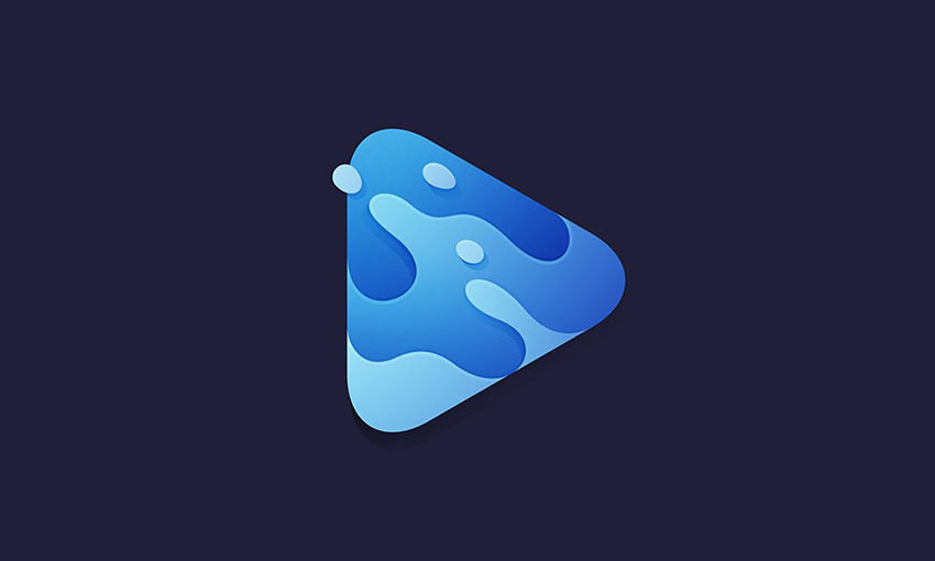
This is just fantastic work from a graphic designer. A clean and simple, yet so very pretty logo. Made to look like ocean waves, every piece of the water blends together beautifully. The reverse gradient effect on the lighting makes the logo look interesting and dynamic as well.
Flat, simple design is a fairly popular trend online. It’s clean, easy to create, and looks nice. But it can also be boring! The slight gradient effect here adds a ton of beauty and dynamic, while still retaining that smooth, clean-cut appearance that’s super satisfying to look at.
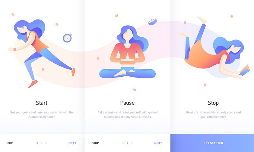
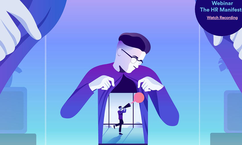
Gradients work great with light colors and pastels, and here’s the perfect example. The effect is slight, but compelling, with the central character getting a more dramatic gradient while the background is pale enough to almost blend in with the white.
Inspiring Effective Gradients
Gradients are a great tool for designers. Used well, they can add a dynamic look and a spark of beauty to a design. Subtle or flashy, there’s a place for a good gradient in any creation.
And a skilled designer can utilize one to add contrast to important elements, highlight areas of interest, incorporate UI elements into the gradient, or any other number of clever tricks.
This post may contain affiliate links. See our disclosure about affiliate links here.