Good news, not so good news, fabulous news, and a bonus.
The global market is getting bigger and bigger. That’s good news.
Clients, meanwhile, are getting more selective and demanding in their drive to share their messages with the world through the use of highly creative websites – that may not be such good news if it means a heavy dose of arduous work for you.
The fabulous news? Be Theme’s size and versatility make it the perfect web design tool for meeting the challenges brought on by the need to design creative, eye-catching websites that will pass muster with the most selective and eagle-eyed client. This is your opportunity to cash in by showing these clients what you can do for them.
The bonus is 5 simple steps to create a website your client will love and a website that converts.
5 Steps to Building Amazingly Creative Websites
Table of Contents
Step 1: Choose a Mesmerizing Color Palette
There are 3 simple rules you need to follow when choosing your color palette.
- It needs to immediately attract attention;
- It needs to be on brand, and;
- It needs to be compatible with and supportive of your messages;
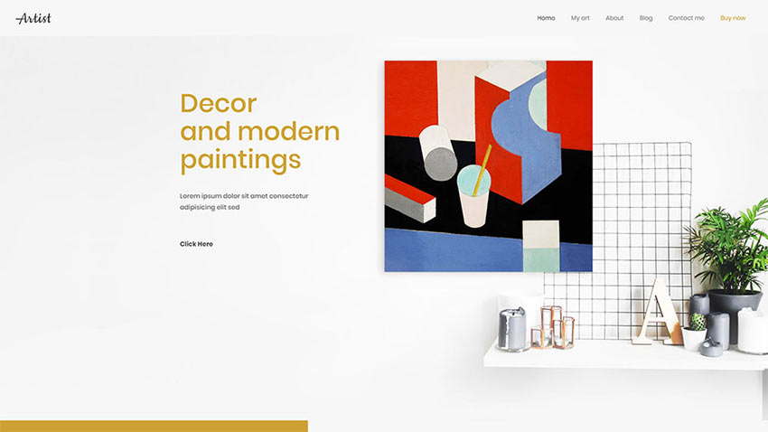
Artist’s BOLD color touches immediately attract attention.
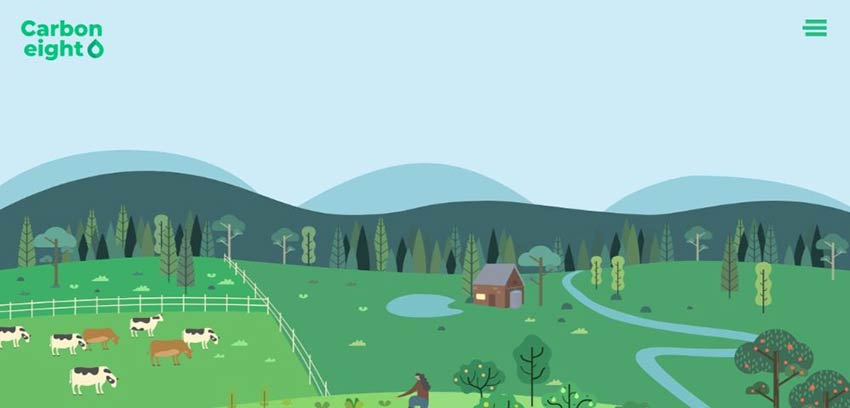
This Be Theme pre-built website offers an excellent example of an attractive, eye-catching color palette.
Carbon8, with its shades of green and contrasting colors perfectly aligns the color palette with the brand to produce a visually remarkable website.
The BeInsurance color palette is crisp, yet subtle; just the right combination of factors to reinforce a message and attract more clients.

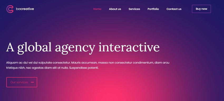
The BeFestival color palette is a perfect example of an approach you can take to appeal to a larger audience.

Step 2: Display Crystal-Clear Pictures
Presenting crystal clear images should be a no brainer. It’s the best way to let people know precisely what your business offers; as opposed to artsy, somewhat out of focus images that keep them guessing.
Flair and clarity always triumph over mystery and ambiguity when it comes to marketing a product – or a service for that matter.
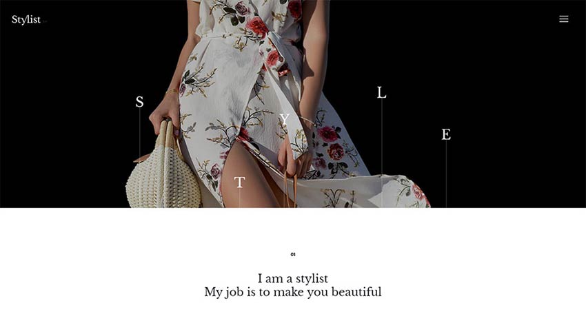
BeStylist makes excellent use of both flair and clarity in its images. Color schemes are easier to figure out when images are sharp.
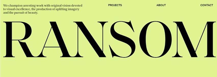
See if you can come up with a website design similar to RansomLTD. This website was built from scratch to display sharp, pixel-perfect digital images. Check this one out against what’s currently out there.
Or, you can go with a more conventional website like Zajno.

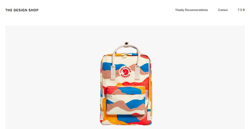
The Design Shop offers a no-nonsense approach to displaying your products with flair, dignity, and creativity. Compelling and crisp would be a good summary description.
Step 3: Show Visitors How Your Creativity Benefits Them
Showing people what’s in it for them is always a powerful marketing tactic, and one way to do that is to help them imagine themselves as being actual customers.
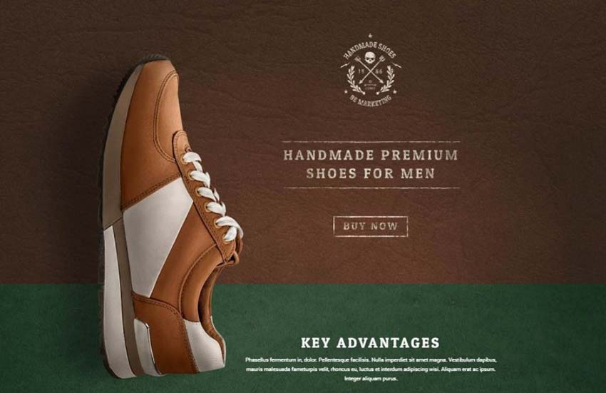
BeMarketing’s video on the homepage shows visitors how they can expect to benefit from using your product.
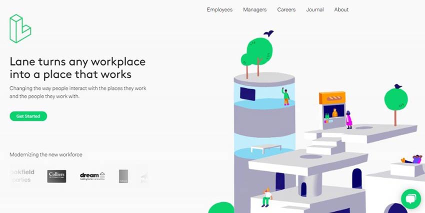
Lane, on the other hand, expresses a structural design perspective with its example of flexibility and functionality in workplace design.
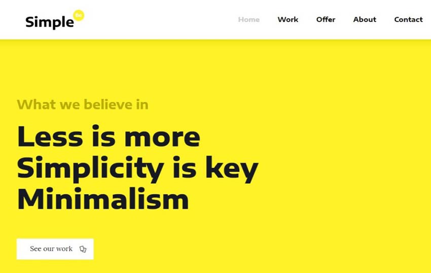
BeSimple demonstrates the power of a minimalist view; attractive, yet to the point.
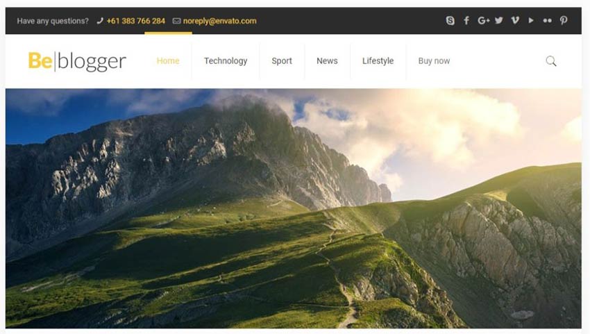
If you’re a travel blogger this one’s for you. BeTravelBlogger’s graphics layout makes it a travel blogger’s dream.
Step 4: (Over)Use “White” Space in Even in Creative Websites
“Overusing” white space is actually difficult to do. After all, it’s the #1 visual element found in many, if not most, successful websites. Don’t be hesitant about using it to highlight your creativity.
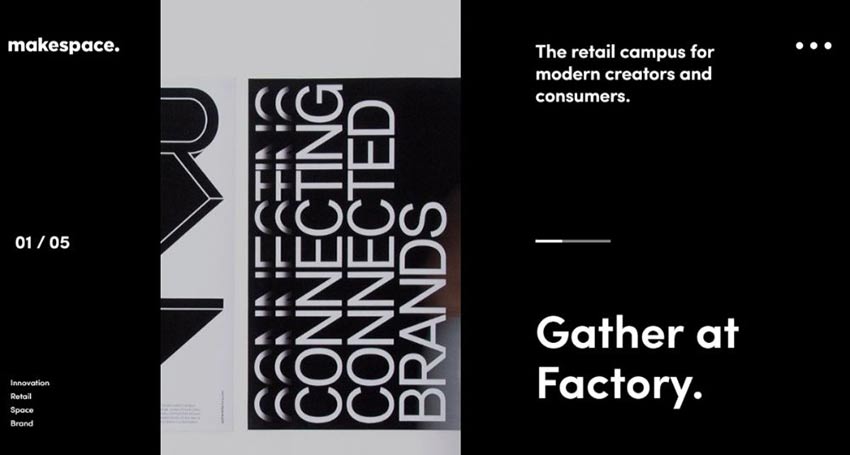
Makespace has a clean design that makes it oh-so-easy for the eye to focus on what’s most important.
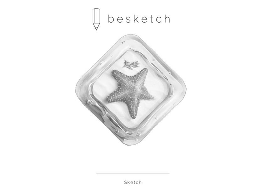
You can accomplish the same with either BeSketch or The Drive New York (or both). White space is used in these two websites to enhance the overall visual experience in addition to highlighting the page’s key elements.

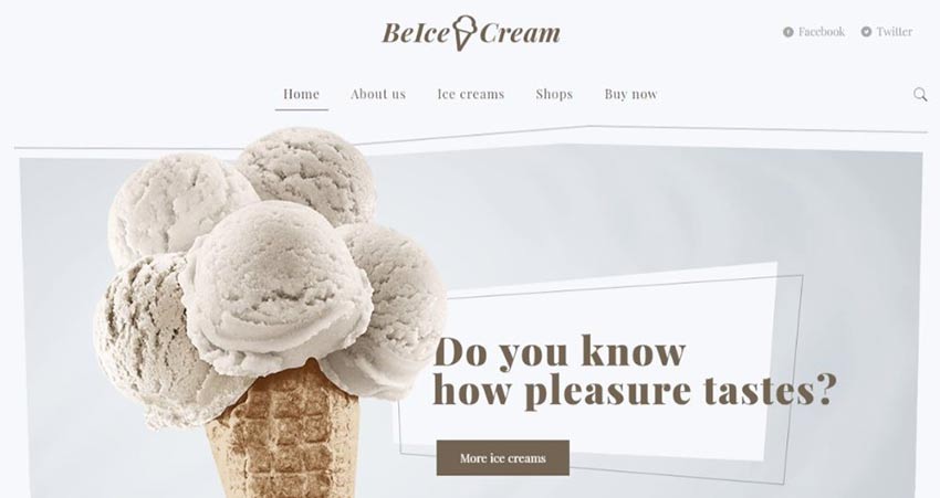
BeIceCream might well be THE most extreme example of effective use of white space. Its use definitely supports the brand while effectively driving the message home.
Step 5: Make Your CTAs Grab Visitors by the Eyeballs
If a CTA button doesn’t command immediate attention, why use one at all? Why not just let the visitor try to figure out what to do next?
Not a good idea. You want big, bold, bright buttons that are impossible to ignore, buttons that compel visitors to click.
Look at BeDrawing. It has a CTA button that clearly stands out. It’s centered nicely right below the sub-headline, where it acts like a welcoming invitation to step forward.

Stuart has the same idea; two CTA buttons, with the main one at the bottom.

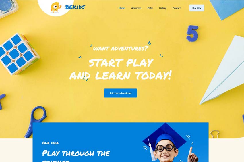
Here’s a great example of having the CTA match other elements on the page. Even though BeKids uses blue to match other blue elements, the CTA button still stands out.
Surefire Ways to Build Creative Websites
These 5 surefire tactics will take you a long way in your quest to building eye-catching websites that will convert. You should find the examples helpful in selecting your color combinations, positioning key elements, understanding the power of the generous use (or overuse) of white space, designing and placing CTA buttons that practically demand to be clicked, and of course showing your visitors, through your creativity, how they will benefit.
You’ll find the web’s most comprehensive and visually impressive gallery of fully-functional, professionally-designed creative websites on Be Theme. There are currently more than 450, and counting, pre-built websites to choose from and customize to your needs and to your liking.
This post may contain affiliate links. See our disclosure about affiliate links here.