Are you making a travel website that needs to capture the beauty of the world? World explorer, outdoorsy business, or travel agency, we know you need some big inspiration to get started with your design.
We’ve collected the work of some amazing web designers here for you. Let the mockups and websites they’ve created help you create your own awe-inspiring travel site.
UNLIMITED DOWNLOADS: Email, admin, landing page & website templates
Starting at only $16.50 per month!
DOWNLOAD NOW![]()
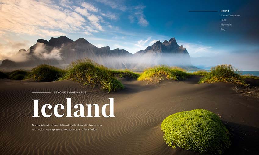
Dark and light contrasts the elements of this beautiful design, with light used to highlight the gorgeous imagery. Fullscreen photography, galleries, and sliders of the most scenic places in Iceland are scattered throughout and keep people engaged.
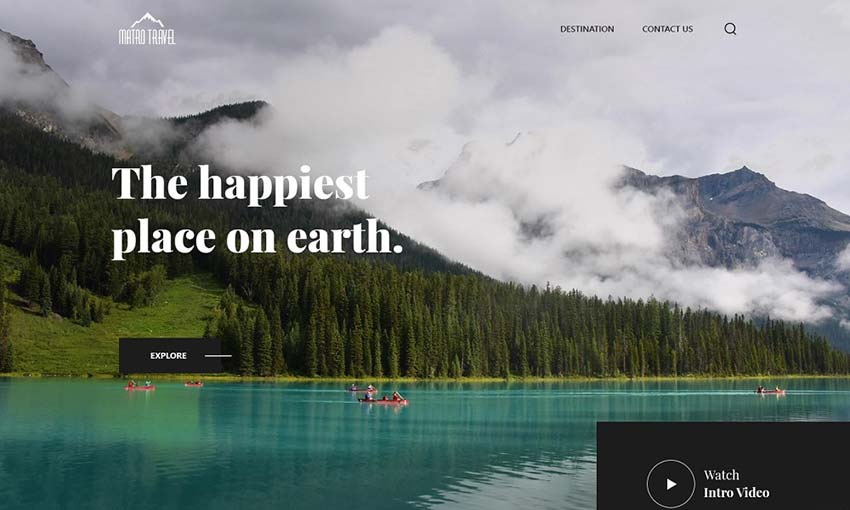
Bright and clean design dominates this well-made mockup. There’s a nice full screen hero image followed by plenty of smaller images next to calls to action and other information.
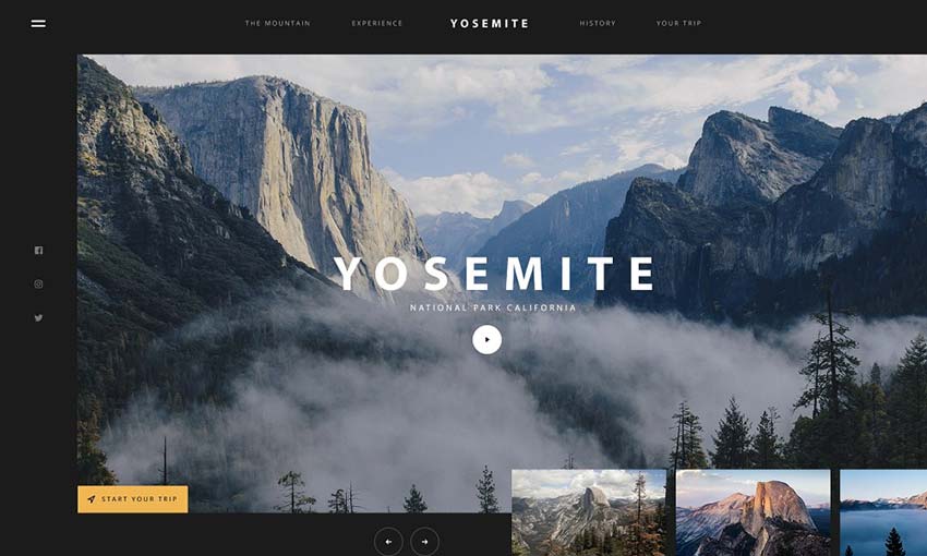
Huge photography, a large and user-friendly UI, and sections of interest that take up the whole screen or more are scattered about this landing page. It’s fitting for one of the largest national parks in America.
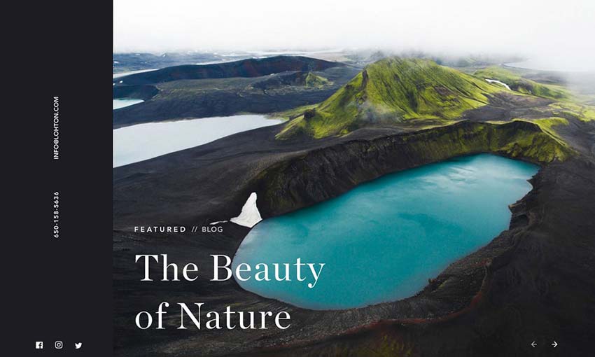
If you want to create a blog that stuns people just as much as the homepage, look here. Create a travel blog that looks like this and people are sure to quickly subscribe for more.
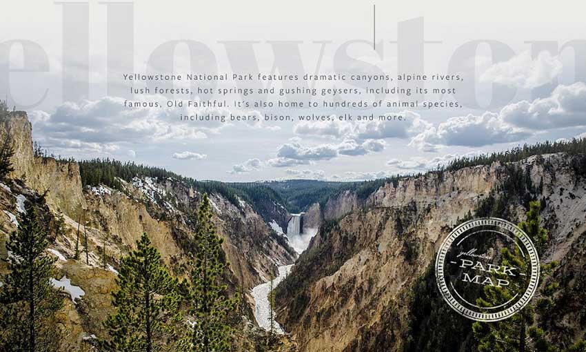
Yellowstone’s gorgeous homepage is simply a masterpiece. It combines the amazing imagery of an untouched national park with a pleasing user interface and helpful info at every scroll.
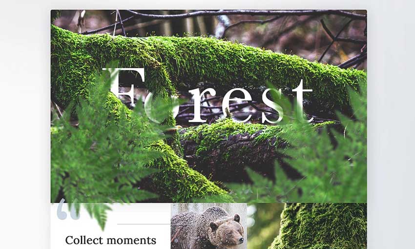
The tile-based design here is used well, with 3D overlays and lots of interactive media in every block. A similar design would look great for a website that relies on visuals rather than text content.
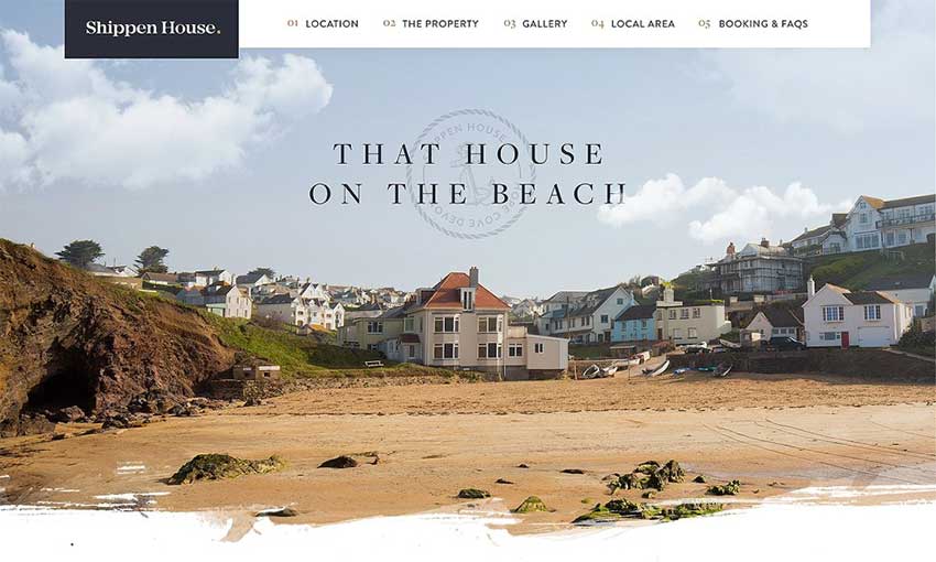
This mockup has more of a focus on real estate. Photos of vast landscapes are replaced with pretty interior and exterior shots, and it all has a bright, fresh look to it.
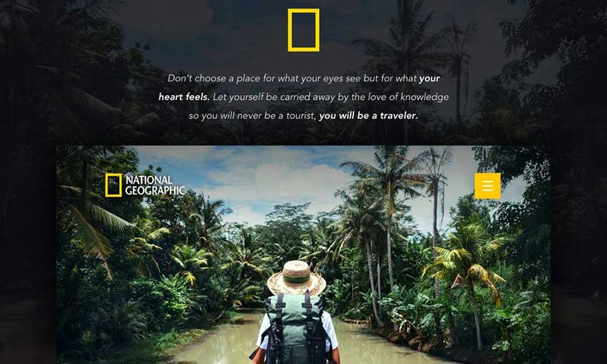
It may only be inspired by National Geographic, but this project looks completely authentic. Exciting photography is what the brand is all about, and it’s woven perfectly into its landing page.
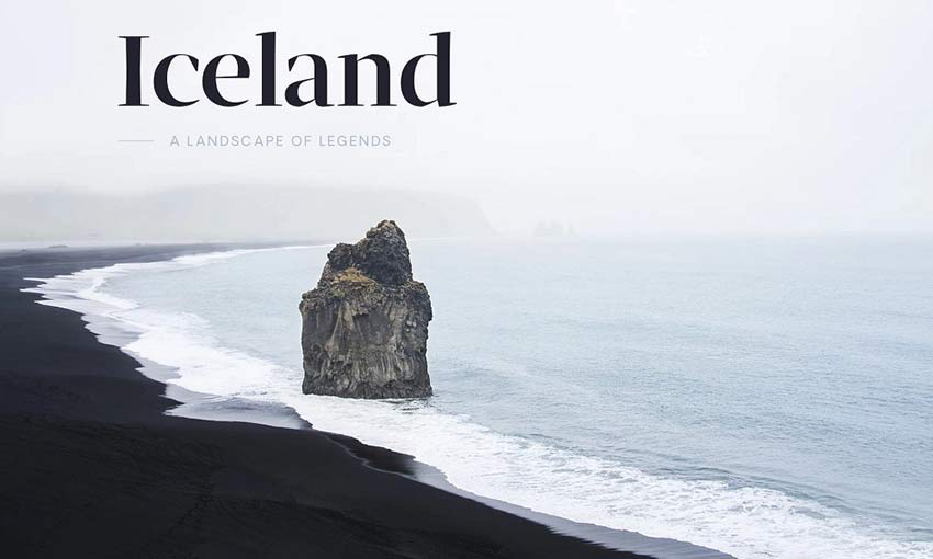
This hero image transitions from white to black, which seamlessly spills down into the rest of the page. The design is then broken up with beautiful, bright photography that stands out against the darkness. It’s a great concept for a landing page, and very inspiring.
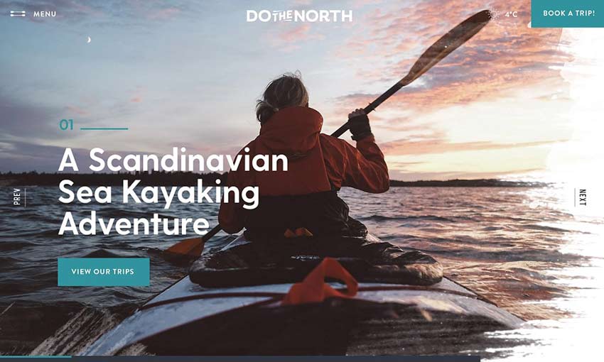
Pretty and functional, this is a great project to study if you’re making a business website. Calls to action are everywhere, but it never gets in the way of the landscape and portrait shots.
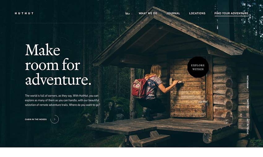
Here’s an example of nice composition. The hero image and footer utilize photography, while the content area is the middle is light and spacious. Large images offer breathing room between text.
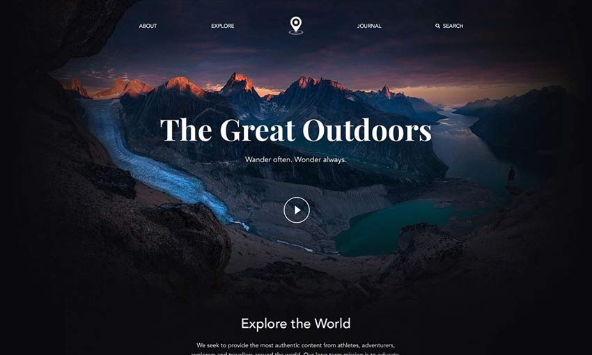
Short, sweet, and simple, this landing page gets its point across quickly and stylishly. The photo header smoothly fades out to give way to image links and blog posts, before fading back in to the footer.
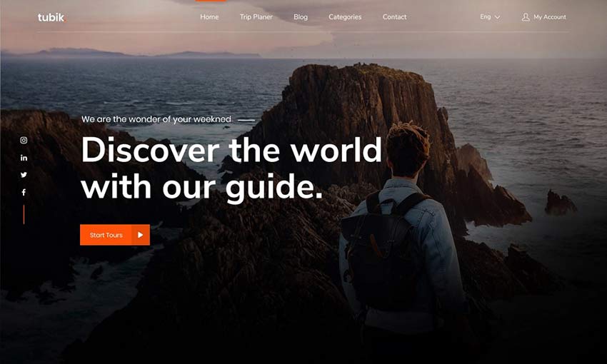
A good homepage is crucial for success, and here’s a great example. Notice the focus on orange hues; they appear everywhere from UI to the photography. Strong usage of color can create a beautiful effect.
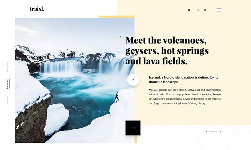
Many travel sites tend to go for contrast between the photos and background, but this contrasts dark UI against snowy photography. It gives a greater focus to the text content.
Gorgeous Travel Sites
Travel websites are especially beautiful. They utilize jaw-dropping photography and videos to draw you in and get you excited to explore. Knowing how to incorporate these into a great user interface is key to creating an amazing travel design.
There’s something about seeing gorgeous natural imagery that draws people in. Use this to your advantage as you design a website that captures people with its beauty.
This post may contain affiliate links. See our disclosure about affiliate links here.


