Have you ever entered a silent and dull-looking store? No music playing in the background, no design elements to individualize the brand. No brand elements to make it look unique? How did you feel? Like most people, you probably felt uncomfortable and searched for the exit. On the other side of the scale, how do you feel when you enter a store like Starbucks? With cheerful music and pleasant design elements? You wanted to spend some time to get into the atmosphere and cheerfulness of the place and drink some of their signature beverages. Music and aesthetic elements are the keys to putting people in the right mood and attracting clients.
When you create a website, meditate on these statements. You’ve got only one shot to impress your clients and catch their attention. The web is oversaturated with stores offering the same products as yours, and your page should stand out to catch the public’s attention. And most importantly, your website should keep visitors engaged and convince them to place an order.
Background music
Table of Contents
Music is the shortcut to creating an emotional connection between your brand and the public. Are you running a carefree brand? Do you create a warm atmosphere in your physical stores? Is your brand energetic and vibrant? The style, loudness, and tempo of the music you play in the background communicate your message and the brand’s personality from the moment they open the door. Think about your website as a house your clients enter. They want to feel welcomed from the moment they step inside, and music can help you achieve this effect. If they’re looking for wedding dresses, they won’t probably enter the store that plays rock or rap, but the one with cello sounds. On the other hand, when you sell sneakers or sports outwear, a more energetic soundtrack may attract people.
The e-commerce world is quite competitive for a young brand, and the quality of the content posted on the website can become a differentiator. Music can play a big role in enhancing the retail experience the users have when brose the store. Research shows that music impacts the shoppers’ moods and feelings and the online shop’s overall environment. The style and tempo of the music set the mood for the store and create a specific atmosphere.
Analyze your brand’s values and determine the kind of environment you want to create. It’ll help you pick the music. For most online stores, slow rhythms work best because they create a pensive atmosphere. You can buy copyright free music from an online directory like MelodyLoops that provides a wide range of sounds.
Your clients have short attention spans, but they respond to music from a young age because they associate it with specific feelings and emotions, so you can use to captivate their attention. By adding background music to your website, you raise interest and convert leads. The public is sensitive to musical clues and expects them when they first get in touch with a brand. See it as an opportunity for your brand to stand out and self-express.
Video is now an essential element for brands that want to draw the audiences’ attention. But internet users expect to find a high-quality video that provides structured and valuable information and includes sounds that maintain the message’s energy. And this gets us to the next elements your website should feature.
Videos and design elements
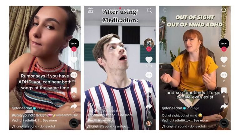
Videos are omnipresent in website design. Websites include tutorials, interviews, promotional videos, and review videos on their website to engage their public and communicate vital information in a friendly way.
But recently, videos have taken a new role in website design, they’re no longer simply informational, but they have grown into design elements that improve the page’s aesthetics.
How can you turn videos into design elements that make your web page stand out?
Thanks to top-notch technologies developed in the last years, it’s easy to add videos to your website design. You can use a tool specially created for this purpose that allows you to play a video on a loop or in slo-mo, or you can collaborate with a website designer that creates a video to fit your brand’s values.
Shapes and abstract design
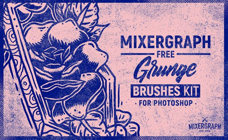
We expect abstract shapes to have a strong presence in 2021. You may think they’re too basic elements to include in your website, but when used right, they can act as key visual accessories that draw attention to a piece of content. You can pin some simple shapes to the background or homepage to add a splash of color, make the content look fresh and engaging, or highlight text.
Abstract illustrations will be a hot trend in web design in the following year, and you can collaborate with a digital artist to create some unique pieces that fit your brand’s values and insert them on your website. They can strengthen your band’s identity. By incorporating them in all marketing materials, you make it easier for your clients to identify your brand on the market. Maintain the same visual style and colors on all communication channels because they are data representations of your brand.
Animation
Animation has been a popular element in web design for a couple of years, and it doesn’t plan to go anywhere. The good news is that you have countless ways to add animation to your website. Animation enhances user experience through effects that highlight an element or piece of content. When you add animation on a website, it immediately catches the user’s eyes and makes a lasting impression. While some brands use animation for purely aesthetic reasons, you can use it to entice your clients to perform specific actions. You can draw the attention towards a product or piece of text or attach it to a call-to-action button to boost the chances of people clicking on it.
You’re living in a time of change in all domains, and web design makes no exception. And therefore, you’re forced to redesign the website to meet the market’s requirements.

