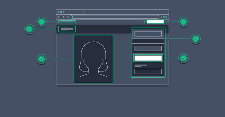
Landing pages are a must-have for every business today. It’s not a homepage of your website but a separate marketing tool to attract traffic and convert it into leads. You design a landing page to speed up the sale process when promoting a particular product or service.
A landing page is what explains and proves your awesomeness to website visitors. The goal is to provide them with information, get them interested in your offer, and encourage them to take action.
And that’s where you might hit a snag:
People come to your landing page, scroll through it, shrug shoulders, and… nothing! No registrations, orders, or subscriptions. They just go away.
How can it happen? You follow the latest design trends, add or remove text blocks, play page length, and employ A/B tests to find out what button color works better, don’t you?
But:
Do you pay enough attention to what exactly you write on that page?
Sales copywriting is what lets you communicate with a target audience successfully. Text content is your weapon to convince visitors that they are in the right place, encouraging them to buy from you.
In this post, you’ll learn some copywriting tricks to consider for your landing page to convert better.
1. Keep to a structure
Table of Contents
- 1 1. Keep to a structure
- 2 2. Use neuro copywriting tricks in headlines and subheads
- 3 3. Consider SEO
- 4 4. Think of a hero image
- 5 5. Craft a selling proposition
- 6 6. Provide an added value
- 7 7. Speak the same language with your targets
- 8 8. Keep to the rules of UX writing
- 9 9. Add trust signals
- 10 10. Remember about a call to action
- 11 11. Tell them how to contact you
- 12 Final thoughts
Whether you write content for events, products, or services, its structure matters a lot. A landing page needs to include definite elements. More than that, these elements need to fall into a logical sequence so that visitors could move deeper into the page and take the desired action.
Your landing page should have:
- an eye-grabbing yet relevant headline and subhead
- an engaging picture, known as a hero image
- a clear selling proposition, revealing the features of your product/service in the context of its value for customers
- trust signals (social proof, customer reviews, etc.)
- a call to action and alternative ways to contact you
A well-structured landing page can help to increase conversions and sales by far. However, please keep in mind that a structure alone can’t do the magic: You need to know your target audience inside out, with all their pain points, and stick to a clear marketing goal when writing a text for your landing page.
2. Use neuro copywriting tricks in headlines and subheads
Professional copywriters know that their work is a mental process for the purpose of selling. In other words, they need to get inside people’s heads and find hooks that will ultimately engage readers and motivate them to act.
Known as neuro copywriting, this skill works with landing pages in the best way possible.
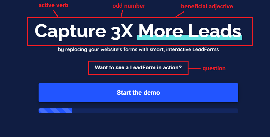
- A headline grabs attention and encourages visitors to stay on a page to learn more. It needs to be short, up to a point, yet compelling enough. Active verbs, power words, and beneficial adjectives are your writing tools to use here for better results.
- A subhead appears just below your headline and provides more details about what’s in there on the page. It needs to be concise yet descriptive and punchy. Subheads persuade visitors to keep on reading. Questions, quotes, odd numbers are neuro copywriting tricks to try here for a positive response.

3. Consider SEO
When writing a copy for your landing page, ensure to use words and word expressions your target customers type to Google search when looking for solutions your product/service can solve.
Please do keyword research and focus on those most relevant to your offer and marketing goals. Simultaneously, the keywords you’ll insert into a landing page copy need to match your prospects’ search intent.
Search intent is the why behind a query. Why do users do that search?
(Do they want to learn anything? Or, are they looking to buy a particular product? Or, maybe they aren’t sure what service to choose, so they look for reviews or comparisons?)
Not only will SEO-adaptive copy and design of your landing page attract potential customers, but it will also give higher ranks to your website in search engines. Giving users information that matches their search intent, you’ll influence the bounce rate and dwell time of your landing page.
4. Think of a hero image
Efficient landing pages are hard to imagine without images or any other visual content. No wonder:
Most people perceive information through pictures better than through words, and that’s why a leading image of your landing page can play a core role in their decision to stay and learn more.
Please pay particular attention to a banner picture of your landing page. Also known as a hero image, it builds the first impression of your website, grabs attention, and helps a visitor understand what your business is about.
It looks like this:
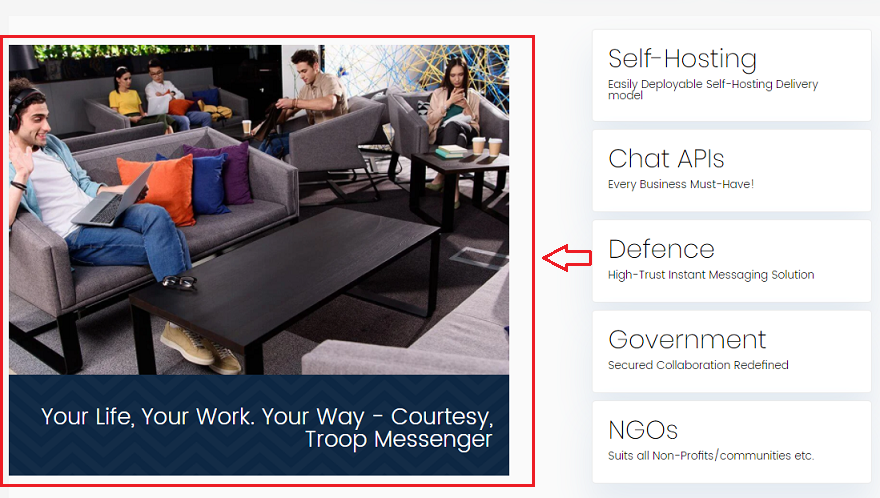

Ensure to choose a high-quality hero image that will be relevant to your selling proposition, fit the overall design of your page, and trigger positive emotions. Also, this image shouldn’t distract visitors from your CTA button.
Why do we call it a hero image? That’s because it demonstrates to users that they’ll benefit from working with us, and they’ll become heroes once they’ve made our desired action.
5. Craft a selling proposition
When writing a copy for your landing page, remember the 4 Cs copywriting formula: The text needs to be clear, concise, compelling, and credible. The first two characteristics are key here because visitors won’t spend a long time reading and guessing what you want from them.
To get things going, make your target offer clear and craft a straightforward explanation of all the features and benefits users will get from you. Use words with positive meaning, reveal what makes you different from others, and answer the “What’s in there for me?” question.
Writing tips here:
- Try to avoid the passive voice and too many adverbs, such as “very,” “actually,” “easily,” “obviously,” and so on.
- Say no to redundant pairs a la “each and every,” “first and foremost,” etc.
- Edit your copy without mercy, deleting all the redundant modifiers and determiners that may confuse readers or lead to your marketing message’s misinterpretation.
Your selling proposition needs to be unique and explain how it will solve a customer’s problem.
6. Provide an added value
An added value is some extra perk a user can get when choosing you. Human nature is so that most of us crave additional bonuses, emotions, and benefits from brands; so, why not provide them at your landing page for better conversion and customer retention?
Think of some reward for working with you: a discount, a free subscription to your extra features, a gift card, or any cute byproduct you can give to visitors who turn into your leads.
You can also come up with a lead magnet for their subscription: a free e-book, checklist, issue-related ultimate guide, etc.
7. Speak the same language with your targets
You write a landing page for potential customers, not college admission officers or editors of The New York Times. It’s often tempting to use professional slang or jargon in texts, but you need to know your target audience inside out and write so they would understand what you mean.
When writing, remember that you talk directly to customers. Use words that would resonate with them, driving them to explore your product or service. Avoid tech terms, unclear abbreviations, or any lexical items your targets may misinterpret.
8. Keep to the rules of UX writing
As I’ve already mentioned in one of my articles, UX writing is writing for users. While UX design helps them navigate a website, UX writing explains what and why to do and where to click, compelling visitors to take action.
So, make your landing page intuitive and straightforward. Please don’t overload it with too much info, buttons, images, and other visual elements. The text content of your landing page should be easy and comfortable to read.
- Write in short sentences and paragraphs.
- Avoid large text blocks.
- Choose the font type and size carefully. (Up to three different fonts is OK to use on one page.)
- Consider spacing before and after subheads.
- Remember about color-contrast ratio: Poor font and background color combinations make it exhausting for readers to consume the information.
9. Add trust signals
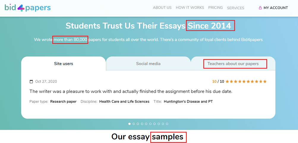
Trust signals are a core element of your landing page: People want to feel secure when doing business with you, so you need to provide them with signs that your brand is trustworthy.
Trust signals can take different forms: guarantees, testimonials, social proofs, badges, customer reviews, numbers, and so on. All they influence your landing page’s conversion rate, demonstrating to visitors that you’re worth trust and encouraging them to take action.

10. Remember about a call to action
All your landing page information serves to grab attention and reassure visitors that they need your offer. But it’s a call to action (CTA) that converts them into subscribers and customers. So you need to pay precise attention to its design and text.
Make sure your CTA stands out from the rest of the page elements. (Visitors should understand that it’s exactly where and what to do next.) Make this button big, of a different color, and with words or expressions that invite to click:
Active verbs describing what will happen after click (“Claim offer,” “Learn more,” “Download,” “Take a gift,” etc.) are great options to try.
11. Tell them how to contact you
According to Quality Evaluator Guidelines from Google, every online business needs to provide proof that it’s real. For that, please do your best to include several contact methods on your landing page: It can be a contact form, a physical address and phone numbers, social media buttons, and emails.
In the case of contact forms, please keep them short and ask for minimum info from users. While most of them are OK with sharing names and emails, they’ll hardly be happy to give you phone numbers, physical addresses, postcodes, and other personal stuff like this.
A great tool to increase loyalty and trust, attract, and retain users is a live chat option on your landing page. It stimulates visitors to communicate with a real person, ask all the questions they have, and make certain of their choice.
If you don’t have enough resources for live chats on landing pages, consider chatbots. Just make sure to choose a good one.
Final thoughts
Writing matters, but you never know what will influence your conversion rates most. That’s why please do your best to try different options and test your landing pages regularly.
Testing is what helps you choose the most convertible headlines, calls to action, selling propositions, and trust signals for your page. Remember to track its performance and optimize it accordingly for better lead generation and sales.
Photo by Visual Design on Unsplash


