In this article, we’ll explore the world of animations on the Web using only CSS. We’ll first create a simple animation using a combination of SVG and CSS. We’ll then create another couple of animations using only HTML and CSS. We’ll also discuss when we need to call JavaScript into action and the limitations of CSS.
By the end of this article, you’ll be able to use CSS to create animations in favor of using JavaScript. You’ll also be able to identify when you’ll need to use JavaScript to create an animation.
To get the most out of this article, it’s presumed you have at least a core knowledge of CSS and HTML. If you’re just starting with web development, there are some great resources for learning and getting help, such as learning resources on sitePoint, the very helpful SitePoint forums, and also freecodecamp.
Drawing Effect Animation
Table of Contents
This is an impressive animation that’s deceptively easy to create. Below is a screenshot of what we’re aiming for.

We first need to create the SVG for our logo:
<svg xmlns="http://www.w3.org/2000/svg" width="279.15" height="343.95" overflow="visible" stroke="#000" stroke-width="1"> <path d="M110.57 248.64c-22.7-21.25-45.06-42.09-67.31-63.06-11.73-11.06-23.32-22.26-34.87-33.51C-2.6 141.35-2.86 128 8.02 117.42 47.67 78.82 87.46 40.35 127.21 1.84c.46-.44 1.03-.77 2.47-1.84 12.52 13.66 25.06 27.34 37.1 40.47-4.44 4.76-10.06 11.31-16.21 17.33-22.69 22.2-45.56 44.22-68.34 66.32-7.89 7.66-7.97 13.48.11 21.07 19.38 18.19 38.85 36.29 58.37 54.33 7.53 6.96 7.75 12.42.32 19.64-10.01 9.72-20.05 19.4-30.46 29.48z"/> <path d="M150.02 343.95c-13.41-13.03-26.71-25.97-40.2-39.08 1.23-1.32 2.19-2.44 3.24-3.46 27.8-26.95 55.61-53.89 83.42-80.83 8.32-8.05 8.41-13.92-.01-21.79-19.54-18.27-39.14-36.47-58.77-54.63-6.52-6.04-6.76-12.11-.37-18.33 10.24-9.96 20.52-19.87 31.15-30.16 6.33 5.89 12.53 11.58 18.65 17.37 27.53 26.03 55.07 52.05 82.52 78.16 12.57 11.96 12.66 24.78.33 36.75-38.99 37.85-78.04 75.64-117.07 113.45-.82.79-1.71 1.51-2.89 2.55z"/>
</svg>
Here’s a Pen with that SVG set up. Feel free to fork it so you can follow along with the steps below.
With our SVG in place, we now set the fill-opacity to 0. We’ll animate this back in later:
svg { fill-opacity: 0;
}
(Updated Pen)
We can now concentrate on drawing the SVG. We’ll achieve this by using the CSS stroke-dashoffset and stroke-dasharray properties.
The stroke-dasharray property controls the pattern of gaps and dashes used to make a stroke a path. For example, stroke-dasharray: 10 applied to the paths in the SVG creates a dashed effect with stroke and gap lengths of ten pixels:
See the Pen Stroke-dasharray demo by SitePoint (@SitePoint)
on CodePen.
Now, for the animation we’re creating here, we want our gap and dash to be the same length as our path. That is, the whole length of our logo outline will be considered “one dash”, so to speak, and one gap will also be the whole length of the outline too. The idea is that we’ll start with the logo outline as a gap, and then animate in the outline as the dash.
But how long is the logo’s outline? An easy way to deal with this is to set the length. Let’s edit our SVG code by adding pathLength="1" to each path:
… <path pathLength="1" d="M110.57 … > …
(Updated Pen)
This makes it much easier to do the drawing animation. Now that we’ve set the pathLength, we can also set the stroke-dasharray to 1 in the CSS:
svg path { stroke-dasharray: 1;
}
(Updated Pen)
Now, it appears that nothing has changed here, but that’s okay. The whole path for each part of the logo is just one big dash now. (You can experiment by removing pathLength="1" from one of the paths. It will suddenly become a dotted line of 1px line and gaps.)
We can now use stroke-dashoffset, which specifies how far into the dash pattern we should start the dash. In our case, we want to set stroke-dashoffset to 1, so we start on a gap rather than a dash. Since the length of each of our gaps is the entire length of our path, we’ll now see a blank screen:
svg path { stroke-dasharray: 1; stroke-dashoffset: 1; }
We can now animate stroke-dashoffset back to 0, which will give a drawing effect:
svg path { stroke-dasharray: 1; stroke-dashoffset: 1; animation: draw 2s forwards;
} @keyframes draw { from { stroke-dashoffset: 1; } to { stroke-dashoffset: 0; }
}
Cool! With this in place we now have this:
See the Pen SitePoint Logo Animation: Step 5 by SitePoint (@SitePoint)
on CodePen.
To complete our animation, we just have to animate in our fill-opacity:
svg { width: 40%; fill-opacity: 0; // we set a delay of 2s so it won't start until our drawing is finished animation: fadeOpacity 2s forwards 2s;
} @keyframes fadeOpacity { from { fill-opacity: 0; } to { fill-opacity: 1; }
}
We now have our final animation:
See the Pen SitePoint Logo Animation: Step 6 (final) by SitePoint (@SitePoint)
on CodePen.
I bet that was a lot easier than you thought! I know the stroke-dashoffset and stroke-dasharray attributes can be a little confusing, but when you set your path to have a length of 1, they’re much easier to work with.
That’s a quick example of the power of CSS combined with SVG. Now let’s push this further in our next example.
CSS Candle Animation
So we kind of cheated in the last example as we used an SVG. For this next example, we’ll use only CSS (and HTML, of course).
With this animation, we’ll use some basic CSS drawing. Then we’ll create a trigger event with CSS. Finally, we’ll emulate a flame (as best we can!).
Excited? Scared? I’m both! So let’s go!
I learned a lot about drawing with CSS through the awesome Jhey Thompkins. I recommend checking out this great article for some extra reading.
Note: you’ll see below that I use absolute positioning and transform to position my HTML elements, which is nice trick when drawing with CSS.
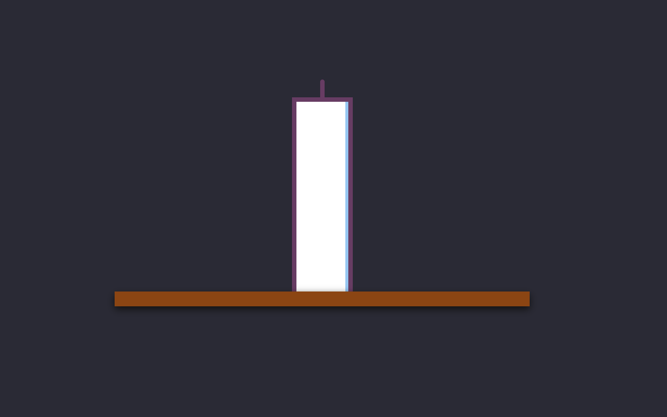
Below is what we want to draw using CSS:

You can follow along with me if you’d like. I’ve set up a base Pen that has the root of everything set up.
So let’s first draw the base of our candle (the table surface).
We’ll use some SCSS variables for the color and the width of our table:
$tableWidth: 280px;
$tableHeight: 10px;
$tableBackground: #8b4513;
The table is basically a div with some dimensions.
We can update our HTML to look as follows:
<div class="wrapper"> <div class="table"></div>
</div>
Now we add some basic SCSS (we use transform to center our table):
.table { position: absolute; left: 50%; top: 50%; width: $tableWidth; height: $tableHeight; background: $tableBackground; transform: translate(-50%, -50%); z-index: 2;
}
This will look a little lifeless. The trick to CSS drawings is to use box-shadow, so let’s add that in:
.table { .... box-shadow: 0px 2px 5px #111;
}
You should now have this:
See the Pen Candle Animation: Step 2 by SitePoint (@SitePoint)
on CodePen.
Awesome!
Let’s put a candle on that table now. We’ll set up a few SCSS variables for our candle dimensions and color (feel free to use whatever dimensions you’d like):
$candleWidth: 35px;
$candleHeight: 130px;
$candleBorderColor: #673c63;
$stickWidth: 3px;
$stickHeight: 15px;
If you examine the image of the candle I showed earlier, you can see that it’s essentially a div with a big border and a stick on top. Let’s first draw the candle itself.
We first update our HTML:
<div class="wrapper"> <div class="candle"> </div> <div class="table"></div>
</div>
Now we add our CSS (again, box-shadow is the trick here):
.candle { position: absolute; left: 50%; top: 50%; width: $candleWidth; height: $candleHeight; background: #fff; transform-origin: center right; transform: translate(-50%, -100%); box-shadow: -2px 0px 0px #95c6f2 inset; border: 3px solid $candleBorderColor;
}
Cool! We have our candle!
See the Pen Candle Animation: Step 3 by SitePoint (@SitePoint)
on CodePen.
Now we add our stick on top (we’ve already included the dimensions for this above).
We first need to add it to our HTML:
<div class="wrapper"> <div class="candle"> <div class="candle-stick"></div> </div> <div class="table"></div>
</div>
CSS (nothing too fancy here):
.candle-stick { width: $stickWidth; height: $stickHeight; background: #673c63; position: absolute; left: 50%; top: 0%; background: $candleBorderColor; border-radius: 8px; transform: translate(-50%, -100%);
}
We’ve successfully drawn our candle:
See the Pen Candle Animation: Step 4 by SitePoint (@SitePoint)
on CodePen.
As you can see, there’s no animation here, so let’s get started on an animation.
We’ll first add a button that will change the background color from light to dark (we already have these SCSS variables set up — $lightBackground and $darkBackground). Add this to the very top of the HTML:
<input id="toggle" type="checkbox">
<label for="toggle">Trigger Candle</label>
This will give us a not so attractive checkbox and label. So let’s style this up so it looks a little better:
label { background: #a5d6a7; padding: 0.5rem 1rem; border-radius: 0.5rem; position: absolute; font: 900 24px/1.4 -system-ui, sans-serif; transform: translate(50%, 50%); cursor: pointer;
}
This gives a bit of style to the label, but we also want to hide the checkbox from view. Now, we could do this by adding the hidden attribute to the checkbox HTML. However, that makes the checkbox inaccessible to keyboard navigators, so a better option is to simply move it out of sight. Firstly, let’s add a class of .visually-hidden to the checkbox HTML:
<input id="toggle" type="checkbox" class="visually-hidden">
Then we move the checkbox to the left with this CSS:
.visually-hidden { position: absolute; left: -100vw;
}
Let’s also provide a visual cue when the checkbox has focus:
input:checked + label { outline: 1px dotted red;
}
(If you were wondering why I placed the input before the label in the HTML, now you know why. It’s so that we could use a sibling selector (+). We’ll use another one later.)
Now, you probably don’t like that red, dotted outline around the button, but I’ll leave it to you to come up with something better. (For example, you could change the background color of the label instead.)
Here’s what we have now:
See the Pen Candle Animation: Step 5 by SitePoint (@SitePoint)
on CodePen.
Let’s change the background of the page based on whether the checkbox is checked or not. We can do this without using JavaScript by using the general sibling selector ~:
#toggle:checked ~ .wrapper { background: $lightBackground;
}
Now we can also add a transition so it’s little bit smoother:
.wrapper { background-color: $darkBackground; height: 100vh; width: 100vw; transition: background-color 0.6s ease;
}
We now have this:
See the Pen Candle Animation: Step 6 by SitePoint (@SitePoint)
on CodePen.
Cool!
Another thing we’ll do is add a flame when the background is bright.
Like before, we set up our SCSS variables:
$flameHeight: 20px;
$flameWidth: 16px;
$flameColor1: #e25822;
$flameColor2: #e2b822;
Let’s also update the HTML to include the flame:
<label for="toggle">Trigger Candle</label>
<input id="toggle" type="checkbox" hidden>
<div class="wrapper"> <div class="candle"> <div class="candle-stick"></div> <div class="flame"></div> </div> <div class="table"></div>
</div>
The base of our flame needs to use border-radius with eight values. When drawing complicated shapes, the Fancy Border Radius Generator site is great for generating the border-radius for you.
So here’s our CSS (the border-radius being the key part):
.flame { width: $flameWidth; height: $flameHeight; background: #673c63; position: absolute; left: 50%; top: 0%; background: $flameColor1; transform: translate(-50%, -170%); border-radius: 50% 50% 50% 50% / 60% 60% 40% 40%;
}
That gives us this:
See the Pen Candle Animation: Step 7 by SitePoint (@SitePoint)
on CodePen.
Now we can add a little animation to make it flicker like a real flame. We’ll change the flame between two colors ($flameColor1 and $flameColor2) and we’ll also vary the position slightly to the left and right. Firstly, here’s the keyframe code:
@keyframes fire-flicker { from { background: $flameColor1; left: 47%; } to { background: $flameColor2; left: 53%; }
}
We then need to add this animation to the flame class:
animation: fire-flicker 0.2s infinite linear;
Our flame will now be flickering:
See the Pen Candle Animation: Step 8 by SitePoint (@SitePoint)
on CodePen.
Feel free to have a go at improving this, as it could be better!
Okay, let’s make a further adjustment. We’ll turn the flame off when the background is dark.
We’ll use opacity to achieve this. On the flame class, add opacity. We’ll also add a transition to it so it matches the background:
.flame { ... opacity: 0; transition: opacity 0.6s ease;
}
Then we can use the power of SCSS and some nesting for checked states:
#toggle:checked ~ .wrapper { background: $lightBackground; .flame { opacity: 1; }
}
Now the flame only shows up with the light background:
See the Pen Candle Animation: Step 9 by SitePoint (@SitePoint)
on CodePen.
Lastly, the “Trigger Candle” text of the label is a bit bland. We could do a lot with that! So let’s improve our label so that the text toggles between “Lumos” and “Nox” — inspired by Harry Potter, of course!
First, we can change our label to have no text (we’ll use content to add the text in):
<label for="toggle"></label>
Now we’ll add some CSS to toggle the text:
label::after { content: "Lumos";
} #toggle:checked ~ label::after { content: "Nox";
}
And to stop the label jumping around, let’s add the following styles:
label { ... min-width: 100px; text-align: center;
}
And there we have it. Our candle animation is finished — with not a trace of JavaScript!
See the Pen Candle Animation: Step 10 (final) by SitePoint (@SitePoint)
on CodePen.
As an added bonus, in case you’re not into SCSS and would rather experiment with CSS custom properties (aka variables), here’s a pure CSS version of our candle demo. It’s not much different! (Of course, you can also view the compiled CSS on each of the Pens above if you prefer. Open CSS Settings > CSS Preprocessor > None.)
Pulse Animation
This is a less involved animation but shows what you can do with only a little CSS.
To get started, we need to make a circle. Let’s first add some HTML:
<div class="pulse"> </div>
Now we can use some CSS to create our circle:
.pulse { position:absolute; left:50%; top:50%; transform:scale(1.5,1.5) translate(-50%,-50%); height: 150px; width: 150px; background: #a83f39; border-radius: 50%;
}
This is what we have so far:
See the Pen Pulse Animation: Step 1 by SitePoint (@SitePoint)
on CodePen.
To create a pulse animation, we use the box-shadow property. If you’ve never used box-shadow before, Mozilla has some great documentation:
@keyframes pulse { 0% { box-shadow: 0 0 0 0 rgba(168, 63, 57, 0.4); } 70% { box-shadow: 0 0 0 50px rgba(168, 63, 57, 0); } 100% { box-shadow: 0 0 0 150px rgba(168, 63, 57, 0); }
}
To use this animation, we just need to add this to .pulse:
.pulse { .... animation: pulse 2s infinite;
}
We’ve now created our pulse animation. Not too shabby, eh?
See the Pen Pulse Animation: Step 2 (final) by SitePoint (@SitePoint)
on CodePen.
What Can’t You Do with CSS?
So as much as I love CSS animations, there are some things that are impossible or very difficult to do.
-
There’s no way that you can seek through a CSS animation, or jump to a certain part of the animation. So tailoring your animation based on the position of a user click would be very difficult to do. To achieve this with JavaScript, I would recommend using the brilliant GreenSock library.
-
Animating along a curve is very difficult to do.
-
Animations involving scrolling are also tricky, although Chris Coyier explains how you can do it with just a teeny bit of JavaScript.
-
Animating the height of an element from an auto-computed height.
-
Sequencing multiple animations is also quite difficult. You can achieve this with delays, but for complex animations with a lot of moving parts it can be very difficult. Again, this is much easier with the GreenSock library.
Above are some of the key limitations of CSS animations. Some of these can be bypassed by using SVGs, but overall the above is much more easily achieved with JavaScript.
Conclusion
I hope by reading this article you come away with a fresh understanding of CSS animations. What I’ve showed in this article is only scratching the surface. I’ll list some inspirational Pens below that you can check out!
Feel free to check me out on Instagram or YouTube.


