In this tutorial, we’ll take a deep-dive into the little-used HTML5 <datalist> element. It can implement a lightweight, accessible, cross-browser autocomplete form control that doesn’t require JavaScript.
What’s Wrong with <select>?
Table of Contents
HTML5 <select> controls are ideal when you want the user to choose from a small range of options. They’re less practical when:
- there are lots of options, such as countries or job titles
- the user wants to enter their own option which is not on the list
The obvious solution is an autocomplete control. This allows the user to enter a few characters, which limits the options available for quicker selection.
<select> will jump to the right location as you start typing, but that’s not always obvious. It won’t work on all devices (such as touchscreens), and it resets within a second or two.
Developers often turn to one of the many JavaScript-powered solutions, but a custom autocomplete control is not always necessary. The HTML5 <datalist> element is lightweight, accessible, and has no JavaScript dependencies. You may have heard it’s buggy or lacks support. That’s not true in 2021, but there are browser inconsistencies and caveats.
<datalist> Quick Start
Picking your country from a list containing more than 200 options is an ideal candidate for an autocomplete control. Define a <datalist> with child <option> elements for every country directly in an HTML page:
<datalist id="countrydata"> <option>Afghanistan</option> <option>Åland Islands</option> <option>Albania</option> <option>Algeria</option> <option>American Samoa</option> <option>Andorra</option> <option>Angola</option> <option>Anguilla</option> <option>Antarctica</option> ...etc...
</datalist>
The datalist’s id can then be referenced by a list attribute in any <input> field:
<label for="country">country</label> <input type="text" list="countrydata" id="country" name="country" size="50" autocomplete="off" />
Confusingly, it’s best to set autocomplete="off". This ensures the user is shown values in the <datalist> but not values they previously entered in the browser.
The result:
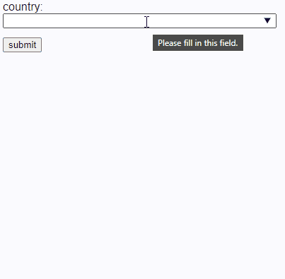
This is the default rendering in Microsoft Edge. Other applications implement similar functionality, but the look differs across platforms and browsers.
<option> Options
Using the label as a text child of an <option> is common:
<datalist id="mylist"> <option>label one</option> <option>label two</option> <option>label three</option>
</datalist>
Using a value attribute produces identical results:
<datalist id="mylist"> <option value="label one" /> <option value="label two" /> <option value="label three" />
</datalist>
Note: the closing /> slash is optional in HTML5, although it could help prevent coding errors.
You can also set a value according to a chosen label using either of the following formats.
Option 1:
<datalist id="mylist"> <option value="1">label one</option> <option value="2">label two</option> <option value="3">label three</option>
</datalist>
Option 2:
<datalist id="mylist"> <option value="1" label="label one" /> <option value="2" label="label two" /> <option value="3" label="label three" />
</datalist>
In both cases, the input field is set to 1, 2 or 3 when a valid option is chosen, but the UI varies across browsers:
- Chrome shows a list with both the value and the label. Only the value remains once an option is chosen.
- Firefox shows a list with the label only. It switches to the value once an option is chosen.
- Edge shows the value only.
The following CodePen example shows all variations:
See the Pen HTML5 <datalist> autocomplete examples by SitePoint (@SitePoint)
on CodePen.
Implementations will evolve but, for now, I’d advise you do not use a value and label since it’s likely to confuse users. (A workaround is discussed below.)
<datalist> Browser Support and Fallbacks
The <datalist> element is well supported in modern browsers as well as Internet Explorer 10 and 11:
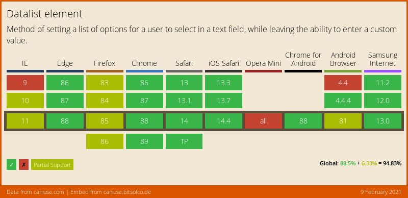
There are several implementation notes, but they won’t affect most usage. The worst that could happen is a field reverts to a standard text input.
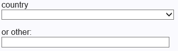
If you absolutely must support IE9 and below, there’s a fallback pattern which uses a standard <select> in conjunction with a text input when the <datalist> fails. Adapting the country example:
<label for="country">country</label> <datalist id="countrydata"> <select name="countryselect"> <option></option> <option>Afghanistan</option> <option>Åland Islands</option> <option>Albania</option> <option>Algeria</option> <option>American Samoa</option> <option>Andorra</option> <option>Angola</option> <option>Anguilla</option> <option>Antarctica</option> ...etc... </select> <label for="country">or other</label> </datalist> <input type="text" id="country" name="country" size="50" list="countrydata" autocomplete="off" />
See the Pen HTML5 <datalist> autocomplete fallback by SitePoint (@SitePoint)
on CodePen.
In modern browsers, the <option> elements become part of the <datalist> and the “or other” label is not shown. It looks identical to the example above, but a countryselect form value will be set to an empty string.
In IE9 and below, both the (very long) <select> and text input fields are active:
Both values could be entered in old IEs. Your application must either:
- decide which is most valid, or
- use a small JavaScript function to reset one when the other is changed
Using <datalist> on Non-text Controls
Chrome-based browsers can also apply <datalist> values to:
-
An input with the type of
"date". The user can choose from a range of options defined asYYYY-MM-DDvalues but presented in their locale format. -
An input with the type of
"color". The user can choose from a selection of color options defined as six-digit hex values (three-digit values don’t work). -
An input with a type of
"range". The slider shows tick marks, although this doesn’t limit which value can be entered.
See the Pen HTML5 <datalist> on other input types by SitePoint (@SitePoint)
on CodePen.
<datalist> CSS Styling
If you ever struggled styling a <select> box, … you had it easy!
An <input> can be styled as normal, but a linked <datalist> and its child <option> elements cannot be styled in CSS. List rendering is wholly determined by the platform and browser.
I hope this situation improves, but for now, a solution is proposed at MDN which:
- overrides the default browser behavior
- effectively treats the
<datalist>like a<div>so it can be styled in CSS - replicates all autocomplete functionality in JavaScript
I’ve enhanced it further and the code is available on GitHub. To use it, load the script anywhere in your HTML page as an ES6 module. The jsDelivr CDN URL can be used:
<script src="https://cdn.jsdelivr.net/npm/datalist-css/dist/datalist-css.min.js"></script>
Or you can install it with npm if you’re using a bundler:
npm install datalist-css
Your <datalist> elements must use the <option>value</option> format. For example:
<datalist id="mylist"> <option>label one</option> <option>label two</option> <option>label three</option>
</datalist>
Note: <option value="value" /> can’t be used, since it results in an empty element that can’t be styled!
CSS can then be added to style some or all <datalist> and <option> elements. For example:
datalist { position: absolute; max-height: 20em; border: 0 none; overflow-x: hidden; overflow-y: auto;
} datalist option { font-size: 0.8em; padding: 0.3em 1em; background-color: #ccc; cursor: pointer;
} datalist option:hover, datalist option:focus { color: #fff; background-color: #036; outline: 0 none;
}
Example:
See the Pen HTML5 <datalist> autocomplete CSS styling by SitePoint (@SitePoint)
on CodePen.
Styling works, but is it worth the effort? I suspect not …
- Re-implementing the browser’s standard keyboard, mouse, and touch controls with reasonable accessibility is difficult. The MDN example doesn’t support keyboard events and, while I tried to improve it, there will inevitably be issues on some devices.
- You’re relying on 200 lines of JavaScript to solve a CSS problem. It minifies to 1.5kB, but could introduce performance issues if you required many long
<datalist>elements on the same page. - If JavaScript is a requirement, would it be preferable to use a prettier, more consistent, battle-tested JavaScript component?
The control falls back to a standard HTML5 <datalist> without styling when JavaScript fails, but that’s a minor benefit.
Creating an Ajax-enhanced <datalist>
Presuming your designer is happy to accept browser styling differences, it’s possible to enhance standard <datalist> functionality using JavaScript. For example:
- Implement optional validation which only accepts a known value in the
<datalist>. - Set
<option>elements from data returned by Ajax calls to search APIs. - Set other field values when an option is chosen. For example, selecting “United States of America” sets “US” in a hidden input.
The code primarily needs to redefine <option> elements, although there are several coding considerations:
- An Ajax API request should only occur once a minimum number of characters has been entered.
- Typing events should be debounced. That is, an Ajax call is only triggered once the user has stopped typing for at least half a second.
- Query results should be cached so it’s not necessary to repeat or parse identical calls.
- Unnecessary queries should be avoided. For example, entering “un” returns 12 countries. There’s no need to make further Ajax calls for “unit” or “united” because all the resulting options are contained in the original 12 results.
I’ve created a standard Web Component for this, and the code is available on GitHub. The CodePen example below allows you to select a valid country after entering at least two characters. A music artist autocomplete then returns artists who originated in that country with names matching the search string:
See the Pen HTML5 <datalist> with Ajax autocomplete by SitePoint (@SitePoint)
on CodePen.
To use it in your own application, load the script anywhere in your HTML page as an ES6 module. The jsDelivr CDN URL can be used:
<script src="https://cdn.jsdelivr.net/npm/datalist-ajax/dist/datalist-ajax.min.js"></script>
Or you can install it with npm if you’re using a bundler:
npm install datalist-ajax
Create an <auto-complete> element with a child <input> to use as the data-entry field. For example, the country lookup uses this:
<label for="country">country lookup:</label> <auto-complete api="https://restcountries.eu/rest/v2/name/${country}?fields=name;alpha2Code;region" resultname="name" querymin="2" optionmax="50" valid="please select a valid country"
> <input type="text" id="country" name="country" size="50" required />
</auto-complete>
<auto-complete> element attributes:
| attribute | description |
|---|---|
api |
the REST API URL (required) |
resultdata |
the name of the property containing a result array of objects in the returned API JSON (not required if only results are returned) |
resultname |
the name of the property in each result object which matches the search input and is used for datalist <option> elements (required) |
querymin |
the minimum number of characters to enter before a search is triggered (default: 1) |
inputdelay |
the minimum time to wait in milliseconds between keypresses before a search occurs (default debounce: 300) |
optionmax |
the maximum number of autocomplete options to show (default: 20) |
valid |
if set, this error message is shown when an invalid value is selected |
The REST URL must contain at least one ${id} identifier, which is substituted by the value set in the <input> with that id. In the example above, ${country} in the api URL references the value in the child <input>, which has an id of "country". The URL will normally use the child input, but any other fields on the page can be referenced.
The restcountries.eu API returns a single object or array of objects containing country data. For example:
[ { "name": "Cyprus", "alpha2Code": "CY", "region": "Europe" }, { "name": "Sao Tome and Principe", "alpha2Code": "ST", "region": "Africa" }, { "name": "Andorra", "alpha2Code": "AD", "region": "Europe" }
]
The resultdata attribute doesn’t need to be set because this is the only data returned (there’s no wrapper object). The resultname attribute must be set to "name" because that property is used to populate datalist <option> elements.
Other fields can be auto-filled when an option is chosen. The following inputs receive the "alpha2Code" and "region" property data because a data-autofill attribute has been set:
<input data-autofill="alpha2Code" type="text" id="countrycode" name="countrycode" readonly /> <input data-autofill="region" type="text" id="region" name="region" readonly />
How datalist-ajax works
You can skip this section if you’d rather not read 230 lines of code and keep the magic alive!
The code initially creates a new <datalist> within the <auto-complete>, which it attaches to the child <input> using a list attribute. An input event handler monitors the <input> and calls a runQuery() function when a minimum number of characters have been entered and the user is not still typing.
runQuery() builds the API URL from data in the form and makes an Ajax call using the Fetch API. The returned JSON is parsed, then a reusable DOM fragment containing <option> elements is constructed and placed into a cache.
A datalistUpdate() function is called, which updates the <datalist> with the appropriate cached DOM fragment. Further calls to runQuery() avoid Ajax calls if a query has already been cached or a previous query can be used.
A change event handler also monitors the <input>, which is triggered when focus is moved from the field and the value has been modified. The function checks that the value matches a known option and, if necessary, uses the Constraint Validation API to show the error message provided in the valid attribute.
Assuming a valid option has been chosen, the change handler function populates all fields with matching data-autofill attributes. A reference to the auto-fill fields is retained so they can be reset if an invalid option is subsequently entered.
Note that the shadow DOM is not used. This ensures the auto-complete <input> (and <datalist>) elements can be styled by CSS and accessed by other scripts if necessary.
Dunkin’ <datalist>
The HTML5 <datalist> has limitations but is ideal if you require a simple framework-agnostic auto-complete field. The lack of CSS support is a shame, but browser vendors may eventually address that oversight.
Any of the code and examples shown in this tutorial can be adopted for your own projects.