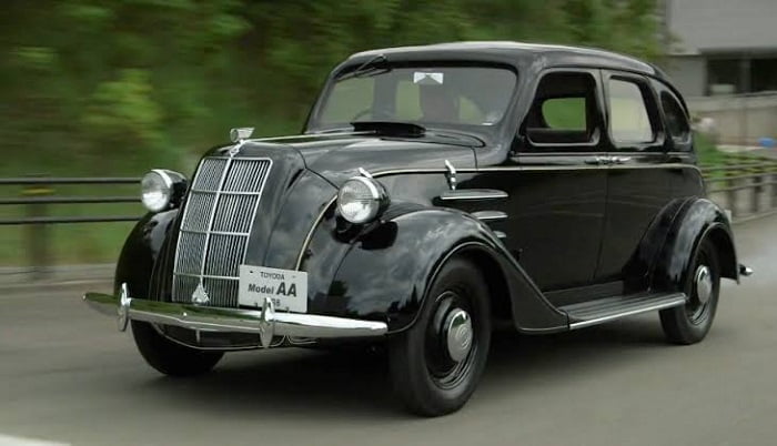
Let’s talk shadows in web design. Shadows add texture, perspective, and emphasize the dimensions of objects. In web design, using light and shadow can add physical realism and can be used to make rich, tactile interfaces.
Take the landing page below. It is for cycling tours in Iceland. Notice the embellished drop shadow of the cyclist and how it creates the perception that they are flying above not only the content on the page, but the page itself, as though they are “popping” over the screen. It feels dynamic and immediate, which is perfect for the theme of adventure.

Compare that with this next example. It’s a “flat” design, sans shadows. In this case, the bike itself is the focal point. The absence of depth and realism allows the bike to stand out on its own.

You can appreciate the differences between these approaches. Using shadows and depth is a design choice; they should support the theme and the message you want the content to convey.
Light and shadows
Table of Contents
- 1 Light and shadows
- 2 Light sources and color
- 3 Positioning light sources
- 4 Elevation
- 5 Inner shadows
- 6 Layering shadows
- 7 Shadows and accessibility
- 8 Shadows and performance
- 9 Did you know?
- 10 Best use cases for different types of shadows
- 11 Shadows in the wild
- 12 What about pseudo-elements?
- 13 Animating shadows
- 14 Wrapping up
As we just saw, depth can enhance content. And what exactly makes a shadow? Light!
It’s impossible to talk about shadow without getting into light. It controls the direction of a shadow as well as how deep or shallow the shadow appears. You can’t have one without the other.
Google’s Material Design design system is a good example of employing light and shadows effectively. You’ve certainly encountered Material Design’s aesthetics because Google employs it on nearly all of its products.
The design system takes cues from the physical world and expresses interfaces in three-dimensional space using light, surfaces, and cast shadows. Their guidelines on using light and shadows covers this in great detail.
In the Material Design environment, virtual lights illuminate the UI. Key lights create sharper, directional shadows, called key shadows. Ambient light appears from all angles to create diffused, soft shadows, called ambient shadows.
Shadows are a core component of Material Design. Compare that with Apple’s Human Interface Guidelines for macOS, where translucency and blurring is more of a driving factor for evoking depth.
In this case, light is still an influential factor, as it allows elements to either blend into the desktop, or even into other panels in the UI. Again, it’s is a design choice to employ this in your interface. Either way, you can see how light influences the visual perception of depth.
Light sources and color
Now that we understand the relationship between light and shadows, we ought to dig in a little deeper to see how light affects shadows. We’ve already seen how the strength of light produces shadows at different depths. But there’s a lot to say about the way light affects the direction and color of shadows.
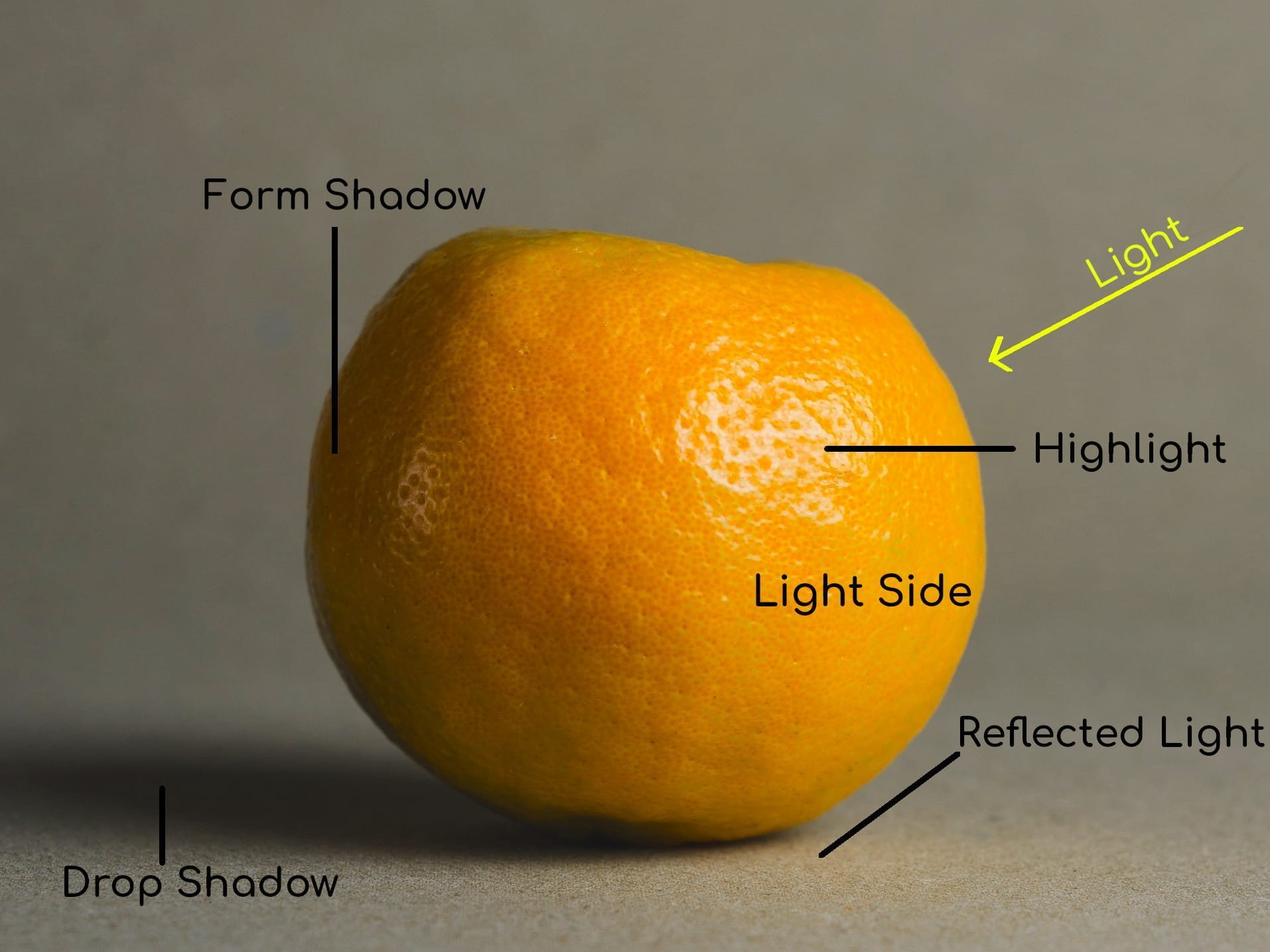
There are two kinds of shadows that occur when a light shines on an object, a drop shadow and a form shadow.
Drop shadows
A drop shadow is cast when an object blocks a light source. A drop shadow can vary in tone and value. Color terminology can be dense and confusing, so let’s talk about tone and value for a moment.
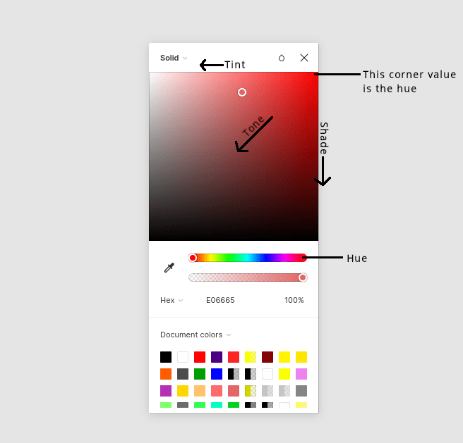
Tone is a hue blended with grey. Value describes the overall lightness or darkness of a color. Value is a big deal in painting as it is how the artist translates light and object relationships to color.
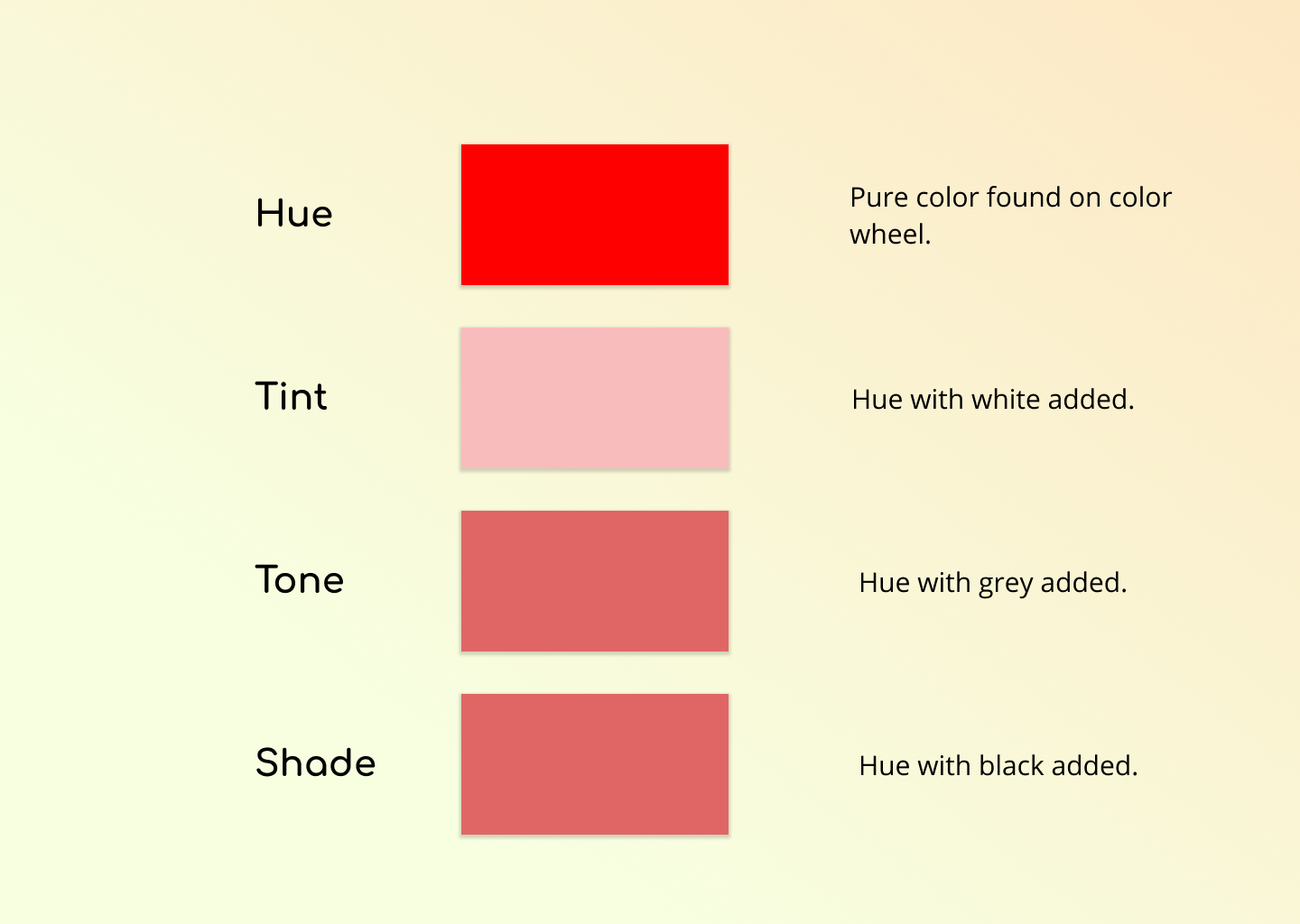
In the web design world, these facets of color are intrinsic to the color picker UI.
Form shadows
A form shadow, on the other hand, is the side of an object facing away from the light source. A form shadow has softer, less defined edges than a drop shadow. Form shadows illustrate the volume and depth of an object.
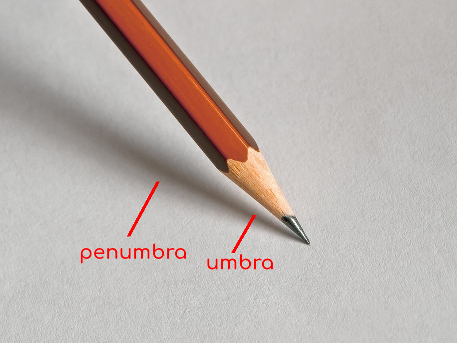
The appearance of a shadow depends on the direction of light, the intensity of light, and the distance between the object and the surface where the shadow is cast. The stronger the light, the darker and sharper the shadow is. The softer the light, the fainter and softer the shadow is. In some cases, we get two distinct shadows for directional light. The umbra is where light is obstructed and penumbra is where light is cast off.
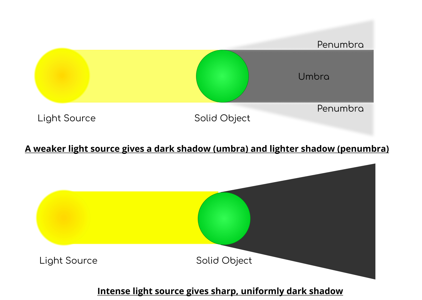
If a surface is close to an object, the shadow will be sharper. If a surface is further away, the shadow will be fainter. This is not some abstract scientific stuff. This is stuff we encounter every day, whether you realize it or not.
Light may also be reflected from sides of an object or another surface. Bright surfaces reflect light, dark surfaces absorb light.
These are the most valuable facets of light to understand for web design. The physics behind light is a complex topic, I have just lightly touched on some of it here. If you’d like to see explicit examples of what shadows are cast based on different light sources, this guide to drawing shadows for comics is instructive.
Positioning light sources
Remember, shadows go hand-in-hand with light, so defining a light source — even though there technically isn’t one — is the way to create impressive shadow effects. The trick is to consistently add shadows relative to the light source. A light source positioned above an element will cast a shadow below the element. Placing a light source to the left of an element will cast a shadow to the right. Placing multiple light sources to the top, bottom, left and right of an element actually casts no shadow at all!
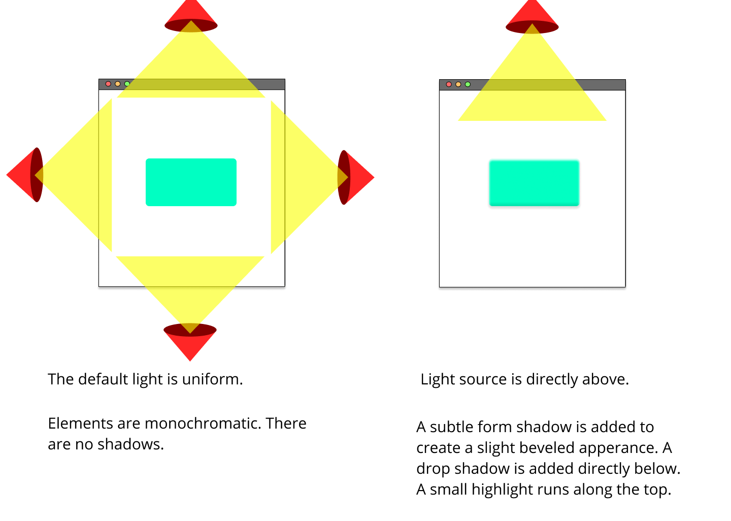
A light source can be projected in any direction you choose. Just make sure it’s used consistently in your design, so the shadow on one element matches other shadows on the page.
Elevation
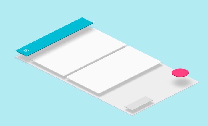
Shadows can also convey elevation. Once again, Material Design is a good example because it demonstrates how shadows are used to create perceived separation between elements.
Inner shadows
Speaking of elevation, the box-shadow property is the only property that can create inner shadows for a sunken effect. So, instead of elevating up, the element appears to be pressed in. That’s thanks to the inset keyword.
That good for something like an effect where clicking a button appears to physically press it.
It’s also possible to “fake” an inner text shadow with a little trickery that’s mostly supported across browsers:
Layering shadows
We’re not limited to a single shadow per element! For example, we can provide a comma-separated list of shadows on the box-shadow property. Why would we want to do that? Smoother shadows, for one.
Interesting effects is another.
Layering shadows can even enhance typography using the text-shadow property.
Just know that layering shadows is a little different for filter: drop-shadow() It’s syntax also takes a list, but it’s space-separated instead of comma-separated.
.box { box-shadow: 0 2px 2px #555, /* commas */ 0 6px 5px #777, 0 12px 10px #999 ;
} .box { filter: drop-shadow(0 2px 2px #555) /* spaces */ drop-shadow(0 6px 5px #777) drop-shadow(0 12px 10px #999);
}
Another thing? Shadows stack on top of one another, in the order they are declared where the top shadow is the first one in the list.
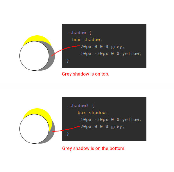
You may have guessed that drop-shadow() works a little differently here. Shadows are added exponentially, i.e. 2^number of shadows - 1.
Here’s how that works:
- 1 shadow = (2^1 – 1). One shadow is rendered.
- 2 shadows = (2^2 – 1). Three shadows are rendered.
- 3 shadows = (2^3 – 1). Seven shadows are rendered.
Or, in code:
.one-shadow { filter: drop-shadow(20px 20px 0 grey);
} .three-shadows { filter: drop-shadow(20px 20px 0 grey) drop-shadow(40px 0 0 yellow);
} .seven-shadows { filter: drop-shadow(20px 20px 0 grey) drop-shadow(40px 0 0 yellow); drop-shadow(80px 0 0 red);
}
The <feDropShadow> element works the exact same way for SVGs.
Shadows and accessibility
Here’s something for you to chew on: shadows can help improve accessibility.
Google conducted a study with low-vision participants to better understand how shadows and outlines impact an individual’s ability to identify and interact with a component. They found that using shadows and outlines:
- increases the ease and speed of finding a component when scanning pages, and
- improves one’s ability to determine whether or not a component is interactive.
That wasn’t a wide-ranging scientific study or anything, so let’s turn around and see what the W3C says in it’s guidelines for WCAG 2.0 standards:
[…] the designer might darken the background behind the letter, or add a thin black outline (at least one pixel wide) around the letter in order to keep the contrast ratio between the letter and the background above 4.5:1.
That’s talking about light text on a light background. WCAG recommends a contrast ratio that’s at least 4.5:1 between text and images. You can use text shadows to add a stronger contrast between them.
Shadows and performance
Before diving into shadows and adding them on all the things, it’s worth calling out that they do affect performance.
For example, filter: drop-shadow is hardware-accelerated by some browsers. A new compositor layer may be created for that element, and offloaded to the GPU. You don’t want to have too many layers, as it takes up limited GPU memory, and will eventually degrade performance. You can assess this in your browser’s DevTools.
Blurring is an expensive operation, so use it sparingly. When you blur something, it mixes the colors from pixels all around the output pixel to generate a blurred result. For example, if your <blur-radius> parameter is 2px, then the filter needs to look at two pixels in every direction around each output pixel to generate the mixed color. This happens for each output pixel, so that means a lot of calculations that grow exponentially. So, shadows with a large blur radius are generally slower to render than other shadows.
Did you know?
Did you know that shadows don’t influence the document layout?
A shadow is the same size as the element it targets. You can modify the size of a box-shadow (through the spread radius parameter), but other properties cannot modify the shadow size.
And did you know that a shadow implicitly has a lower z-index than elements? That’s why shadows sit below other elements.
And what about clipping and masking? If an element with a box-shadow is clipped (with clip-path) or uses a mask (with mask), the shadow isn’t shown. Conversely, if an element with text-shadow or filter: drop-shadow() is clipped, a shadow is shown, as long as it is within the clip region.
Here’s another: We can’t create oblique shadows (with diagonal lines) with shadow properties. That requires creating a shadow element and use a transform:skew() on it.
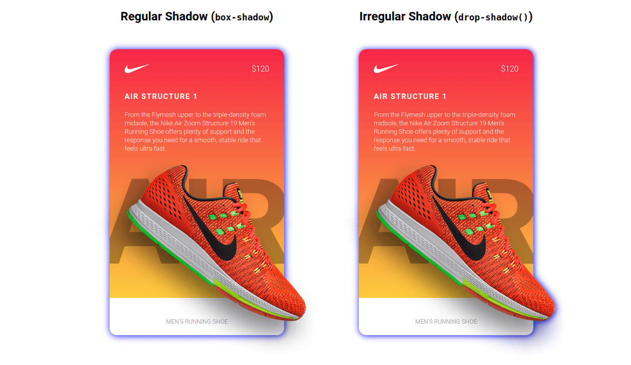
Oh, and one more: box-shadow follows border-radius. If an element has rounded corners, the shadow is rounded as well. In other words, the shadow mirrors the shape of the box. On the other hand, filter: drop-shadow() can create an irregular shape because it respects transparency and follows the shape of the content.
Best use cases for different types of shadows
Practically anything on the web can have a shadow and there are multiple CSS properties and functions that create shadows. But choosing the right type of shadow is what makes a shadow effective.
Let’s evaluate the options:
- box-shadow: This CSS property creates shadows that conform to the elements bounding box. It’s versatile and can be used on anything from cards to buttons to just about anything where the shadow simply needs to follow the element’s box.
- text-shadow: This is a CSS property that creates shadows specifically for text elements.
- filter: drop-shadow(): The CSS property here is
filter, but what create the shadow is thedrop-shadowfunction it accepts. What makes this type of shadow different from, saybox-shadow, is that it follows the rendered shape of any element (including pseudos). - <feDropShadow>: This is actually an SVG element, whereas the rest are CSS properties. So, you would use this to create drop shadows directly in SVG markup.
Once you get the hang of the different types of shadows and each one’s unique shadow-creating powers, the possibilities for shadow effects feels endless. From simple drop shadows to floating elements, and even inner shadows, we can create interesting visuals that add extra meaning or value to UI.
The same goes for text shadows.
Shadows in the wild
Shadows are ubiquitous. We’re seeing them used in new and interesting ways all the time.
Have you heard the buzzword “neumorphism” floating around lately? That’s all about shadows. Here’s an implementation by Maria Muñoz:
Yuan Chuan, who makes amazing generative art, calls shadows a “secret weapon” in UI design:
CSS relies on existing DOM structure in the browser. It’s not possible to generate new elements other than
::beforeand::after. Sometimes I really wish CSS had the ability to do so straightforwardly.Yet, we can partially make up for this by creating various shadows and gradients entirely in CSS.
That’s why having
drop-shadowis so exciting. Together withtext-shadowandbox-shadowwe can do a lot more.
Just check out how he uses drop shadows to create intricate patterns.
Yes, that’s pretty crazy. And speaking of crazy, it’s worth mentioning that going too crazy can result in poor performance, so tread carefully.
What about pseudo-elements?
Oh yes, shadow properties are supported by the ::before and ::after pseudo-elements.
Other pseudos that respect shadows? The ::first-letter pseudo-element accepts box-shadow and text-shadow. The ::first-line pseudo-element accepts text-shadow.
Look at how Jhey Tompkins got all creative using box-shadow on pseudo elements to create animated loaders.
Animating shadows
Yes, we can make them move! The properties and function we’ve covered here are totally compatible with CSS animations and transitions. That means we can move shadows, blur shadows, expand/shrink shadows (with box-shadow), and alter the color.
Animating a shadow can provide a user with a cue that an element is interactive, or that an action has taken place. We saw earlier with our button example that an inset shadow showed that the button had been pressed. Another common animation pattern is elevating a card on hover.
If you want to optimize the animation performance, avoid animating box-shadow! It is more performant to animate drop-shadow(). But if you want the smoothest animation, a hack is the best option! Add an ::after pseudo-element with a bigger box-shadow, and animate its opacity instead.
Of course, there is a lot more you can animate. I will leave that exploration up to you!
Wrapping up
Phew, who knew there was so much to something as seemingly “simple” as CSS shadows! There’s the light source and how shadows are cast. The different types of shadows and their color. There’s using shadows for evoking depth, elevating elements and insetting them. There’s the fact that we can layer shadows on top of other shadows. And that we have a selection of CSS properties that we can use for different use cases. Then, there are the accessibility and performance implications that come with them. And, hey, animation is thing! That’s a heckuva lot!
Anyway, hopefully this broad overview gave you something new to chew on, or at the very least, helped you brush up on some concepts.


