Not sure about you, but I often wonder how to build a carousel component in such a way that you can easily dump a bunch of items into the component and get a nice working carousel — one that allows you to scroll smoothly, navigate with the dynamic buttons, and is responsive. If that is the thing you’d like to build, follow along and we’ll work on it together!
This is what we’re aiming for:
We’re going to be working with quite a bit of JavaScript, React and the DOM API from here on out.
First, let’s spin up a fresh project
Table of Contents
Let’s start by bootstrapping a simple React application with styled-components tossed in for styling:
npx create-react-app react-easy-carousel cd react-easy-carousel
yarn add styled-components
yarn install yarn start
Styling isn’t really the crux of what we’re doing, so I have prepared aa bunch of predefined components for us to use right out of the box:
// App.styled.js
import styled from 'styled-components' export const H1 = styled('h1')` text-align: center; margin: 0; padding-bottom: 10rem;
`
export const Relative = styled('div')` position: relative;
`
export const Flex = styled('div')` display: flex;
`
export const HorizontalCenter = styled(Flex)` justify-content: center; margin-left: auto; margin-right: auto; max-width: 25rem;
`
export const Container = styled('div')` height: 100vh; width: 100%; background: #ecf0f1;
`
export const Item = styled('div')` color: white; font-size: 2rem; text-transform: capitalize; width: ${({size}) => `${size}rem`}; height: ${({size}) => `${size}rem`}; display: flex; align-items: center; justify-content: center;
`
Now let’s go to our App file, remove all unnecessary code, and build a basic structure for our carousel:
// App.js
import {Carousel} from './Carousel' function App() { return ( <Container> <H1>Easy Carousel</H1> <HorizontalCenter> <Carousel> {/* Put your items here */} </Carousel> </HorizontalCenter> </Container> )
}
export default App
I believe this structure is pretty straightforward. It’s the basic layout that centers the carousel directly in the middle of the page.
Now, let’s make the carousel component
Let’s talk about the structure of our component. We’re gonna need the main <div> container which as our base. Inside that, we’re going to take advantage of native scrolling and put another block that serves as the scrollable area.
// Carousel.js <CarouserContainer> <CarouserContainerInner> {children} </CarouserContainerInner>
</CarouserContainer>
You can specify width and height on the inner container, but I’d avoid strict dimensions in favor of some sized component on top of it to keep things flexible.
Scrolling, the CSS way
We want that scroll to be smooth so it’s clear there’s a transition between slides, so we’ll reach for CSS scroll snapping, set the scroll horizontally along the x-axis, and hide the actual scroll bar while we’re at it.
export const CarouserContainerInner = styled(Flex)` overflow-x: scroll; scroll-snap-type: x mandatory; -ms-overflow-style: none; scrollbar-width: none; &::-webkit-scrollbar { display: none; } & > * { scroll-snap-align: center; }
`
Wondering what’s up with scroll-snap-type and scroll-snap-align? That’s native CSS that allows us to control the scroll behavior in such a way that an element “snaps” into place during a scroll. So, in this case, we’ve set the snap type in the horizontal (x) direction and told the browser it has to stop at a snap position that is in the center of the element.
In other words: scroll to the next slide and make sure that slide is centered into view. Let’s break that down a bit to see how it fits into the bigger picture.
Our outer <div> is a flexible container that puts it’s children (the carousel slides) in a horizontal row. Those children will easily overflow the width of the container, so we’ve made it so we can scroll horizontally inside the container. That’s where scroll-snap-type comes into play. From Andy Adams in the CSS-Tricks Almanac:
Scroll snapping refers to “locking” the position of the viewport to specific elements on the page as the window (or a scrollable container) is scrolled. Think of it like putting a magnet on top of an element that sticks to the top of the viewport and forces the page to stop scrolling right there.
Couldn’t say it better myself. Play around with it in Andy’s demo on CodePen.
But, we still need another CSS property set on the container’s children (again, the carousel slides) that tells the browser where the scroll should stop. Andy likens this to a magnet, so let’s put that magnet directly on the center of our slides. That way, the scroll “locks” on the center of a slide, allowing to be full in view in the carousel container.
That property? scroll-snap-align.
& > * { scroll-snap-align: center;
}
We can already test it out by creating some random array of items:
const colors = [ '#f1c40f', '#f39c12', '#e74c3c', '#16a085', '#2980b9', '#8e44ad', '#2c3e50', '#95a5a6',
]
const colorsArray = colors.map((color) => ( <Item size={20} style={{background: color, borderRadius: '20px', opacity: 0.9}} key={color} > {color} </Item>
))
And dumping it right into our carousel:
// App.js
<Container> <H1>Easy Carousel</H1> <HorizontalCenter> <Carousel>{colorsArray}</Carousel> </HorizontalCenter>
</Container>
Let’s also add some spacing to our items so they won’t look too squeezed. You may also notice that we have unnecessary spacing on the left of the first item. We can add a negative margin to offset it.
export const CarouserContainerInner = styled(Flex)` overflow-x: scroll; scroll-snap-type: x mandatory; -ms-overflow-style: none; scrollbar-width: none; margin-left: -1rem; &::-webkit-scrollbar { display: none; } & > * { scroll-snap-align: center; margin-left: 1rem; }
`
Take a closer look at the cursor position while scrolling. It’s always centered. That’s the scroll-snap-align property at work!
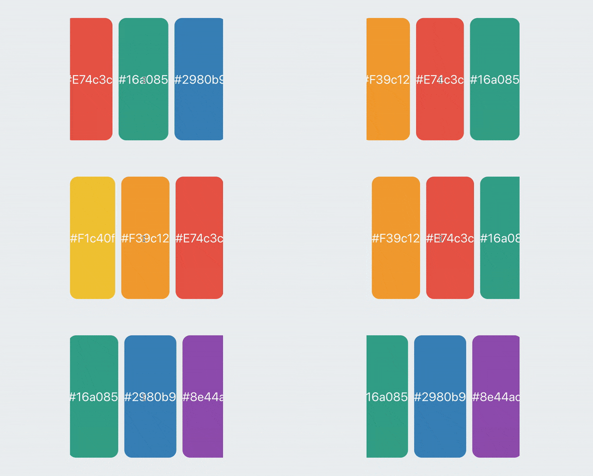
And that’s it! We’ve made an awesome carousel where we can add any number of items, and it just plain works. Notice, too, that we did all of this in plain CSS, even if it was built as a React app. We didn’t really need React or styled-components to make this work.
We could end the article here and move on, but I want to take this a bit further. What I like about what we have so far is that it’s flexible and does the basic job of scrolling through a set of items.
But you may have noticed a key enhancement in the demo at the start of this article: buttons that navigate through slides. That’s where we’re going to put the CSS down and put our JavaScript hats on to make this work.
First, let’s define buttons on the left and right of the carousel container that, when clicked, scrolls to the previous or next slide, respectively. I’m using simple SVG arrows as components:
// ArrowLeft
export const ArrowLeft = ({size = 30, color = '#000000'}) => ( <svg xmlns="http://www.w3.org/2000/svg" width={size} height={size} viewBox="0 0 24 24" fill="none" stroke={color} strokeWidth="2" strokeLinecap="round" strokeLinejoin="round" > <path d="M19 12H6M12 5l-7 7 7 7" /> </svg>
) // ArrowRight
export const ArrowRight = ({size = 30, color = '#000000'}) => ( <svg xmlns="http://www.w3.org/2000/svg" width={size} height={size} viewBox="0 0 24 24" fill="none" stroke={color} strokeWidth="2" strokeLinecap="round" strokeLinejoin="round" > <path d="M5 12h13M12 5l7 7-7 7" /> </svg>
)
Now let’s position them on both sides of our carousel:
// Carousel.js
<LeftCarouselButton> <ArrowLeft />
</LeftCarouselButton> <RightCarouselButton> <ArrowRight />
</RightCarouselButton>
We’ll sprinkle in some styling that adds absolute positioning to the arrows so that the left arrow sits on the left edge of the carousel and the right arrow sits on the right edge. A few other things are thrown in to style the buttons themselves to look like buttons. Also, we’re playing with the carousel container’s :hover state so that the buttons only show when the user’s cursor hovers the container.
// Carousel.styled.js // Position and style the buttons
export const CarouselButton = styled('button')` position: absolute; cursor: pointer; top: 50%; z-index: 1; transition: transform 0.1s ease-in-out; background: white; border-radius: 15px; border: none; padding: 0.5rem;
` // Display buttons on hover
export const LeftCarouselButton = styled(CarouselButton)` left: 0; transform: translate(-100%, -50%); ${CarouserContainer}:hover & { transform: translate(0%, -50%); }
`
// Position the buttons to their respective sides
export const RightCarouselButton = styled(CarouselButton)` right: 0; transform: translate(100%, -50%); ${CarouserContainer}:hover & { transform: translate(0%, -50%); }
`
This is cool. Now we have buttons, but only when the user interacts with the carousel.
But do we always want to see both buttons? It’d be great if we hide the left arrow when we’re at the first slide, and hide the right arrow when we’re at the last slide. It’s like the user can navigate past those slides, so why set the illusion that they can?
I suggest creating a hook that’s responsible for all the scrolling functionality we need, as we’re gonna have a bunch of it. Plus, it’s just good practice to separate functional concerns from our visual component.
First, we need to get the reference to our component so we can get the position of the slides. Let’s do that with ref:
// Carousel.js
const ref = useRef()
const position = usePosition(ref) <CarouserContainer> <CarouserContainerInner ref={ref}> {children} </CarouserContainerInner> <LeftCarouselButton> <ArrowLeft /> </LeftCarouselButton> <RightCarouselButton> <ArrowRight /> </RightCarouselButton>
</CarouserContainer>
The ref property is on <CarouserContainerInner> as it contains all our items and will allow us to do proper calculations.
Now let’s implement the hook itself. We have two buttons. To make them work, we need to keep track of the next and previous items accordingly. The best way to do so is to have a state for each one:
// usePosition.js
export function usePosition(ref) { const [prevElement, setPrevElement] = useState(null) const [nextElement, setNextElement] = useState(null)
}
The next step is to create a function that detects the position of the elements and updates the buttons to either hide or display depending on that position.
Let’s call it the update function. We’re gonna put it into React’s useEffect hook because, initially, we want to run this function when the DOM mounts the first time. We need access to our scrollable container which is available to use under the ref.current property. We’ll put it into a separate variable called element and start by getting the element’s position in the DOM.
We’re gonna use getBoundingClientRect() here as well. This is a very helpful function because it gives us an element’s position in the viewport (i.e. window) and allows us to proceed with our calculations.
// usePosition.js useEffect(() => { // Our scrollable container const element = ref.current const update = () => { const rect = element.getBoundingClientRect()
}, [ref])
We’ve done a heck of a lot positioning so far and getBoundingClientRect() can help us understand both the size of the element — rect in this case — and its position relative to the viewport.
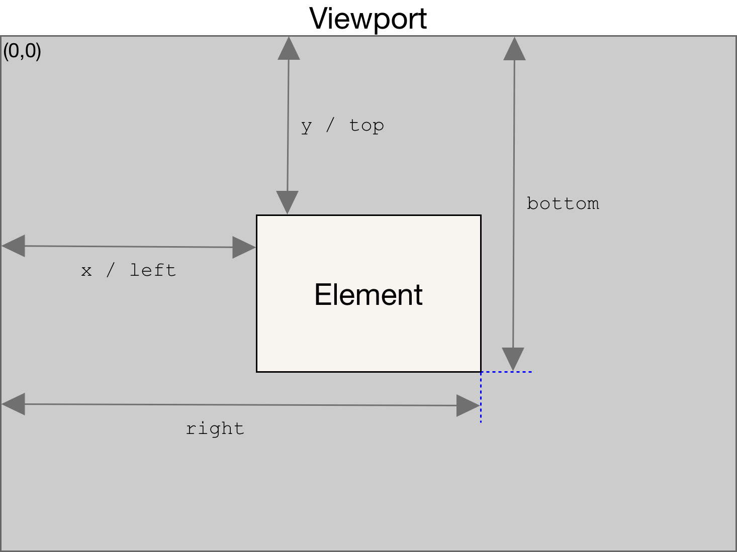
The following step is a bit tricky as it requires a bit of math to calculate which elements are visible inside the container.
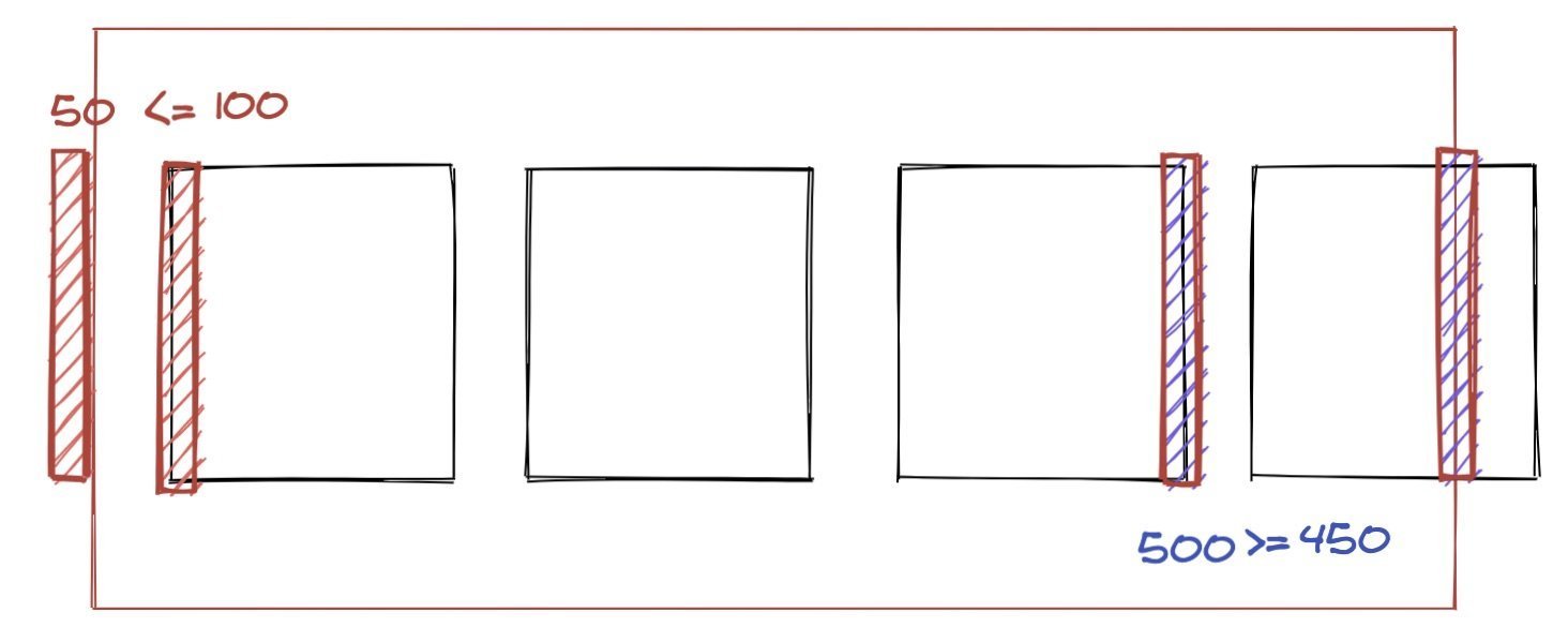
First, we need to filter each item by getting its position in the viewport and checking it against the container boundaries. Then, we check if the child’s left boundary is bigger than the container’s left boundary, and the same thing on the right side.
If one of these conditions is met means that our child is visible inside the container. Let’s convert it into the code step-by-step:
- We need to loop and filter through all container children. We can use the
childrenproperty available on each node. So, let’s convert it into an array and filter:
const visibleElements = Array.from(element.children).filter((child) => {}- After that, we need to get the position of each element by using that handy
getBoundingClientRect()function once again:
const childRect = child.getBoundingClientRect()- Now let’s bring our drawing to life:
rect.left <= childRect.left && rect.right >= childRect.rightPulling that together, this is our script:
// usePosition.js
const visibleElements = Array.from(element.children).filter((child) => { const childRect = child.getBoundingClientRect() return rect.left <= childRect.left && rect.right >= childRect.right
})
Once we’ve filtered out items, we need to check whether an item is the first or the last one so we know to hide the left or right button accordingly. We’ll create two helper functions that check that condition using previousElementSibling and nextElementSibling. This way, we can see if there is a sibling in the list and whether it’s an HTML instance and, if it is, we will return it.
To receive the first element and return it, we need to take the first item from our visible items list and check if it contains the previous node. We’ll do the same thing for the last element in the list, however, we need to get the last item in the list and check if it contains the next element after itself:
// usePosition.js
function getPrevElement(list) { const sibling = list[0].previousElementSibling if (sibling instanceof HTMLElement) { return sibling } return sibling
} function getNextElement(list) { const sibling = list[list.length - 1].nextElementSibling if (sibling instanceof HTMLElement) { return sibling } return null
}
Once we have those functions, we can finally check if there are any visible elements in the list, and then set our left and right buttons into the state:
// usePosition.js if (visibleElements.length > 0) { setPrevElement(getPrevElement(visibleElements)) setNextElement(getNextElement(visibleElements))
}
Now we need to call our function. Moreover, we want to call this function each time we scroll through the list — that’s when we want to detect the position of the element.
// usePosition.js
export function usePosition(ref) { const [prevElement, setPrevElement] = useState(null) const [nextElement, setNextElement] = useState(null) useEffect(() => { const element = ref.current const update = () => { const rect = element.getBoundingClientRect() const visibleElements = Array.from(element.children).filter((child) => { const childRect = child.getBoundingClientRect() return rect.left <= childRect.left && rect.right >= childRect.right }) if (visibleElements.length > 0) { setPrevElement(getPrevElement(visibleElements)) setNextElement(getNextElement(visibleElements)) } } update() element.addEventListener('scroll', update, {passive: true}) return () => { element.removeEventListener('scroll', update, {passive: true}) } }, [ref])
Here’s an explanation for why we’re passing {passive: true} in there.
Now let’s return those properties from the hook and update our buttons accordingly:
// usePosition.js
return { hasItemsOnLeft: prevElement !== null, hasItemsOnRight: nextElement !== null,
}
// Carousel.js <LeftCarouselButton hasItemsOnLeft={hasItemsOnLeft}> <ArrowLeft />
</LeftCarouselButton> <RightCarouselButton hasItemsOnRight={hasItemsOnRight}> <ArrowRight />
</RightCarouselButton>// Carousel.styled.js
export const LeftCarouselButton = styled(CarouselButton)` left: 0; transform: translate(-100%, -50%); ${CarouserContainer}:hover & { transform: translate(0%, -50%); } visibility: ${({hasItemsOnLeft}) => (hasItemsOnLeft ? `all` : `hidden`)};
`
export const RightCarouselButton = styled(CarouselButton)` right: 0; transform: translate(100%, -50%); ${CarouserContainer}:hover & { transform: translate(0%, -50%); } visibility: ${({hasItemsOnRight}) => (hasItemsOnRight ? `all` : `hidden`)};
`So far, so good. As you’ll see, our arrows show up dynamically depending on our scroll location in the list of items.
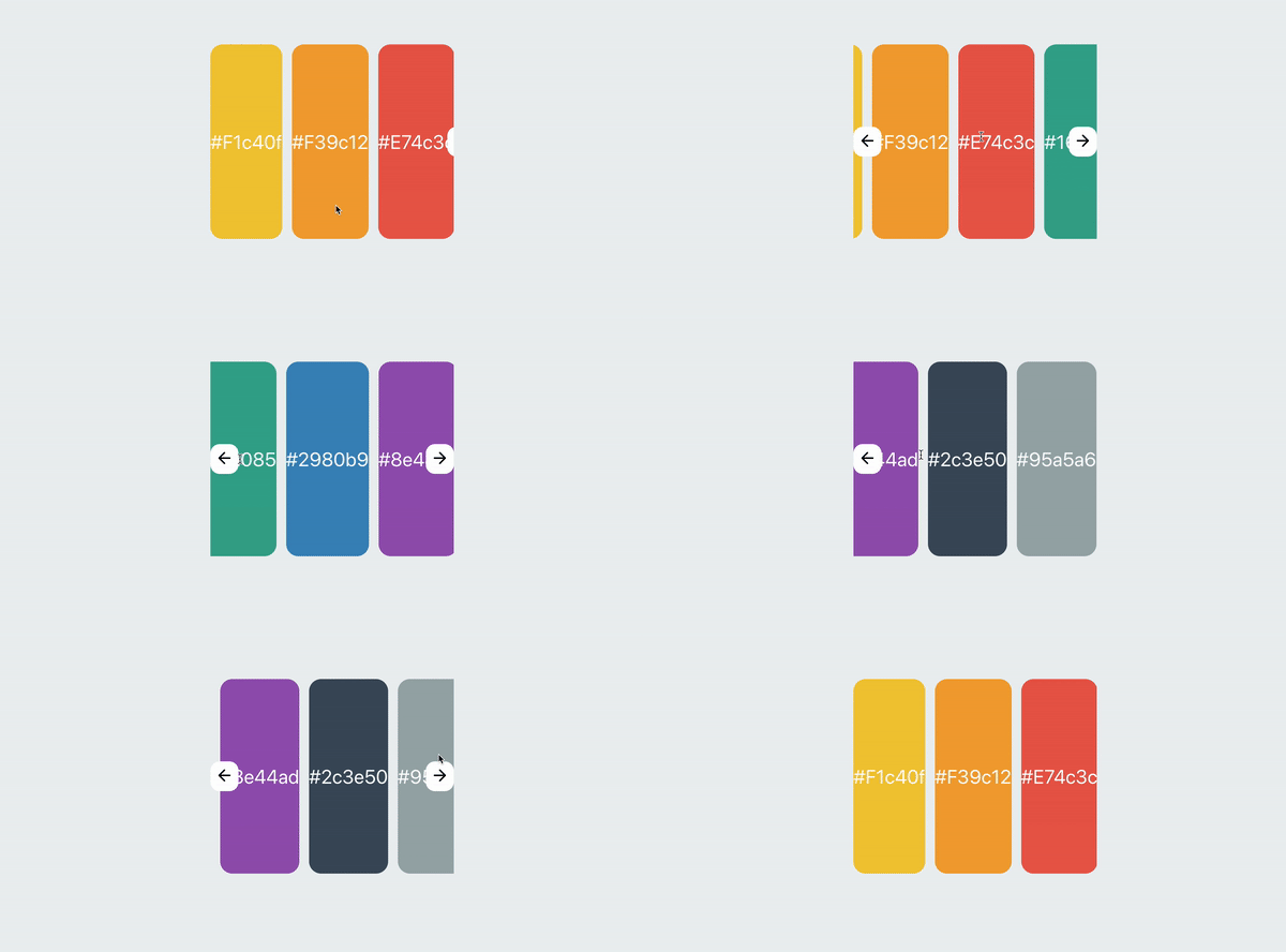
We’ve got just one final step to go to make the buttons functional. We need to create a function that’s gonna accept the next or previous element it needs to scroll to.
const scrollRight = useCallback(() => scrollToElement(nextElement), [ scrollToElement, nextElement,
])
const scrollLeft = useCallback(() => scrollToElement(prevElement), [ scrollToElement, prevElement,
])
Don’t forget to wrap functions into the useCallback hook in order to avoid unnecessary re-renders.
Next, we’ll implement the scrollToElement function. The idea is pretty simple. We need to take the left boundary of our previous or next element (depending on the button that’s clicked), sum it up with the width of the element, divided by two (center position), and offset this value by half of the container width. That will give us the exact scrollable distance to the center of the next/previous element.
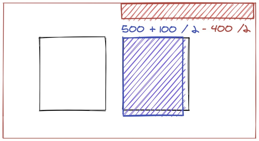
Here’s that in code:
// usePosition.js const scrollToElement = useCallback( (element) => { const currentNode = ref.current if (!currentNode || !element) return let newScrollPosition newScrollPosition = element.offsetLeft + element.getBoundingClientRect().width / 2 - currentNode.getBoundingClientRect().width / 2 currentNode.scroll({ left: newScrollPosition, behavior: 'smooth', }) }, [ref],
)
scroll actually does the scrolling for us while passing the precise distance we need to scroll to. Now let’s attach those functions to our buttons.
// Carousel.js const { hasItemsOnLeft, hasItemsOnRight, scrollRight, scrollLeft,
} = usePosition(ref) <LeftCarouselButton hasItemsOnLeft={hasItemsOnLeft} onClick={scrollLeft}> <ArrowLeft />
</LeftCarouselButton> <RightCarouselButton hasItemsOnRight={hasItemsOnRight} onClick={scrollRight}> <ArrowRight />
</RightCarouselButton>
Pretty nice!
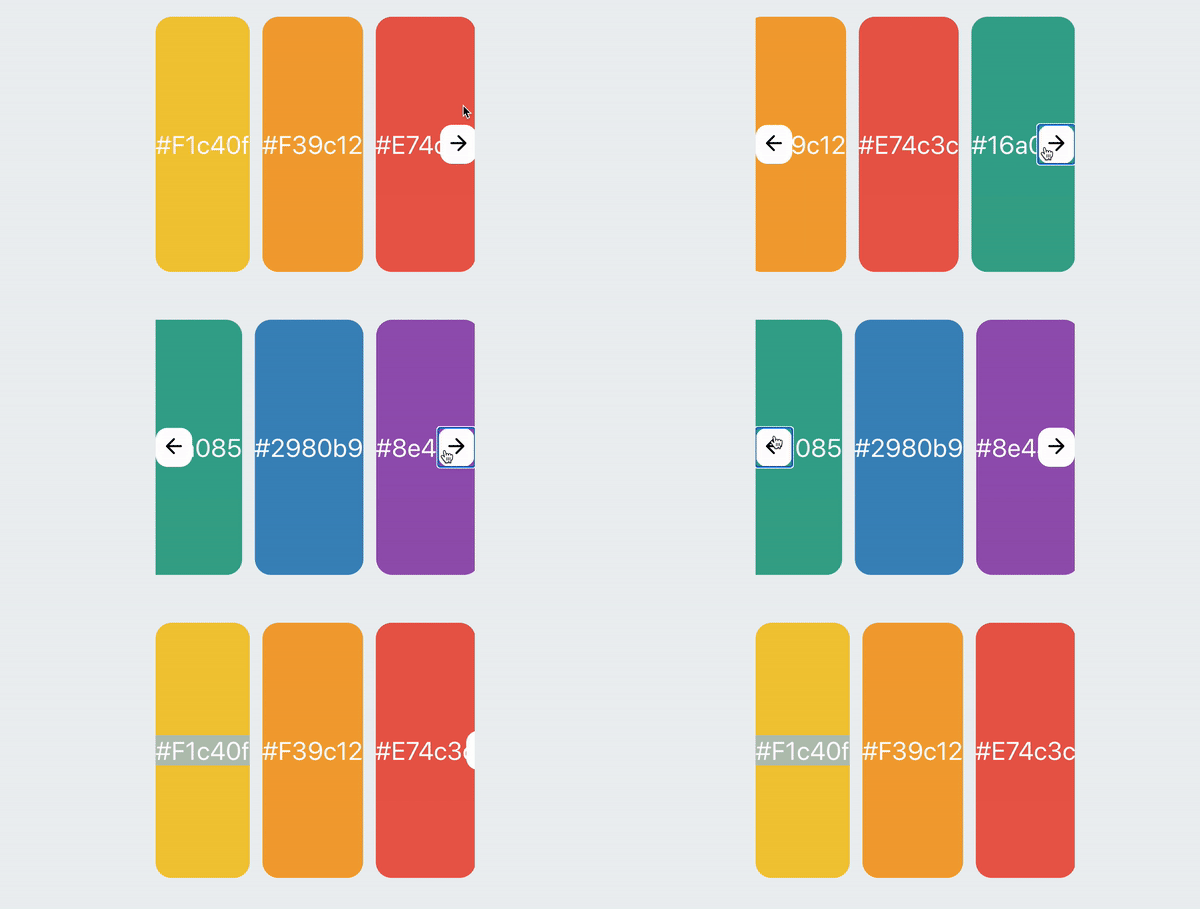
Like a good citizen, we ought to clean up our code a bit. For one, we can be more in control of the passed items with a little trick that automatically sends the styles needed for each child. The Children API is pretty rad and worth checking out.
<CarouserContainerInner ref={ref}> {React.Children.map(children, (child, index) => ( <CarouselItem key={index}>{child}</CarouselItem> ))}
</CarouserContainerInner>
Now we just need to update our styled components. flex: 0 0 auto preserves the original sizes of the containers, so it’s totally optional
export const CarouselItem = styled('div')` flex: 0 0 auto; // Spacing between items margin-left: 1rem;
`
export const CarouserContainerInner = styled(Flex)` overflow-x: scroll; scroll-snap-type: x mandatory; -ms-overflow-style: none; scrollbar-width: none; margin-left: -1rem; // Offset for children spacing &::-webkit-scrollbar { display: none; } ${CarouselItem} & { scroll-snap-align: center; }
`Accessibility
We care about our users, so we need to make our component not only functional, but also accessible so folks feel comfortable using it. Here are a couple things I’d suggest:
- Adding
role='region'to highlight the importance of this area. - Adding an
area-labelas an identifier. - Adding labels to our buttons so screen readers could easily identify them as “Previous” and “Next” and inform the user which direction a button goes.
// Carousel.js
<CarouserContainer role="region" aria-label="Colors carousel"> <CarouserContainerInner ref={ref}> {React.Children.map(children, (child, index) => ( <CarouselItem key={index}>{child}</CarouselItem> ))} </CarouserContainerInner> <LeftCarouselButton hasItemsOnLeft={hasItemsOnLeft} onClick={scrollLeft} aria-label="Previous slide > <ArrowLeft /> </LeftCarouselButton> <RightCarouselButton hasItemsOnRight={hasItemsOnRight} onClick={scrollRight} aria-label="Next slide" > <ArrowRight /> </RightCarouselButton> </CarouserContainer>
More than one carousel? No problem!
Feel free to add additional carousels to see how it behaves with the different size items. For example, let’s drop in a second carousel that’s just an array of numbers.
const numbersArray = Array.from(Array(10).keys()).map((number) => ( <Item size={5} style={{color: 'black'}} key={number}> {number} </Item>
)) function App() { return ( <Container> <H1>Easy Carousel</H1> <HorizontalCenter> <Carousel>{colorsArray}</Carousel> </HorizontalCenter> <HorizontalCenter> <Carousel>{numbersArray}</Carousel> </HorizontalCenter> </Container> )
}
And voilà, magic! Dump a bunch of items and you’ve got fully workable carousel right out of the box.
Feel free to modify this and use it in your projects. I sincerely hope that this is a good starting point to use as-is, or enhance it even further for a more complex carousel. Questions? Ideas? Contact me on Twitter, GitHub, or the comments below!

