Looks like 2021 is the time to start using CSS Logical Properties! Plus, Chrome recently shipped a few APIs that have raised eyebrows, SVG allows us to disable its aspect ratio, WordPress focuses on the accessibility of its typography, and there’s still no update (or progress) on the development of CSS custom media queries.
Let’s jump right into the news…
Logical CSS could soon become the new default
Table of Contents
Six years after Mozilla shipped the first bits of CSS Logical Properties in Firefox, this feature is now on a path to full browser support in 2021. The categories of logical properties and values listed in the table below are already supported in Firefox, Chrome, and the latest Safari Preview.
| CSS property or value | The logical equivalent |
|---|---|
margin-top |
margin-block-start |
text-align: right |
text-align: end |
bottom |
inset-block-end |
border-left |
border-inline-start |
| (n/a) | margin-inline |
Logical CSS also introduces a few useful shorthands for tasks that in the past required multiple declarations. For example, margin-inline sets the margin-left and margin-right properties, while inset sets the top, right, bottom and left properties.
/* BEFORE */
main { margin-left: auto; margin-right: auto;
} /* AFTER */
main { margin-inline: auto;
}
A website can add support for an replacing all instances of left and right with their logical counterparts in the site’s CSS code. Switching to logical CSS makes sense for all websites because the user may translate the site to a language that is written right-to-left using a machine translation service. The biggest languages with 310 million native speakers), Persian (70 million), and Urdu (70 million).
/* Switch to RTL when Google translates the page to an RTL language */
.translated-rtl { direction: rtl;
}
David Bushell’s personal website now uses logical CSS and relies on Google’s translated-rtl class to toggle the site’s inline base direction. Try translating David’s website to an RTL language in Chrome and compare the RTL layout with the site’s default LTR layout.
Chrome ships three controversial Fugu APIs
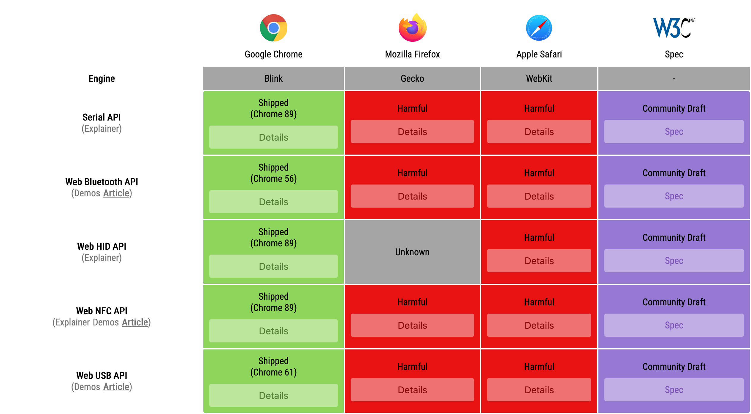
Last week Chrome shipped three web APIs for “advanced hardware interactions”: the WebHID and Web Serial APIs on desktop, and Web NFC on Android. All three APIs are part of Google’s capabilities project, also known as Project Fugu, and were developed in W3C community groups (though they’re not web standards).
- The WebHID API allows web apps to connect to old and uncommon human interface devices that don’t have a compatible device driver for the operating system (e.g., Nintendo’s Wii Remote).
- The Web Serial API allows web apps to communicate (“byte by byte”) with peripheral devices, such as microcontrollers (e.g., the Arduino DHT11 temperature/humidity sensor) and 3D printers, through an emulated serial connection.
- Web NFC allows web apps to wirelessly read from and write to NFC tags at short distances (less than 10 cm).
Apple and Mozilla, the developers of the other two major browser engines, are currently opposed to these APIs. Apple has decided to “not yet implement due to fingerprinting, security, and other concerns.” Mozilla’s concerns are summarized on the Mozilla Specification Positions page.
Stretching SVG with preserveAspectRatio=none
By default, an SVG scales to fit the <svg> element’s content box, while maintaining the aspect ratio defined by the viewBox attribute. In some cases, the author may want to stretch the SVG so that it completely fills the content box on both axes. This can be achieved by setting the preserveAspectRatio attribute to none on the <svg> element.
Distorting SVG in this manner may seem counterintuitive, but disabling aspect ratio via the preserveAspectRatio=none value can make sense for simple, decorative SVG graphics on a responsive web page:
This value can be useful when you are using a path for a border or to add a little effect on a section (like a diagonal [line]), and you want the path to fill the space.
WordPress tones down the use of italics
An italic font can be used to highlight important words (e.g., the <em> element), titles of creative works (<cite>), technical terms, foreign phrases (<i>), and more. Italics are helpful when used discreetly in this manner, but long sections of italic text are considered an accessibility issue and should be avoided.
Italicized text can be difficult to read for some people with dyslexia or related forms of reading disorders.
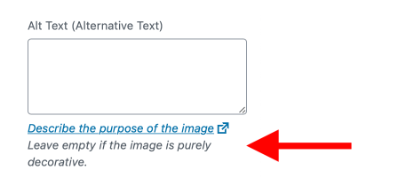
WordPress 5.7, which was released earlier this week, removed italics on descriptions, help text, labels, error details text, and other places in the WordPress admin to “improve accessibility and readability.”
In related news, WordPress 5.7 also dropped custom web fonts, opting for system fonts instead.
Still no progress on CSS custom media queries
The CSS Media Queries Level 5 module specifies a @custom-media rule for defining custom media queries. This proposed feature was originally added to the CSS spec almost seven years ago (in June 2014) and has since then not been further developed nor received any interest from browser vendors.
@custom-media --narrow-window (max-width: 30em); @media (--narrow-window) { /* narrow window styles */
}
A media query used in multiple places can instead be assigned to a custom media query, which can be used everywhere, and editing the media query requires touching only one line of code.
Custom media queries may not ship in browsers for quite some time, but websites can start using this feature today via the official PostCSS plugin (or PostCSS Preset Env) to reduce code repetition and make media queries more readable.
On a related note, there is also the idea of author-defined environment variables, which (unlike custom properties) could be used in media queries, but this potential feature has not yet been fully fleshed out in the CSS spec.
@media (max-width: env(--narrow-window)) { /* narrow window styles */
}
