An update on phones, networks, browsers, and the new baseline scenario for web performance.
Table of Contents
March 7, 2021
TL;DR: A lot has changed since 2017 when we last estimated a global baseline resource per-page resource budget of 130-170KiB. Thanks to progress in networks and browsers (but not devices), a more generous global budget cap has emerged for sites constructed the “modern” way. We can now afford ~100KiB of HTML/CSS/fonts and ~300-350KiB of JS (gzipped). This rule-of-thumb limit should hold for at least a year or two. As always, the devil’s in the footnotes, but the top-line is unchanged: when we construct the digital world to the limits of the best devices, we build a less usable one for 80+% of the world’s users.
Way back in 2016, I tried to raise the alarm about the causes and effects of the terrible performance for most users from sites using popular frontend tools. The negative effects were particularly pronounced in the fastest-growing device segment: low-end to mid-range Android phones.
Bad individual experiences can colour expectations of the entire ecosystem. Your company’s poor site performance can manifest as lower engagement, higher bounce rates, or a reduction in conversions. While this local story is important, it isn’t the whole picture. If a large enough proportion of sites behave poorly, performance hysteresis may colour user views of all web experiences.
Unless a site is launched from the home screen as a PWA, pages are co-mingled. Pages are experienced as a series of taps, flowing effortlessly across sites; a river of links. A bad experience in the flow is a bad experience of the flow, with constituent parts blending together.
If tapping links tends to feel bad…why keep tapping? It’s not as though slow websites are the only way to access information. Plenty of native apps are happy to aggregate content and serve it up in a reliably fast package, given half a chance. The consistency of those walled gardens is a large part of what the mobile web is up against — and losing to.
The Mobile Web: MIA
Poor performance of sites that link to and from yours negatively impacts engagement on your site, even if it is consistently snappy. Live by the link, die by the link.
The harmful business impact of poor performance is constantly re-validated. Big decreases in performance predictably lead to (somewhat lower) decreases in user engagement and conversion. The scale of the effect can be deeply situational or hard to suss out without solid metrics, but it’s there.
Variance contributes another layer of concern; high variability in responsiveness may create effects that perceptually dominate averages, or even medians. If 9 taps in 10 respond in 100ms, but every 10th takes a full second, what happens to user confidence and engagement? These deep-wetware effects and their cross-origin implications mean that your site’s success is, partially, a function of the health of the commons.
From this perspective, it’s helpful to consider what it might take to set baselines that can help ensure minimum quality across link taps, so in 2017 I followed up with a post sketching a rubric for thinking about a global baseline.
The punchline:
The default global baseline is a ~$200 Android device on a 400Kbps link with a 400ms round-trip-time (“RTT”). This translates into a budget of ~130-170KB of critical-path resources, depending on composition — the more JS you include, the smaller the bundle must be.
A $200USD device at the time featured 4-8 (slow, in-order, low-cache) cores, ~2GiB of RAM, and pokey MLC NAND flash storage. The Moto G4, for example.
The 2017 baseline represented a conservative, but evidence-driven, interpretation of the best information I could get regarding network performance, along with trend lines regarding device shipment volumes and price points. Getting accurate global information that isn’t artificially reduced to averages remains an ongoing challenge. Performance work often focuses on high percentile users (the slowest), after all.
Since then, the metrics conversation has moved forward significantly, culminating in Core Web Vitals, reported via the Chrome User Experience Report to reflect the real-world experiences of users.
Devices and networks have evolved too:
An update on mobile CPUs and the Performance Inequality Gap:
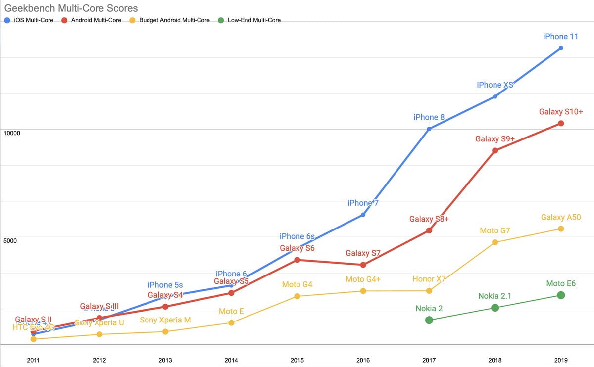
Mid-tier Android devices (~$300) now get the single-core performance of a 2014 iPhone and the multi-core perf of a 2015 iPhone.
The cheapest (high volume) Androids perform like 2012/2013 iPhones, respectively. twitter.com/slightlylate/status/1139684093602349056
Meanwhile, developer behaviour offers little hope:

A silver lining on this dark cloud is that mobile JavaScript payload growth paused in 2020. How soon will low-end and middle-tier phones be able to handle such chonky payloads? If the median site continued to send 3x the recommended amount of script, when would the web start to feel usable on most of the world’s devices?
Here begins our 2021 adventure.
Hard Reset
To update our global baseline from 2017, we want to update our priors on a few dimensions:
- The evolved device landscape
- Modern network performance and availability
- Advances in browser content processing
Content Is Dead, Long Live Content
Good news has consistently come from the steady pace of browser progress. The single largest improvements visible in traces come from improved parsing and off-thread compilation of JavaScript. This step-change, along with improvements to streaming compilation, has helped to ensure that users are less likely to notice the unreasonably-sized JS payloads that “modern” toolchains generate more often than not. Better use of more cores (moving compilation off-thread) has given sites that provide HTML and CSS content a fighting chance of remaining responsive, even when saddled with staggering JS burdens.
A steady drumbeat of improvements have contributed to reduced runtime costs, too, though I fear they most often create an induced demand effect.
The residual main-thread compilation, allocation, and script-driven DOM/Layout tasks pose a challenge for delivering a good user experinece. As we’ll see below, CPUs are not improving fast enough to cope with frontend engineers’ rosy resource assumptions. If there is unambiguously good news on the tooling front, multiple popular tools now include options to prevent sending first-party JS in the first place (Next.js, Gatsby), though the JS community remains in stubborn denial about the costs of client-side script. Hopefully, toolchain progress of this sort can provide a more accessible bridge as we transition costs to a reduced-script-emissions world.
4G Is A Miracle, 5G Is A Mirage
The 2017 baseline post included a small model for thinking about how to think about how various factors of a page’s construction influence the likelihood of hitting a 5-second first load goal.
The hard floor of that model (~1.6s) came from the contributions DNS, TCP/IP, and TLS connection setup over a then-reasonable 3G network baseline, leaving only 3400ms to work with, fighting Nagle and weak CPUs the whole way. Adding just one extra connection to a CDN for a critical path resource could sink the entire enterprise. Talk about a hard target.
Four years later, has anything changed? I’m happy to report that it has. Not as much as we’d like, of course, but the worldwide baseline has changed enormously. How? Why?
Reliance Jio, mostly.
India has been the epicentre of smartphone growth in recent years, owing to the sheer size of its market and an accelerating shift away from feature phones which made up the majority of Indian mobile devices until as late as 2019. Continued projections of double-digit market growth for smartphones, on top of a doubling of shipments in the past 5 years, paint a vivid picture.
Key to this growth is the effect of Reliance Jio’s entry into the carrier market. Before Jio’s disruptive pricing and aggressive rollout, data services in India were among the most expensive in the world relative to income and heavily reliant on 3G outside wealthier “tier 1” cities. Worse, 3G service often performed like 2G in other markets, thanks to over-provisioning and data rate throttling by incumbent carriers.
In 2016, Jio swept over the subcontinent like a monsoon dropping a torrent of 4G infrastructure and free data rather than rain.
Competing carriers responded instantly, dropping prices aggressively, leading to reductions in per-packet prices approaching 95%.
Jio’s blanket 4G rollout blitzkrieg shocked incumbents with a superior product at an unheard-of price, forcing the entire market to improve data rates and coverage. India became a 4G-centric market sometime in 2018.
If there’s a bright spot in our construction of a 2021 baseline for performance, this is it. We can finally upgrade our assumptions about the network to assume slow-ish 4G almost everywhere (pdf).
5G looks set to continue a bumpy rollout for the next half-decade. Carriers make different frequency band choices in different geographies, and 5G performance is heavily sensitive to mast density, which will add confusion for years to come. Suffice to say, 5G isn’t here yet, even if wealthy users in a few geographies come to think of it as “normal” far ahead of worldwide deployment.
Hardware Past As Performance Prologue
Whatever progress runtimes and networks have made in the past half-decade, browsers are stubbornly situated in the devices carried by real-world users, and the single most important thing to understand about the landscape of devices your sites will run on is that they are not new phones.
This makes some intuitive sense: smartphones are not in their first year (and haven’t been for more than a dozen years), and most users do not replace their devices every year. Most smartphone sales today are replacements (that is, to users who have previously owned a smartphone), and the longevity of devices continues to rise.
The worldwide device replacement average is now 33 months. In markets near smartphone saturation, that means we can expect the median device to be nearly 18 months old. Newer devices continue to be faster for the same dollar spent. Assuming average selling prices (ASPs) remaining in a narrow year-on-year band in most geographies, a good way to think of the “average phone” as being the average device sold 18 months ago. ASPs, however, have started to rise, making my prognostications from 2017 only technically correct:
The true median device from 2016 sold at about ~$200 unlocked. This year’s median device is even cheaper, but their performance is roughly equivalent. Expect continued performance stasis at the median for the next few years. This is part of the reason I suggested the Moto G4 last year and recommend it or the Moto G5 Plus this year.
Median devices continue to be different from averages, but we can squint a little as we’re abstracting over multi-year cohorts. The worldwide ASP 18 months ago was ~$300USD, so the average performance in the deployed fleet can be represented by a $300 device from mid-2019. The Moto G7 very much looks the part.
Compared to devices wealthy developers carry, the performance is night and (blinding) day. However shocking a 6x difference in single-thread CPU performance might be, it’s nothing compared to where we should be setting the global baseline: the P75+ device. Using our little mental model for device age and replacement, we can naively estimate what the 75th percentile (or higher) device could be in terms of device price + age, either by tracking devices at half the ASP at half the replacement age, or by looking at ASP-priced devices 3/4 of the way through the replacement cycle. Today, either method returns a similar answer.
This is inexact for dozens of reasons, not least of all markets with lower ASPs not yet achieving smartphone saturation. Using a global ASP as a benchmark can further mislead thanks to the distorting effect of ultra-high-end prices rising while shipment volumes stagnate. It’s hard to know which way these effects cut when combined, so we’re going to make a further guess: we’ll take half the average price and note how wrong this likely is.
So what did $150USD fetch in 2019?
Say hello to the Moto E6! This 2GiB RAM, Android 9 stalwart features the all-too classic lines of a Quad-core A53 (1.4GHz, small mercies) CPU, tastefully presented in a charming 5.5″ package.

If those specs sound eerily familiar, it’s perhaps because they’re identical to 2016’s $200USD Moto G4, all the way down to the 2011-vintage 28nm SoC process node used to fab the chip’s anemic, 2012-vintage A53 cores. There are differences, of course, but not where it counts.
You might recall the Moto G4 as a baseline recommendation from 2016 for forward-looking performance work. It’s also the model we sent several dozen of to Pat Meenan — devices that power webpagetest.org/easy to this day. There was no way to know that the already-ageing in-order, near-zero-cache A53 + too-hot-to-frequency-scale 28nm process duo would continue to haunt us five year on. Today’s P75 devices tell the story of the yawning Performance Inequality Gap: performance for those at the top end continues to accelerate away from the have-nots who are perpetually stuck with 2014’s hardware.
The good news is that chip progress has begun to move, if glacially, in the past couple of years. 28nm chips are being supplanted at the sub-$200USD price-point by 14nm and even 11nm parts. Specs are finally improving quickly at the bottom of the market now, with new ~$135USD devices sporting CPUs that should give last year’s mid-range a run for its money.
Mind The Gap
Regardless, the overall story for hardware progress remains grim, particularly when we recall how long device replacement cycles are:
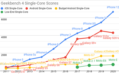
Updated Geekbench 4 single-core scores for each mobile price-point.
Recall that single-core performance most directly translates into speed on the web. Android-ecosystem SoC performance is, in a word, disastrous.
How bad is it?
We can think about each category in terms of years behind contemporary iPhone releases:
- 2020’s high-end Androids sport the single-core performance of an iPhone 8, a phone released in Q3’17
- mid-priced Androids were slightly faster than 2014’s iPhone 6
- low-end Androids have finally caught up to the iPhone 5 from 2012
You’re reading that right: single core Android performance at the low end is both shockingly bad and dispiritingly stagnant.
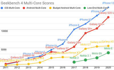
Android ecosystem SoC’s fare slightly better on multi-core performance, but the Performance Inequality Gap is growing there, too.
The multi-core performance shows the same basic story: iOS’s high-end and the most expensive Androids are pulling away from the volume-shipment pack. The fastest Androids predictably remain 18-24 months behind, owing to cheapskate choices about cache sizing by Qualcomm, Samsung Semiconductor, MediaTek, and the rest. Don’t pay a lot for an Android-shaped muffler.
Chip design choices and silicon economics are the defining feature of the still-growing Performance Inequality Gap.
Things continue to get better and better for the wealthy, leaving the rest behind. When we construct a digital world to the limits of the best devices, the worse an experience we build, on average, for those who cannot afford iPhones or $800 Samsung flagships.
It is perhaps predictable that, instead of presenting a bulwark against stratification, technology outcomes have tracked society’s growing inequality. A yawning chasm of disparities is playing out in our phones at the same time it has come to shape our economic and political lives. It’s hard to escape thinking they’re connected.
Developers, particularly in Silicon Valley firms, are definitionally wealthy and enfranchised by world-historical standards. Like upper classes of yore, comfort (“DX”) comes with courtiers happy to declare how important comfort must surely be. It’s bunk, or at least most of it is.
As frontenders, our task is to make services that work well for all, not just the wealthy. If improvements in our tools or our comfort actually deliver improvements in that direction, so much the better. But we must never forget that measurable improvement for users is the yardstick.
Instead of measurement, we seem to suffer a proliferation of postulates about how each new increment of comfort must surely result in better user experiences. But the postulates are not tied to robust evidence. Instead, experience teaches that it’s the process of taking care to attend to those least-well-off that changes outcomes. Trickle-down user experience from developer-experience is, in 2021, as fully falsified as the Laffer Curve. There’s no durable substitute for compassion.
A 2021 Global Baseline
It’s in that spirit that I find it important to build to a strawperson baseline device and network target. Such a benchmark serves as a stand-in until one gets situated data about a site or service’s users, from whom we can derive informed conclusions about user needs and appropriate resource budgets.
A global baseline is doubly important for generic frameworks and libraries, as they will be included in projects targeted at global-baseline users, whether or not developers have that in mind. Tools that cannot fit comfortably within, say, 10% of our baseline budget should be labelled as desktop-only or replaced in our toolchains. Many popular tools over the past 5 years have been blithely punctured these limits relative to the 2017 baseline, and the results have been predictably poor.
Given all the data we’ve slogged through, we can assemble a sketch of the browsers, devices, and networks today’s P50 and P75 users will access sites from. Keep in mind that this baseline might be too optimistic, depending on your target market. Trust but verify.
OpenSignal’s global report on connection speeds (pdf) suggest that WebPageTest’s default 4G configuration (9Mbps w/ 170ms RTT) is a reasonable stand-in for the P75 network link. WPT’s LTE configuration (12Mbps w/ 70ms RTT) may actually be too conservative for a P50 estimate today; something closer to 25Mbps seems to approach the worldwide median today. Network progress has been astonishing, particularly channel capacity (bandwidth). Sadly, data on latency is harder to get, even from Google’s perch, so progress there is somewhat more difficult to judge.
As for devices, the P75 situation remains dire and basically unchanged from the baseline I suggested more than five years ago. Slow A53 cores — a design first introduced nearly a decade ago — continue to dominate the landscape, differing only slightly in frequency scaling (through improved process nodes) and GPU pairing. The good news is that this will change rapidly in the next few years. The median new device is already benefiting; modern designs and fab processes are powering a ramp-up in performance for a $300USD device, particularly in multi-core workloads. But the hardware future is not evenly distributed, and web workloads aren’t heavily parallel.
Astonishingly, I believe this means that for at least the next year we should consider the venerable Moto G4 to still be our baseline. If you can’t buy one new, the 2020-vintage Moto E6 does a stirring rendition of the classic; it’s basically the same phone, after all. The Moto E7 Plus is a preview of better days to come, and they can’t arrive soon enough.
“All models are wrong, but some are useful.”
Putting it all together, where does that leave us? Back-of-the napkin, and accepting our previous targets of 5 seconds for first load and two seconds for second load, what can we afford?
Plugging the new P75 numbers in, the impact of network improvements are dramatic. Initial connection setup times are cut in half, dropping from 1600ms to 700ms, which frees up significant headroom to transmit more data in the same time window. The channel capacity increase to 9Mbps is enough to transmit more than 4MiB (megabytes) of content over a single connection in our 5 second window (1 Byte == 8 bits, so 9Mbps is just over ~1MBps). Of course, if most of this content is JavaScript, it must be compiled and run, shrinking our content window back down significantly. Using a single connection (thanks to the magic of HTTP/2), a site composed primarily of JavaScript loaded perfectly can, in 2021, weigh nearly 600KiB and still hit the first-load bar.
That’s a very fine point to balance on, though. A single additional TCP/TLS connection setup in the critical path reduces the amount by 100KiB (as do subsequent critical-path network handshakes). Serialized requests for data, high TTFBs, and ever-present font serving issues make these upper limits far higher than what a site shooting for consistently good load times should be aiming for. In practice, you can’t actually afford 600KiB of content if your application is build in the increasingly popular “single page app” style.
As networks have improved, client-side CPU time now dominates script download, adding further variability. Not all script parses and runs in the same amount of time for the same size. The contribution of connection setup also looms large.
If you want to play with the factors and see how they contribute, you can try this slightly updated version of 2017’s calculator (launch a larger version in a new tab here):
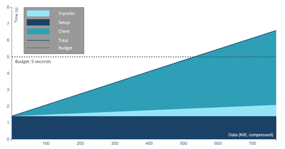
This model of browser behaviour, network impacts, and device processing time is, of course, wrong for your site. It could be wrong in ways big and small. Perhaps your content is purely HTML, CSS, and images which would allow for a much higher budget. Or perhaps your JS isn’t visually critical path, but still creates long delays because of delayed fetching. And nobody, realistically, can predict how much main-thread work a given amount of JS will cause. So it’s an educated guess with some padding built in to account for worst-case content-construction (which is more common than you or I would like to believe).
Conservatively then, assuming at least 2 connections need to be set up (burning ~1400 of our 5000ms), and that script resources are in the critical path, the new global baseline leaves space for ~100KiB (gzipped) of HTML/CSS/fonts and 300-350KiB of JavaScript on the wire (compressed). Critical path images for LCP, if any, need to subtract their transfer size from one of these buckets, with trades against JS bundle size potentially increasing total download budget, but the details matter a great deal. For “modern” pages, half a megabyte is a decent hard budget.
Is that a lot? Well, 2-4x our previous budget, and as low-end CPUs finally begin to get faster over the next few years, we can expect it to loosen further for well-served content.
Sadly, most sites aren’t perfectly served or structured, and most mobile web pages send more than this amount of JS. But there’s light at the end of the tunnel: if we can just hold back the growth of JS payloads for another year or two — or reverse the trend slightly — we might achieve a usable web for the majority of the world’s users by the middle of the decade.
Getting there involves no small amount of class traitorship; the frontend community will need to value the the commons over personal comfort for a little while longer to ease our ecosystem back toward health. The past 6 years of consulting with partner teams has felt like a dark remake of Groundhog Day, with a constant parade of sites failing from the get-go thanks to Framework + Bundler + SPA architectures that are mismatched to the tasks and markets at hand. Time (and chips) can heal these wounds if we only let it. We only need to hold the line on script bloat for a few years for devices and networks to overtake the extreme, unconscionable excesses of the 2010’s.
Baselines And Budgets Remain Vital
I mentioned near the start of this too-long piece that metrics better than Time-to-Interactive have been developed since 2017. The professionalism with which the new Core Web Vitals (CWV) have been developed, tested, and iterated on inspires real confidence. CWV’s constituent metrics and limits work to capture important aspects of page experiences as users perceive them on real devices and networks.
As RUM (field) metrics rather than bench tests, they represent ground truth for a site, and are reported in aggregate by the Chrome User Experience Report (CrUX) pipeline. Getting user-population level data about the performance of sites without custom tooling is a 2016-era dream come true. Best of all, the metrics and limits can continue to evolve in the future as we gain confidence that we can accurately measure other meaningful components of a user’s journey.
These field metrics, however valuable, don’t yet give us enough information to guide global first-best-guess making when developing new sites. Continuing to set performance budgets is necessary for teams in development, not least of all because conformance can be automated in CI/CD flows. CrUX data collection and first-party RUM analytics of these metrics require live traffic, meaning results can be predicted but only verified once deployed.
Both budgets and RUM analytics will continue to be powerful tools in piercing the high-performance privilege bubble that surrounds today’s frontend discourse. Grounding our choices against a baseline and measuring how it’s going for real users are the only proven approaches I know that reliably help teams take the first step toward frontend’s first and highest calling: a web that’s truly for everyone.

