
With the Chrome 88 release, we got support for clip-path: path(). That means it now has support in “most” major browsers!
With path(), we’re able to use path definitions for a clip-path. (You catch up on what clip-path is here). These path definition strings are the same as those we can use with the SVG path element. What’s cool about this is that it provides a way to create shapes that before may have meant using SVG. We can even create paths that break without requiring any tricks.
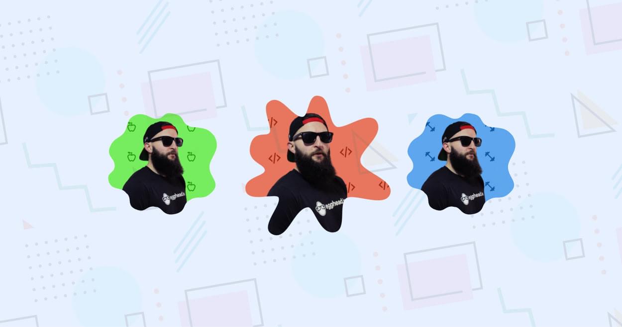
With the increased support came an opportunity to try something fun with it! Let’s make “Squeaky Portraits”! It’s a fun take on using clip-path: path() to clip the viewable area of an element into these “Nickelodeon-esque” splats.
"Squeaky Portraits ????????"
Wasn't done playing with CSS clip-path: path() ????
Aiming for a splat but settled for a squeaky sound effect ????
Powered by scoped variables! ????
(Better with sound ????)
???? https://t.co/Nuqyivpm5Y via @CodePen pic.twitter.com/TCCouglKpd
— Jhey ???????? (@jh3yy) February 12, 2021
Creating a Path
First up, we need our own SVG style path definition string. And in this case, more than one. The neat thing with clip-path is that we can transition them with CSS. As long as the clip-path function and number of nodes are consistent, we can transition.
To make some paths, we can hop in any vector graphic editor. In this case, I’m using Figma. And instead of creating the paths from scratch, we can use a desired “splat” as a foundation. This one looks good!
The trick here is to create more splats based on the foundation splat. And we need to do this without introducing or removing any nodes. These are the three splats I came up with. But you could make any shapes you like as long as you stick to that rule!
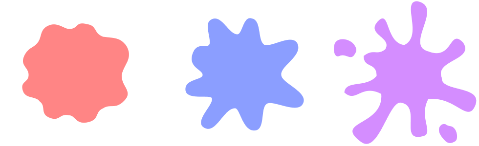
You may notice that the third splat has two blobs that separate off from the main shape. This is fine, because SVG path definitions allow us to do this. We can start a line, close it, and move to another point to start another.
But didn’t I say they needed a consistent number of points? They do. And that’s what we have here! Those two blobs appear for each splat. But the trick is that we can move them behind the rest of the path when they aren’t needed.
Once we have our splats, we can export them and grab the path definition strings:
See the Pen 1. SVG Splats by SitePoint (@SitePoint)
on CodePen.
Applying Splats
To apply the splats, we’re going to create variables for each path:
.portrait { --splat: "M161 188.375C170 193.5 177.919 193.854 186 188.375C197.919 180.294..."; --splattier: "M161 188.375C170 193.5 177.919 193.854 186 188.375C197.919..."; --splatted: "M232.5 256C225 251 209.5 262.5 224 281.5C232.736 292.948..."; } These are the paths we’ve lifted straight out of the exported SVG.
We’re going with the names “splat”, “splattier”, and “splatted”. Naming things is hard. Ha! But take, for example, the “splatted” SVG:
<svg width="300" height="300" viewBox="0 0 300 300" fill="none" xmlns="http://www.w3.org/2000/svg"> <path d="M232.5 256C225 251 209.5 262.5 224 281.5C232.736 292.948 238.561 297.756 251 290.5C257 287 256.114 271.924 250 264.5C243.886 257.076 240 261 232.5 256ZM147 92.5C118.738 94.6708 118 17 93 44C68 71 123.543 76.5 108 101.5C90.5 115 70.81 98.3664 64 115C56.7766 132.643 91.1967 136.948 90.5 156C89.4406 184.974 19.1766 161.499 24.5 190C29.9178 219.006 78.6461 172.635 100 193C130.207 221.808 1 248.5 58.5 291.5C94.5576 318.465 114.991 206.551 140.5 211C183.5 218.5 134.5 294 186.5 279.5C207.5 273 174.638 224.658 196 204C223.117 177.777 275.916 253 291.5 218.5C311.375 174.5 228.698 194.565 224 160C219.553 127.282 291.5 123.5 267.5 87.5C238.5 57 247 125.5 196 105.5C147 92.5 229.5 13.5 173.5 2.5C140.5 2.49999 183.532 89.694 147 92.5ZM45 92.5C36.8766 80.3149 14.1234 75.3149 6.00001 87.5C0.584412 95.6234 2.00001 120.357 14.5 115C27.9606 109.231 36.8766 124.685 45 112.5C50.4156 104.377 50.4156 100.623 45 92.5Z" fill="#A91CFF"/> </svg> We’re lifting out the d attribute from the path elements and creating CSS variables for them. Next, we need an element to apply these to. Let’s create an element with the class “portrait”:
<div class="portrait"></div> Next, apply some styling to it:
.portrait { --splat: "M161 188.375C170 193.5 177.919 193.854 186 188.375C197.919 180.294..."; --splattier: "M161 188.375C170 193.5 177.919 193.854 186 188.375C197.919..."; --splatted: "M232.5 256C225 251 209.5 262.5 224 281.5C232.736 292.948..."; --none: ""; height: 300px; width: 300px; background: #daa3f5; clip-path: path(var(--clip, var(--none))); transition: clip-path 0.2s; } And we’re good to go! Here’s a demo where you can switch between the different clip states:
See the Pen 2. Applying Clip Splat by SitePoint (@SitePoint)
on CodePen.
Note how the shape transitions between the three splat shapes. But, also note how we’ve given our element an explicit height and width. This size matches the dimensions of our SVG exports. This is important. This is the one drawback of using clip-path: path(). It’s not responsive. The path definition is relative to the dimensions of your element. This is the same problem faced by CSS motion paths.
This is fine if we’re mindful of the sizes of things we’re clipping. We could also create different path variables for different viewport sizes. But if you have images that resize in a fluid way, other solutions using SVG are going to be more robust.
Interaction
For our demo, we want the splat to be interactive. We can do this with CSS alone. We can use a scoped CSS variable — --clip — to control the current clip. And then we can update that variable on both :hover and :active. The --active state is triggered when we press our pointer down:
.portrait { clip-path: path(var(--clip, var(--splat))); } .portrait:hover { --clip: var(--splattier); } .portrait:active { --clip: var(--splatted); } Throw that together and we get something like this. Try hovering over the splat and pressing it:
See the Pen 3. Interactive Splat by SitePoint (@SitePoint)
on CodePen.
Adding Some Character
Now that we can transition the splat, it needs a little something extra. What if we transform it in those states too?
.portrait { transition: clip-path 0.2s, transform 0.2s; transform: scale(var(--scale, 1)) rotate(var(--rotate, 0deg)); } .portrait:hover { --scale: 1.15; --rotate: 30deg; } .portrait:active { --scale: 0.85; --rotate: -10deg; } Using scoped CSS variables to apply a transform, we can add something. Here we update the scale and rotation of our splat. We can experiment with different values and play with different effects here. Translating the element a little could look good?
See the Pen 4. Adding Some Character by SitePoint (@SitePoint)
on CodePen.
Continue reading Squeaky Portraits: Having Fun with the CSS path() Function on SitePoint.


