Most inputs have something in common — they are happiest with a companion label! And the happiness doesn’t stop there. Forms with proper inputs and labels are much easier for people to use and that makes people happy too.
In this post, I want to focus on situations where the lack of a semantic label and input combination makes it much harder for all sorts of people to complete forms. Since millions of people’s livelihoods rely on forms, let’s get into the best tips I know for creating a fulfilling and harmonious relationship between an input and a label.
Content warning: In this post are themes of love and relationships.
The love story starts here! Let’s cover the basics for creating happy labels and inputs.
How to pair a label and an input
Table of Contents
There are two ways to pair a label and an input. One is by wrapping the input in a label (implicit), and the other is by adding a for attribute to the label and an id to the input (explicit).
Think of an implicit label as hugging an input, and an explicit label as standing next to an input and holding its hand.
<label> Name: <input type="text" name="name" />
</label>
An explicit label’s for attribute value must match its input’s id value. For example, if for has a value of name, then id should also have a value of name.
<label for="name">Name: </label>
<input type="text" id="name" name="name" />
Unfortunately, an implicit label is not handled correctly by all assistive technologies, even if for and id attributes are used. Therefore, it is always the best idea to use an explicit label instead of an implicit label.
<!-- IMPLICIT LABEL (not recommended for use) - the label wraps the input. -->
<label> Name: <input type="text" name="name" />
</label> <!-- EXPLICIT LABEL (recommended for use) - the label is connected to an input via "for" and "id" -->
<label for="explicit-label-name">Name: </label>
<input type="text" id="explicit-label-name" name="name" />
Each separate input element should only be paired with one label. And a label should only be paired with one input. Yes, inputs and labels are monogamous. ♥️
Note: There’s one sort of exception to this rule: when we’re working with a group of inputs, say several radio buttons or checkboxes. In these cases, a <legend> element is used to group certain input elements, such as radio buttons, and serves as the accessible label for the entire group.
Not all inputs need labels
An input with a type="submit" or type="button" does not need a label — the value attribute acts as the accessible label text instead. An input with type="hidden" is also fine without a label. But all other inputs, including <textarea> and <select> elements, are happiest with a label companion.
What goes in a label
The content that goes inside of a label should:
- Describe its companion input. A label wants to show everyone that it belongs with its input partner.
- Be visible. A label can be clicked or tapped to focus its input. The extra space it provides to interact with the input is beneficial because it increases the tap or click target. We’ll go into that more in just a bit.
- Only contain plain text. Don’t add elements like headings or links. Again, we’ll go into the “why” behind this further on down.
One useful thing you can do with the content in a label is add formatting hints. For example, the label for <input type="date" id="date"> will be <label for="date"> as we’d expect. But then we can provide a hint for the user that the date needs to be entered in a specific format, say DD-DD-YYYY, in the form of a <span> between the label and input that specifies that requirement. The hint not only specifies the date format, but has an id value that corresponds to an aria-describedby attribute on the input.
<!-- Describes what the input is for - should be plain text only -->
<label for="date">Start date</label>
<!-- Describes additional information, usually about formatting -->
<span id="date-format">(DD-MM-YYYY):</span>
<input type="date" id="date" aria-describedby="date-format" min="2021-03-01" max="2031-01-01" />
This way, we get the benefit of a clear label that describes what the input is for, and a bonus hint to the user that the input needs to be entered in a specific format.
Best practices for a healthy relationship
The following tips go beyond the basics to explain how to make sure a label and input are as happy as can be.
Do: Add a label in the right place
There is a WCAG success criterion that states the visual order of a page should follow the order in which elements appear in the DOM. That’s because:
A user with low vision who uses a screen magnifier in combination with a screen reader may be confused when the reading order appears to skip around on the screen. A keyboard user may have trouble predicting where focus will go next when the source order does not match the visual order.
Think about it. If we have some standard HTML where the label comes before the input:
<label for="orange">Orange</label>
<input type="checkbox" id="orange" name="orange">
That places the label before the input in the DOM. But now let’s say our label and form are inside a flexible container and we use CSS order to reverse things where the input visually comes before the label:
label { order: 2; }
input { order: 1; }
A screen reader user, who is navigating between elements, might expect the input to gain focus before the label because the input comes first visually. But what really happens is the label comes into focus instead. See here for the difference between navigating with a screen reader and a keyboard.
So, we should be mindful of that. It is conventional to place the label on the right-hand side of the input for checkboxes and radio buttons. This can be done by placing the label after the input in the HTML, ensuring the DOM and visual order match.
<form> <!-- Checkbox with label on the right --> <span> <input type="checkbox" id="orange" name="orange"> <label for="orange">Orange</label> </span> <!-- Radio button with label on the right --> <span> <input type="radio" id="banana" name="banana"> <label for="banana">Banana</label> </span> <!-- Text input with label on the left --> <span> <label for="apple">How do you like them apples?</label> <input type="text" id="apple" name="apple"> </span>
</form>
Do: Check inputs with a screen reader
Whether an input is written from scratch or generated with a library, it is a good idea to check your work using a screen reader. This is to make sure that:
- All relevant attributes exist — especially the matching values of the
forandidattributes. - The DOM matches the visual order.
- The label text sounds clear. For example, “dd-mm-yyyy” is read out differently to its uppercase equivalent (DD-MM-YYYY).
Over the last few years, I have used JavaScript libraries, like downshift, to build complex form elements such as autocomplete or comboboxes on top of native HTML ones, like inputs or selects. Most libraries make these complex elements accessible by adding ARIA attributes with JavaScript.
However, the benefits of native HTML elements enhanced using JavaScript are totally lost if JavaScript is broken or disabled, making them inaccessible. So check for this and provide a server-rendered, no-JavaScript alternative as a safe fallback.
Check out these basic form tests to determine how an input and its companion label or legend should be written and announced by different screen readers.
Do: Make the label visible
Connecting a label and an input is important, but just as important is keeping the label visible. Clicking or tapping a visible label focuses its input partner. This is a native HTML behavior that benefits a huge number of people.
Imagine a label wanting to proudly show its association with an input:
That said, there are going to be times when a design calls for a hidden label. So, if a label must be hidden, it is crucial to do it in an accessible way. A common mistake is to use display: none or visibility: hidden to hide a label. These CSS display properties completely hide an element — not only visually but also from screen readers.
Consider using the following code to visually hide labels:
/* For non-natively-focusable elements. For natively focusable elements */
/* Use .visually-hidden:not(:focus):not(:active) */
.visually-hidden { border-width: 0 !important; clip: rect(1px, 1px, 1px, 1px) !important; height: 1px !important; overflow: hidden !important; padding: 0 !important; position: absolute !important; white-space: nowrap !important; width: 1px !important;
}
Kitty Giraudel explains in depth how to hide content responsibly.
What to Avoid
To preserve and maintain a healthy relationship between inputs and labels, there are some things not to do when pairing them. Let’s get into what those are and how to prevent them.
Don’t: Expect your input to be the same in every browser
There are certain types of inputs that are unsupported In some older desktop browsers. For example, an input that is type="date" isn’t supported in Internet Explorer (IE) 11, or even in Safari 141 (released September 2020). An input like this falls back to type="text". If a date input does not have a clear label, and it automatically falls back to a text input in older browsers, people may get confused.
Don’t: Substitute a label with a placeholder
Here is why a placeholder attribute on an input should not be used in place of a label:
- Not all screen readers announce placeholders.
- The value of a
placeholderis in danger of being cut-off on smaller devices, or when a page is translated in the browser. In contrast, the text content of a label can easily wrap onto a new line. - Just because a developer can see the pale grey
placeholdertext on their large retina screen, in a well-lit room, in a distraction-free environment, doesn’t mean everyone else can. Aplaceholdercan make even those with good vision scrunch their eyes up and eventually give up on a form.


- Once a character is entered into an input, its
placeholderbecomes invisible — both visually and to screen readers. If someone has to back-track to review information they’ve entered in a form, they’d have to delete what was entered just to see the placeholder again. - The
placeholderattribute is not supported in IE 9 and below, and disappears when an input is focused in IE 11. Another thing to note: the placeholder color is unable to be customized with CSS in IE 11.
Placeholders are like the friend that shows up when everything is perfect, but disappears when you need them most. Pair up an input with a nice, high-contrast label instead. Labels are not flaky and are loyal to inputs 100% of the time.
The Nielsen Norman Group has an in-depth article that explains why placeholders in form fields are harmful.
Don’t: Substitute a label with another attribute or element
When no label is present, some screen readers will look for adjacent text and announce that instead. This is a hit-and-miss approach because it’s possible that a screen reader won’t find any text to announce.
The below code sample comes from a real website. The label has been substituted with a <span> element that is not semantically connected to the input.
<div> <span>Card number</span> <div> <input type="text" value="" id="cardNumber" name="cardNumber" maxlength="40"> </div>
</div>
The above code should be re-written to ensure accessibility by replacing the span with a label with for="cardNumber" on it. This is by far the most simple and robust solution that benefits the most people.
While a label could be substituted with a span that has an id with a value matching the input’s aria-labelledby attribute, people won’t be able to click the span to focus the input in the same way a label allows. It is always best to harness the power of native HTML elements instead of re-inventing them. The love story between native input and label elements doesn’t need to be re-written! It’s great as-is.
Don’t: Put interactive elements inside labels
Only plain text should be included inside a label. Avoid inserting things such as headings, or interactive elements such as links. Not all screen readers will announce a label correctly if it contains something other than plain text. Also, if someone wants to focus an input by clicking its label, but that label contains a link, they may click the link by mistake.
<form> <div> <!-- Don't do this --> <input type="checkbox" id="t-and-c" name="name" /> <label for="t-and-c">I accept the <a href="https://link.com">terms and conditions</a></label> </div> <div> <!-- Try this --> <input type="checkbox" id="t-and-c2" name="name" /> <label for="t-and-c2">I accept the terms and conditions.</label> <span>Read <a href="https://link.com">terms and conditions</a></span> </div>
</form>
Real-life examples
I always find that real-life examples help me to properly understand something. I searched the web and found examples of labels and inputs from a popular component library and website. Below, I explain where the elements fall short and how they can be improved to ensure a better pairing.
Component library: Material
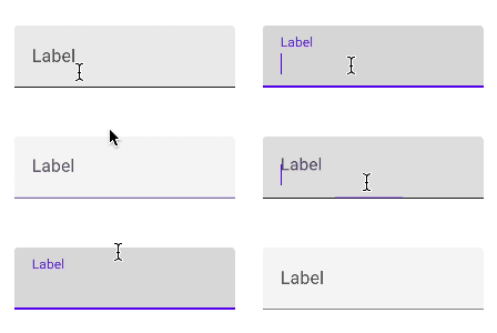
MaterialUI is a React component library based on Google’s design system. It includes a text input component with a floating label pattern that has become a popular go-to for many designers and developers:

Clicking on the input feels smooth and looks great. But that’s the problem. Its qualities are mostly skin-deep.
At the time of writing this post, some issues I found with this component include:
- There is no option to have the label outside of the input in order to offer an increased interactive area for focusing the input.
- There is an option to add a hint like we saw earlier. Unfortunately, the hint is only associated with the input via proximity and not through a matching
idandaria-describedby. This means that not all screen readers will be able to associate the helper message with the input. - The label is behind the input in the DOM, making the visual order is incorrect.
- The empty input looks look like it is already filled out, at least as long as it is not active.
- The label slides up when the input is clicked, making it unsuitable for those who prefer reduced motion.
Adam Silver also explains why float labels are problematic and gets into a detailed critique of Material’s text input design.
Website: Huffpost
The Huffpost website has articles containing a newsletter subscription form:

At the time of writing this blog post, the email input that Huffpost uses could benefit from a number of improvements:
- The lack of a label means a smaller click or tap target. Instead of a label there is an
aria-labelattribute on the input. - The font size of the
placeholderand input values are a tiny 11px, which can be hard to read. - The entire input disappears without JavaScript, meaning people have no way to sign up to the newsletter if JavaScript is disabled or broken.
A surprising number of people struggle to enter information into poorly-constructed inputs. That list includes people with cognitive, motor and physical disabilities, autism spectrum disorders, brain injuries, and poor vision. Other people who struggle include those in a hurry, on a poor connection, on a small device, on an old device, and unfamiliar with digital forms, among many others.
Additionally, there are numerous reasons why JavaScript might break or be switched off in a browser, meaning inputs become dysfunctional or completely inaccessible. There are also people who are fully capable of viewing a web page but who may choose to use a keyboard along with a screen reader.
The message I want to get across is that happy label and input pairs are crucial. It doesn’t matter if your form is beautiful if it is unusable. I can bet that almost everyone would rather fill out an ugly but easy-to-use form rather than a pretty one that causes problems.
Thanks
I want to warmly thank the following people for helping me with this post: Eric Eggert, Adam Silver, Dion Dajka, and Kitty Giraudel. Their combined accessibility knowledge is a force to be reckoned with!
- 1 The datepicker is actually well-supported in iOS 14 and very nice. One would imagine that a macOS version has got to be on the horizon. ⮑


