In the news this week, Firefox gets rounded outlines, SVG animations are now GPU-accelerated in Chrome, there are no physical units in CSS, The New York Times crossword is accessible, and CSS variables are resolved before the value is inherited.
Let’s jump in the news!
Rounded outlines are coming to Firefox
Table of Contents
The idea to have the outline follow the border curve has existed ever since it became possible to create rounded borders via the border-radius property in the mid 2000s. It was suggested to Mozilla, WebKit, and Chromium over ten years ago, and it’s even been part of the CSS UI specification since 2015:
The parts of the outline are not required to be rectangular. To the extent that the outline follows the border edge, it should follow the
border-radiuscurve.
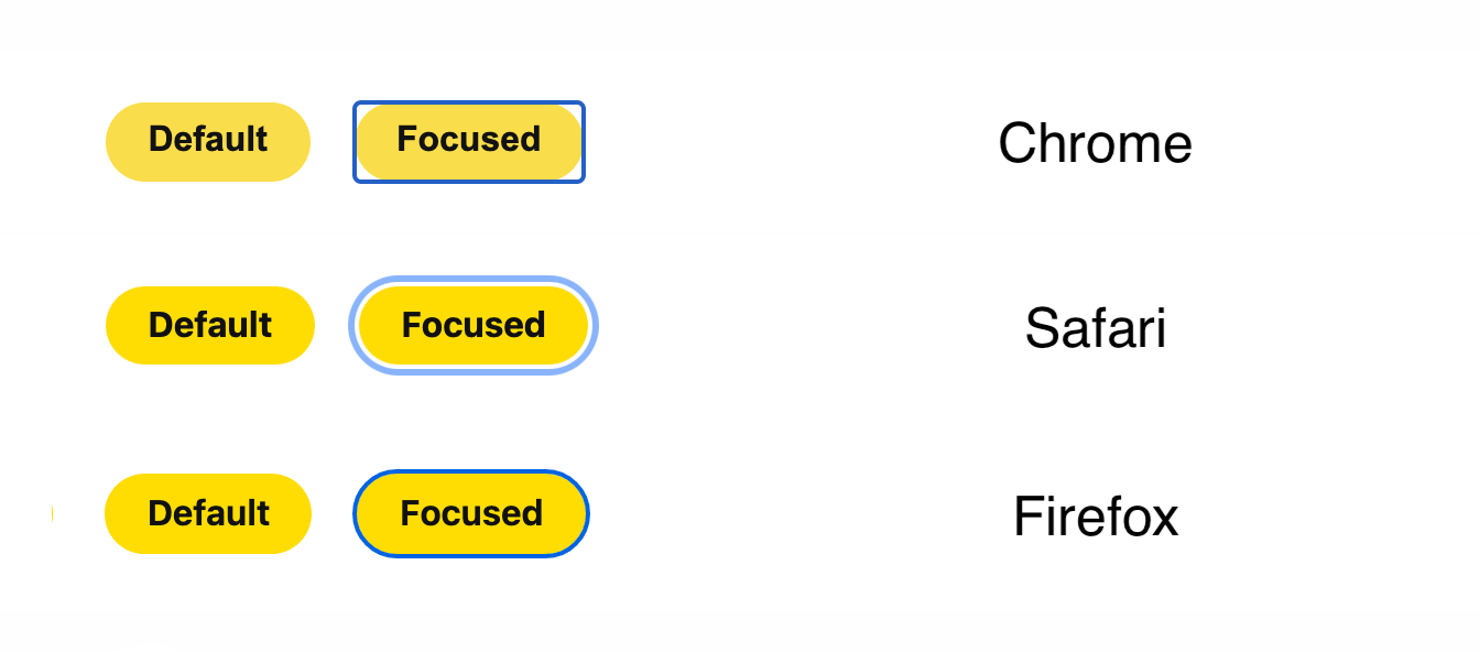
Fast-forward to today in 2021 and outlines are still rectangles in every browser without exception:
But this is finally starting to change. In a few weeks, Firefox will become the first browser with rounded outlines that automatically follow the border shape. This will also apply to Firefox’s default focus outline on buttons.

Please star Chromium Issue #81556 (sign in required) to help prioritize this bug and bring rounded outlines to Chrome sooner rather than later.
SVG animations are now GPU-accelerated in Chrome
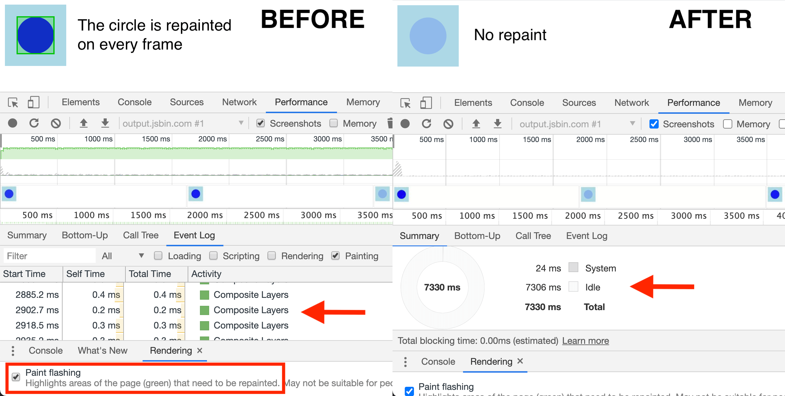
Until recently, animating an SVG element via CSS would trigger repaint on every frame (usually 60 times per second) in Chromium-based browsers. Such constant repainting can have a negative impact on the smoothness of the animation and the performance of the page itself.
The latest version of Chrome has eliminated this performance issue by enabling hardware acceleration for SVG animations. This means that SVG animations are offloaded to the GPU and no longer run on the main thread.

The switch to GPU acceleration automatically made SVG animations more performant in Chromium-based browsers (Firefox does this too), which is definitely good news for the web:
Hooray for more screen reader-accessible, progressively enhanced SVG animations and less Canvas.
There cannot be real physical units in CSS
CSS defines six physical units, including in (inches) and cm (centimeters). Every physical unit is in a fixed ratio with the pixel unit, which is the canonical unit. For example, 1in is always exactly 96px. On most modern screens, this length does not correspond to 1 real-world inch.
The FAQ page of the CSS Working Group now answers the question why there can’t be real physical units in CSS. In short, the browser cannot always determine the exact size and resolution of the display (think projectors). For websites that need accurate real-world units, the Working Group recommends per-device calibration:
Have a calibration page, where you ask the user to measure the distance between two lines that are some CSS distance apart (say,
10cm), and input the value they get. Use this to find the scaling factor necessary for that screen (CSS length divided by user-provided length).
This scaling factor can then be set to a custom property and used to compute accurate lengths in CSS:
html { --unit-scale: 1.428;
} .box { /* 5 real-world centimeters */ width: calc(5cm * var(--unit-scale, 1));
}
The Times crossword is accessible to screen reader users
The NYT Open team wrote about some of the improvements to the New York Times website that have made it more accessible in recent years. The website uses semantic HTML (<article>, <nav>, etc.), increased contrast on important components (e.g., login and registration), and skip-to-content links that adapt to the site’s paywall.
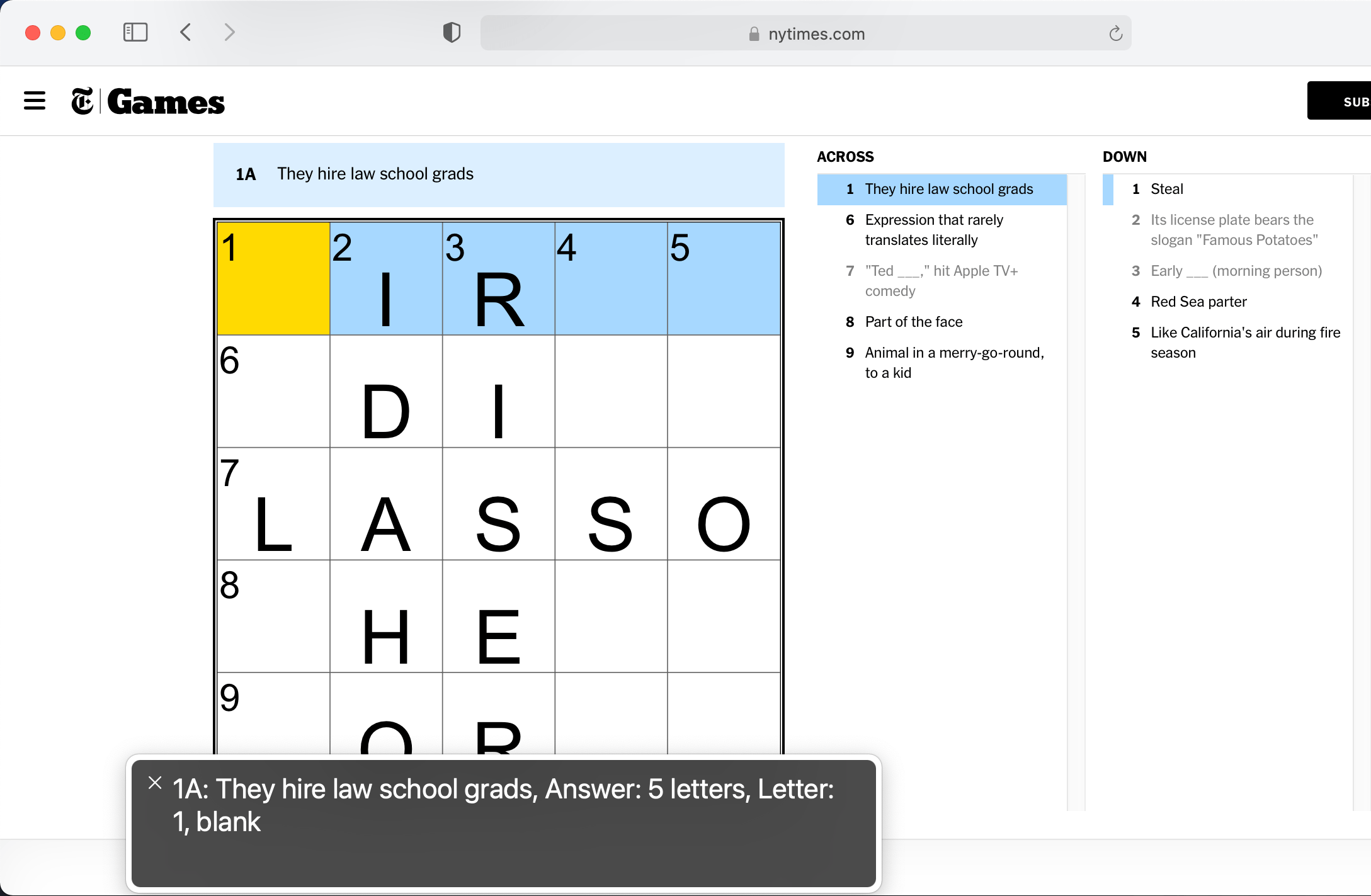
Furthermore, the Games team made the daily crossword puzzle accessible to keyboard and screen reader users. The crossword is implemented as a grid of SVG <rect> elements. As the user navigates through the puzzle, the current square’s aria-label attribute (accessible name) is dynamically updated to provide additional context.

You can play the mini crossword without an account. Try solving the puzzle with the keyboard.
CSS variables are resolved before the value is inherited
Yuan Chuan recently shared a little CSS quiz that I didn’t answer correctly because I wasn’t sure if a CSS variable (the var() function) is resolved before or after the value is inherited. I’ll try to explain how this works on the following example:
html { --text-color: var(--main-color, black);
} footer { --main-color: brown;
} p { color: var(--text-color);
}
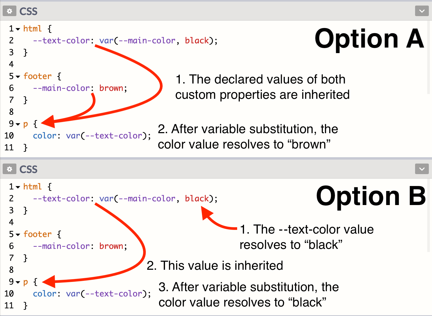
The question: Is the color of the paragraph in the footer black or brown? There are two possibilities. Either (A) the declared values of both custom properties are inherited to the paragraph, and then the color property resolves to brown, or (B) the --text-color property resolves to black directly on the <html> element, and then this value is inherited to the paragraph and assigned to the color property.

The correct answer is option B (the color is black). CSS variables are resolved before the value is inherited. In this case, --text-color falls back to black because --main-color does not exist on the <html> element. This rule is specified in the CSS Variables module:
It is important to note that custom properties resolve any
var()functions in their values at computed-value time, which occurs before the value is inherited.


