Definition
Table of Contents
Sticky headers (or persistent headers) are a common pattern for keeping the header of a website or app in the same place on the screen while the user scrolls down the page. A version of this pattern is the partially sticky header, which (re)appears at the top of the page as soon as the user starts scrolling up.
When done appropriately, sticky headers allow users to quickly access the navigation, search, and utility-navigation elements without scrolling up to the top of the page. They increase the discoverability of the elements in the header and the chance that users will take advantage of them.
However, when implemented poorly, sticky headers are annoying, distracting, and obstruct page content.
Here are 5 tips to ensure that your sticky header’s design helps, not hinders, your users.
1. Maximize the Content-to-Chrome Ratio by Keeping It Small
Sticky headers inherently take up space on the screen that could be used for content, so it’s important that you use that space responsibly. This factor is even more important on mobile devices, given the small size of the screen. You want to ensure that the content-to-chrome ratio is maximized, so that your sticky header takes the smallest amount of space that still provides appropriately readable text and tappable target sizes.
On touchscreen devices, ensure that all tap targets are a minimum of 1cm × 1 cm, all text is approximately 16pt (depending on the x-height and overall distinctiveness of the letterforms in the typeface, an appropriate minimum may be slightly smaller or larger), and then minimize any additional vertical height beyond those sizes (while still maintaining appropriate aesthetic considerations, of course).
On desktop, while there is considerably more space to work with, it’s still not advisable to luxuriate in excessive empty pixels for the header, simply to make the logo as large as possible. Again, start with readable text sizes for your header elements and minimize the vertical height from there.
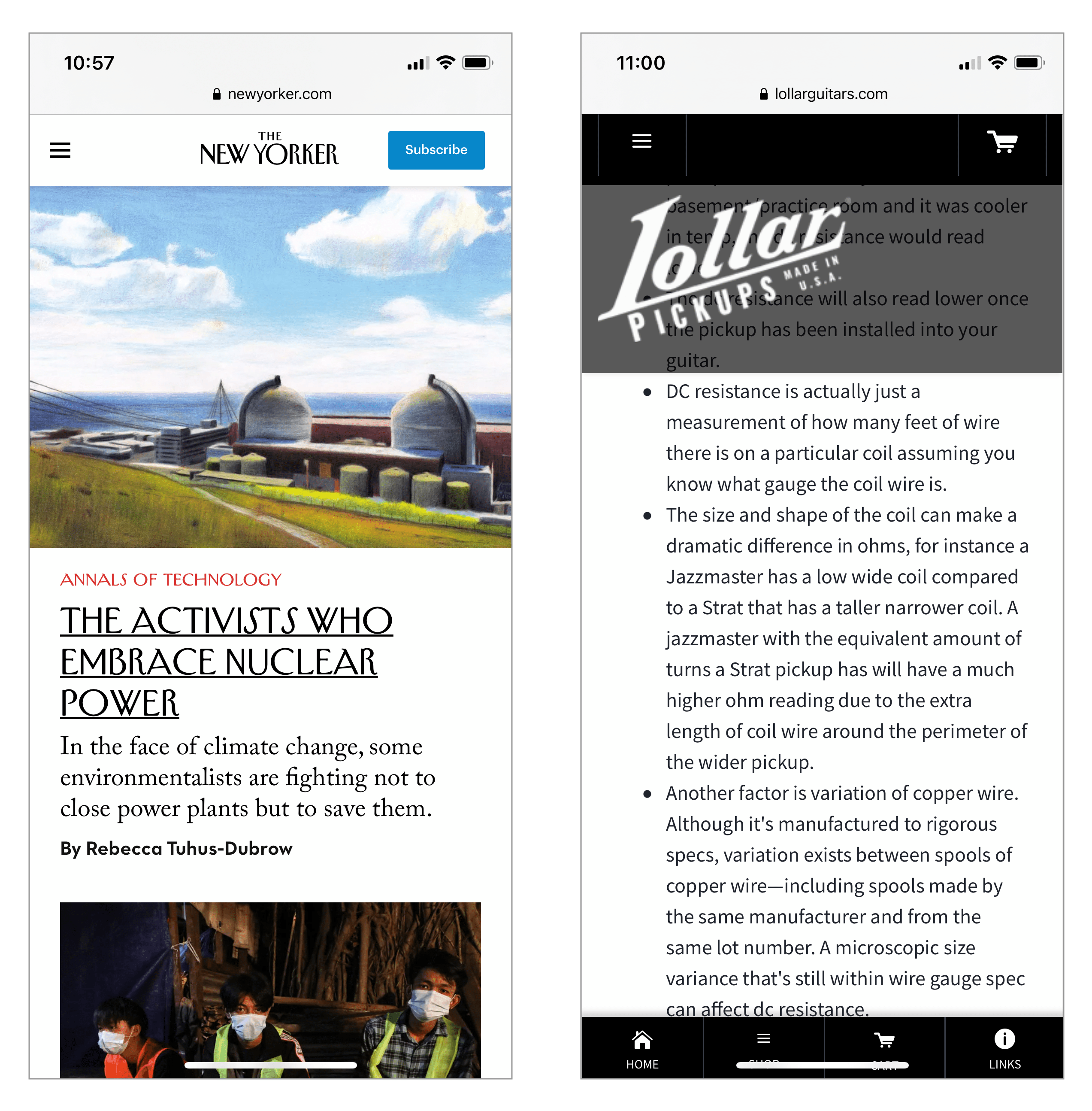
Right: Lollar Pickups has a miserly 2:1 content-to-chrome ratio on the same device, with an excessively large translucent logo header that does not provide sufficient contrast against the content (so we count it as chrome) and an unnecessary duplicative tab bar at the bottom of the page that is also sticky.
2. Contrast with Content Is Important
To choose an appropriate background color for a sticky header, consider whether there is sufficient visual differentiation between the header and content everywhere on the page. Since the header will appear on top of every point on the page, it is important that it has enough visual contrast with the background to be noticeable, readable, and clearly differentiated from the content that it is hovering over. Any expanded submenus or dropdowns should also be clearly separated from the background.
As a result, the sticky header must be an opaque color, different from the background of main content areas. Even though translucent sticky headers intend to make more of the page content (partially) visible, the low contrast ratios that result from these headers make the semivisible content hard to read and frequently annoy and distract users.

3. Keep Motion Minimal, Natural, and Responsive
Animation is often disruptive, distracting, and annoying for users, so aim to use it only minimally for sticky headers. In general, it’s best to not use animation at all and simply keep the header in place as the user scrolls. There are two cases in which animation may be necessary: shrinking a large header area, or partially persistent headers (more on this topic in guideline #4 below).
While a very large header area is usually not recommended, occasionally considerations unrelated to UX (and often rooted in internal organizational politics) mandate a large logo at the top of the page; the logo shrinks down as the user scrolls like in the Michigan.gov example below. This animation should be quick, smooth, and immediate — the header should shrink at roughly typical scrolling speed and should not disappear, jump, or otherwise startle the user.
Sticky headers also should stay in a fixed spot at the top or side of the browser window, rather than scooting into position after a delay (a pattern known as the ‘stalker menu’).
4. Consider Partially Persistent Headers
Partially persistent headers are most frequently seen on mobile sites and, in some cases, offer the best of both worlds: a header that is easily accessible from anywhere on the page, but stays unobtrusive while you read and scroll down the page.
This style works moderately well. Partially persistent headers assume that any scroll up is an indication that the user wants to access the header. In many situations that will be true, but in some it will not — for example, the user may simply want to reread a previous paragraph. In such cases, the animations associated with partially persistent header can be distracting for the user.
That is why such animations should be unobtrusive and appear neither too soon nor too slowly. We recommend that it feel like it’s being manually scrolled into view by the user, but be actually triggered by the user scrolling up by a few pixels (i.e., if the user stops scrolling up, the header should continue to fully animate into view). A slide-in animation that is roughly 300–400ms long will preserve that natural feel, without being distracting.
5. Consider Whether a Sticky Header Is Needed at All
A final aspect to consider is whether the sticky header truly needed. Ultimately, by using a sticky header you give away some screen real estate on every single page of your site. And, if the sticky header is not helpful to your users, any other optimizations you make to its design are moot. Do a cost–benefit analysis of your sticky headers by answering the questions below:
- What types of elements will your header contain? Main navigation? Utility navigation? A logo?
- Are these elements likely to be needed often or at any point during a session?
For example, if a login button is in your header, is it likely that your users will log in on any page of your site? If your main navigation categories are in the header, will users jump from one category to the next during one session or is it more likely that they will stay in a single category for their entire time?
The answers to such questions will vary depending on the type of site and the tasks and content that it supports.
Summary
Sticky headers can be a positive addition to a site, but only if they truly serve a purpose for your users. If a sticky header does provide value to users, then ensure that it is as small as reasonably possible, it has high contrast against the background, does not use gratuitous animation, does not obscure content, and does not distract your users.